Showing posts with label stocks. Show all posts
Showing posts with label stocks. Show all posts
Thursday, March 23, 2017
Picking the Top
In Shorting With Reckless Abandon I expressed my views. I have now started documenting my journey at Picking The Top for anyone who wants to see my foolishness in realtime.
Wednesday, August 28, 2013
Applications of Interactivity to Finance
Of the nearly infinite ways of using crossfilter and dc.js in finance, the 2 that immediately came to my mind are signal analysis in system building and money manager analysis in due diligence. My first very basic experiment explores a commonly known signal (RSI) on the daily S&P 500 since 1950. Interactivity adds a lot to the experience. I used R to grab and reshape the data and slidify to make it pretty. Check it out by clicking here or on the screenshot below.

For another very fine example of dc.js and crossfilter in use with AAII Stockpicking strategy data, see this fine site.

Tuesday, August 13, 2013
Stocks and Bonds Behavior by Decade
I struggled with whether or not I should even post this. It is raw and ugly, but it might help somebody out there. I might use this as a basis for some more gridSVG posts, but I do not think I have the motivation to finish the analysis.


Code:
require(latticeExtra)
require(quantmod)
require(PerformanceAnalytics)
getSymbols("SP500",src="FRED")
US10 <- na.omit(getSymbols("DGS10",src="FRED",auto.assign=FALSE))
stocksBonds <- na.omit(
merge(
lag(SP500,k=-100)/SP500-1, #forward 100 day sp500 perf
US10 / runMean(US10,n=250) - 1, #us10 yield - 250 day average
SP500
)
)
#get the decade
stocksBonds$decade = as.numeric(substr(index(stocksBonds),1,3)) * 10
#name columns
colnames(stocksBonds) <- c("sp500","us10","SP500","decade")
#get a color ramp for our change in us10 year yields
linecolors <- colorRamp(
c("red","green"),
interpolate="linear",
space="rgb"
)((stocksBonds[,2]+0.5))
xyplot(
stocksBonds[,1],
col=rgb(linecolors,max=255),
type="p",pch=19,cex=0.5,
main = "Stocks 100d Forward Performance"
)
xyplot(
sp500 ~ us10 | factor(decade),
groups = decade,
data = as.data.frame(stocksBonds),
pch=19,
cex = 0.5,
scales = list(
x = list(tck=c(1,0),alternating=1)
),
layout=c(6,1),
main = "S&P 500 Forward Performance vs US 10y Change in Yields",
ylab = "S&P Forward Performance (100d)",
xlab = "US 10y Yields - 250d Avg"
) +
latticeExtra::layer(panel.abline(h=0,col="gray",lty=2)) +
latticeExtra::layer(panel.abline(v=0,col="gray",lty=2)) +
xyplot(
sp500 ~ us10 | factor(decade),
col="gray",
data = as.data.frame(stocksBonds),
panel = panel.lmline)
require(ggplot2)
ggplot(data = data.frame(stocksBonds), aes(y=sp500, x= us10,colour=decade))+
geom_point()+facet_wrap(~decade,ncol=6)+geom_smooth()
charts.PerformanceSummary(
merge(
ROC(stocksBonds[,3],n=1,type="discrete"),
ROC(stocksBonds[,3],n=1,type="discrete") * (stocksBonds[,2]>0)
),
main="S&P 500 | if Bonds - Mean(250d) > 0"
)
Thursday, February 21, 2013
Additional Plots on French Breakpoints as Valuation
I feel like there might be some merit in Slightly Different Measure of Valuation using Ken French’s Market(ME) to Book(BE) Breakpoints by percentile to offer an additional valuation metric for US stocks. I thought some additional plots might help me flesh out the concept. This plot struck me as particularly helpful.
 |
| From TimelyPortfolio |
In the next iteration, I hope to add a look at prospective drawdown or returns. However, I struggle since the last 30 years all have basically exhibited historical overvaluation. Since 1926, no period of overvaluation has lasted longer than 14 years except the last 30.
Thanks to the post from http://timotheepoisot.fr/2013/02/17/stacked-barcharts/ which helped me use much more appealing colors than the default lattice set.
Wednesday, January 16, 2013
Slightly Different Measure of Valuation
I grow tired of the tried and true standard measures of valuation, and from time to time I try to think of alternate methods. One thought was to analyze Ken French’s Market(ME) to Book(BE) Breakpoints by percentile. We can see by year at what level is a stock considered cheap relative to the universe. As these breakpoints move higher, the market is willing to pay a higher price. In reverse, as these breakpoints move lower, stocks fetch a lower price or can be considered cheaper. Since there are 20 fifth percentiles, a horizon plot can provide a good overall look at this measure of valuation.
Here is a horizon plot of absolute ME/BE valuation by fifth percentile since 1926.
 |
| From TimelyPortfolio |
For a more representative look, let's plot a horizon chart of the ME-BE / historical mean - 1.
 |
| From TimelyPortfolio |
For one more non-horizon look, we can use an xyplot.
 |
| From TimelyPortfolio |
In theory, I think this could provide yet another gauge of the cheapness of stocks, but of course, there is lots of research to be done.
Wednesday, December 5, 2012
Apple Compared to Others with ggthemes
For a happy person delightfully concentrated in Apple, I wanted to show Apple’s performance versus Microsoft and Cisco in decades 1(1990-2000) and 2 (2000-2012). I thought this would give me a good chance to try out the very interesting work being done at https://github.com/jrnold/ggthemes.
 |
| From TimelyPortfolio |
Just as a reference, my general goto chart is theEconomist set from latticeExtra. Here is how it would look with that method. I think it is still my favorite.
 |
| From TimelyPortfolio |
For another chart since 2003 prepared by the far more capable at the Wall Street Journal, see Why Microsoft Beats Apple hat tip from Stock Picking Matters: Apple v Microsoft from The Big Picture by Global Macro Monitor with a hat tip from Jason Zweig.
My best guess in terms of the debate is some other company will resoundingly beat both Microsoft and Apple over the next decade.
Wednesday, November 7, 2012
Cash–Opportunity Lost or Opportunity Gained
Tom Brakke from http://researchpuzzle.com/ wrote a great thought piece Cash as Trash, Cash as King, and Cash as a Weapon for the CFA Institute blog. My favorite part comes in the last paragraph:
“That’s the kind of analysis that should be brought to the discussion of cash, not simple sayings that bounce back and forth in response to the mood of the market. Individual investors should not be afraid to hold cash, even when it’s earning little, if it’s available to them when needed most. And investment professionals should get away from misguided notions about how much cash is too much cash in a portfolio. Let the manager use the value and power of cash to execute a strategy. Then you can judge whether the strategy makes sense. Don’t remove cash as an effective weapon.”
Another way of looking at cash is does it represent the commonly accepted notion of opportunity lost (opportunity cost or “cash as trash”) or does it represent opportunity gained (Buffett’s cash as a “call option” as described in the solid Globe and Mail article). I hope those who know me or read this blog know where I stand. Cash is a refuge in the absence of opportunity, and I plan to spend significant time over the next couple months exploring how to mathematically price cash as a call option. If anyone has attempted this or read any research, please share it with me.
Interestingly enough as a byproduct of some other research, yesterday I was confronted with something that I should have already known. If you compare the 1 year US Treasury (not really cash but close enough) with just the price return of the S&P 500 starting from 1960, the price only S&P 500 is extraordinarily unremarkable.
 |
| From TimelyPortfolio |
 |
| From TimelyPortfolio |
Also, cash does not look so bad when we consider the new Research Affiliates research "Glidepath Illusion". Certainly commonly accepted “wisdom” does not seem so wise.
Tuesday, October 16, 2012
Life on the Big International Frontier
Although I have used the Kenneth French data library extensively in various posts, I have not yet used the international data sets paired with the wonderful paper.
Eugene F. Fama and Kenneth R. French (2012) "Size, Value, and Momentum in International Stock Returns", Critical Finance Review
To rectify this home bias, let’s generate some efficient frontiers for the biggest cap stocks by geographic region to see how the frontiers have evolved over the last 20 years.
 |
| From TimelyPortfolio |
Eventually, I would like to think through some other methods of comparing risk, return, and weights across multiple frontiers.
Tuesday, October 2, 2012
Emerging as Low Vol
Extending the series begun with When Russell 2000 is Low Vol, I thought I should take a look at Emerging Market stocks during periods of low relative volatility to the S&P 500. So you can replicate even without access to expensive data, let’s use the Vanguard Emerging Market Fund (VEIEX) and the Vanguard S&P 500 Fund (VFINX) as proxies. In the 12 month rolling regression, we see the same fairly steadily increasing beta and correlation of the Emerging Market stocks to the S&P 500 that we saw in the Russell 2000.
 |
| From TimelyPortfolio |
If I progress further on this research, I will have to work on an adaptive definition of “low vol”, but for the purpose of this post, I defined “low vol” as
Emerging 50 day std. dev – S&P 500 50 day sd > –0.075
For the Russell 2000, we used a more strict 0.0125. Although the numeric definition is different, the chart shows a very similar profile.
 |
| From TimelyPortfolio |
Monday, October 1, 2012
When Russell 2000 is Low Vol
Continuing in my exploration of the Russell 2000 (Russell 2000 Softail Fat Boy), I thought I would try to approach the topic with a low volatility paradox mindset. Since 2005, beta of the Russell 2000 compared to the S&P 500 has exceeded 1.2 with a max of 1.6 for almost every rolling 1 year period. This suggests that the Russell 2000 is anything but low vol.
 |
| From TimelyPortfolio |
However, we can take a more simplistic view by comparing the rolling 50-day standard deviation of the Russell 2000 with the S&P 500. Russell 2000 on an absolute and relative basis does very well when rolling 50-day standard deviation of the Russell 2000 minus the same standard deviation on the S&P 500 exceeds –1.25%, so the Russell 2000 performs best when volatility approaches the S&P 500. In low relative volatility environments, it seems we should own the high beta Russell 2000. You will see the largest down moves all occur in the non-shaded time periods.
 |
| From TimelyPortfolio |
I intentionally wanted this post to be simple, so I hid a lot of the preliminary work and extra links. Far more went into this than appears above.
Tuesday, July 24, 2012
The Failure of Asset Allocation - Bonds Are An Imperfect Hedge
US investors were spoiled by US Treasuries which acted as a near perfect hedge to stocks during the 2008-2009 crisis. However, in real crisis, bonds rarely offer any comfort, and asset allocation fails (see post Death Spiral of a Country and IMF paper Systemic Banking Crises Database: An Update; by Luc Laeven ... – IMF). As a very timely example, we can examine Spain, which is not even to crisis level yet.
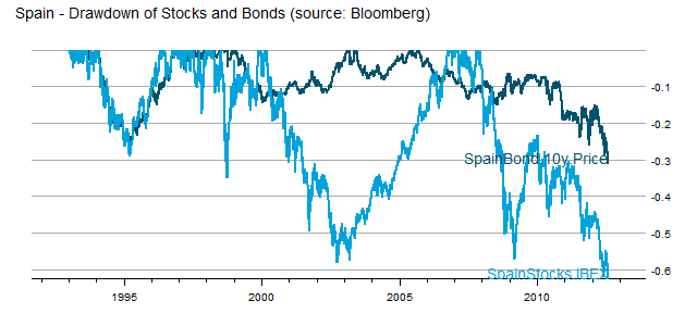 |
| From TimelyPortfolio |
In Spain, there is nowhere to hide, and allocation offers no comfort.
Monday, June 11, 2012
Statistics of Drawdown–paper and post
Thank so much to Patrick Burns’ post Variability in maximum drawdown. He starts with “Maximum drawdown is blazingly variable,” which I say is why money management is so blazingly difficult. After spending a lot of time thinking about his post and trying to replicate the referenced paper
Casati, Alessandro, About the Statistics of the Maximum Drawdown in Financial Time Series (May 1, 2012). Available at SSRN: http://ssrn.com/abstract=2049584 or http://dx.doi.org/10.2139/ssrn.2049584
I think that the cumulative statistics, both total return and drawdown, fit well with the comment “The pictures imply that the maximum drawdown could have been pretty much anything.” Here is one of the figures that leads to this conclusion, and the predicted confidence interval from 20% to 90% is incredibly wide and not all that helpful. If someone was willing to pay me for the bet that over the next 1,000 days, the S&P 500 or really any equity index drawdown falls between 20% and 90%, I would be happy to take that bet, and I would not need sophisticated statistical techniques to give me that insight.

Although I do not replicate the paper exactly with the most obvious difference that I use monthly returns 1950-May 2012 rather than daily returns 2002-2009, we can evaluate both return and drawdown through density plots with multiple distribution methods. I limited my simulation to 10,000 samples so that I would not be up all night, but 10,000 is sufficient to show that over 62 years, both cumulative return and max drawdown can be virtually anything and both are “blazingly variable.” I wonder how this would compare with life with sickness/death as drawdown and age of death as cumulative return.
 |
| From TimelyPortfolio |
 |
| From TimelyPortfolio |
To be fair, let’s annualize the cumulative returns (actually probably better to do over 5 to 20 year periods).
 |
| From TimelyPortfolio |
Independent of the outcome, I really enjoyed the paper’s Figures 8, 9, and 10 getting me one step closer to the question posed in my post Is Drawdown the Biggest Determinant of System Success?


We do see a relationship between return and drawdown.
 |
| From TimelyPortfolio |
If nothing else, I was delighted to see a discussion of the often ignored drawdown statistic, which is the key to every investment decision I make.
Friday, June 8, 2012
Evaluation of Tactical Approaches
Tactical approaches are often chosen based on the best cumulative return which implicitly incorporates significant hindsight bias. Just because an approach dominates for a period of time does not indicate that it will be the best approach. As the investment community abandons buy-and-hold and embraces tactical allocation, my guess is that the best cumulative return gathers the most assets.
Mebane Faber’s 10-month moving average system explored in
A Quantitative Approach to Tactical Asset Allocation
Journal of Wealth Management, Spring 2007
and further refined in his book
offers a simple method for achieving what most would deem as a good result—respectable cumulative returns with significantly less risk regardless of risk measure. Let’s play with degrees of freedom and make slight changes to the system to see how they performed in the past. Let’s then try to decide which approach we should pursue in the future given very incomplete information. Once we decide, let’s then decide how confident we can be in the future result.
I will test 4 systems that are all very similar in approach:
NOT INVESTMENT ADVICE. PLEASE DO NOT USE AS THE RESULT WILL BE LARGE AND PAINFUL LOSSES.
- Mebane Faber 10 month moving average
- Rolling Proprietary (say with a smile but don’t use emoticon) Sharpe ratio > 10 month moving average
- Rolling Proprietary Sharpe ratio > 0
- Rolling Proprietary Sharpe ratio > 6 months ago Rolling Proprietary Sharpe ratio
With a little help from the fine examples given in Download and parse EDHEC hedge fund indexes, we can visualize the cumulative returns and drawdowns of each approach. I have denoted with a line 1985 which is a time when we might have chosen approach #2 since it offered significantly better cumulative returns from 1950-1985. However, the result after our 1985 choice was not as good as we would have expected.
 |
| From TimelyPortfolio |
Again using Download and parse EDHEC hedge fund indexes, we can use some more sophisticated measure of risk. The middle (MovAvgSharpe or approach #2) offers the lowest level of historical risk on a cumulative basis. Even though performance lagged since its 1985 first place finish, this might encourage us to still pick this approach.
 |
| From TimelyPortfolio |
To continue our move away from cumulative return towards other statistics, we can check the distribution of the monthly changes and also some higher-moment statistics skewness and kurtosis.
 |
| From TimelyPortfolio |
 |
| From TimelyPortfolio |
Even after all this exploration, we can predict nothing. For more confidence, we might use ttrTests (explained in posts http://timelyportfolio.blogspot.com/search/label/ttrTests), use random portfolios as advocated and explained very well by http://portfolioprobe.com, and/or let relative strength decide as advocated and explained very well by http://systematicrelativestrength.com/. However in 30 years, we have no idea what will do best or even what best means.
Friday, June 1, 2012
System from Trend Following Factors
As I thought more about Trend Following Factors from Hsieh and Fung, I thought that the trend following factors might indicate a state/regime for the equity markets that could potentially offer momentum-style timing signals for a system on the S&P 500. Now, THIS ABSOLUTELY SHOULD NOT BE CONSIDERED INVESTMENT ADVICE, especially since the factor data is very lagged and the testing is nowhere near comprehensive enough. I will however try to replicate the factor methodology to get a more real-time indicator extended to any index in another post. What is most interesting to me is that this is ex-ante intuitive and the signal is just basic statistics.
 |
| From TimelyPortfolio |
 |
| From TimelyPortfolio |
 |
| From TimelyPortfolio |
Monday, April 30, 2012
French Global Factors
I have said it already in multiple posts, but Kenneth French’s data library is one of the most generous and powerful contributions to the financial community. To build on Systematic Investor’s series on factors, I thought I should run some basic analysis on the Global Factors maintained by Kenneth French. I cannot imagine how long this would take without the data library and the incredible set of R packages available.
 |
| From TimelyPortfolio |
 |
| From TimelyPortfolio |
 |
| From TimelyPortfolio |
 |
| From TimelyPortfolio |
 |
| From TimelyPortfolio |
 |
| From TimelyPortfolio |
Friday, April 27, 2012
Real Time Structural Break
Yesterday as I played with bfast I kept thinking “Yes, but this is all in hindsight. How can I potentially use this in a system?” Fortunately, one of the fine authors very generously commented on my post Structural Breaks (Bull or Bear?):
“Jan Verbesselt Apr 27, 2012 02:01 AM
Nice application! you can also detect seasonal breaks. also check some new near real-time disturbance detection functionality using bfastmonitor() http://bfast.r-forge.r-project.org/Verbesselt+Zeileis+Herold-2012.pdf
cheers, Jan”
And away I went on an unexpected but very pleasant journey into bfastmonitor. Please see the following paper for all the details.
Jan Verbesselt, Achim Zeileis, Martin Herold (2011). Near Real-Time Disturbance
Detection in Terrestrial Ecosystems Using Satellite Image Time Series: Drought
Detection in Somalia. Working Paper 2011-18. Working Papers in Economics and
Statistics, Research Platform Empirical and Experimental Economics, Universitaet
Innsbruck. URL http://EconPapers.RePEc.org/RePEc:inn:wpaper:2011-18
Doing a walk-forward test seemed like the best method of testing and illustration, so I chose the excruciating and incredibly volatile period from late 2008 to early 2009 as our example. Amazingly, it picked with no optimizing or manual intervention March 2009 as the breakpoint. Of course, we would not know this until the end of March, but picking real-time with only a month lag is unbelievable to me. Please try it out, and let me know your results. Of course, I already have the 30 year bond bull in mind as a next trial.
Thanks to Yihui Xie who resurfaced again (see posts on knitr) with his animation package, which I used to create a good old-fashioned animated GIF. I wish I had time to play more with the prettier and more robust options offered by the package.

Thursday, April 26, 2012
Structural Breaks (Bull or Bear?)
When I spotted the bfast R package, I could not resist attempting to apply it to identify bull and bear markets. For all the details that I do not understand, please see the references:
I believe the result on the S&P 500 (even with a high h and only one iteration) is a fairly close marker for bull and bear markets, and I thoroughly enjoyed applying forestry techniques to financial time series.
 |
| From TimelyPortfolio |
 |
| From TimelyPortfolio |
 |
| From TimelyPortfolio |
Wednesday, April 18, 2012
Efficient Frontier of Funds and Allocation Systems
I did a very basic experiment in Efficient Frontier of Buy-Hold and Tactical System where I determined the efficient frontier of the S&P 500 with itself transformed by a Mebane Faber 10-month moving average tactical allocation.
The result was interesting, but I did not pursue further. Now with some inspiration and tools by Systematic Investor, I thought I would extend the post. This time around we will use both the Vanguard U.S. Total Bond Market (VBMFX) and Vanguard U.S. S&P 500 (VFINX) combined with both portfolios determined by tactical methods (moving average, RSI, and omega) and those funds transformed individually by the same tactical methods. I will as always warn you that this is not advice and large losses are almost guaranteed. Also, I would like to note that I have checked the 10-month moving average every way possible (even manually in Excel), and it has been incredible on the VFINX since 1990. Prior to 1990, results were good but nowhere near as amazing. If I messed up, please let me know.
 |
| From TimelyPortfolio |
| From TimelyPortfolio |
 |
| From TimelyPortfolio |
Thursday, March 15, 2012
Opinions Not Backed by Money Updated Again
Strange that I am updating this post for a third time and nothing really has changed, but the fact that nothing has changed is incredibly interesting to me. Since it is an update, I will not duplicate the explanation, so please read the last version Opinions Not Backed by Money Are Not That Believable--Updated and with R. The basic conclusion is that we are in a bull market and AAII surveys are bullish, but nobody is willing to bet money on a good stock market.
 |
| From TimelyPortfolio |
Data in a Google Doc (https://docs.google.com/spreadsheet/ccc?key=0Amqp2r96khJPdENIRnE1SG5nanJ5OXFyYVUxOXRBVmc) sourced from AAII- The American Association of Individual Investors and ICI.
R code (not even worth putting in GIST):
require(quantmod)
require(ggplot2)
aaii_ici=read.csv("aaii-ici-noblank.csv",row.names=1)
#using ggplot example from http://learnr.wordpress.com/2009/03/16/ggplot2-split-data-range-into-multiple-chart-series/
p <- ggplot(data=aaii_ici, aes(x = AAIIBULL-AAIIBEAR, y = runSum(aaii_ici[,4],3), colour = Range, shape = Range, label = Range))
p1 <- p + geom_point() + scale_y_continuous(limits = c(-200000, 200000),formatter=comma) + geom_hline(yintercept=0) + geom_vline(xintercept=0) + stat_smooth(method="lm", se=FALSE) + ylab("ICI Equity Rolling 3-mo Sum") + opts(title = "ICI Equity Flows by AAII Survey")
print(p1)
Thursday, January 12, 2012
Stocks When Bonds are Extreme
In Extreme Bond Returns, I did not consider the context of extreme bond returns, so let’s examine annual returns for the Dow Jones Industrial Average when bonds experience extreme annual returns. I was very surprised that stocks performed extremely well when bonds also did extremely well. Unfortunately, 6 of the 8 periods all occurred during the incredible 30 year bond bull 1980-2011, so it is difficult to come to any universal conclusions.
 |
| From TimelyPortfolio |
And a little different look with lattice
 |
| From TimelyPortfolio |
Subscribe to:
Posts (Atom)