Showing posts with label reporting. Show all posts

Monday, March 2, 2015

Experiments in Time Series Clustering

Last night I spotted this tweet about the R package TSclust.

I should start by saying that I really don’t know what I’m doing, so be warned.  I thought it would interesting to apply TSclust to the S&P 500 price time series.  I took the 1-day simple rate of change, grouped by year with dplyr, and then indexed by the day of the year all in one pipeR pipeline.  Since the TSclust paper

TSclust: An R Package for Time Series Clustering

Journal of Statistical Software, Volume 62, Issue 1

November 2014

http://www.jstatsoft.org/v62/i01/paper

demonstrates interoperability with hclust in their OECD interest rate example ( Section 5.2 ), I thought I could visualize the results nicely with treewidget from the epiwidgets package.  Just because the htmlwidget was designed for phylogeny doesn’t mean we can’t use it for finance.  Here is the result.

For reference and searching, I’ll copy the code below, but all of this can be found in this Github repo.


library(TSclust) library(quantmod) library(dplyr) library(pipeR) library(tidyr) library(epiwidgets) sp5 <- getSymbols("^GSPC",auto.assign=F,from="1900-01-01")[,4] sp5 %>>% # dplyr doesn't like xts, so make a data.frame ( data.frame( date = index(.) ,price = .[,1,drop=T] ) ) %>>% # add a column for Year mutate( year = as.numeric(format(date,"%Y"))) %>>% # group by our new Year column group_by( year ) %>>% # within each year, find what day in the year so we can join mutate( pos = rank(date) ) %>>% mutate( roc = price/lag(price,k=1) - 1 ) %>>% # can remove date select( -c(date,price) ) %>>% as.data.frame %>>% # years as columns as pos as row spread( year, roc ) %>>% # remove last year since assume not complete ( .[,-ncol(.)] ) %>>% # remove pos since index will be same select( -pos ) %>>% # fill nas with previous value na.fill( 0 ) %>>% t %>>% # use TSclust diss; notes lots of METHOD options diss( METHOD="ACF" ) %>>% hclust %>>% ape::as.phylo() %>>% treewidget

Tuesday, July 22, 2014

Chart from R + Color from Javascript

Another color experiment combining resources from R and Javascript.  I just wish I could do Mean Phylogenetic Distance in Javascript like rPlotter.  I enjoyed using d3.js zoom behavior to pan and zoom the image on canvas.  Also, filedrop.js made the drag and drop image easy.  There are lots of mini lessons in this code for someone who want to pick inside the code.

You might also notice the reference color from my last post Pick a Color Site built in R with Shiny tags %$%.

image

Wednesday, July 16, 2014

Pick a Color Site built in R with Shiny tags %$%

I started down the color path with yesterday’s post Palette of Colors from Image %>% ggplot2 %>% rCharts + dimple.js.  Although R has lots of tools, such as RColorBrewer and the mentioned rPlotter, javascript does too with Gregor Aisch's chroma.js and this translated-from-Perl color-scheme-js.

I figured I should explore these javscript color tools but not in the easy way.  Rather, I thought I should make it a little more challenging by forcing myself to build the site all in R using Shiny Tags based on an idea proposed by Ramnath Vaidyanathan in this rChartsDygraphs issue.  While I was at it, I thought I should keep plugging away with magrittr by playing with the new %$%.

I’m sure the result would amuse professional web developers and color pickers and probably even diehard R coders, but at least there was a result.

image

Tuesday, July 15, 2014

Palette of Colors from Image %>% ggplot2 %>% rCharts + dimple.js

R should be mature and dying by now, but it is instead alive and vibrant. I experiment with some of the new developments below. It is probably best to copy/paste the intro below in case you do not see the iframe content.

The five purposes of this post/experiment are not really related, but I figured it would be an interesting challenge to combine them.

  1. Highlight the great blog MetaEvoPhyloEcoOmics from Russell Dinnage
  2. Explore the new world of color in R provided by Jo-Fai Chow through rPlotter
  3. Continue Experimenting with magrittr
  4. Examine ggplot_build as proposed by Carson Sievert in Visualizing ggplot2 internals with shiny and D3
  5. Test the use of alternate colors in rCharts and dimple.js

Thursday, July 3, 2014

Beer and Pie | rCharts pie charts with d3pie

In honor of the 4th of July, I thought a quick example of a pie chart on beer using the wonderful new d3pie library would be appropriate.  The rCharts binding with d3pie is simply an experiment now, but expect more in the near future.


Using slidify and rCharts, I created a more complete writeup of the experiment with d3pie if you would like to play with it yourself.

Friday, June 6, 2014

Dispelling Myths of Momentum | AQR Research Factory

In a recent working paper from the prolific AQR Research Factory, the authors seek to dispel ten common myths of momentum investing.  To their credit, they use the fine data publicly available from Kenneth French and use fairly simple metrics to make compelling arguments against the myths and for the momentum factor.  I replicated most of the calculations in R, and then in a blend of replication, summary, and discussion on process, used rCharts, Gmisc, and slidify to create the following writeup.  I hope others find it useful, and it serves a purpose much greater than a re-creation.

For another very detailed summary of the paper, see the post from Gary Antonacci of Optimal Momentum.


image

To make sure this gets seen by those who might not read the paper, I will copy the thanks section below.

Thanks specifically:

Wednesday, June 4, 2014

Active Share and Tracking Error | Not Mutually Exclusive Decisions

Antti Petajisto got a lot of attention with his research on Active Share and Tracking Error in mutual fund management.  While the research is fairly compelling, there is a missing discussion about a potential relationship between the two measures. The paper seems to suggest that mutual fund managers can independently and intentionally pursue Active Share and/or Tracking Error.  However, some research from the PIMCO Quantitative Team argues that Active Share and Tracking Error are related and that they can easily be a byproduct of other decisions such as benchmark or fund exposure.  I strongly suggest reading both sets of research to gather a full understanding of these concepts.

Table 2 is simple enough, but despite its simplicity I could not visualize in my head, so I copied the data and with a couple lines of R + rCharts got all the visualization I needed.

image


replicate:

source code from Github

Thursday, May 15, 2014

PDF Chart–> Inkscape SVG –> d3 Interactive Chart

I just spent the last couple of days updating myself on the newest research on currency management.  For the best real-time (delayed about a year) broad look, BIS puts out an incredibly helpful Triennial Central Bank Survey of foreign exchange... in which you see things like this

image

and this.

image

pdfs suffer from a lack of interactivity, so I thought why not use Inkscape’s PDF to SVG conversion to strip the above chart and make it SVG.  Then, if everything goes well, experiment with some basic interactivity provided by d3.js.  Here is what happened.

If anyone would like a more extensive write up of the process, please let me know.

Friday, April 4, 2014

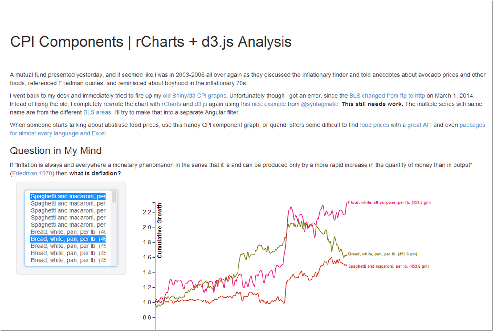
R as a Publishing Engine | CPI Components Use Case

R was certainly not designed to be a publishing engine, but in my workflow, R is the primary method of content creation.  With that in mind, I have been thinking about a very different use case of rCharts in which we might want to include inflexible and not really reusable custom javascript components in our document.  As a quick example after updating my CPI component graph using d3.js and angular, I want to plug it into a document and really only need to modify a couple of parameters.  While someone might want to use this for different data, I doubt it.

rCharts seamless integration with knitr/slidify/Rpres makes this very easy.  I just wonder how popular this will become.

image

Friday, March 28, 2014

Slopegraphs | rCharts –> maybe finance versions

Back in 2011, Charlie Park did two very thorough posts on Edward Tufte’s table graphics or slopegraphs.

http://charliepark.org/slopegraphs/

http://charliepark.org/a-slopegraph-update/

These type graphics can provide very effective visualizations of finance and economic information.  For my first test though I will stick with cancer survivor data from this post Slopegraphs in R | James Keirstead.  We can use a dimplejs line chart from rCharts as our platform and add some javascript to do something similar.

If you know of any good finance or economics slopegraphs, please let me know and I might just try to recreate them.

Click here or on the image below to see the fully post

image

Tuesday, March 25, 2014

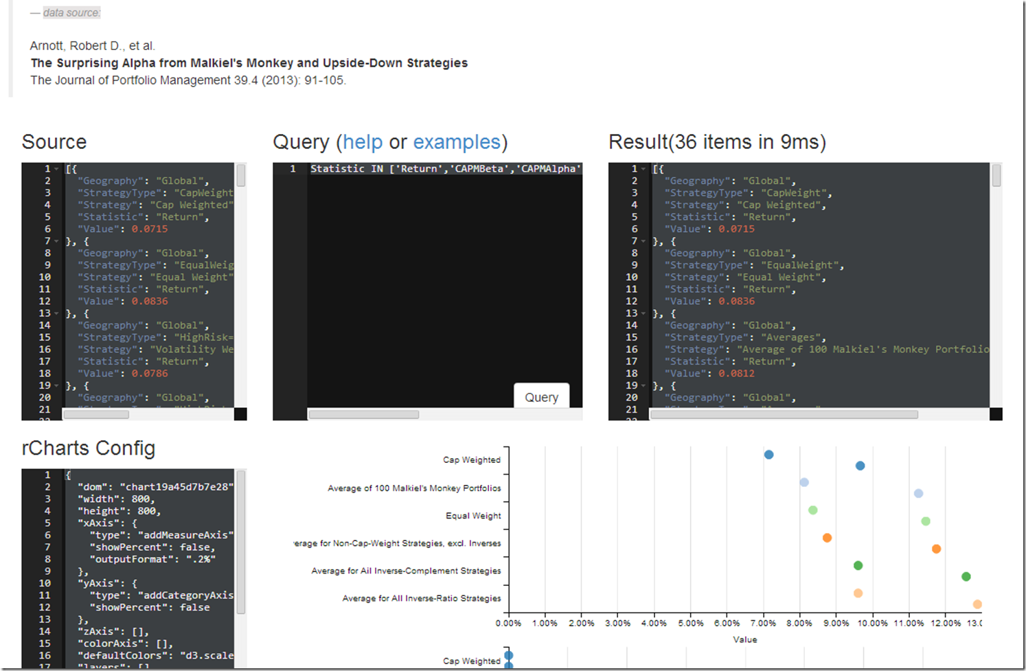
Interactive Discovery of Research Affiliates JoPM Paper

In my previous post More on Rebalancing | With Data from Research Affiliates , I did some really basic visualizations, but I thought this data would be great for some more powerful interactive discovery using an interesting javascript SQL-like query language objeq along with the d3.js charting library dimple.js.  Next, I hope to extend to use lodash or lazy.js.

This exercise helps me think through a couple of lingering issues:

  1. After we create the plot, do we need to maintain the overhead of a connection with R using something like shiny, or can we port some of the aggregation, filtering, and calculations to javascript as we did in this example?
  2. How can we use the rCharts templates with other languages such as Python, Ruby, and Javascript?
  3. What can we do with some more specific and customized page templates for rCharts?
  4. Is a Lyra-like interface better or will this type interface work for more advanced users?

Help me with your thoughts after you have played with the example shown by the screenshot below.image

Friday, March 14, 2014

Bond Shop Views with dimplejs and rCharts

I saw this chart in a presentation and thought I could make it better and interactive.  Here is a short article on the iteration process.  Click on the screenshot below or here for the full post.

Note: these are not my views and this is not financial advice.  I did not name the original source of the graphic.  If you are the source, and you happen to see this, let me know if you would like me to name you.

image

Monday, January 27, 2014

Emerging Currencies with rCharts + FRED

I liked this chart a lot.

I thought I would show how we can semi-replicate it in R with rCharts.  Here it is with the currencies that are on FRED with dimplejs.

… and here with nvd3.

Code to replicate from Github Gist:

Tuesday, January 21, 2014

What Do the Odds Say? Buy Stocks Begin of Year?

At some point in 2013, I read (can’t remember where) that 2012 was a rare year for the S&P 500  where no day’s closing  price was lower than the closing price  for the first day.  So if you bought on the first day of 2012, you never had a loss for the entire year.  Well, the same thing happened 2013, so I just had to do some analysis.  Below is a dimple.js chart built using rCharts with the minimum close price for the year divided by the close price for the first day of that year.

data source: Yahoo! Finance, Standard & Poors

Tuesday, October 8, 2013

rCharts goes Polar

The new micropolar library from Chris Viau, author of

  gives us reusable charts with polar coordinates for d3.js.  In testament to rCharts design, Ramnath Vaidyanathan integrated micropolar with rCharts in less than 30 minutes.  I don’t use polar coordinates much, so I wrote this quick little comparison of Cartesian and Polar systems using simulated money manager returns to get me up to speed.

image

Friday, October 4, 2013

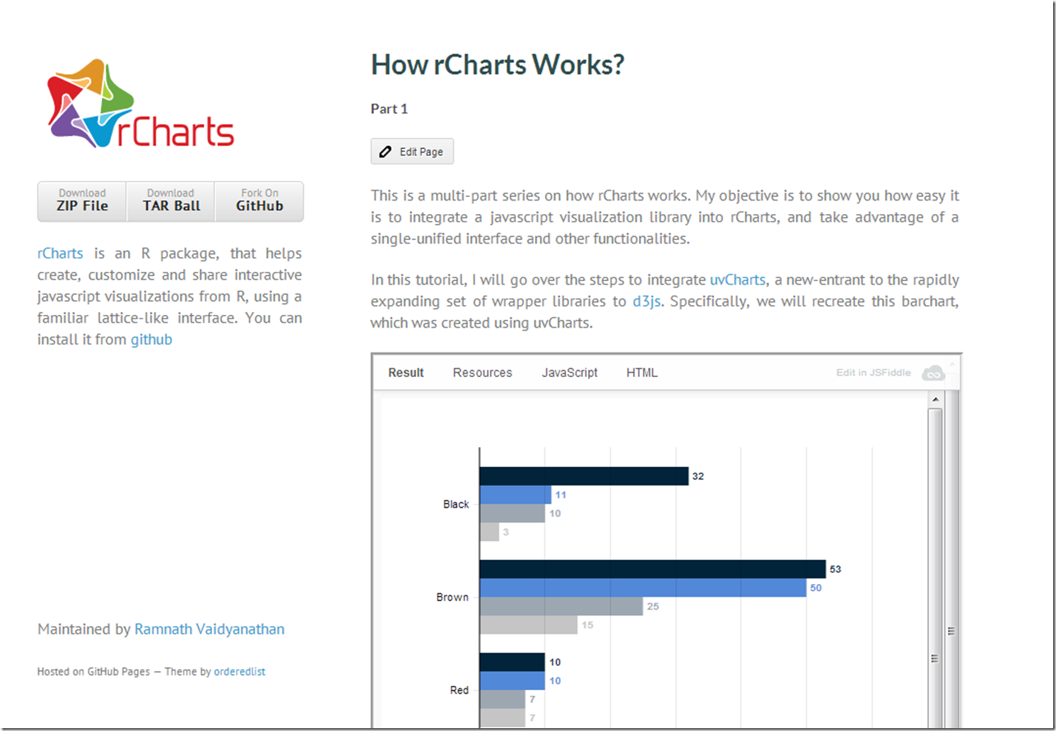
Simplicity Explained by The Author

Source is usually best explained by the source.  Ramnath Vaidyanathan provides an excellent look under the hood in his tutorial on rCharts explaining how he integrates the new d3 library uvCharts.

image

If you want to explore further, here is a list of my posts on using custom d3 with rChartsrCharts Remake of NYT, Exploring Networks with Sankey, rCharts version of d3 horizon, d3 <- R with rCharts and slidify.  I hope you are inspired to add your own rCharts implementation.

Wednesday, September 25, 2013

Ode to Systematic Clusters

Extending the d3 remixes of the fine work at Systematic Investor, I thought it woud be fun to do some dimple.js and nvd3 scatterplots of clusters of PIMCO mutual funds.  As always, I welcome thoughts, comments, and suggestions.  Click here or on the screenshot below.

screenshot

Thursday, September 12, 2013

rCharts | PerformanceAnalytics Tables + Systematic Investor Cluster

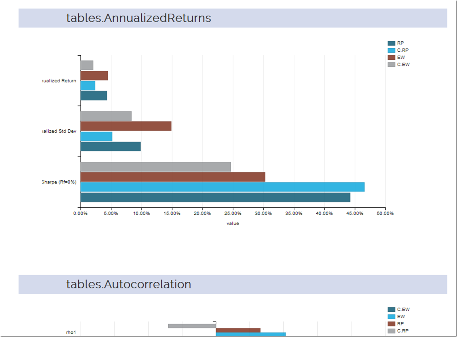
I thought a good extension of the last post d3-ify Systematic Investor Cluster Weight would be to analyze the returns with every table that PerformanceAnalytics offers.  Since d3 interactive charts are way more fun than tables, let’s plot each table with dimplejs and rCharts. Click here or on the screenshot below to see the result.

screenshot_return

Monday, September 9, 2013

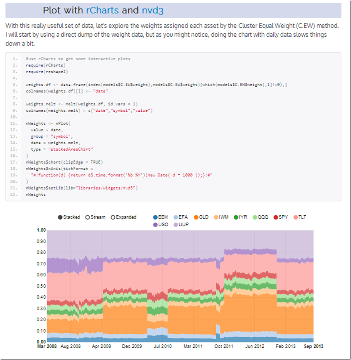
d3-ify Systematic Investor Cluster Weight

I have posted before about the brilliant R/finance work being done at Systematic Investor.  I just had to see what his cluster work would look like with d3 interactivity.  Click on the screenshot below or here to see an interactive recreation of his post.

cluster_weights