Showing posts with label fed. Show all posts

Tuesday, January 17, 2012

Foreign Currencies and US 10y Treasury Yields

Since I explored the relationship between the Japanese Yen and the US 10y Treasury Yield on Friday, I thought it might be worthwhile to extend the exploration to a much broader range of currencies. I personally am most interested on how Asian Central Bank manipulation has affected the US 10y yield, and how if that changes what might be the impact to world markets. Please let me know your thoughts.

From TimelyPortfolio

R code in GIST:

Thursday, January 12, 2012

Quick Update on the Components of Bond Returns

In Real Squeeze, -1% Guaranteed Real Real Return! Yummy??, and Historical Sources of Bond Returns, I offer some historical perspective on the only sources of bond returns: inflation, real returns, and credit.  Assuming no credit risk in US Treasuries (probably not a good assumption given this Bloomberg quote on CDS on US Treasuries), the formula is fixed, and all inputs except inflation are provided ex-ante.  While bond prices can fluctuate wildly (Extreme Bond Returns), the experience over the life of a bond and a bond index is predetermined by the yield to maturity.  Unfortunately, that guaranteed experience in inflation or deflation is not so pleasant.

While everyone should know R, I understand that some readers would prefer an easier route.  FRED as usual comes to the rescue.  Unfortunately though, labeling is not allowed.  The codes can be translated as follows:

  • DBAA = total return on BAA
  • DBAA – (DGS10 – DFII10) = credit return
  • DGS10 – DFII10 = inflation (expected)
  • DGS10 = real return

In the spirit of continuous improvement, here is the chart now using lattice and latticeExtra.

From TimelyPortfolio

R code now in GIST:

Friday, September 30, 2011

Difficult Month for One of My Best Ideas

THIS IS NOT INVESTMENT ADVICE.  MY IDEAS PROBABLY WILL LOSE YOU MONEY, AND I WILL NOT LET YOU KNOW WHEN I CHANGE MY MIND.

Bloomberg’s article “Asian Currencies Set for Worst Month Since 1997 Crisis Caused IMF Bailouts” demonstrates why with all my bearishness I did not make much money this month.  Just as a reminder for the not so faithful readers, http://timelyportfolio.blogspot.com/2011/05/russell-napier-asip-in-ft-says-emerging.html shows why I like long emerging market stocks and short Russell 2000.  However, this trade does not work so well when the currencies get clobbered.  I understand the clobbering in 1997 when Soros and others had control of the Asian currencies, but 15 years 10 trillion since that crisis, the Asian central banks clearly have control of their currencies if they choose to exert that influence.  Billions in outflows are meaningless compared to the trillions sitting in foreign currencies (see post Join the Reserves), primarily the US $.

From TimelyPortfolio

R code:

require(quantmod)

#get asian currency data from the FED FRED data series
getSymbols("DEXKOUS",src="FRED") #load Korea
getSymbols("DEXMAUS",src="FRED") #load Malaysia
getSymbols("DEXSIUS",src="FRED") #load Singapore
getSymbols("DEXTAUS",src="FRED") #load Taiwan
getSymbols("DEXCHUS",src="FRED") #load China
getSymbols("DEXJPUS",src="FRED") #load Japan
getSymbols("DEXTHUS",src="FRED") #load Thailand
getSymbols("DEXBZUS",src="FRED") #load Brazil
getSymbols("DEXMXUS",src="FRED") #load Mexico
getSymbols("DEXINUS",src="FRED") #load India
getSymbols("DTWEXO",src="FRED") #load US Dollar Other Trading Partners
getSymbols("DTWEXB",src="FRED") #load US Dollar Broad

par(mfrow=c(4, 3)) #provides 2 columns and 3 rows for charts
plot(1/coredata(DEXKOUS["1995::2011"]),type="l",ylab="Korea")
plot(1/coredata(DEXMAUS["1995::2011"]),type="l",ylab="Malaysia")
plot(1/coredata(DEXSIUS["1995::2011"]),type="l",ylab="Singapore")
plot(1/coredata(DEXTAUS["1995::2011"]),type="l",ylab="Taiwan")
plot(1/coredata(DEXCHUS["1995::2011"]),type="l",ylab="China")
plot(1/coredata(DEXJPUS["1995::2011"]),type="l",ylab="Japan")
plot(1/coredata(DEXTHUS["1995::2011"]),type="l",ylab="Thailand")
plot(1/coredata(DEXBZUS["1995::2011"]),type="l",ylab="Brazil")
plot(1/coredata(DEXMXUS["1995::2011"]),type="l",ylab="Mexico")
plot(1/coredata(DEXINUS["1995::2011"]),type="l",ylab="India")
plot(coredata(DTWEXO["1995::2011"]),type="l",ylab="US Dollar Other")
plot(coredata(DTWEXB["1995::2011"]),type="l",ylab="US Dollar Broad")

Thursday, June 30, 2011

Cash Might be Your Tail Risk

Just like James Montier Ode to the Joy of Cash and David Merkel Got Cash?, I think cash is an extremely powerful tool.  Of the 3 ingredients (land, labor, and capital) of the economy, capital (cash) is most scarce at the end of a crisis or recession while land and labor are most plentiful.  Its scarcity in disaster rewards patient holders of cash when opportunity is most plentiful and rewards most certain.  Deflation, or alternately stable to inflating currency, also rewards the most risk averse with high cash allocations.

However, if your cash is the US $, owning US $ throughout and at the end of the next collapse will not be rewarded.  Please expand your definition of cash to include other currencies besides the US $, and do not let home bias determine your cash denomination.  The tail risk most ignored in the average US investors’ portfolios is the US $.  If nothing else, at least monitor the currency markets.  You very easily could hold the most overowned and least scarce asset in the world (the US $).  Argentine Peso was not good in 2001. Russian Ruble was not good in 1998. Thai Baht, Malaysian Ringgit, and Korean Won were not good in 1997.  Mexican Peso was not good in 1994.  Cash is fine as long as cash is not the source of the tail risk.

From TimelyPortfolio

Fortunately, the Euro has been a distraction, but at some point the focus will shift to the US.  Don’t fight the Fed generally works in stocks, and it also definitely applies to the US $ here.

R code (click to download):

#monitor currencies   require(quantmod)   #get currency data from the FED FRED data series
Korea <- getSymbols("DEXKOUS",src="FRED",auto.assign=FALSE) #load Korea
Malaysia <- getSymbols("DEXMAUS",src="FRED",auto.assign=FALSE) #load Malaysia
Singapore <- getSymbols("DEXSIUS",src="FRED",auto.assign=FALSE) #load Singapore
Taiwan <- getSymbols("DEXTAUS",src="FRED",auto.assign=FALSE) #load Taiwan
China <- getSymbols("DEXCHUS",src="FRED",auto.assign=FALSE) #load China
Japan <- getSymbols("DEXJPUS",src="FRED",auto.assign=FALSE) #load Japan
Thailand <- getSymbols("DEXTHUS",src="FRED",auto.assign=FALSE) #load Thailand
Brazil <- getSymbols("DEXBZUS",src="FRED",auto.assign=FALSE) #load Brazil
Mexico <- getSymbols("DEXMXUS",src="FRED",auto.assign=FALSE) #load Mexico
India <- getSymbols("DEXINUS",src="FRED",auto.assign=FALSE) #load India
USDOther <- getSymbols("DTWEXO",src="FRED",auto.assign=FALSE) #load US Dollar Other Trading Partners
USDBroad <- getSymbols("DTWEXB",src="FRED",auto.assign=FALSE) #load US Dollar Broad       #combine all the currencies into one big currency xts
currencies <- merge(1/Korea, 1/Malaysia, 1/Singapore, 1/Taiwan,
1/China, 1/Japan, 1/Thailand, 1/Brazil, 1/Mexico, 1/India,
USDOther, USDBroad)
currencies <- na.omit(currencies)
colnames(currencies) <- c("Korea", "Malaysia", "Singapore", "Taiwan",
"China", "Japan", "Thailand", "Brazil", "Mexico", "India",
"USDOther", "USDBroad")       #use sde MODist package as described in the fine presentation
#http://www.rinfinance.com/agenda/2011/StefanoIacus.pdf
require(sde)   currenciesROC <- as.zoo(ROC(currencies,1,type="discrete"))
d <- MOdist(ROC(currencies,1,type="discrete"))
cl <- hclust( d )
groups <- cutree(cl, k=4)
#jpeg(filename="currencies.jpg",quality=100,width=6.5, height = 6.5, units="in",res=96)
plot(as.zoo(currencies), col=groups, main="Various Asian and American Currencies
1995-Current"
)
#dev.off()

Created by Pretty R at inside-R.org

Tuesday, June 28, 2011

Monitoring Sources of Bond Returns with ML/BAC Corporate OAS and CPI

In response to the nice comment requesting an update to Monitoring Sources of Bond Return and also longer history, I thought I would update the original and then rerun with CPI to give a longer time series.  For even longer history back to 1919, see Historical Sources of Bond Returns with Shiller Data 1919-2011.  Below are the results, and real returns are negative again.

How in the world can this quote in Institutional Investor Endowments Are Shifting To Fixed Income be valid (fixed income is not defensive)?

“With the problems of equity markets volatility and unpredictability, the case for increasing the allocation to fixed income is greater than ever, notes Michael Purves, chief market strategist and head of global derivatives research at BGC Financial in New York. But if fixed income assets were once seen as low risk, low reward instruments, they now are seen as assets with the potential to deliver real returns, says Purves.

Also, the availability of fixed assets in the emerging markets offers investors safety as well as growth, Purves notes.  Not only has the number of opportunities increased, they also offer greater rewards relative to similar products in the developed markets. “The move to fixed income is not a defensive strategy any more,” says New York’s Andrew Lawrence. “In today’s market conditions they offer relatively outsized returns.”

Expecting real returns here is a bet on prolonged deflation, and if deflation is so certain, go short the instruments that most suffer from deflation.  Please do not treat this as investment advice; I just cannot restrain my opinion that bonds guarantee failure in most cases with 3-4% 10 year total returns.  If your long-term target growth is 3-4%, then enjoy your bonds.

I will consider myself a complete failure as a money manager if I can only return 3-4% over the next 10-30 years.

From TimelyPortfolio


R code (click to download):
#just an update as requested to
#http://timelyportfolio.blogspot.com/2011/04/monitoring-sources-of-bond-return.html?showComment=1309270268204#c6728361948693873056   require(quantmod)
require(PerformanceAnalytics)
require(reshape2)
require(ggplot2)   getSymbols("WGS10YR",src="FRED") #load 10yTreasury
getSymbols("WFII10",src="FRED") #load 10yTIP for real return
getSymbols("BAMLC0A0CM",src="FRED") #load Corporate for credit
getSymbols("CPIAUCSL",src="FRED") #load Corporate for credit    bondReturnSources<-na.omit(merge(WGS10YR-WFII10,WFII10,to.weekly(BAMLC0A0CM)[,4])["2003::"])
colnames(bondReturnSources)<-c("10yTreasury","10yTIPReal","Credit")
bondReturnSourcesToGraph<-data.frame(cbind(as.Date(index(bondReturnSources)),coredata(bondReturnSources)))
colnames(bondReturnSourcesToGraph)<-c("Date","InflationBreakEven","10yTIPReal","Credit")
bondReturnSourcesToGraph<-melt(bondReturnSourcesToGraph,id.vars=1)
colnames(bondReturnSourcesToGraph)<-c("Date","ReturnSource","Yield")
rownames(bondReturnSourcesToGraph)<-c(1:NROW(bondReturnSourcesToGraph))
ggplot(bondReturnSourcesToGraph, stat="identity",
aes(x=Date,y=Yield,fill=ReturnSource,group=ReturnSource)) +
geom_area() +scale_x_date(format = "%Y") +
opts(title = "Sources of Bond Return")     #let's do it all over again with CPI instead of TIP breakeven
getSymbols("GS10",src="FRED") #load 10yTreasury
getSymbols("BAMLC0A0CM",src="FRED") #load Corporate for credit
getSymbols("CPIAUCSL",src="FRED") #load CPI
BAMLC0A0CM <- to.monthly(BAMLC0A0CM)[,4]
index(BAMLC0A0CM) <- as.Date(index(BAMLC0A0CM))   bondReturnSources<-na.omit(merge(GS10/100-ROC(CPIAUCSL,n=12,type="discrete"),
ROC(CPIAUCSL,n=12,type="discrete"),BAMLC0A0CM/100))
colnames(bondReturnSources)<-c("10yTreasury","Inflation","Credit")
bondReturnSourcesToGraph<-data.frame(cbind(as.Date(index(bondReturnSources)),coredata(bondReturnSources)))
colnames(bondReturnSourcesToGraph)<-c("Date","RealReturn","Inflation","Credit")
bondReturnSourcesToGraph<-melt(bondReturnSourcesToGraph,id.vars=1)
colnames(bondReturnSourcesToGraph)<-c("Date","ReturnSource","Yield")
rownames(bondReturnSourcesToGraph)<-c(1:NROW(bondReturnSourcesToGraph))
#do line instead to handle the negative inflation and negative real returns
ggplot(bondReturnSourcesToGraph, stat="identity",
aes(x=Date,y=Yield)) + geom_line(aes(colour=ReturnSource)) +
scale_x_date(format = "%Y") + opts(title = "Sources of Bond Return")

Created by Pretty R at inside-R.org

Monday, June 27, 2011

Bonds Risk and Return by Rating

As an extension to the Bond Market as a Casino Game series and Historical Sources of Bond Returns-Comparison of Daily to Monthly, I thought a ggplot of risk and return by decade and Moody’s Rating might be helpful.  Anyone who has read those other posts know that my opinion of bonds Guaranteed Failure with Bonds is not very favorable, and this is just another illustration that bond returns 1980-2011 are extremely abnormal and are mathematically impossible now.

From TimelyPortfolio


R code (click to download):

#do everything twice to compare monthly average to daily    require(RQuantLib)
require(quantmod)
require(PerformanceAnalytics)
require(ggplot2)   getSymbols("AAA",src="FRED") # load Moody's AAA from Fed Fred
getSymbols("BAA",src="FRED") # load Moody's BAA from Fed Fred    #Fed monthly series of yields is the monthly average of daily yields
#set index to yyyy-mm-dd format rather than to.monthly mmm yyy for better merging later
index(AAA)<-as.Date(index(AAA))
index(BAA)<-as.Date(index(BAA))
AAApricereturn<-AAA
BAApricereturn<-BAA   AAApricereturn[1,1]<-0
BAApricereturn[1,1]<-0
colnames(AAApricereturn)<-"PriceReturn-monthly avg AAA"
colnames(BAApricereturn)<-"PriceReturn-monthly avg BAA"
#use quantlib to price the AAA and BAA bonds from monthly yields
#AAA and BAA series are 20-30 year bonds so will advance date by 25 years
for (i in 1:(NROW(AAA)-1)) {
AAApricereturn[i+1,1]<-FixedRateBondPriceByYield(yield=AAA[i+1,1]/100,issueDate=Sys.Date(),
maturityDate= advance("UnitedStates/GovernmentBond", Sys.Date(), 25, 3),
rates=AAA[i,1]/100,period=2)[1]/100-1
}
for (i in 1:(NROW(BAA)-1)) {
BAApricereturn[i+1,1]<-FixedRateBondPriceByYield(yield=BAA[i+1,1]/100,issueDate=Sys.Date(),
maturityDate= advance("UnitedStates/GovernmentBond", Sys.Date(), 25, 3),
rates=BAA[i,1]/100,period=2)[1]/100-1
}   #total return will be the price return + yield/12 for one month
AAAtotalreturn<-AAApricereturn+lag(AAA,k=1)/12/100
colnames(AAAtotalreturn)<-"TotalReturn-monthly avg AAA"
BAAtotalreturn<-BAApricereturn+lag(BAA,k=1)/12/100
colnames(BAAtotalreturn)<-"TotalReturn-monthly avg BAA"   charts.PerformanceSummary(merge(AAApricereturn,AAAtotalreturn,BAApricereturn,BAAtotalreturn),ylog=TRUE,
colorset=c("cadetblue","darkolivegreen3","purple","goldenrod"),
main="Simulated Returns from Moody's AAA and BAA Yield")
mtext("Source: Federal Reserve FRED",side=1,adj=0)   AAA_BAA <- na.omit(merge(AAAtotalreturn,BAAtotalreturn))
#get df for ggplot
df <- as.data.frame(cbind(index(AAA_BAA),coredata(AAA_BAA[,1:2])))
df[,1] <- paste(substr(format(as.Date(df[,1]),"%Y"),1,3),0,sep="")
colnames(df) <- c("Decade","AAA","BAA")
dfmelt <- melt(df,id.vars=1)
colnames(dfmelt) <- c("Decade","Moodys_Rating","TotalReturn")
dfsum <- ddply(dfmelt, .(Decade,Moodys_Rating), summarise,
mean = mean(TotalReturn),
sd = sd(TotalReturn))
jpeg(filename="risk and return by rating.jpg",quality=100,width=6.25, height = 5,
units="in",res=96)
ggplot(dfsum, aes(x=sd,y=mean,label=factor(Decade))) + geom_point(aes(colour=Moodys_Rating)) +
geom_line(aes(x=sd,y=mean,colour=Moodys_Rating)) + geom_text(aes(colour=Moodys_Rating)) +
opts(title="Risk (sd) and Return (mean) by Moodys Rating since 1919")
dev.off()     ####some other experimentation but not part of blog post
getSymbols("DJTA",src="FRED")
getSymbols("DJIA",src="FRED")
#convert to monthly and get monthly returns
DJTA <- ROC(to.monthly(DJTA)[,4],n=1,type="discrete")
DJIA <- ROC(to.monthly(DJIA)[,4],n=1,type="discrete")
#set index to yyyy-mm-dd format rather than to.monthly mmm yyy for better merging later
index(DJTA)<-as.Date(index(DJTA))
index(DJIA)<-as.Date(index(DJIA))   #merge AAA,BAA,DJTA,DJIA
assetReturns <- na.omit(merge(AAAtotalreturn,BAAtotalreturn,DJTA,DJIA))   charts.PerformanceSummary(assetReturns,ylog=TRUE,
colorset=c("cadetblue","darkolivegreen3","purple","goldenrod"),
main="DJIA, DJTA, and Simulated Returns from Moody's AAA and BAA Yield")
mtext("Source: Federal Reserve FRED",side=1,adj=0)   chart.RiskReturnScatter(assetReturns["1950::1959",])

Created by Pretty R at inside-R.org

Tuesday, May 31, 2011

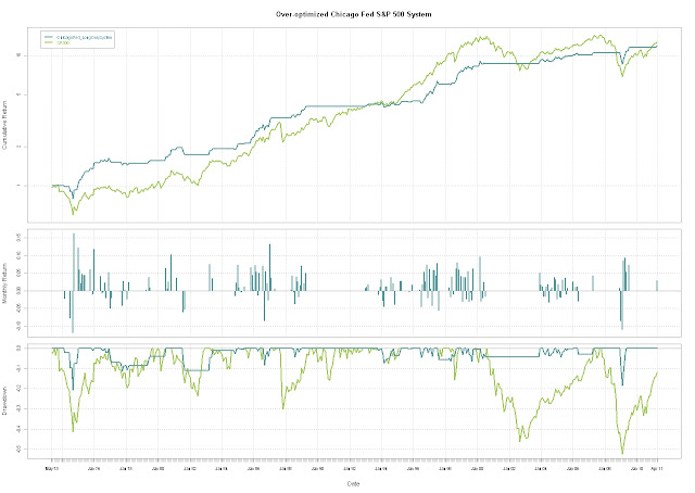
Overoptimizing Chicago Fed

THIS SHOULD BE OBVIOUS THROUGHOUT THE POST BUT THIS IS NOT INVESTMENT ADVICE.  PLEASE DO NOT FOLLOW THIS SYSTEM AS IT COULD RESULT IN SERIOUS LOSSES.

One of the perils of system-building is the tendency to unintentionally overoptimize by playing/refining the parameters to fit history.  It starts with some harmless data playing but very possibly a system appears with some potential like that shown in More St. Louis Fred Fun with National Financial Conditions.  Then through some form of iterative adjusting something seemingly magical occurs.

From TimelyPortfolio

However, after this subtle adjusting, I have no more data to test what might be something worthwhile, so I’m left with something to watch but not something on which I would risk my assets.

Play away but be careful.  It is much better to start with an idea, test this idea with a limited dataset, and then extend the test to a much more encompassing out-of-sample dataset in terms of timeframes, other countries, or other asset classes.


R code:

#this bit of code will show a system after significant
#optimization and hindsight bias
#without any out-of-sample testing
#explore how SP500 behaves in different ranges of Financial Conditions
#see previous posts for more discussion  
require(quantmod)
require(PerformanceAnalytics)
require(ggplot2)   #get data from St. Louis Federal Reserve (FRED)
getSymbols("SP500",src="FRED") #load SP500
getSymbols("ANFCI",src="FRED") #load Adjusted Chicago Financial
getSymbols("CFNAI",src="FRED") #load Chicago National Activity
#do not use this but here in case you want to play
getSymbols("PANDI",src="FRED") #load Chicago Fed Production and Income    
#do a little manipulation to get the data lined up on weekly basis
SP500 <- to.monthly(SP500)[,4]
ANFCI <- to.monthly(ANFCI)[,4]
CFNAI <- to.monthly(CFNAI)[,4]
PANDI <- to.monthly(PANDI)[,4]
index(SP500) <- as.Date(index(SP500))
index(ANFCI) <- as.Date(index(ANFCI))
index(CFNAI) <- as.Date(index(CFNAI))
index(PANDI) <- as.Date(index(PANDI))    
SP500_ANFCI <- na.omit(merge(ROC(SP500,n=1,type="discrete"),
ANFCI,CFNAI,PANDI))        
#and just for fun an enhanced very basic system
signal <- runSum(-0.25*SP500_ANFCI[,2]-SP500_ANFCI[,3],n=4)
chartSeries(signal, name="Chicago Fed Signal")
signal <- lag(signal,k=1)
#go long if extremely negative (signal>10)
#or good but not too good (signal between -.25 and -2)
ret <- ifelse(signal>10 | (signal <= -0.25 & signal > -2.25) , 1, 0) * SP500_ANFCI[,1]
ret <- merge(ret, SP500_ANFCI[,1])
colnames(ret) <- c("ChicagoFed_LongOnlySystem","SP500")
charts.PerformanceSummary(ret, ylog=TRUE, main="Over-optimized Chicago Fed S&P 500 System",
colorset=c("cadetblue","darkolivegreen3"))    
#I really like the boxplot by range, so let's do the same here
df <- na.omit(merge(round(signal,0),ROC(SP500,n=1,type="discrete")))
df <- as.data.frame(cbind(index(df),
coredata(df)))
colnames(df) <- c("date","ChiFedSignal","SP500return")
ggplot(df,aes(factor(ChiFedSignal),SP500return)) +
geom_boxplot(aes(colour = factor(ChiFedSignal))) +
opts(title="Box Plot of SP500 Monthly Change by Chicago Fed Signal")

Created by Pretty R at inside-R.org

Friday, May 20, 2011

Spreads and Stress

Since we have the Gifts from BAC ML and the Federal Reserve, I thought I should look at another interesting element of bonds.  Bond spreads act as a very strong symbol of financial stability and confidence.  The St. Louis Fed Stress Index is weekly, but maybe we can use spreads as a daily proxy of stress or financial instability similar to the Bloomberg Financial Conditions Index (BFCIUS) nicely explained at http://www.ssc.wisc.edu/~mchinn/fcw_sep112009.pdf and www.princeton.edu/~mwatson/papers/MPF_paper_April_13.pdf.

From TimelyPortfolio

If we plot the values from the BAC ML Emerging Market and High Yield Spreads and the St. Louis Fed Index, it is hard to distinguish the lines.

From TimelyPortfolio

Just for the ggplot2 fans

From TimelyPortfolio

Correlations total and rolling look like this.

From TimelyPortfolio

Like volatility and financial turbulence, periods of extremes are autocorrelated.

From TimelyPortfolio

And just for fun, here is a chart of the higher moments.

From TimelyPortfolio

If you want a challenge, tie this spread data to my post Wonderful New Blog TimeSeriesIreland or Great FAJ Article on Statistical Measure of Financial Turbulence Part 3.  Don’t think I have it in me before the weekend.

R code:

#thank you Bank of America Merrill Lynch and St. Louis Fed for this data

require(quantmod)
require(PerformanceAnalytics)
require(ggplot2)

#get Bank of America Merrill Lynch bond index data from St. Louis Fed
#use auto.assign = FALSE so we can use shorter names
MLEmCorpSpreads<-getSymbols("BAMLEMCBPIOAS",src="FRED",auto.assign=FALSE)
MLHYCorpSpreads<-getSymbols("BAMLH0A0HYM2",src="FRED",auto.assign=FALSE)
getSymbols("STLFSI",src="FRED")  #get St.Louis Fed Stress Index

spreadsStress<-na.omit(merge(MLEmCorpSpreads,MLHYCorpSpreads,STLFSI))
colnames(spreadsStress)<-c("BAC ML Emerging","BAC ML HY","St Louis Fed Stress")
chart.TimeSeries(spreadsStress,colorset=c("cadetblue","darkolivegreen3","gray70"),
    legend.loc="topleft",
    main="Bank of America Merrill Lynch Bond Spreads and St. Louis Fed Stress Index")

#chart changes of Spreads and Stress
spreadsStress<-na.omit(merge(momentum(MLEmCorpSpreads,5),momentum(MLHYCorpSpreads,5),momentum(STLFSI,1)))
colnames(spreadsStress)<-c("BAC ML Emerging","BAC ML HY","St Louis Fed Stress")
chart.TimeSeries(spreadsStress,colorset=c("cadetblue","darkolivegreen3","gray70"),
    legend.loc="topleft",
    main="Bank of America Merrill Lynch Bond Spreads and St. Louis Fed Stress Index")
#for the ggplot fans
spreadsStressDf<-data.frame(index(spreadsStress),coredata(spreadsStress))
colnames(spreadsStressDf)<-c("Date",colnames(spreadsStress))
spreadsStressDf<-melt(spreadsStressDf,id.var="Date")
colnames(spreadsStressDf)<-c("Date","Index","Value")
ggplot(spreadsStressDf, stat="identity", aes(x=Date,y=Value,colour=Index)) + geom_line() +
    scale_x_date(format = "%Y") +
    opts(title = "Bank of America Merrill Lynch Bond Spreads and St. Louis Fed Stress Index")
#chart correlations
chart.Correlation(spreadsStress,main="Bank of America Merrill Lynch Bond Spreads and St. Louis Fed Stress Index Correlation")

#explore autocorrelation lags
par(mfrow=c(3,1))  #3 rows and 1 column
acf(spreadsStress[,1],main=colnames(spreadsStress)[1])
acf(spreadsStress[,2],main=colnames(spreadsStress)[2])
acf(spreadsStress[,3],main=colnames(spreadsStress)[3])

#get rolling correlations
corHYStress<-runCor(spreadsStress[,3],spreadsStress[,1],n=20)
corEmStress<-runCor(spreadsStress[,3],spreadsStress[,2],n=20)
corAll<-merge(corHYStress,corEmStress)
chart.TimeSeries(corAll,main="Rolling 20 Week Correlation between Spreads and Stress",
    legend.loc="topright", colorset=c("cadetblue","darkolivegreen3"))

#look at the higher moments
higherMoments<-table.HigherMoments(spreadsStress[,1:2],spreadsStress[,3])
higherMoments<-melt(cbind(rownames(higherMoments),higherMoments))
colnames(higherMoments)<-c("Moment","Index","Value")
ggplot(higherMoments, stat="identity", aes(x=Moment,y=Value,fill=Index)) +
    geom_bar(position="dodge") + coord_flip() +
    opts(legend.position=c(.75,0.88)) #thanks for the tip timeseriesireland