Showing posts with label ggplot. Show all posts

Tuesday, August 6, 2013

I Want ggplot2/lattice and d3 (gridSVG–The Glue)

I really like interactive graphics, especially when they come straight from R.  I posted a lot about rCharts, but it is not the only way.  In my mind there are three types of glue to link R to SVG/HTML/Javascript:

  1. Let R do the data and then send the data to Javascript to create the SVG graphics. This is the process employed by rCharts, clickme,d3network, googleVis, gigvis, and tabplotd3.

  2. Let R both do the data and render the graph then export the SVG to get interactivity from Javascript. We see this with the new and improved gridSVG and the predecessor SVGAnnotation.

  3. Use 1. or 2. and then maintain bidirectional communication between R and Javascript through shiny, Rook, or some other web server type interface.

Let’s think about method 2.  R has ggplot2 and lattice.  Javascript has d3.  I want both.

We R users are very spoiled by the ggplot2 and lattice engines that rival or beat the plotting libraries of any language.  Wouldn’t it be nice to have all the power of these engines to create interactive graphs?  Well, Paul Murrell, the author of grid (platform of ggplot2 and lattice), wrote gridSVG to do just that.  Over the last couple of years, Simon Potter under the guidance of Murrell has refined gridSVG for his honours project.  It is now a full-featured robust package capable of sending even your most complicated ggplot2 and lattice masterpieces to SVG.   gridSVG can do amazing things on his own, but I, of course, wanted to combine gridSVG with d3.  Click here or on the screenshot below to see a walkthrough applying a little gridSVG glue to ggplot2 and d3.

image

Thanks to Paul Murrell, Simon Potter, Hadley Wickham, Mike Bostock, Duncan Temple Lang, Deborah Nolan, Juliana Williams, Andreas Neumann, Ramnath Vaidyanathan and all the folks along the way that have made this possible.

Friday, July 26, 2013

ggplot2 with Noam Ross theme

When I first saw Noam Ross' blog post "The null model for age effects with overdispersed infection", I immediately liked the look of his ggplot2 graphs. I was even more delighted when I discovered that he has made his theme available on github. Even though I am all into rCharts, I still love a beautiful publication quality R graphic.

Below is some code to combine Noam Ross' theme with autoplot.zoo which makes plotting xts/zoo objects with ggplot2 easy.

require(ggplot2)
require(grid)
require(RColorBrewer)
require(quantmod)

# get closing values for S&P 500 from Yahoo! Finance
sp500 <- getSymbols("^GSPC", auto.assign = FALSE)[, 4]

sp500$ma <- runMean(sp500, n = 200)

colnames(sp500) <- c("S&P500", "200d Mov Avg")

# get noam ross ggplot2 theme from github
source("https://raw.github.com/noamross/noamtools/master/R/theme_nr.R")
# for some reason on my computer panel.background still shows up gray this
# fixes it but might not be necessary for others
theme_nr <- theme_nr() + theme(panel.background = element_rect(fill = "white")) +
theme(plot.title = element_text(size = rel(2), hjust = -0.05, vjust = -0.3)) +
theme(plot.margin = unit(c(1, 1, 2, 1), "cm"))

autoplot(sp500, facets = NULL) + theme_nr + theme(legend.position = "none") +
scale_colour_manual(values = brewer.pal("Blues", n = 9)[c(6, 3)]) + geom_line(size = 1.15) +
xlab(NULL) + ggtitle("S&P 500 (ggplot2 theme by Noam Ross)")

It isn’t perfect, but I think it offers a very nice starting point.  Using ggplot2 directly would have allowed us more control over the bothersome details.


Rplot

Wednesday, July 17, 2013

All My Roads Lead Back to Finance–PIMCO Sankey

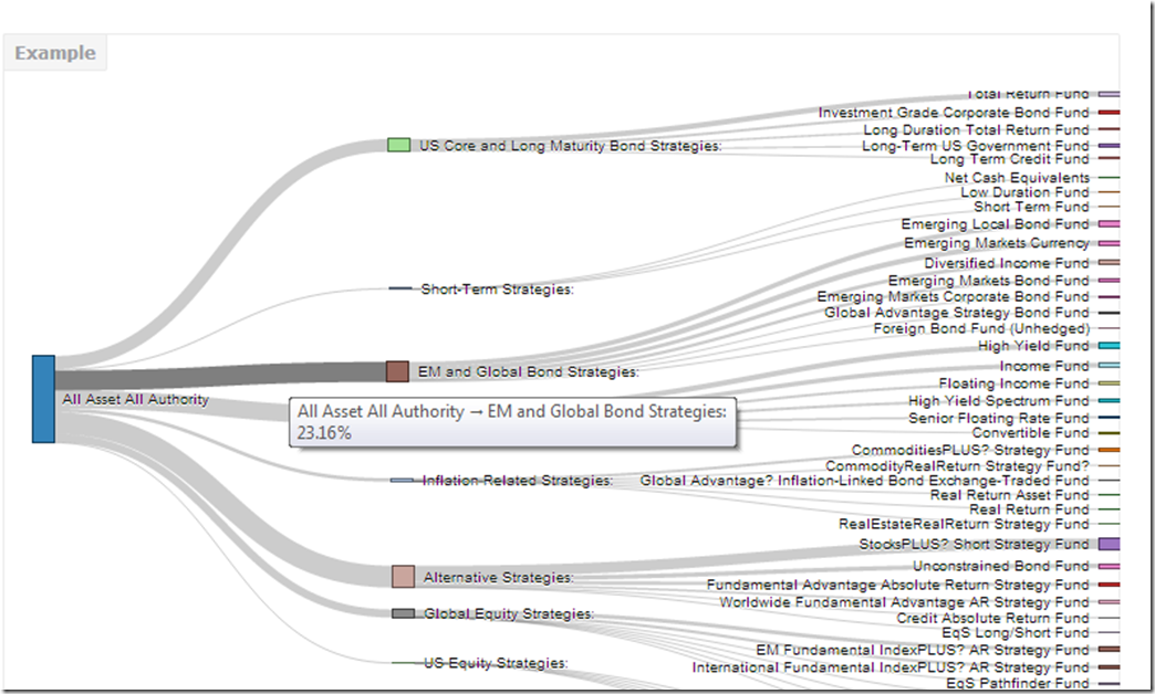
Even though the route might be circuitous, my seemingly random journeys all seem to lead back to finance.  My fun with rCharts sankey diagrams (Exploring Networks with Sankey) has led me into an exploration of the PIMCO network.  Although PIMCO is best known for its fixed income products, PIMCO has broadened its product offerings beyond bonds.  This shift away from bonds goes back much farther than the highly publicized moves in 2009-2010 (Risk.net “Interview: Bill Gross, PIMCO”) to the 2002 launches of the PIMCO CommodityRealReturn Strategy (“Pimco Dreams Up Funds to Overcome The Nightmare of Inflation”) and PIMCO All Asset Fund ( “PIMCO, Arnott team to offer an 'unusual' TAA mutual fund”, “Investing Without Blinders” and “PIMCO All Asset Shies From Stocks”).
The PIMCO All Asset funds are managed by Research Affiliates Robert Arnott and invest only in other PIMCO mutual funds rather than individual securities, so in many ways the fund’s success is dependent on the quality and breadth of other PIMCO funds.  Since it sounds slightly incestuous, I thought it would be a good subject for my new tools—sankey diagrams and basic network analysis.

Excel to Edgelist with Old-school VBA

Since PIMCO (and nobody else for that matter) doesn’t provide holdings in an igraph readable edgelist, I decided to revive some fond memories and use VBA to convert the spreadsheet into a 3 column edgelist (source, target, value).  Even though I am embarrassed by my VBA code, I will show it below.

Sub getedgelist()
    Dim clInfo As Range, clWrite As Range, tempcl As Range
    Dim offsetamt As Integer
    
    'this will be used throughout to indicate columns to offset for desired date
    'watch out for hidden rows
    offsetamt = 15
    
    'clInfo will be the cell with our reference information
    Set clInfo = ThisWorkbook.ActiveSheet.Range("a9")
    'clWrite will be the cell where we write the info that we gather
    Set clWrite = ThisWorkbook.ActiveSheet.Range("u9")
    
    Do Until clInfo = "Total Gross Asset Allocation"
        'looking at formatting is probably the easiest way to determine if group or fund
        'I chose indent to determine if group or fund
        'IndentLevel = 0 for groups and 1 for funds
        If clInfo.IndentLevel = 0 Then
            'if we are on a group write in clWrite the group and each fund within the group
            'with group as source and fund as target
            'we will loop until we are at the next group
            Set tempcl = clInfo
            'write mutual fund as source, group as target, and weight
            clWrite.Value = ThisWorkbook.ActiveSheet.Range("e6").Value
            clWrite.Offset(0, 1).Value = clInfo.Value
            clWrite.Offset(0, 2).Value = clInfo.Offset(0, offsetamt).Value
            Set clWrite = clWrite.Offset(1, 0)
            Do Until tempcl.Offset(1, 0).IndentLevel = 0
                'now loop through each fund in group
                'write group as source, held fund as target, and weight
                clWrite.Value = clInfo.Value
                clWrite.Offset(0, 1).Value = tempcl.Offset(1, 0).Value
                clWrite.Offset(0, 2).Value = tempcl.Offset(1, offsetamt).Value
                'next cell down
                Set tempcl = tempcl.Offset(1, 0)
                Set clWrite = clWrite.Offset(1, 0)
            Loop
            Set clInfo = clInfo.Offset(1, 0)
        Else
        
        End If
        'if we are on a group write in clWrite the group and each fund within the group
        'with group as source and fund as target
        Debug.Print (clInfo)
        Set clInfo = clInfo.Offset(1, 0)
    Loop
End Sub

Now we have everything we need to do the sankey diagram in R.

#sankey of PIMCO All Asset All Authority holdings
#data source http://investments.pimco.com/ShareholderCommunications/External%20Documents/PIMCO%20Bond%20Stats.xls


require(rCharts)

#originally read the data from clipboard of Excel copy
#for those interested here is how to do it
#read.delim(file = "clipboard")

holdings = read.delim("http://timelyportfolio.github.io/rCharts_d3_sankey/holdings.txt", skip = 3, header = FALSE, stringsAsFactors = FALSE)
colnames(holdings) <- c("source","target","value")

#get rid of holdings with 0 weight or since copy/paste from Excel -
holdings <- holdings[-which(holdings$value == "-"),]
holdings$value <- as.numeric(holdings$value)

#now we finally have the data in the form we need
sankeyPlot <- rCharts$new()
sankeyPlot$setLib('http://timelyportfolio.github.io/rCharts_d3_sankey')

sankeyPlot$set(
  data = holdings,
  nodeWidth = 15,
  nodePadding = 10,
  layout = 32,
  width = 750,
  height = 500,
  labelFormat = ".1%"
)

sankeyPlot

Blogger makes it hard to incorporate d3 directly into this post, so click here or on the screenshot below, to engage and interact with the sankey.

example_pimco

Just for good measure, here is the default plot from igraph.

image

Of course we could also plot the data a little more traditionally with a ggplot2 bar chart.

image


Any way we look at it, we can see that PIMCO now has way more than just bonds and the fund All Asset All Authority uses almost everything.

Wednesday, December 5, 2012

Apple Compared to Others with ggthemes

For a happy person delightfully concentrated in Apple, I wanted to show Apple’s performance versus Microsoft and Cisco in decades 1(1990-2000) and 2 (2000-2012).  I thought this would give me a good chance to try out the very interesting work being done at https://github.com/jrnold/ggthemes.

From TimelyPortfolio

Just as a reference, my general goto chart is theEconomist set from latticeExtra.  Here is how it would look with that method.  I think it is still my favorite.

From TimelyPortfolio

For another chart since 2003 prepared by the far more capable at the Wall Street Journal, see Why Microsoft Beats Apple hat tip from Stock Picking Matters: Apple v Microsoft from The Big Picture by Global Macro Monitor with a hat tip from Jason Zweig.

My best guess in terms of the debate is some other company will resoundingly beat both Microsoft and Apple over the next decade.

R code in GIST:

Monday, August 27, 2012

Horizon on ggplot2

SocialDataBlog’s kind reference in post Horizon plots with ggplot (not) motivated me to finish what the post started.  I knew that ggplot2 would be a little more difficult to use for the purpose of a horizon plot, but I felt compelled to provide at least one example of a horizon plot for each of the major R graphing packages.  I achieved a good result but the code is not as elegant or as flexible as I would like.  Readers more comfortable with ggplot2, please bash, fork, and improve.

From TimelyPortfolio

R code in GIST (do raw for copy/paste):

Monday, July 2, 2012

Graphics Artifacts from Quarterly Commentary

For my Q2 2012 commentary, I tried multiple graphs to illustrate the disconnect of the US stock markets with the rest of the world.  I think I finally settled on this simple Excel bar graph populated by Bloomberg data, but I thought some might like to see some of the R graphical artifacts as I explored how best to illustrate my point.

From TimelyPortfolio

Although I settled on a 1 year performance chart, I really wanted to show more history, but without all the noise of a daily, weekly, or even monthly chart.  I tried a chart connecting the 200 day max/min points, but it still seemed noisy and difficult to follow. One big letdown was Yahoo! Finance not providing DJUBS, E1DOW, or P1DOW any more.

From TimelyPortfolio

I then thought connecting the end of year points might offer a nice simplification, and I probably liked this best of the R charts.  This shows enough of the path to see the universal move up to 2010, and then the disconnect.

From TimelyPortfolio

Even one R base graphics chart. Thanks again Josh for the fork.

From TimelyPortfolio

As one other option, I thought I would try to just connect beginning, middle, and end since December 2008.  This certainly shows the huge disconnect between the U.S. and the rest of the world, but I found it difficult to describe the methodology within the chart.

From TimelyPortfolio

I hope this helps someone somewhere.  As always, I very much enjoy comments and opinions.

R code in GIST (do raw for copy/paste):

Tuesday, March 27, 2012

R Fell on Alabama–Presentation to Birmingham Open Source

Birmingham Open Source Software (BOSS) was kind enough to invite me to do a debut presentation on R.  I had a lot of fun.  Below is the embedded Youtube.  Please let me know how I can improve.  I really appreciate helpful feedback.

Thursday, March 15, 2012

Opinions Not Backed by Money Updated Again

Strange that I am updating this post for a third time and nothing really has changed, but the fact that nothing has changed is incredibly interesting to me.  Since it is an update, I will not duplicate the explanation, so please read the last version Opinions Not Backed by Money Are Not That Believable--Updated and with R.  The basic conclusion is that we are in a bull market and AAII surveys are bullish, but nobody is willing to bet money on a good stock market.

From TimelyPortfolio

Data in a Google Doc (https://docs.google.com/spreadsheet/ccc?key=0Amqp2r96khJPdENIRnE1SG5nanJ5OXFyYVUxOXRBVmc) sourced from AAII- The American Association of Individual Investors and ICI.

R code (not even worth putting in GIST):

require(quantmod)
require(ggplot2)

aaii_ici=read.csv("aaii-ici-noblank.csv",row.names=1)

#using ggplot example from http://learnr.wordpress.com/2009/03/16/ggplot2-split-data-range-into-multiple-chart-series/
p <- ggplot(data=aaii_ici, aes(x = AAIIBULL-AAIIBEAR, y = runSum(aaii_ici[,4],3), colour = Range, shape = Range, label = Range))
p1 <- p + geom_point() + scale_y_continuous(limits = c(-200000, 200000),formatter=comma) + geom_hline(yintercept=0) + geom_vline(xintercept=0) + stat_smooth(method="lm", se=FALSE) + ylab("ICI Equity Rolling 3-mo Sum") + opts(title = "ICI Equity Flows by AAII Survey")
print(p1)

Friday, December 9, 2011

A Tale of Two Frontiers

In a follow up to Evolving Domestic Frontier, I wanted to explore the efficient frontier including international indexes since 1980.  Life is great when your primary indexes (Barclays Aggregate and S&P 500) lie on the frontier as they did 1980-1999.  The situation becomes much more difficult with a frontier like 2000-now.

From TimelyPortfolio

If we examine return, risk, and Sharpe though, 1980 to now was really not that bad with annualized returns of all indexes stocks and bonds > 8% even including the last decade of “equity misery”.  As the S&P 500 shifted from the top of the efficient frontier to the bottom, it seems the focus over the last decade as been finding alternatives for the S&P 500. Strangely, the unbelievable riskless return of bonds has allowed some investors to claim and use bonds as one of these potential alternatives to the S&P 500.

From TimelyPortfolio

Bonds as alternatives to equities have made even more sense when we look at correlations.

From TimelyPortfolio

However, bonds based on the yield to maturity of the Barclays Aggregate index suggest, even guarantee, forward returns of only 2.3%, significantly below the +8% generously provided for 30 years.  I believe the focus on alternatives should be alternatives for the guaranteed miserably low returns of bonds (WSJ Bond Buyers Dilemma).  The trick though is reducing risk (drawdown) of these alternatives to an acceptable level to most bond investors.  Max drawdown on bonds since 1982 has been 5%, which is virtually an impossible constraint for any risky alternatives, since in even very attractive secular buy-hold periods, drawdown generally is 20% to 30%.

From TimelyPortfolio

Our options are basically limited to cash, which at 0% return is unacceptable, unless we can discover a method to reduce drawdown on the risky set of alternatives to 20%, but really down to 10%.  How do we transform risky alternatives with historical drawdowns of 40%-70% to an acceptable bond alternative?  I think it requires tactical techniques blended with cash with a lot of client education and hand-holding.

R code from GIST:

Sunday, December 4, 2011

Improved Moving Average?

I have been notified by the authors that the code does not perfectly reflect the improved moving average introduced.  In another post, I will explore the differences.  The authors have now released their version of the code http://www.quantf.com/fotis-papailias/improved-moving-average-code-is-available-for-download/332.

When @quantfblog started following me on Twitter, I was delighted to discover their papers

Papailias, Fotis and Thomakos, Dimitrios D., An Improved Moving Average Technical Trading Rule (September 11, 2011). Available at SSRN: http://ssrn.com/abstract=1926376

Papailias, Fotis and Thomakos, Dimitrios D., An Improved Moving Average Technical Trading Rule II - Can We Obtain Performance Improvements with Short Sales? (November 12, 2011). Available at SSRN: http://ssrn.com/abstract=1958906

backed by a nice and improving website http://www.quantf.com.  I just could not resist the opportunity to port their improved moving average idea to R and run some additional tests.  The entire process was extremely pleasant due to the authors’ willingness to test, comment, and suggest throughout the implementation process.  Thanks so much to them for all their help.

In this process, I AM NOT OFFERING INVESTMENT ADVICE.  THIS IS SIMPLY A TEST/ILLUSTRATION.  PURSUING THESE CONCEPTS WILL MOST LIKELY LOSE SIGNIFICANT AMOUNTS (ALL) OF YOUR MONEY.


From TimelyPortfolio

For fun, I thought it would be interesting to compare the "Improved Moving Average" to a Mebane Faber style 10-month moving average system.

From TimelyPortfolio


While I enjoyed the testing, I am still not entirely sure if the “improved moving average” is significantly improved, but it certainly might fit someone’s utility curve better than the standard moving average.  More than anything, this process has proven to me a couple of things:

1) the beauty of open-source and collaboration.  The authors were incredibly generous and helpful as I worked through this process.  To even better demonstrate the power of open-source, I will use ttrTests to do additional testing and then the bt examples from http://systematicinvestor.wordpress.com in future posts.

2) how even a simple moving average can become incredibly complex.  Making one very slight change markedly changes the results.

R code from GIST:


Friday, September 16, 2011

Performance with ggplot2

Now after Reporting Good Enough to Share, let’s use ggplot2 and PerformanceAnalytics to turn this

image4

into this

From TimelyPortfolio

I have been notified that the colors aren’t great.  How does everyone like this?

R code (click to download):

require(quantmod)
require(ggplot2)
require(PerformanceAnalytics)   clientPerf <- read.csv("clientperf.csv",stringsAsFactors=FALSE)
clientPerf[,2:NCOL(clientPerf)] <- lapply(clientPerf[,2:NCOL(clientPerf)],as.numeric)
clientPerf <- as.xts(clientPerf[,2:NCOL(clientPerf)]/100,
order.by = as.Date(clientPerf[,1],format="%m-%d-%y"))
colnames(clientPerf) <- c("Client","BarclaysAgg","SP500")     returns.cumul <- xts(apply((1+clientPerf),MARGIN=2,FUN=cumprod),order.by=index(clientPerf))
returns.cumul.Melt <- melt(as.data.frame(cbind(index(returns.cumul),
coredata(returns.cumul))),id.vars=1)
colnames(returns.cumul.Melt) <- c("Date","Portfolio","Growth")
a<-ggplot(returns.cumul.Melt,stat="identity",
aes(x=Date,y=Growth,colour=Portfolio)) +
geom_line(lwd=1) +
scale_x_date() +
scale_colour_manual(values=c("cadetblue","darkolivegreen3","gray70","bisque3","purple")) +
theme_bw() +
labs(x = "", y = "") +
opts(title = "Cumulative Returns",plot.title = theme_text(size = 20, hjust = 0))   returnTable <- table.TrailingPeriods(clientPerf,
periods=c(12,24,36,NROW(clientPerf)),
FUNCS="Return.annualized")
rownames(returnTable) <- c(paste(c(1:3)," Year",sep=""),"Since Inception")
returnMelt <- melt(cbind(rownames(returnTable),returnTable*100))
colnames(returnMelt)<-c("Period","Portfolio","Value")
b<-ggplot(returnMelt, stat="identity",
aes(x=Period,y=Value,fill=Portfolio)) +
geom_bar(position="dodge") +
scale_fill_manual(values=c("cadetblue","darkolivegreen3","gray70")) +
theme_bw() +
labs(x = "", y = "") +
opts(title = "Returns (annualized)",plot.title = theme_text(size = 20, hjust = 0))     downsideTable<-table.DownsideRisk(clientPerf)[c(1,3,5,7,8),]
downsideMelt<-melt(cbind(rownames(downsideTable),
downsideTable))
colnames(downsideMelt)<-c("Statistic","Portfolio","Value")
c<-ggplot(downsideMelt, stat="identity",
aes(x=Statistic,y=Value,fill=Portfolio)) +
geom_bar(position="dodge") + coord_flip() +
scale_fill_manual(values=c("cadetblue","darkolivegreen3","gray70")) +
theme_bw() +
labs(x = "", y = "") +
opts(title = "Risk Measures",plot.title = theme_text(size = 20, hjust = 0))
#geom_hline(aes(y = 0))
#opts(axis.line = theme_segment(colour = "red"))
#opts(panel.grid.major = theme_line(linetype = "dotted"))   #jpeg(filename="performance ggplot.jpg",quality=100,width=6.5, height = 8, units="in",res=96)
#pdf("perf ggplot.pdf", width = 8.5, height = 11)   grid.newpage()
pushViewport(viewport(layout = grid.layout(3, 1)))   vplayout <- function(x, y)
viewport(layout.pos.row = x, layout.pos.col = y)
print(a, vp = vplayout(1, 1))
print(b, vp = vplayout(2, 1))
print(c, vp = vplayout(3, 1))
#dev.off()

Created by Pretty R at inside-R.org

Wednesday, July 27, 2011

Join the Reserves

Most forget that the tremendous macro imbalances caused by the 10 Trillion in foreign reserves are just 14 years old phenomenon but the results have been and will be profound.  The buying started after the Asia Pacific collapse of 1997, and the Asian central banks chose to continuously engage a different form of quantitative easing that far exceeds Bernanke’s QE1 and QE2. Remember Greenspan’s “Conundrum” and the inability of Fed rate increases to push the long end of the curve higher.  Those artificially restrained rates persuaded money managers and institutions to seek higher returns in new products like CDOs and motivated additional housing demand from the US consumer.  These were both significant factors in the 2008 collapse.

Interest rates are a very effective negative feedback mechanism that helps control the cyclicality of the economy.  When nonmarket forces inhibit the normal functioning of interest rates, significant macro imbalances can cause severe consequences.  Unfortunately, it seems we still have not learned our lesson.

It is very odd to me that all the recent media and popular attention on the political debate gives an illusion of control to our inept politicians and causes us to forget that the market, primarily Asian central bank buyers, determines the limits of US fiscal and monetary policy.  I can only hope that somehow the US can maintain the very tenuous confidence we take for granted.

From TimelyPortfolio

R code (click to download):

#get reserve data from IMF
require(ggplot2)   url = "http://www.imf.org/external/np/sta/cofer/eng/cofer.csv"   cofer <- read.csv (url, skip=5)
cofer <- cofer[c(7:17),c(1,3:18)]
rownames(cofer) <- cofer[,1]
cofer <- cofer[,2:NCOL(cofer)]
#erase commas
col2cvt <- 1:NCOL(cofer)
cofer[,col2cvt] <- lapply(cofer[,col2cvt],
function(x){as.numeric(gsub(",", "", x))})
#erase spaces
rownames(cofer) <- gsub(" ", "", rownames(cofer))
#get numeric
col2cvt <- 1:NCOL(cofer)
cofer[,col2cvt] <- lapply(cofer[,col2cvt],
function(x){as.numeric(x)})
#get data frame and invert
cofer <- as.data.frame(t(cofer))
#convert years to dates to use
datestoformat <- rownames(cofer)
datestoformat <- as.Date(paste(substr(datestoformat,2,5),"-12-31",sep=""))
#prepare for ggplot
rownames(cofer) <- 1:NROW(cofer)
cofer <- cbind(datestoformat,cofer)
cofer_melt <- melt(cofer,id.vars=1)
colnames(cofer_melt) <- c("Date","Country","Amount")   #get area chart
jpeg(filename="oecd cofer reserves area chart.jpg",quality=100,
width=6.25, height = 6.25, units="in",res=96)
ggplot(cofer_melt,
aes(x=Date,y=Amount,fill=Country)) + geom_area() +
scale_fill_hue(l=40, c=65) +
opts(title="OECD Cofer Foreign Currency Reserves",
panel.background = theme_rect(colour="gray"))
dev.off()

Created by Pretty R at inside-R.org

Tuesday, July 19, 2011

Shorting Mebane Faber

Although I do not personally know Mebane Faber, I know enough that I do not want to short him.

However, I thought it would be insightful to see how the short side of his “A Quantitative Approach To Tactical Asset Allocation” might look.  Once we see how it looks, I think it confirms my focus on drawdown as my primary risk measure (see post Drawdown Control Can Also Determine Ending Wealth) and proves the difficulty of shorting upward sloping U.S. equities.

From TimelyPortfolio

I thought this chart was a nice modification of PerformanceAnalytics RiskReturnScatter.

From TimelyPortfolio

Here is an illustration of how all the other risk measures don't say much except for the drawdown number.

From TimelyPortfolio

R code (click to download):

require(quantmod)
require(PerformanceAnalytics)   #completely from the PerformanceAnalytics package chart.RiskReturn
#cannot claim any of the credit for the fine work in this package   chart.DrawdownReturn <- function (R, Rf = 0, main = "Annualized Return and Worst Drawdown", add.names = TRUE,
xlab = "WorstDrawdown", ylab = "Annualized Return", method = "calc",
geometric = TRUE, scale = NA, add.sharpe = c(1, 2, 3), add.boxplots = FALSE,
colorset = 1, symbolset = 1, element.color = "darkgray",
legend.loc = NULL, xlim = NULL, ylim = NULL, cex.legend = 1,
cex.axis = 0.8, cex.main = 1, cex.lab = 1, ...)
{
if (method == "calc")
x = checkData(R, method = "zoo")
else x = t(R)
if (!is.null(dim(Rf)))
Rf = checkData(Rf, method = "zoo")
columns = ncol(x)
rows = nrow(x)
columnnames = colnames(x)
rownames = rownames(x)
if (length(colorset) < columns)
colorset = rep(colorset, length.out = columns)
if (length(symbolset) < columns)
symbolset = rep(symbolset, length.out = columns)
if (method == "calc") {
comparison = cbind(t(Return.annualized(x[, columns:1])),
t(maxDrawdown(x[, columns:1])))
returns = comparison[, 1]
risk = comparison[, 2]
rnames = row.names(comparison)
}
else {
x = t(x[, ncol(x):1])
returns = x[, 1]
risk = x[, 2]
rnames = names(returns)
}
if (is.null(xlim[1]))
xlim = c(0, max(risk) + 0.02)
if (is.null(ylim[1]))
ylim = c(min(c(0, returns)), max(returns) + 0.02)
if (add.boxplots) {
original.layout <- par()
layout(matrix(c(2, 1, 0, 3), 2, 2, byrow = TRUE), c(1,
6), c(4, 1), )
par(mar = c(1, 1, 5, 2))
}
plot(returns ~ risk, xlab = "", ylab = "", las = 1, xlim = xlim,
ylim = ylim, col = colorset[columns:1], pch = symbolset[columns:1],
axes = FALSE, ...)
if (ylim[1] != 0) {
abline(h = 0, col = element.color)
}
axis(1, cex.axis = cex.axis, col = element.color)
axis(2, cex.axis = cex.axis, col = element.color)
if (!add.boxplots) {
title(ylab = ylab, cex.lab = cex.lab)
title(xlab = xlab, cex.lab = cex.lab)
}
if (!is.na(add.sharpe[1])) {
for (line in add.sharpe) {
abline(a = (Rf * 12), b = add.sharpe[line], col = "gray",
lty = 2)
}
}
if (add.names)
text(x = risk, y = returns, labels = rnames, pos = 4,
cex = 0.8, col = colorset[columns:1])
rug(side = 1, risk, col = element.color)
rug(side = 2, returns, col = element.color)
title(main = main, cex.main = cex.main)
if (!is.null(legend.loc)) {
legend(legend.loc, inset = 0.02, text.col = colorset,
col = colorset, cex = cex.legend, border.col = element.color,
pch = symbolset, bg = "white", legend = columnnames)
}
box(col = element.color)
if (add.boxplots) {
par(mar = c(1, 2, 5, 1))
boxplot(returns, axes = FALSE, ylim = ylim)
title(ylab = ylab, line = 0, cex.lab = cex.lab)
par(mar = c(5, 1, 1, 2))
boxplot(risk, horizontal = TRUE, axes = FALSE, ylim = xlim)
title(xlab = xlab, line = 1, cex.lab = cex.lab)
par(original.layout)
}
}     getSymbols("DJIA",src="FRED")
#if you prefer Yahoo! Finance
#getSymbols("^DJI",from="1919-01-01",to=Sys.Date())   DJIA <- to.monthly(DJIA)[,4]
index(DJIA) <- as.Date(index(DJIA))   signalUp <- ifelse(DJIA > runMean(DJIA,n=10), 1, 0)
signalDown <- ifelse(DJIA < runMean(DJIA,n=10), -1, 0)   retUp <- lag(signalUp,k=1)* ROC(DJIA,type="discrete",n=1)
retDown <- lag(signalDown, k=1) * ROC(DJIA,type="discrete",n=1)
ret <- merge(retUp + retDown,retUp,retDown,-retDown,ROC(DJIA,type="discrete",n=1))
colnames(ret) <- c("Combined","LongAbove","ShortBelow","LongBelow","DJIA")   #jpeg(filename="performance summary all.jpg",quality=100,
# width=6.25, height = 6.25, units="in",res=96)
charts.PerformanceSummary(ret,ylog=TRUE,
colorset=c("cadetblue","darkolivegreen3","goldenrod","purple","gray70"),
main="DJIA 10 Month Moving Average Strategy Comparisons
May 1896-Jun 2011"
)
#dev.off()
#jpeg(filename="performance summary before 1932.jpg",quality=100,
# width=6.25, height = 6.25, units="in",res=96)
charts.PerformanceSummary(ret["::1932-06",3],ylog=TRUE,
main="DJIA Short Below 10 Month Moving Average Works
May 1896-Jun 1932"
)
#dev.off()
#jpeg(filename="performance summary after 1932.jpg",quality=100,
# width=6.25, height = 6.25, units="in",res=96)
charts.PerformanceSummary(ret["1932-07::",3],ylog=TRUE,
main="DJIA Short Below 10 Month Moving Average Fails
Jul 1932-Jun 2011"
)
#dev.off()   #jpeg(filename="drawdown annualized return scatter.jpg",quality=100,
# width=6.25, height = 6.25, units="in",res=96)
chart.DrawdownReturn(ret[,1:5])
#dev.off()   #look at risk measures
require(ggplot2)
#jpeg(filename="risk.jpg",quality=100,width=6.25, height = 5,
# units="in",res=96)
downsideTable<-table.DownsideRisk(ret)
downsideTable<-melt(cbind(rownames(downsideTable),
downsideTable))
colnames(downsideTable)<-c("Statistic","Portfolio","Value")
ggplot(downsideTable, stat="identity",
aes(x=Statistic,y=Value,fill=Portfolio)) +
geom_bar(position="dodge") + coord_flip()
#dev.off()
Created by Pretty R at inside-R.org