Showing posts with label lattice. Show all posts

Wednesday, November 5, 2014

Update on JGBs versus USTs

Given the recent selloff in the Yen, I thought now would be a good time to update my favorite chart from Intended or Unintended Consequences.

image

For a true currency death spiral, rates need to move up rather than down.  It appears we are long way from that.

Long-time readers will know that I have been keenly interested in the Yen for the entire history of this blog http://timelyportfolio.blogspot.com/search?q=yen.

Code for this post: https://gist.github.com/timelyportfolio/5665790

Monday, October 6, 2014

Popular Mutual Funds Decomposed With Ekholm (2014)

While we have a foundation and momentum from the last post “SelectionShare & TimingShare | Masterfully Written by Delightfully Responsive Author” , we can run the Ekholm calculations on some popular funds to see how they have evolved since the early 1980s.  Remember these are my opinions and not investment advice.  I chose these four funds for

  1. popularity in terms of Assets Under Management (AUM)
  2. style (active)
  3. tenure (old)
  4. evolution ( 2 evolved in a bad way and 2 have stayed consistent in a good way ).

This will continue what I envision to be a whole series of posts experimenting with the Ekholm (2014) decomposition into SelectionShare and TimingShare and determining how to use it in a mutual fund selection process.  Just as a reminder, below is the link to the very well-done paper by Anders Ekholm.

Ekholm, Anders G.

Components of Portfolio Variance: Systematic, Selection and Timing

August 8, 2014

http://ssrn.com/abstract=2463649

See if you can make any conclusions after reading the paper and looking at the chart below on the 2 year rolling Ekholm decomposition of FPA Crescent ®  Fund (FPACX), Sequoia ® Fund (SEQUX), Fidelity ® Contrafund ® (FCNTX), and The Growth Fund of America ®   (AGTHX).

image

As always, I really would like for you to reproduce and extend.  Please let me know if you do.  Below is the code.

# perform Ekholm (2012,2014) analysis on some popular mutual funds

# Ekholm, A.G., 2012
# Portfolio returns and manager activity:
# How to decompose tracking error into security selection and market timing
# Journal of Empirical Finance, Volume 19, pp 349-€“358

# Ekholm, Anders G., July 21, 2014
# Components of Portfolio Variance:
# R2, SelectionShare and TimingShare
# Available at SSRN: http://ssrn.com/abstract=2463649


library(Quandl) # use to get Fama/French factors
library(pipeR) # pipes are the future or R
library(rlist) # rlist - like underscore/lodash for R lists
library(dplyr) # super fast and really powerful
library(tidyr) # next gen wide/long formatter package
library(latticeExtra) # old but still awesome
library(directlabels) # fantastic and works with ggplot & lattice
library(quantmod) # also will load xts

# use Quandl Kenneth French Fama/French factors
# http://www.quandl.com/KFRENCH/FACTORS_D
f <- Quandl("KFRENCH/FACTORS_D",type = "xts") / 100

# grab our function from post
# http://timelyportfolio.blogspot.com/2014/10/selectionshare-timingshare-masterfully.html
devtools::source_gist("e5728c8c7fb45dbdb6e0")

tickers <- c( "FCNTX", "AGTHX", "SEQUX", "FPACX" )
ekFunds <- lapply(
tickers
,function(ticker) {
ticker %>>%
getSymbols( from = "1896-01-01", auto.assign = F ) %>>%
(fund ~
structure(
fund[,6] / stats::lag( fund[,6], 1 ) - 1
,dimnames = list(NULL,gsub(x = colnames(fund)[6], pattern = "[\\.]Adjusted", replacement = ""))
)
) %>>%
merge( f ) %>>% # Quandl("KFRENCH/FACTORS_D",type = "xts") / 100
na.omit %>>%
rollapply (
FUN= function(x){
x %>>%
jensen_ekholm %>>%
( data.frame( summary(.[["linmod"]])$"r.squared" , .$ekholm ) ) %>>%
xts(order.by=tail(index(x),1)) -> return_df
colnames(return_df)[1] <- "R_sq"
return(return_df)
}
, width = 500
#, by = 100
, by.column=F
, fill = NULL
) %>>%
na.fill(0)
}
)
names(ekFunds) <- tickers

ekFunds %>>%
list.map(
{
structure(
data.frame(
date = index(.)
, fund = names(ekFunds)[.i]
, .
)
) %>>%
gather(measure,value,-date,-fund)
}
) %>>%
(
do.call( rbind , . )
) -> ekT

ekT %>>%
# just plot at R^2, SelectionShare, and TimingShare
filter( measure %in% c("R_sq","SelectionShare","TimingShare") ) %>>%
(
xyplot(
value ~ date | measure
, groups = fund
, data = .
, type = "l"
# using direct.label so not necessary
, auto.key = list( space = "right" )
# title our plot
, main = paste(
"Comparison of Ekholm Decomposition for Various Mutual Funds"
,paste0("2 Year Rolling since ",format(.$date[1],format="%b %d, %Y"))
,sep="\n"
)
# layout one on top of the other
, layout = c(1,length(unique(.$measure)))
)
) %>>%
# I like labels on plot rather than legend
directlabels::direct.label( method = "last.qp" ) %>>%
# pretty it up with the latticeExtra Economist theme
asTheEconomist

Wednesday, August 14, 2013

gridSVG Multi-line Data Bind with d3–US Treasury Yields

If you have not read the other posts on gridSVG and d3, I recommend reading those before progressing to this one.

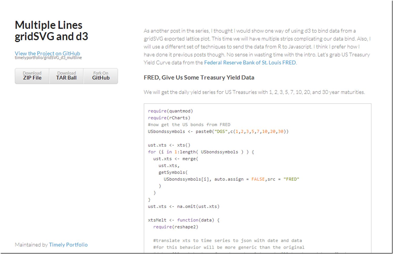
Facets or strips are one of my favorite features of lattice and ggplot2, so of course I want to extend our d3 reverse data bind to support these small multiples.  Let’s see one way of accomplishing this.  For a short explanation of the process, click here or on the screenshot below.  If you just like yield curve data, I think you will enjoy the graph which I have embedded below.

screenshot of tutorial

Tuesday, August 13, 2013

Stocks and Bonds Behavior by Decade

I struggled with whether or not I should even post this.  It is raw and ugly, but it might help somebody out there.   I might use this as a basis for some more gridSVG posts, but I do not think I have the motivation to finish the analysis.

ggplot stocks bonds by decadeperformance by timelattice stocks bonds by decadeperf summar

Code:

require(latticeExtra)
require(quantmod)
require(PerformanceAnalytics)

getSymbols("SP500",src="FRED")
US10 <- na.omit(getSymbols("DGS10",src="FRED",auto.assign=FALSE))

stocksBonds <- na.omit(
  merge(
    lag(SP500,k=-100)/SP500-1,  #forward 100 day sp500 perf
    US10 / runMean(US10,n=250) - 1,       #us10 yield - 250 day average
    SP500
  )
)
#get the decade
stocksBonds$decade = as.numeric(substr(index(stocksBonds),1,3)) * 10
#name columns
colnames(stocksBonds) <- c("sp500","us10","SP500","decade")
#get a color ramp for our change in us10 year yields
linecolors <- colorRamp(
  c("red","green"),
  interpolate="linear",
  space="rgb"
)((stocksBonds[,2]+0.5))

xyplot(
  stocksBonds[,1],
  col=rgb(linecolors,max=255),
  type="p",pch=19,cex=0.5,
  main = "Stocks 100d Forward Performance"
)

xyplot(
  sp500 ~ us10 | factor(decade),
  groups = decade,
  data = as.data.frame(stocksBonds),
  pch=19,
  cex = 0.5,
  scales = list(
    x = list(tck=c(1,0),alternating=1)
  ),
  layout=c(6,1),
  main = "S&P 500 Forward Performance vs US 10y Change in Yields",
  ylab = "S&P Forward Performance (100d)",
  xlab = "US 10y Yields - 250d Avg"
) +
latticeExtra::layer(panel.abline(h=0,col="gray",lty=2)) +
latticeExtra::layer(panel.abline(v=0,col="gray",lty=2)) +
xyplot(
  sp500 ~ us10 | factor(decade),
  col="gray",
  data = as.data.frame(stocksBonds),
  panel = panel.lmline)

require(ggplot2)
ggplot(data = data.frame(stocksBonds), aes(y=sp500, x= us10,colour=decade))+
  geom_point()+facet_wrap(~decade,ncol=6)+geom_smooth()


charts.PerformanceSummary(
  merge(
    ROC(stocksBonds[,3],n=1,type="discrete"),
    ROC(stocksBonds[,3],n=1,type="discrete") * (stocksBonds[,2]>0)
  ),
  main="S&P 500 | if Bonds - Mean(250d) > 0"
)

Friday, August 9, 2013

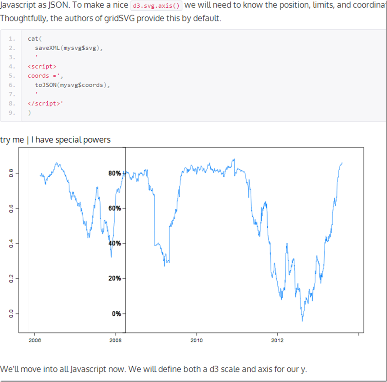
PIMCO Rolling Correlation, d3, R, gridSVG, lattice | Gets An Axis

Where else will you hear Pimco, rolling correlation, R, gridSVG, lattice, and d3 all in one post?  Let’s mix them all together to see what might happen.  For those here for the geekery, we will add a d3 axis for our y and it will follow the mouse.  For those who care nothing about d3 and R, you might like the chart too since it plots the 90 day rolling correlation between Pimco Total Return and Pimco All Asset Authority  .  Click here if or on the screenshot below. to see the live version.


image


At some point I will find the limits of my creativity and knowledge.  Please give me some ideas.

Thursday, August 8, 2013

R/gridSVG/d3 Line Reverse Data Bind

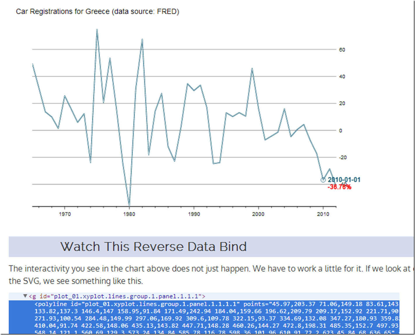
I veer from finance to tech, so let’s use some data from FRED/OECD this time.  I do not think I need to comment much on what has happened to New Car Registrations in Greece.

Reverse data binding a line plot from ggplot2 or lattice is slightly more difficult than what we saw in the last post I Want ggplot2/lattice and d3 (gridSVG–The Glue).  Here is a quick tutorial on one way we can accomplish this.  Click on this link or the screenshot below.

image

As always, this is fully reproducible.  See the code on Github.

Thursday, May 30, 2013

If…then in Japan

If Japan starts to spiral out of control, then what do they do? A spiral would be a sudden move higher in JGB rates with a simultaneous crash in the Japanese Yen. Their response would be to try to slow the positive feedback loop through external intervention. Fortunately for Japan, they have amassed a significant reserve position of 1.2 trillion compared to a US reserve position of 135 billion, so they do have some firepower.
require(latticeExtra)
require(quantmod)

japanReserves <- getSymbols("TRESEGJPM052N", src = "FRED", 
    auto.assign = FALSE)
asTheEconomist(xyplot(japanReserves, scales = list(y = list(rot = 1)), 
    main = "Japan Foreign Reserves excluding Gold"))


From TimelyPortfolio

Based on data from the US Treasury, 1.1 trillion of the 1.2 trillion of Japanese foreign reserves are US Treasury bonds. If Japan decides (is forced) to liquidate, the only thing they have to liquidate are US Treasury bonds. Who will buy if they sell? What happens next?
# get data from US Treasury for top 10 foreign
# holders of US treasuries
foreignUSTreas <- read.csv("http://www.treasury.gov/resource-center/data-chart-center/tic/Documents/mfhhis01.csv", 
    skip = 4, nrows = 13, stringsAsFactors = FALSE)
top10 <- data.frame(foreignUSTreas[4:13, 1:2])
colnames(top10) <- c("Country", "Value")
top10$Value <- as.numeric(top10$Value)
top10$Country <- factor(top10$Country, levels = top10$Country[order(top10$Value)])

barchart(Country ~ Value, data = top10, origin = 0, 
    xlab = "Value (in $Billions)", main = "Foreign Holders of US Treasuries - Top 10", 
    scales = list(y = list(alternating = 3)), par.settings = theEconomist.theme(box = "transparent"), 
    lattice.options = theEconomist.opts())


From TimelyPortfolio


For those comparing the Federal Reserve H4 data to the US Treasury TIC data, this is a very good summary http://www.treasury.gov/resource-center/data-chart-center/tic/Pages/ticfaq2.aspx#q10.

Tuesday, May 28, 2013

Intended or Unintended Consequences

A quick glimpse at the US 10y Treasury Bond rate since 2000 seems benign with low volatility and a general downward trend.

require(latticeExtra)
require(quantmod)

US10y <- getSymbols("^TNX", from = "2000-01-01", auto.assign = FALSE)[,
4]

asTheEconomist(xyplot(US10y, scales = list(y = list(rot = 1)),
main = "US 10y Yield Since 2000"))


From TimelyPortfolio

However, if we plot the change in rate over 252 days or 1 year, we might wonder whether the rate is as benign as we initially surmised. Although this might seem like an acceptable intended consequence of the aggressive monetary easing by the US Fed, I fear that we will face the historically normal unintended consequences.

p1 <- asTheEconomist(xyplot(US10y - lag(US10y, 252), 
scales = list(y = list(rot = 0)), main = "US 10y Yield - Yearly Change"))
p1


From TimelyPortfolio

And if we use some Vanguard US Bond Funds (vbmfx and vustx) as a proxy for the US bond market Approaching the Zero Bound - Bonds, we see that we are now in a market different than the last 4 years.

require(directlabels)
require(reshape2)

getSymbols("VUSTX", from = "1990-01-01")
## [1] "VUSTX"
getSymbols("VBMFX", from = "1990-01-01")
## [1] "VBMFX"

bonds.tr <- merge(ROC(VUSTX[, 6], 250), ROC(VBMFX[,
6], 250))
colnames(bonds.tr) <- c("VanguardLongTsy", "VanguardTotBnd")
bond.funds.melt <- melt(as.data.frame(cbind(as.Date(index(bonds.tr)),
coredata(bonds.tr))), id.vars = 1)
colnames(bond.funds.melt) <- c("date", "fund", "totret250")
bond.funds.melt$date <- as.Date(bond.funds.melt$date)

p2 <- direct.label(xyplot(bonds.tr, screens = 1, ylim = c(-0.35,
0.35), scales = list(y = list(rot = 0)), col = theEconomist.theme()$superpose.line$col,
par.settings = theEconomist.theme(box = "transparent"),
lattice.options = theEconomist.opts(), xlab = NULL,
main = "Vanguard Bond Funds 250 Day Total Return"),
list("last.points", hjust = 1, cex = 1.2))
p2


From TimelyPortfolio

p3 <- asTheEconomist(horizonplot(totret250 ~ date |
fund, origin = 0, horizonscale = 0.05, data = bond.funds.melt,
strip = TRUE, strip.left = FALSE, par.strip.text = list(cex = 1.1),
layout = c(1, 2), main = "Vanguard Bond Funds 250 Day Total Return"))
p3


From TimelyPortfolio

# print(p2,position=c(0,0.4,1,1),more=TRUE)
# print(update(p3,main=NULL),position=c(0,0,1,0.5))

Comparison to Japan


For some reference, let's look at a country getting quite a bit of attention lately in the press. We can add US yields to my favorite chart from Japan - JGB Yields–More Lattice Charts. Most of the difference is in the short end of the curve where the US is still near the minimum since 2012 while Japan is near the max out to 7 years.

url <- "http://www.mof.go.jp/english/jgbs/reference/interest_rate/"
filenames <- paste("jgbcme",c("","_2010","_2000-2009","_1990-1999","_1980-1989","_1974-1979"),".csv",sep="")

#load all data and combine into one jgb data.frame
jgb <- read.csv(paste(url,filenames[1],sep=""),stringsAsFactors=FALSE)
for (i in 2:length(filenames)) {
jgb <- rbind(jgb,read.csv(paste(url,"/historical/",filenames[i],sep=""),stringsAsFactors=FALSE))
}

#now clean up the jgb data.frame to make a jgb xts
jgb.xts <- as.xts(data.matrix(jgb[,2:NCOL(jgb)]),order.by=as.Date(jgb[,1]))
colnames(jgb.xts) <- paste0(gsub("X","JGB",colnames(jgb.xts)))

#get Yen from the Fed
#getSymbols("DEXJPUS",src="FRED")

xtsMelt <- function(data) {
require(reshape2)

#translate xts to time series to json with date and data
#for this behavior will be more generic than the original
#data will not be transformed, so template.rmd will be changed to reflect


#convert to data frame
data.df <- data.frame(cbind(format(index(data),"%Y-%m-%d"),coredata(data)))
colnames(data.df)[1] = "date"
data.melt <- melt(data.df,id.vars=1,stringsAsFactors=FALSE)
colnames(data.melt) <- c("date","indexname","value")
#remove periods from indexnames to prevent javascript confusion
#these . usually come from spaces in the colnames when melted
data.melt[,"indexname"] <- apply(matrix(data.melt[,"indexname"]),2,gsub,pattern="[.]",replacement="")
return(data.melt)
#return(df2json(na.omit(data.melt)))

}


jgb.melt <- xtsMelt(jgb.xts["2012::",])
jgb.melt$date <- as.Date(jgb.melt$date)
jgb.melt$value <- as.numeric(jgb.melt$value)
jgb.melt$indexname <- factor(
jgb.melt$indexname,
levels = colnames(jgb.xts)
)
jgb.melt$maturity <- as.numeric(
substr(
jgb.melt$indexname,
4,
length( jgb.melt$indexname ) - 4
)
)
jgb.melt$country <- rep( "Japan", nrow( jgb.melt ))

#now get the US bonds from FRED
USbondssymbols <- paste0("DGS",c(1,2,3,5,7,10,20,30))

ust.xts <- xts()
for (i in 1:length( USbondssymbols ) ) {
ust.xts <- merge(
ust.xts,
getSymbols(
USbondssymbols[i],
auto.assign = FALSE,
src = "FRED"
)
)
}

ust.melt <- na.omit( xtsMelt( ust.xts["2012::",] ) )

ust.melt$date <- as.Date(ust.melt$date)
ust.melt$value <- as.numeric(ust.melt$value)
ust.melt$indexname <- factor(
ust.melt$indexname,
levels = colnames(ust.xts)
)
ust.melt$maturity <- as.numeric(
substr(
ust.melt$indexname,
4,
length( ust.melt$indexname ) - 4
)
)
ust.melt$country <- rep( "US", nrow( ust.melt ))

bonds.melt <- rbind( jgb.melt, ust.melt )

p4 <- xyplot(
value ~ date | maturity,
groups = country,
data = bonds.melt,
type = "l",
col = c(brewer.pal(9,"Blues")[5],brewer.pal(9,"Blues")[7]),
layout = c( length( unique( bonds.melt$maturity ) ), 1 ),
panel = function(x, y, subscripts, col, ...) {
panel.abline(
h = c(
sapply( by( y, bonds.melt[subscripts,"country"], summary ), min ),
sapply( by( y, bonds.melt[subscripts,"country"], summary ), max )
),
#if(!col){
col = col[1:length(unique(bonds.melt[subscripts,"country"]))]
#} else col = trellis.par.get()$superpose.line$col[1:length(unique(bonds.melt[subscripts,"country"]))]
)
panel.xyplot( x = x, y = y, subscripts = subscripts, col = col, ... )
panel.text(
x = x[ length(unique(x)) / 2],
y = mean(
c(
sapply( by( y, bonds.melt[subscripts,"country"], summary ), max )[1],
sapply( by( y, bonds.melt[subscripts,"country"], summary ), min )[2]
)
),
labels = paste0(unique(bonds.melt$maturity)[panel.number()],"y"),
cex = 0.8,
#font = 2,
col = "black",
adj = c(0.5,0.5)
)
},
scales = list(
x = list(
draw = FALSE
#tck = c(1,0),
#alternating = 1,
#at = min(bonds.melt$date),
#labels = format(min(bonds.melt$date),"%Y")
),
y = list( tck = c(1,0), lwd = c(0,1) )
),
strip = FALSE,
par.settings = list(axis.line = list(col = 0)),
xlab = NULL,
ylab = "Yield",
main = "JGB and US Yields by Maturity Since Jan 2012"
)
p4 <- p4 + layer(
panel.abline(
h = pretty(bonds.melt$value,4),
lty = 3
)
)
p4


From TimelyPortfolio

Replicate

Gist source: https://gist.github.com/timelyportfolio/5665790

Wednesday, May 15, 2013

Even More JGB Yield Charts with R lattice

See the last post for all the details. I just could not help creating a couple more.

Variations on Favorite Plot - Time Series Line of JGB Yields by Maturity

p2 <- xyplot(value ~ date | indexname, data = jgb.melt, 
type = "l", layout = c(length(unique(jgb.melt$indexname)),
1), panel = function(x, y, ...) {
panel.abline(h = c(min(y), max(y)))
panel.xyplot(x = x, y = y, ...)
panel.text(x = x[length(x)/2], y = max(y),
labels = levels(jgb.melt$indexname)[panel.number()],
cex = 0.7, pos = 3)
}, scales = list(x = list(tck = c(1, 0), alternating = 1),
y = list(tck = c(1, 0), lwd = c(0, 1))), strip = FALSE,
par.settings = list(axis.line = list(col = 0)),
xlab = NULL, ylab = "Yield", main = "JGB Yields by Maturity Since Jan 2012")
p2 <- p2 + layer(panel.abline(h = pretty(jgb.melt$value),
lty = 3))
p2


From TimelyPortfolio


jgb.xts.diff <- jgb.xts["2012::", ] - matrix(rep(jgb.xts["2012::",
][1, ], NROW(jgb.xts["2012::", ])), ncol = NCOL(jgb.xts),
byrow = TRUE)
jgb.diff.melt <- xtsMelt(jgb.xts.diff)
jgb.diff.melt$date <- as.Date(jgb.diff.melt$date)
jgb.diff.melt$value <- as.numeric(jgb.diff.melt$value)
jgb.diff.melt$indexname <- factor(jgb.diff.melt$indexname,
levels = colnames(jgb.xts))

p4 <- xyplot(value ~ date | indexname, data = jgb.diff.melt,
type = "h")

update(p2, ylim = c(min(jgb.diff.melt$value), max(jgb.melt$value) +
0.5)) + p4


From TimelyPortfolio


update(p2, ylim = c(min(jgb.diff.melt$value), max(jgb.melt$value) +
0.5), par.settings = list(axis.line = list(col = "gray70"))) +
update(p4, panel = function(x, y, col, ...) {
# do color scale from red(negative) to
# blue(positive)
cc.palette <- colorRampPalette(c(brewer.pal("Reds",
n = 9)[7], "white", brewer.pal("Blues",
n = 9)[7]))
cc.levpalette <- cc.palette(20)
cc.levels <- level.colors(y, at = do.breaks(c(-0.3,
0.3), 20), col.regions = cc.levpalette)
panel.xyplot(x = x, y = y, col = cc.levels,
...)
})


From TimelyPortfolio


p5 <- horizonplot(value ~ date | indexname, data = jgb.diff.melt,
layout = c(1, length(unique(jgb.diff.melt$indexname))),
scales = list(x = list(tck = c(1, 0))), xlab = NULL,
ylab = NULL)

p5


From TimelyPortfolio


update(p2, ylim = c(0, max(jgb.melt$value) + 0.5),
panel = panel.xyplot) + p5 + update(p2, ylim = c(0,
max(jgb.melt$value)))


From TimelyPortfolio


Variations on Yield Curve Evolution with Opacity Color Scale

# add alpha to colors
addalpha <- function(alpha = 180, cols) {
rgbcomp <- col2rgb(cols)
rgbcomp[4] <- alpha
return(rgb(rgbcomp[1], rgbcomp[2], rgbcomp[3],
rgbcomp[4], maxColorValue = 255))
}

p3 <- xyplot(value ~ indexname, group = date, data = jgb.melt,
type = "l", lwd = 2, col = sapply(400/(as.numeric(Sys.Date() -
jgb.melt$date) + 1), FUN = addalpha, cols = brewer.pal("Blues",
n = 9)[7]), main = "JGB Yield Curve Evolution Since Jan 2012")

p3 <- update(asTheEconomist(p3), scales = list(x = list(cex = 0.7))) +
layer(panel.text(x = length(levels(jgb.melt$indexname)),
y = 0.15, label = "source: Japanese Ministry of Finance",
col = "gray70", font = 3, cex = 0.8, adj = 1))

# make point rather than line
update(p3, type = "p")


From TimelyPortfolio


# make point with just most current curve as line
update(p3, type = "p") + xyplot(value ~ indexname,
data = jgb.melt[which(jgb.melt$date == max(jgb.melt$date)),
], type = "l", col = brewer.pal("Blues", n = 9)[7])


From TimelyPortfolio


Replicate Me with code at Gist

Japan - JGB Yields–More Lattice Charts

This blog is littered with posts about Japan. In one sentence, I think Japan presents opportunity and is a very interesting real-time test of much of my macro thinking. Proper visualization is absolutely essential for me to understand all of the dynamics. The R packages lattice and the new rCharts give me the power to see. I thought some of my recent lattice charts might help or interest some folks.

Get and Transform the Data

# get Japan yield data from the Ministry of
# Finance Japan data goes back to 1974

require(xts)
# require(clickme)
require(latticeExtra)

url <- "http://www.mof.go.jp/english/jgbs/reference/interest_rate/"
filenames <- paste("jgbcme", c("", "_2010", "_2000-2009",
"_1990-1999", "_1980-1989", "_1974-1979"), ".csv",
sep = "")

# load all data and combine into one jgb
# data.frame
jgb <- read.csv(paste(url, filenames[1], sep = ""),
stringsAsFactors = FALSE)
for (i in 2:length(filenames)) {
jgb <- rbind(jgb, read.csv(paste(url, "/historical/",
filenames[i], sep = ""), stringsAsFactors = FALSE))
}

# now clean up the jgb data.frame to make a jgb
# xts
jgb.xts <- as.xts(data.matrix(jgb[, 2:NCOL(jgb)]),
order.by = as.Date(jgb[, 1]))
colnames(jgb.xts) <- paste0(gsub("X", "JGB", colnames(jgb.xts)),
"Y")

# get Yen from the Fed
# getSymbols('DEXJPUS',src='FRED')

xtsMelt <- function(data) {
require(reshape2)

# translate xts to time series to json with date
# and data for this behavior will be more generic
# than the original data will not be transformed,
# so template.rmd will be changed to reflect


# convert to data frame
data.df <- data.frame(cbind(format(index(data),
"%Y-%m-%d"), coredata(data)))
colnames(data.df)[1] = "date"
data.melt <- melt(data.df, id.vars = 1, stringsAsFactors = FALSE)
colnames(data.melt) <- c("date", "indexname", "value")
# remove periods from indexnames to prevent
# javascript confusion these . usually come from
# spaces in the colnames when melted
data.melt[, "indexname"] <- apply(matrix(data.melt[,
"indexname"]), 2, gsub, pattern = "[.]", replacement = "")
return(data.melt)
# return(df2json(na.omit(data.melt)))

}

jgb.melt <- xtsMelt(jgb.xts["2012::", ])
jgb.melt$date <- as.Date(jgb.melt$date)
jgb.melt$value <- as.numeric(jgb.melt$value)
jgb.melt$indexname <- factor(jgb.melt$indexname, levels = colnames(jgb.xts))

Favorite Plot - Time Series Line of JGB Yields by Maturity

p2 <- xyplot(value ~ date | indexname, data = jgb.melt, 
type = "l", layout = c(length(unique(jgb.melt$indexname)),
1), panel = function(x, y, ...) {
panel.abline(h = c(min(y), max(y)))
panel.xyplot(x = x, y = y, ...)
panel.text(x = x[length(x)/2], y = max(y),
labels = levels(jgb.melt$indexname)[panel.number()],
cex = 0.7, pos = 3)
}, scales = list(x = list(tck = c(1, 0), alternating = 1),
y = list(tck = c(1, 0), lwd = c(0, 1))), strip = FALSE,
par.settings = list(axis.line = list(col = 0)),
xlab = NULL, ylab = "Yield", main = "JGB Yields by Maturity Since Jan 2012")
p2 + layer(panel.abline(h = pretty(jgb.melt$value),
lty = 3))


From TimelyPortfolio

Good Chart but Not a Favorite


As you can tell, I did not spend a lot of time formatting this one.

p1 <- xyplot(value ~ date | indexname, data = jgb.melt, 
type = "l")
p1


From TimelyPortfolio


Another Favorite - Yield Curve Evolution with Opacity Color Scale

# add alpha to colors
addalpha <- function(alpha = 180, cols) {
rgbcomp <- col2rgb(cols)
rgbcomp[4] <- alpha
return(rgb(rgbcomp[1], rgbcomp[2], rgbcomp[3],
rgbcomp[4], maxColorValue = 255))
}

p3 <- xyplot(value ~ indexname, group = date, data = jgb.melt,
type = "l", lwd = 2, col = sapply(255/(as.numeric(Sys.Date() -
jgb.melt$date) + 1), FUN = addalpha, cols = brewer.pal("Blues",
n = 9)[7]), main = "JGB Yield Curve Evolution Since Jan 2012")

update(asTheEconomist(p3), scales = list(x = list(cex = 0.7))) +
layer(panel.text(x = length(levels(jgb.melt$indexname)),
y = 0.15, label = "source: Japanese Ministry of Finance",
col = "gray70", font = 3, cex = 0.8, adj = 1))


From TimelyPortfolio

Replicate Me


code at Gist

Thursday, March 21, 2013

Dust off 130 Year Old Gold Books on Google Bookshelf

The very fine paper

The Golden Dilemma (January 8, 2013)
Erb, Claude B. and Harvey, Campbell R.
Available at SSRN: http://ssrn.com/abstract=2078535

discussed in this post How Did I Miss “The Golden Dilemma”? motivated me to revisit some really old books on gold that I had added to my Google bookshelf. I am always surprised by how centuries old finance and economics conversations still sound so relevant. Even more interesting is how many of the questions remain unanswered. My new favorite discussion on gold and deflation occurs in Gold and Prices Since 1873 by James Laurence Laughlin and starts like this (emphasis and links mine):

§ I. Much of the difference of opinion as to the significance of recent movements of prices is due to the fact that the value of gold is a ratio which varies with a variation in either of its terms. Whether commodities fall in relation to gold or gold rises in relation to commodities, in either case the value of gold has risen. The same phenomena, therefore, may be due to radically different causes. So that, admitting the fall of prices, it is said, on the one hand, that the rise in the value of gold is due to some cause affecting gold itself, such as scarcity; and, on the other hand, it is claimed that the fall in prices is due to causes connected solely with commodities, and not with gold.

The believers in the scarcity value of gold substantiate their position by reference to the falling off in the annual production of gold; the unusual demands for gold since 1873, by Germany, Italy, and the United States; stringencies in the money market; the increased use of gold in the arts; the claim that the fall of prices is general; the exceptional character of the depression of trade since 1873; the general existence of low wages, profits, and rents; and the absence of any progress since 1873 in the means of economizing gold and silver. These opinions have been prominently associated with Mr. Robert Giffen, the statistician of the English Board of Trade, and Mr. Goschen, the present Chancellor of the Exchequtr; while the evident connection of the main proposition with bimetallism has given it a semi-political character, and many supporters in both Europe and America.

§ II. Inasmuch as the rise in the value of gold since 1873 is in proportion to the fall of prices, it is a matter of some importance to look critically at the facts in regard to prices. With this object in view, the more important tables of prices since 1850 have been collected in the Appendix, with explanations as to the methods of computation, sources, and reliability. It is hoped that a comparison of the diverse methods and results of these tables will serve a useful purpose.

Hitherto, the figures of the London Economist for twenty-two articles have been almost universally used as evidence in regard to the movement of prices; but it is time that the worship of this fetich should cease.* Of late, much more trustworthy tables have been published.

I very much like the author's approach, which is to consider both the numerator and denominator in a price fraction and to gather as much data as possible rather than rely on one potentially flawed dataset. By page 3 we are already presented with this wonderful chart on prices/inflation in Great Britain, France, Germany, and the United States. These extra sources of price data allow us to frame the discussion much more objectively.

[Chart 1 from the Table]


In the spirit of the author's approach, I wanted to reproduce the chart presented above in R and also compare the US Burchard's table with CPI and GDP deflator data from MeasuringWorth. I tried to take the easy route with OCR, but eventually manually entered the price tables from the appendix.

plot of chunk unnamed-chunk-1

The chart was well done and really could not be improved beyond color and labels.

As I have mentioned before, MeasuringWorth is a wonderful source of long-term economic and financial data. I wanted to compare Burchard's US table of prices to MeasuringWorth's US GDP deflator and CPI. The Civil War significantly destabilized prices. The effect is much more pronounced in the MeasuringWorth data.

plot of chunk unnamed-chunk-2

The author discusses the shortcomings of the Burchard prices in Appendix Table M.

An examination of the Finance Report tables indicates that they were not compiled with great care. The price of an article will run along without change from month to month; then, suddenly, it will rise or fall sharply. The prices of articles that normally would fluctuate together (pig and bar iron, butter and cheese) show a very loose correspondence. Moreover, the same articles do not appear from year to year. An article will be quoted for a number of years, will then disappear, and later, perhaps, will reappear…Notwithstanding these serious imperfections, we reprint Mr. Burchard's figures for the years 1850-84, since they are the only continuous figures of average prices in the United States.

The author organizes his remaining arguments into 8 additional sections, which I have titled. Also, I will give my favorite passage from each section. Interestingly, many of these same arguments apply directly to the MMT world of today with the only exception being the absence of a gold standard.


Section 3: The Supply of Both Money and Credit Must Be Considered

In truth, in society as it exists to-day, the general level of prices for considerable periods (sufficiently long to permit the effect of changes in the business habits of the community, or changes in the existing stock of gold, to be felt) must depend upon a combination of the quantity of money with the various forms of credit. The two are inextricably bound together. So, therefore, the level of prices (so far as it is affected by the offer of purchasing power) depends on the expansion or contraction of two factors, quantity of money and credit, each of which may change to a considerable extent independently of each other. Both may increase or diminish together, or the gain of one may offset the loss of the other.

Section 4: Other Events Affecting Prices

The extraordinary and exceptional demand for commodities in periods of war, at the very time of the great destruction of wealth, produced an unhealthy state of affairs; but on the outside all seemed fair, and men had begun to believe that prices were fated always to rise. The speculation in metals (see Chart II.) in 1873 was of an unparalleled kind…There were all the evidences of an unhealthy and abnormal condition of affairs. But the unchecked demand, when the actual power to buy had been greatly impaired, could not go on forever. When it was once found that men had been creating liabilities beyond their means to meet them, the end had come. The crisis of 1873 was the painful return to a consciousness of the real situation, after a prolonged fever of speculation for nearly twenty years, which had spread over many countries. The effects were the more serious because the disease had got such great headway.

Section 5: Improvements in Industrial Process and New Supplies of Commodities

The period following a great financial upheaval is naturally crowded with improvements in processes and in methods of lowering the cost of production. Necessity becomes the mother of invention. The extent to which producers have been driven by the fierce competition since 1873 to cheapen production leads to the inquiry how far the fall of prices can be accounted for by influences connected solely with commodities, and not with gold. If these influences have been widely extended, it will be strong evidence that the scarcity of gold has had less effect than some suppose.

Section 6: Analysis of Prices by Commodity Type

Whether to draw inferences as to a scarcity of gold from forty-nine articles, or to infer that gold was abundant, according to the prices of fifty-one articles, is an awkward dilemma for those who think that prices give direct evidence as to the quantity of money. As Forsell remarks, the theory of a scarcity of gold is incompatible with the rise * in price of so many commodities.

Section 7: Supply of Gold

From these figures, it will be seen that the reserves in the banks of the civilized world show a very remarkable increase in gold. Although the total note circulation was increased 29 per cent., the gold in the reserves was increased 75 per cent., while the silver was also increased 25 per cent. In 1870-74, the gold reserves amounted to 28 per cent. of the total note circulation, and constituted 64 per cent. of all the specie reserves. In 1885, the gold bore a larger ratio to a larger issue of paper, or 41 per cent. of the total note circulation; and, in spite of unusual accumulations of silver (in the Bank of France, for example), the gold formed 71 per cent. of the specie reserves. This is a very significant showing. What it means, without a shadow of doubt, is that the supply of gold is so abundant that the character and safety of the note circulation have been improved in a signal manner. In 1871-74 there was $1 of gold for every $3.60 of paper circulation.* In 1885 there was 11 of gold for every $2.40.

Section 8: Supply of Credit

Specie to the amount of 1800,000,000 has gone into circulation in the form of note issues, representing an equivalent amount of specie; but gold has not been economized by the use of credit in the form of notes. While the total circulation of these countries has increased 35 per cent., the paper has been much better protected…The paper currency of every country except Russia has gained in security, together with a large increase in many of the countries. The gold supplies have not merely permitted an enlarged note circulation, but have furnished a much better protection to that increased issue.

Section 9: Price of Land Labor

It will be recalled at once, in regard to rents, that a marked characteristic of the period since 1873 has been the opening up of new and fertile lands, whose products have been transported at a greatly diminished rate. But this in itself is a reason why lands in the older countries should be thrown out of cultivation, and why rents should be lowered. This phenomenon, then, can be accounted for on other grounds than the scarcity of gold…The fact that wages have risen tends to confirm the belief that the fall of prices is due chiefly to the introduction of improvements.

Section 10: Conclusion

To assume that because the fall of prices coincided with the demonetization of silver it was due to an appreciation of gold, without considering whether the coincident phenomena were traceable to entirely distinct causes, is to fall into the fallacy of post hoc propter hoc. The forces which fix the level of prices at any time, moreover, are far too complex to admit of the inference that, because prices have fallen seriously, gold has become scarce.


Gold and Prices Since 1873 by James Laurence Laughlin is a reminder of how our current is wedded to our past. I often feel like the unprecedented actions of the world's central banks have broken the link to centuries of financial history. Rather, it seems they have simply temporarily suspended the immutable laws of humans and money and maybe “The effects were the more serious because the disease had got such great headway.” will haunt us.


I ran out of time and could not do the visualization in d3. Anybody that is motivated, here is a way to get the JSON:

# for the ambitious and more motivated than me, here is how to easily get
# the JSON to translate the graph to an interactive http://d3js.org
require(rjson)
toJSON(list(Date = format(index(priceTables), "%Y-%m-%d"), as.list(priceTables)))


Post entirely generated from R markdown for reproducibility: