Showing posts with label GRID. Show all posts

Friday, August 9, 2013

PIMCO Rolling Correlation, d3, R, gridSVG, lattice | Gets An Axis

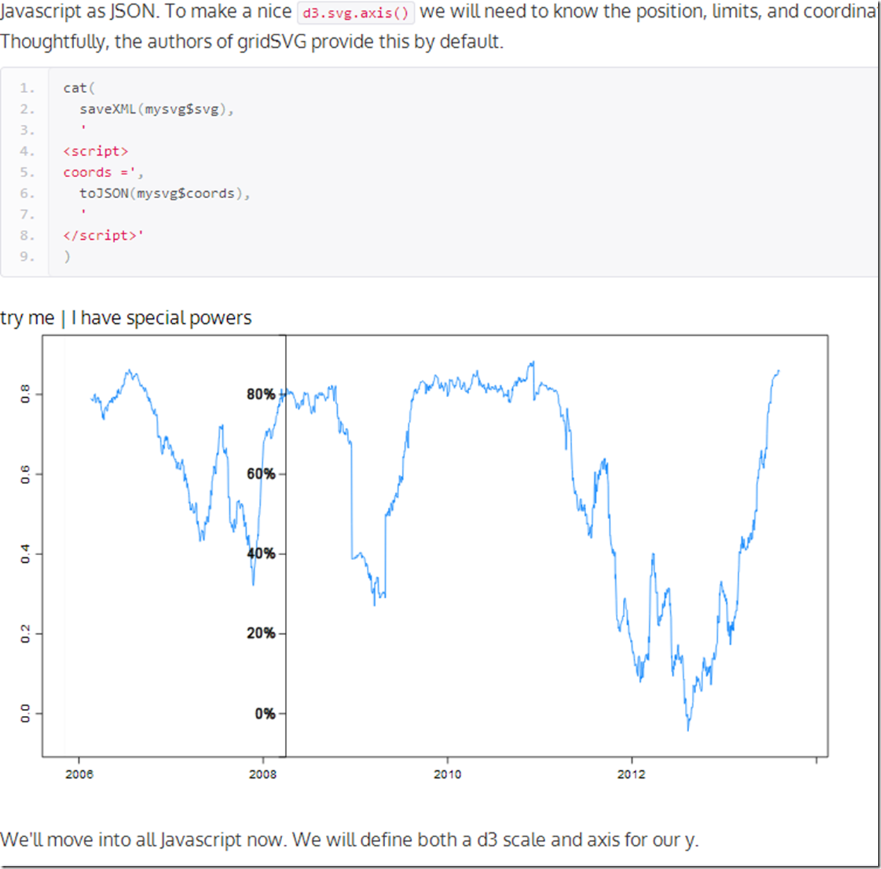
Where else will you hear Pimco, rolling correlation, R, gridSVG, lattice, and d3 all in one post?  Let’s mix them all together to see what might happen.  For those here for the geekery, we will add a d3 axis for our y and it will follow the mouse.  For those who care nothing about d3 and R, you might like the chart too since it plots the 90 day rolling correlation between Pimco Total Return and Pimco All Asset Authority  .  Click here if or on the screenshot below. to see the live version.


image


At some point I will find the limits of my creativity and knowledge.  Please give me some ideas.

Thursday, August 8, 2013

R on Your iPhone (Not the Way You Think)

If you really love R, you should put it on your iPhone.  Apple gives the measurements for its products here. Let's use a little grid magic with ggplot2 to make a chart for the back of your iphone similar to this.

require(grid)
require(ggplot2)

# thanks for the Apple measurements
# https://developer.apple.com/resources/cases/
x11(
height = as.numeric(convertX(unit(58.55, "mm"), "in")),
width = as.numeric(convertX(unit(115.15,"mm"), "in"))
)

# seems Rstudio make it hard to select a dev use until the new dev is
# Active
dev.set(which = dev.next())
# draw anything to activate our window
grid.text("my R iphone case")

plot1

# draw your most beautiful plot with ggplot2 or lattice a good example
# thanks http://sharpstatistics.co.uk/r/ggplot2-guide/
p <- ggplot(iris, aes(Sepal.Length, Sepal.Width)) + geom_point()
p + facet_grid(. ~ Species) + stat_smooth(method = "lm")
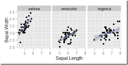
plot2

# draws rectangular and circular(camera) cutout
grid.roundrect(
y = unit(28.975, "mm"),
x = unit(57.275, "mm"),
height = unit(57.95, "mm"),
width = unit(114.55, "mm"),
r = unit(8.17, "mm"),
name = "iphoneback"
)
grid.circle(
y = unit(49.78, "mm"),
x = unit(106.45, "mm"),
r = unit(3.46, "mm")
)
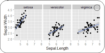
plot3


Cut and insert in or paste/tape to your case.
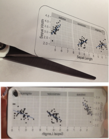

image


A little more seriously, this is a good way to test how your graph might appear on an iOS device if you have the need.  Just use the screen measurements from the Apple specs.
Friday, January 6, 2012

Extreme Bond Returns

20 years of data is nowhere near enough to satisfy my insatiable appetite for bigger datasets.  While I showed Record Long Term Treasury Returns with Vanguard’s US Long Treasury mutual fund, its 20 year life is not sufficient to give me comfort risking money.  What happens when we take the Moody’s AAA rate series dating back to 1919?

My opinion changes dramatically when I include 70 more years, and the opportunity is much less certain.

From TimelyPortfolio

R code from GIST:

Wednesday, December 21, 2011

Record Long Term Treasury Returns

I mistakenly assume everyone knows that US Treasury Returns have been extreme in 2011.  As we near the end of the year, I thought it would be beneficial to look at the world’s best performer while incorporating some new graphical techniques.  There is also an opinion (NOT INVESTMENT ADVICE) expressed in one of the charts.

From TimelyPortfolio

R code in GIST: