Extending the d3 remixes of the fine work at Systematic Investor, I thought it woud be fun to do some dimple.js and nvd3 scatterplots of clusters of PIMCO mutual funds. As always, I welcome thoughts, comments, and suggestions. Click here or on the screenshot below.
Wednesday, September 25, 2013
Thursday, September 12, 2013
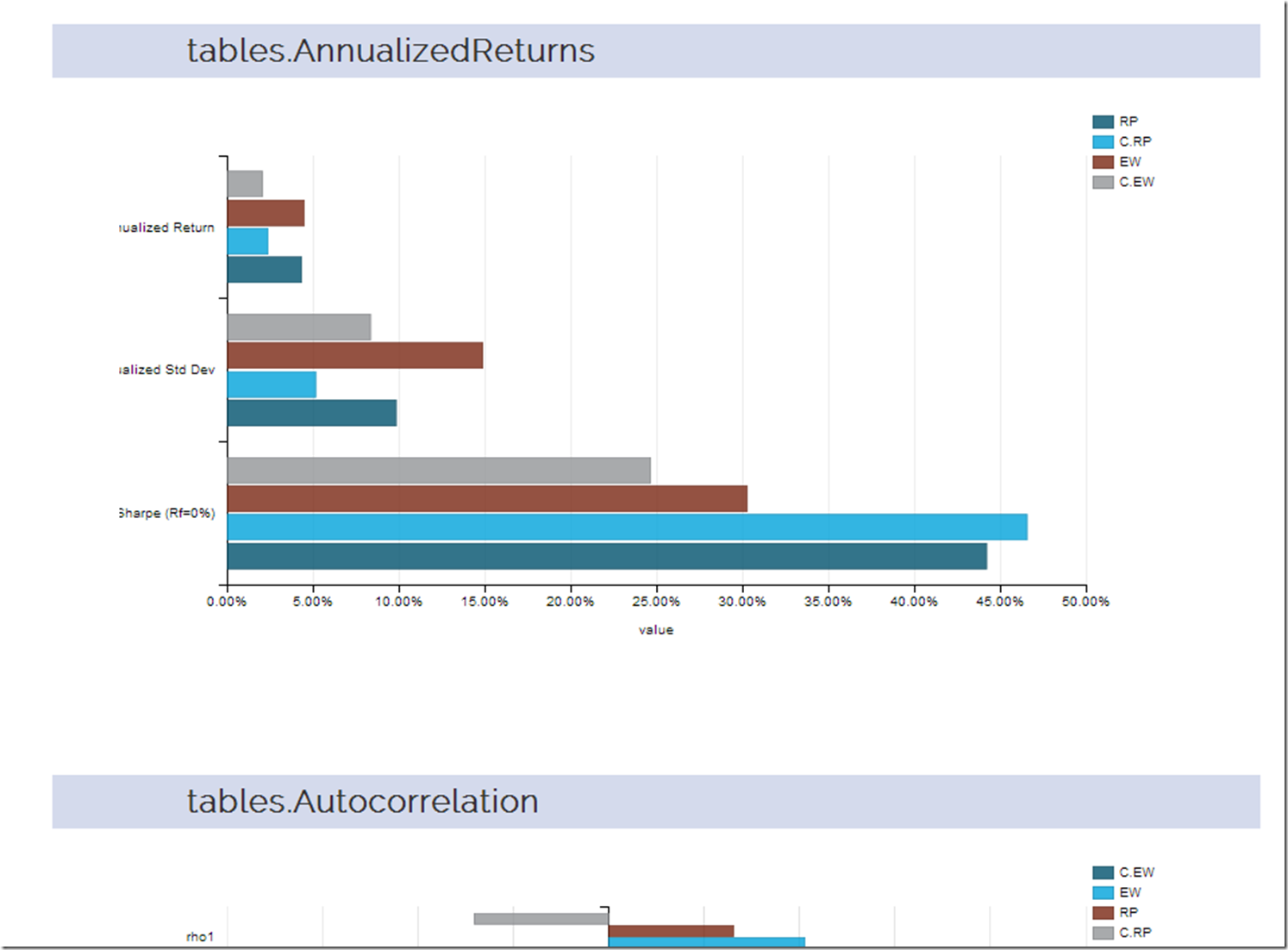
rCharts | PerformanceAnalytics Tables + Systematic Investor Cluster
I thought a good extension of the last post d3-ify Systematic Investor Cluster Weight would be to analyze the returns with every table that PerformanceAnalytics offers. Since d3 interactive charts are way more fun than tables, let’s plot each table with dimplejs and rCharts. Click here or on the screenshot below to see the result.
Monday, September 9, 2013
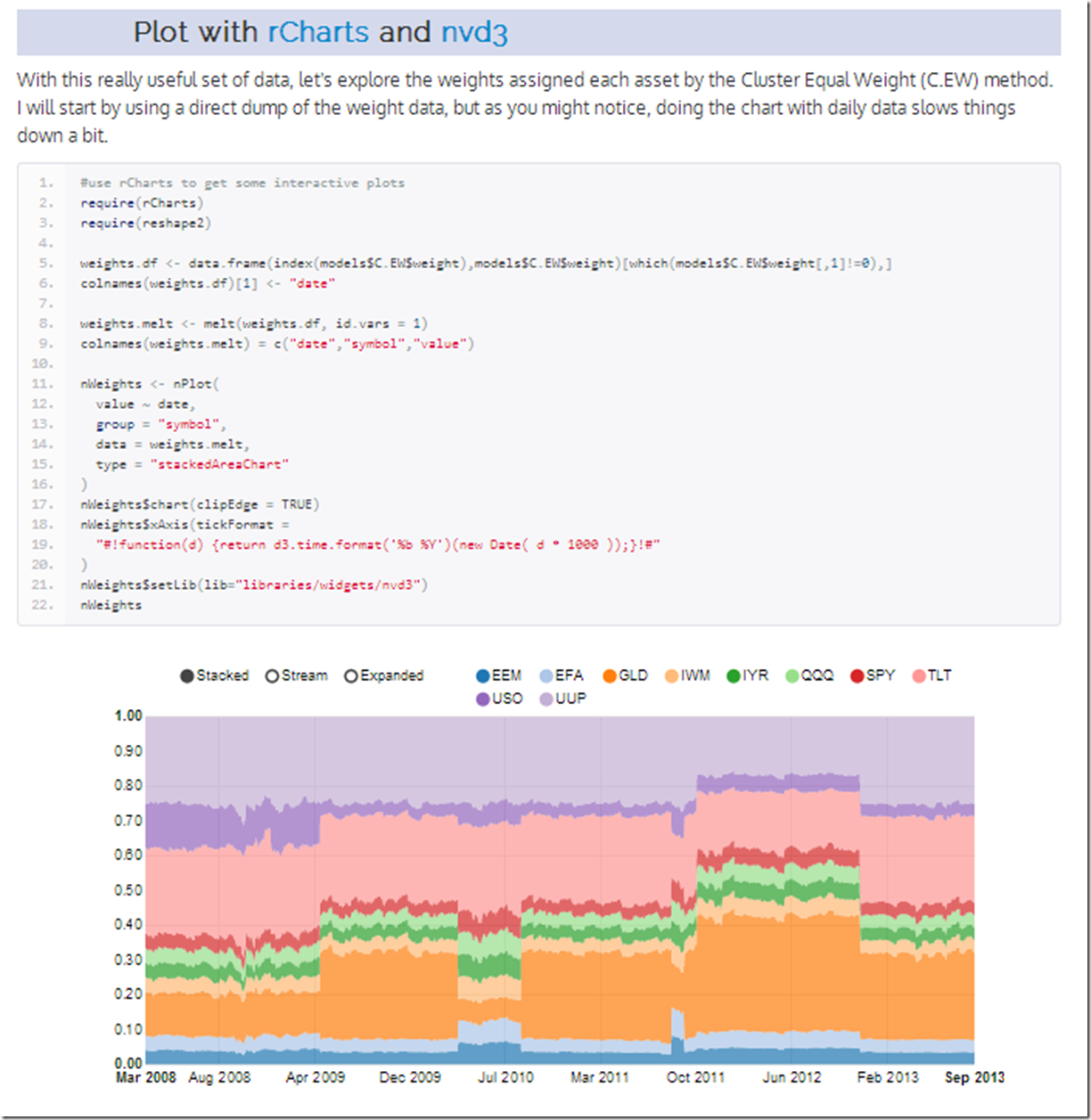
d3-ify Systematic Investor Cluster Weight
I have posted before about the brilliant R/finance work being done at Systematic Investor. I just had to see what his cluster work would look like with d3 interactivity. Click on the screenshot below or here to see an interactive recreation of his post.
Thursday, May 31, 2012
Conditional Drawdown Exploration
After reading Strub, Issam S., Trade Sizing Techniques for Drawdown and Tail Risk Control (May 21, 2012), I thought I should try to tie this with 2 other good R pieces on Conditional Drawdown:
http://systematicinvestor.wordpress.com/2011/11/01/minimizing-downside-risk/
http://www.rinfinance.com/agenda/2010/Carl+Peterson+Boudt_Tutorial.pdf
As always, NONE OF THIS IS INVESTMENT ADVICE.
In Strub’s paper, he uses conditional drawdown (CDaR) and conditional VaR (CVaR) to calculate the position size on directional (breakout determined) long/short currency positions. The results were interesting enough to attempt to replicate with slight changes. For this post, I will use CDaR to determine the position size on a long-only Mebane Faber 10-month moving average strategy. We will start with an efficient frontier comparison and then abandon the frontier for a systematic approach.
(The blue text represents the added explanation in response to a comment)
If we look below at the frontier plots of return versus each measure of risk—the most common standard deviation, CDaR (conditional drawdown), and CVaR (conditional variance at risk)—we see that the frontiers are not noticeably different. Visually, the most different and in a bad way, is the red CVaR line in the top left frontier plot. The red CVaR line offers less return for each unit of standard deviation than the other two frontier lines, but the underperformance is not apparent when we use CDaR or CVaR on our x-axis as our measure of risk.
 |
| From TimelyPortfolio |
Like the frontier plots above, the transition maps show only slightly different efficient allocations for each potential unit of risk. At the lower end of the risk axis (left on the chart), we can see the biggest differences between allocations.
 |
| From TimelyPortfolio |
The lack of noticeably different results seems consistent with well-known issues of mean-variance optimization. These issues are described very well in this Morningstar piece.
“It is well known that mean-variance optimization is very sensitive to the estimates of returns, standard deviations, and correlations (see Michaud [1989] and Best and Grauer [1991]). Of these three inputs, returns are by far the most important and, unfortunately, the least stable. Chopra and Ziemba [1993] estimated that at a moderate risk tolerance level, mean-variance optimization is 11 times more sensitive to estimation error in returns relative to estimation error in risk (variance) and mean-variance optimization is two times more sensitive to estimation error in risk (variance) relative to estimation error in covariances (which also applies to correlations). Richard Michaud coined the phrase “the Markowitz optimization enigma” to describe the problem of input sensitivity and the highly concentrated asset allocations that result (see Michaud [1989]).
Input sensitivity indicates that the model’s output (the asset allocations) changes significantly due to small changes in the input (the capital market assumptions). Estimation error refers to the fact that in a forward-looking context the inputs are forecasts, and as such, are likely to be less than perfect (i.e. they contain errors). Putting these two issues together enables an uninformed practitioner to do more harm than good.”
For one more look at the lack of significant difference, let’s look at the cumulative returns of the 25th allocation from each efficient frontier.
 |
| From TimelyPortfolio |
Even though the frontiers for the entire period are not significantly different, we can still use these more sophisticated risk measures in a different way to determine position size. As a simple example similar to the example provided in Strub, let’s say we would like to pursue a Mebane Faber style 10-month moving average style long only position in each of the 3 currencies. We would also like to limit the CDaR of each position to be 5%, so if we are fully allocated the sum of the 3 CDaR will be 15%. We will try to achieve this by using the 12 month rolling CDaR as our expected CDaR in the next month. Here is the chart of the 12 month rolling CDaR.
 |
| From TimelyPortfolio |
If we just allocated 100% of the portfolio for each currency that exceeded its 10-month moving average, the results would look like this. Our maximum leverage across the portfolio would be 300%.
 |
| From TimelyPortfolio |
However, if we would like to allocate more than 100% in quiet times and constrain our CDaR in volatile times, we can adjust our allocation by the 12 month rolling CDaR. As an example, if the New Zealand Dollar has a 15% CDaR for the last 12 months and we want 5% CDaR, we could allocate 33% or 15%historical/5%target to the New Zealand Dollar. This could result in a near infinite position size when CDaR is small, so we could also say that we want our maximum allocation to a single currency to be 200% or 600% at a portfolio level. The cumulative return chart would look like this.
 |
| From TimelyPortfolio |
 |
| From TimelyPortfolio |
I think it very unlikely that this would be a final allocation mechanism, and I certainly would not be comfortable with this, but I hope it offers some instructive building blocks upon which you can build an allocation system.
Monday, April 30, 2012
French Global Factors
I have said it already in multiple posts, but Kenneth French’s data library is one of the most generous and powerful contributions to the financial community. To build on Systematic Investor’s series on factors, I thought I should run some basic analysis on the Global Factors maintained by Kenneth French. I cannot imagine how long this would take without the data library and the incredible set of R packages available.
 |
| From TimelyPortfolio |
 |
| From TimelyPortfolio |
 |
| From TimelyPortfolio |
 |
| From TimelyPortfolio |
 |
| From TimelyPortfolio |
 |
| From TimelyPortfolio |
Monday, April 23, 2012
Drawdown Look at Frontier of Assets and Systems
In Efficient Frontier of Funds and Allocation Systems, I had hoped to start exploring how a frontier can potentially be created with only one asset, or how an even more efficient frontier could be created with assets and also systems on those assets. I am obsessed with drawdown, so of course I need to extend that post with a look at drawdown to satisfy this obsession. If you have not read the original post, please read it before this, since I will only show the additional graph created.
 |
| From TimelyPortfolio |
Wednesday, April 18, 2012
Efficient Frontier of Funds and Allocation Systems
I did a very basic experiment in Efficient Frontier of Buy-Hold and Tactical System where I determined the efficient frontier of the S&P 500 with itself transformed by a Mebane Faber 10-month moving average tactical allocation.
The result was interesting, but I did not pursue further. Now with some inspiration and tools by Systematic Investor, I thought I would extend the post. This time around we will use both the Vanguard U.S. Total Bond Market (VBMFX) and Vanguard U.S. S&P 500 (VFINX) combined with both portfolios determined by tactical methods (moving average, RSI, and omega) and those funds transformed individually by the same tactical methods. I will as always warn you that this is not advice and large losses are almost guaranteed. Also, I would like to note that I have checked the 10-month moving average every way possible (even manually in Excel), and it has been incredible on the VFINX since 1990. Prior to 1990, results were good but nowhere near as amazing. If I messed up, please let me know.
 |
| From TimelyPortfolio |
 |
| From TimelyPortfolio |
 |
| From TimelyPortfolio |
Monday, April 9, 2012
Piggybacking and Hopefully Publicizing R Experts
I was inspired by the Revolution Analytics blog post http://blog.revolutionanalytics.com/2009/11/charting-time-series-as-calendar-heat-maps-in-r.html on the d3.js style calendar heat map that Paul Bleicher from Humedica developed in R. In an effort to publicize such fine work, I wanted to put a slightly different spin on it to visualize a system’s time in the market. The system is ridiculously basic (not investment advice and will lose money), but the visualization is very helpful.
 |
| From TimelyPortfolio |
To continue with the theme, I would like to continue to highlight some fine R work from http://systematicinvestor.wordpress.com. Although his work is far more sophisticated than this, I thought I would use his plota function to plot the German Dax (used in this example) with RSI below.
 |
| From TimelyPortfolio |
Thanks so much to the amazing R coders who provided the code and functions for this post.
Friday, February 10, 2012
Simplified Example of Systematic Investor’s Fine Work
THIS IS ONLY AN EXAMPLE AND IS NOT INVESTMENT ADVICE. ACTING ON THIS WILL LOSE LOTS OF MONEY.
Systematic Investor Blog (be sure to check out the site) offers extremely good examples of how to use R in finance. Since I firmly believe more examples are always better, I wanted to provide an additional very simple example of how to use his Systematic Investor Toolbox (SIT) for systems development. This will provide a building block for a series of posts similar to my A Quantstrat to Build On Part 6. We’ll use our good old count up/down (CUD) indicator on the S&P 500 Index and compare it to Mebane Faber’s 10 month moving average.
I know this is not pretty, but I wanted to start with as simple a base as possible. Any loyal readers will already have known that CUD is not so great at making money.
 |
| From TimelyPortfolio |


