Showing posts with label bonds. Show all posts

Tuesday, August 13, 2013

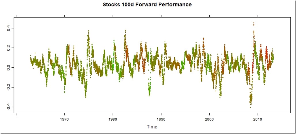
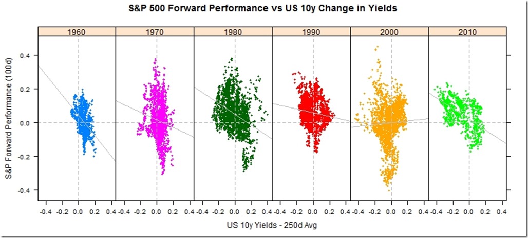
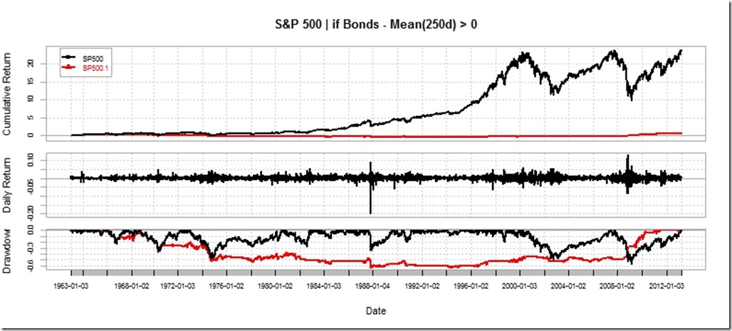
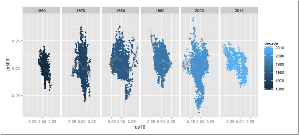
Stocks and Bonds Behavior by Decade

I struggled with whether or not I should even post this.  It is raw and ugly, but it might help somebody out there.   I might use this as a basis for some more gridSVG posts, but I do not think I have the motivation to finish the analysis.

ggplot stocks bonds by decadeperformance by timelattice stocks bonds by decadeperf summar

Code:

require(latticeExtra)
require(quantmod)
require(PerformanceAnalytics)

getSymbols("SP500",src="FRED")
US10 <- na.omit(getSymbols("DGS10",src="FRED",auto.assign=FALSE))

stocksBonds <- na.omit(
  merge(
    lag(SP500,k=-100)/SP500-1,  #forward 100 day sp500 perf
    US10 / runMean(US10,n=250) - 1,       #us10 yield - 250 day average
    SP500
  )
)
#get the decade
stocksBonds$decade = as.numeric(substr(index(stocksBonds),1,3)) * 10
#name columns
colnames(stocksBonds) <- c("sp500","us10","SP500","decade")
#get a color ramp for our change in us10 year yields
linecolors <- colorRamp(
  c("red","green"),
  interpolate="linear",
  space="rgb"
)((stocksBonds[,2]+0.5))

xyplot(
  stocksBonds[,1],
  col=rgb(linecolors,max=255),
  type="p",pch=19,cex=0.5,
  main = "Stocks 100d Forward Performance"
)

xyplot(
  sp500 ~ us10 | factor(decade),
  groups = decade,
  data = as.data.frame(stocksBonds),
  pch=19,
  cex = 0.5,
  scales = list(
    x = list(tck=c(1,0),alternating=1)
  ),
  layout=c(6,1),
  main = "S&P 500 Forward Performance vs US 10y Change in Yields",
  ylab = "S&P Forward Performance (100d)",
  xlab = "US 10y Yields - 250d Avg"
) +
latticeExtra::layer(panel.abline(h=0,col="gray",lty=2)) +
latticeExtra::layer(panel.abline(v=0,col="gray",lty=2)) +
xyplot(
  sp500 ~ us10 | factor(decade),
  col="gray",
  data = as.data.frame(stocksBonds),
  panel = panel.lmline)

require(ggplot2)
ggplot(data = data.frame(stocksBonds), aes(y=sp500, x= us10,colour=decade))+
  geom_point()+facet_wrap(~decade,ncol=6)+geom_smooth()


charts.PerformanceSummary(
  merge(
    ROC(stocksBonds[,3],n=1,type="discrete"),
    ROC(stocksBonds[,3],n=1,type="discrete") * (stocksBonds[,2]>0)
  ),
  main="S&P 500 | if Bonds - Mean(250d) > 0"
)

Thursday, May 30, 2013

If…then in Japan

If Japan starts to spiral out of control, then what do they do? A spiral would be a sudden move higher in JGB rates with a simultaneous crash in the Japanese Yen. Their response would be to try to slow the positive feedback loop through external intervention. Fortunately for Japan, they have amassed a significant reserve position of 1.2 trillion compared to a US reserve position of 135 billion, so they do have some firepower.
require(latticeExtra)
require(quantmod)

japanReserves <- getSymbols("TRESEGJPM052N", src = "FRED", 
    auto.assign = FALSE)
asTheEconomist(xyplot(japanReserves, scales = list(y = list(rot = 1)), 
    main = "Japan Foreign Reserves excluding Gold"))


From TimelyPortfolio

Based on data from the US Treasury, 1.1 trillion of the 1.2 trillion of Japanese foreign reserves are US Treasury bonds. If Japan decides (is forced) to liquidate, the only thing they have to liquidate are US Treasury bonds. Who will buy if they sell? What happens next?
# get data from US Treasury for top 10 foreign
# holders of US treasuries
foreignUSTreas <- read.csv("http://www.treasury.gov/resource-center/data-chart-center/tic/Documents/mfhhis01.csv", 
    skip = 4, nrows = 13, stringsAsFactors = FALSE)
top10 <- data.frame(foreignUSTreas[4:13, 1:2])
colnames(top10) <- c("Country", "Value")
top10$Value <- as.numeric(top10$Value)
top10$Country <- factor(top10$Country, levels = top10$Country[order(top10$Value)])

barchart(Country ~ Value, data = top10, origin = 0, 
    xlab = "Value (in $Billions)", main = "Foreign Holders of US Treasuries - Top 10", 
    scales = list(y = list(alternating = 3)), par.settings = theEconomist.theme(box = "transparent"), 
    lattice.options = theEconomist.opts())


From TimelyPortfolio


For those comparing the Federal Reserve H4 data to the US Treasury TIC data, this is a very good summary http://www.treasury.gov/resource-center/data-chart-center/tic/Pages/ticfaq2.aspx#q10.

Tuesday, May 28, 2013

Intended or Unintended Consequences

A quick glimpse at the US 10y Treasury Bond rate since 2000 seems benign with low volatility and a general downward trend.

require(latticeExtra)
require(quantmod)

US10y <- getSymbols("^TNX", from = "2000-01-01", auto.assign = FALSE)[,
4]

asTheEconomist(xyplot(US10y, scales = list(y = list(rot = 1)),
main = "US 10y Yield Since 2000"))


From TimelyPortfolio

However, if we plot the change in rate over 252 days or 1 year, we might wonder whether the rate is as benign as we initially surmised. Although this might seem like an acceptable intended consequence of the aggressive monetary easing by the US Fed, I fear that we will face the historically normal unintended consequences.

p1 <- asTheEconomist(xyplot(US10y - lag(US10y, 252), 
scales = list(y = list(rot = 0)), main = "US 10y Yield - Yearly Change"))
p1


From TimelyPortfolio

And if we use some Vanguard US Bond Funds (vbmfx and vustx) as a proxy for the US bond market Approaching the Zero Bound - Bonds, we see that we are now in a market different than the last 4 years.

require(directlabels)
require(reshape2)

getSymbols("VUSTX", from = "1990-01-01")
## [1] "VUSTX"
getSymbols("VBMFX", from = "1990-01-01")
## [1] "VBMFX"

bonds.tr <- merge(ROC(VUSTX[, 6], 250), ROC(VBMFX[,
6], 250))
colnames(bonds.tr) <- c("VanguardLongTsy", "VanguardTotBnd")
bond.funds.melt <- melt(as.data.frame(cbind(as.Date(index(bonds.tr)),
coredata(bonds.tr))), id.vars = 1)
colnames(bond.funds.melt) <- c("date", "fund", "totret250")
bond.funds.melt$date <- as.Date(bond.funds.melt$date)

p2 <- direct.label(xyplot(bonds.tr, screens = 1, ylim = c(-0.35,
0.35), scales = list(y = list(rot = 0)), col = theEconomist.theme()$superpose.line$col,
par.settings = theEconomist.theme(box = "transparent"),
lattice.options = theEconomist.opts(), xlab = NULL,
main = "Vanguard Bond Funds 250 Day Total Return"),
list("last.points", hjust = 1, cex = 1.2))
p2


From TimelyPortfolio

p3 <- asTheEconomist(horizonplot(totret250 ~ date |
fund, origin = 0, horizonscale = 0.05, data = bond.funds.melt,
strip = TRUE, strip.left = FALSE, par.strip.text = list(cex = 1.1),
layout = c(1, 2), main = "Vanguard Bond Funds 250 Day Total Return"))
p3


From TimelyPortfolio

# print(p2,position=c(0,0.4,1,1),more=TRUE)
# print(update(p3,main=NULL),position=c(0,0,1,0.5))

Comparison to Japan


For some reference, let's look at a country getting quite a bit of attention lately in the press. We can add US yields to my favorite chart from Japan - JGB Yields–More Lattice Charts. Most of the difference is in the short end of the curve where the US is still near the minimum since 2012 while Japan is near the max out to 7 years.

url <- "http://www.mof.go.jp/english/jgbs/reference/interest_rate/"
filenames <- paste("jgbcme",c("","_2010","_2000-2009","_1990-1999","_1980-1989","_1974-1979"),".csv",sep="")

#load all data and combine into one jgb data.frame
jgb <- read.csv(paste(url,filenames[1],sep=""),stringsAsFactors=FALSE)
for (i in 2:length(filenames)) {
jgb <- rbind(jgb,read.csv(paste(url,"/historical/",filenames[i],sep=""),stringsAsFactors=FALSE))
}

#now clean up the jgb data.frame to make a jgb xts
jgb.xts <- as.xts(data.matrix(jgb[,2:NCOL(jgb)]),order.by=as.Date(jgb[,1]))
colnames(jgb.xts) <- paste0(gsub("X","JGB",colnames(jgb.xts)))

#get Yen from the Fed
#getSymbols("DEXJPUS",src="FRED")

xtsMelt <- function(data) {
require(reshape2)

#translate xts to time series to json with date and data
#for this behavior will be more generic than the original
#data will not be transformed, so template.rmd will be changed to reflect


#convert to data frame
data.df <- data.frame(cbind(format(index(data),"%Y-%m-%d"),coredata(data)))
colnames(data.df)[1] = "date"
data.melt <- melt(data.df,id.vars=1,stringsAsFactors=FALSE)
colnames(data.melt) <- c("date","indexname","value")
#remove periods from indexnames to prevent javascript confusion
#these . usually come from spaces in the colnames when melted
data.melt[,"indexname"] <- apply(matrix(data.melt[,"indexname"]),2,gsub,pattern="[.]",replacement="")
return(data.melt)
#return(df2json(na.omit(data.melt)))

}


jgb.melt <- xtsMelt(jgb.xts["2012::",])
jgb.melt$date <- as.Date(jgb.melt$date)
jgb.melt$value <- as.numeric(jgb.melt$value)
jgb.melt$indexname <- factor(
jgb.melt$indexname,
levels = colnames(jgb.xts)
)
jgb.melt$maturity <- as.numeric(
substr(
jgb.melt$indexname,
4,
length( jgb.melt$indexname ) - 4
)
)
jgb.melt$country <- rep( "Japan", nrow( jgb.melt ))

#now get the US bonds from FRED
USbondssymbols <- paste0("DGS",c(1,2,3,5,7,10,20,30))

ust.xts <- xts()
for (i in 1:length( USbondssymbols ) ) {
ust.xts <- merge(
ust.xts,
getSymbols(
USbondssymbols[i],
auto.assign = FALSE,
src = "FRED"
)
)
}

ust.melt <- na.omit( xtsMelt( ust.xts["2012::",] ) )

ust.melt$date <- as.Date(ust.melt$date)
ust.melt$value <- as.numeric(ust.melt$value)
ust.melt$indexname <- factor(
ust.melt$indexname,
levels = colnames(ust.xts)
)
ust.melt$maturity <- as.numeric(
substr(
ust.melt$indexname,
4,
length( ust.melt$indexname ) - 4
)
)
ust.melt$country <- rep( "US", nrow( ust.melt ))

bonds.melt <- rbind( jgb.melt, ust.melt )

p4 <- xyplot(
value ~ date | maturity,
groups = country,
data = bonds.melt,
type = "l",
col = c(brewer.pal(9,"Blues")[5],brewer.pal(9,"Blues")[7]),
layout = c( length( unique( bonds.melt$maturity ) ), 1 ),
panel = function(x, y, subscripts, col, ...) {
panel.abline(
h = c(
sapply( by( y, bonds.melt[subscripts,"country"], summary ), min ),
sapply( by( y, bonds.melt[subscripts,"country"], summary ), max )
),
#if(!col){
col = col[1:length(unique(bonds.melt[subscripts,"country"]))]
#} else col = trellis.par.get()$superpose.line$col[1:length(unique(bonds.melt[subscripts,"country"]))]
)
panel.xyplot( x = x, y = y, subscripts = subscripts, col = col, ... )
panel.text(
x = x[ length(unique(x)) / 2],
y = mean(
c(
sapply( by( y, bonds.melt[subscripts,"country"], summary ), max )[1],
sapply( by( y, bonds.melt[subscripts,"country"], summary ), min )[2]
)
),
labels = paste0(unique(bonds.melt$maturity)[panel.number()],"y"),
cex = 0.8,
#font = 2,
col = "black",
adj = c(0.5,0.5)
)
},
scales = list(
x = list(
draw = FALSE
#tck = c(1,0),
#alternating = 1,
#at = min(bonds.melt$date),
#labels = format(min(bonds.melt$date),"%Y")
),
y = list( tck = c(1,0), lwd = c(0,1) )
),
strip = FALSE,
par.settings = list(axis.line = list(col = 0)),
xlab = NULL,
ylab = "Yield",
main = "JGB and US Yields by Maturity Since Jan 2012"
)
p4 <- p4 + layer(
panel.abline(
h = pretty(bonds.melt$value,4),
lty = 3
)
)
p4


From TimelyPortfolio

Replicate

Gist source: https://gist.github.com/timelyportfolio/5665790
Wednesday, May 15, 2013

Japan - JGB Yields–More Lattice Charts

This blog is littered with posts about Japan. In one sentence, I think Japan presents opportunity and is a very interesting real-time test of much of my macro thinking. Proper visualization is absolutely essential for me to understand all of the dynamics. The R packages lattice and the new rCharts give me the power to see. I thought some of my recent lattice charts might help or interest some folks.

Get and Transform the Data

# get Japan yield data from the Ministry of
# Finance Japan data goes back to 1974

require(xts)
# require(clickme)
require(latticeExtra)

url <- "http://www.mof.go.jp/english/jgbs/reference/interest_rate/"
filenames <- paste("jgbcme", c("", "_2010", "_2000-2009",
"_1990-1999", "_1980-1989", "_1974-1979"), ".csv",
sep = "")

# load all data and combine into one jgb
# data.frame
jgb <- read.csv(paste(url, filenames[1], sep = ""),
stringsAsFactors = FALSE)
for (i in 2:length(filenames)) {
jgb <- rbind(jgb, read.csv(paste(url, "/historical/",
filenames[i], sep = ""), stringsAsFactors = FALSE))
}

# now clean up the jgb data.frame to make a jgb
# xts
jgb.xts <- as.xts(data.matrix(jgb[, 2:NCOL(jgb)]),
order.by = as.Date(jgb[, 1]))
colnames(jgb.xts) <- paste0(gsub("X", "JGB", colnames(jgb.xts)),
"Y")

# get Yen from the Fed
# getSymbols('DEXJPUS',src='FRED')

xtsMelt <- function(data) {
require(reshape2)

# translate xts to time series to json with date
# and data for this behavior will be more generic
# than the original data will not be transformed,
# so template.rmd will be changed to reflect


# convert to data frame
data.df <- data.frame(cbind(format(index(data),
"%Y-%m-%d"), coredata(data)))
colnames(data.df)[1] = "date"
data.melt <- melt(data.df, id.vars = 1, stringsAsFactors = FALSE)
colnames(data.melt) <- c("date", "indexname", "value")
# remove periods from indexnames to prevent
# javascript confusion these . usually come from
# spaces in the colnames when melted
data.melt[, "indexname"] <- apply(matrix(data.melt[,
"indexname"]), 2, gsub, pattern = "[.]", replacement = "")
return(data.melt)
# return(df2json(na.omit(data.melt)))

}

jgb.melt <- xtsMelt(jgb.xts["2012::", ])
jgb.melt$date <- as.Date(jgb.melt$date)
jgb.melt$value <- as.numeric(jgb.melt$value)
jgb.melt$indexname <- factor(jgb.melt$indexname, levels = colnames(jgb.xts))

Favorite Plot - Time Series Line of JGB Yields by Maturity

p2 <- xyplot(value ~ date | indexname, data = jgb.melt, 
type = "l", layout = c(length(unique(jgb.melt$indexname)),
1), panel = function(x, y, ...) {
panel.abline(h = c(min(y), max(y)))
panel.xyplot(x = x, y = y, ...)
panel.text(x = x[length(x)/2], y = max(y),
labels = levels(jgb.melt$indexname)[panel.number()],
cex = 0.7, pos = 3)
}, scales = list(x = list(tck = c(1, 0), alternating = 1),
y = list(tck = c(1, 0), lwd = c(0, 1))), strip = FALSE,
par.settings = list(axis.line = list(col = 0)),
xlab = NULL, ylab = "Yield", main = "JGB Yields by Maturity Since Jan 2012")
p2 + layer(panel.abline(h = pretty(jgb.melt$value),
lty = 3))


From TimelyPortfolio

Good Chart but Not a Favorite


As you can tell, I did not spend a lot of time formatting this one.

p1 <- xyplot(value ~ date | indexname, data = jgb.melt, 
type = "l")
p1


From TimelyPortfolio


Another Favorite - Yield Curve Evolution with Opacity Color Scale

# add alpha to colors
addalpha <- function(alpha = 180, cols) {
rgbcomp <- col2rgb(cols)
rgbcomp[4] <- alpha
return(rgb(rgbcomp[1], rgbcomp[2], rgbcomp[3],
rgbcomp[4], maxColorValue = 255))
}

p3 <- xyplot(value ~ indexname, group = date, data = jgb.melt,
type = "l", lwd = 2, col = sapply(255/(as.numeric(Sys.Date() -
jgb.melt$date) + 1), FUN = addalpha, cols = brewer.pal("Blues",
n = 9)[7]), main = "JGB Yield Curve Evolution Since Jan 2012")

update(asTheEconomist(p3), scales = list(x = list(cex = 0.7))) +
layer(panel.text(x = length(levels(jgb.melt$indexname)),
y = 0.15, label = "source: Japanese Ministry of Finance",
col = "gray70", font = 3, cex = 0.8, adj = 1))


From TimelyPortfolio

Replicate Me


code at Gist

Sunday, February 3, 2013

Japanese Government Bonds (JGB) Total Return Series

In a follow up to Yen and JGBs Short-Term vs Long Term and a series of posts on Japan, I thought the Bloomberg article "Japan Pension Fund’s Bonds Too Many If Abe Succeeds, Mitani Says" was particularly interesting.  It is difficult to find a total return series for the JGBS, so here is an example of how we might construct it in R with the JGB 9 year. Using the 9 year gets us about a decade more data than the 10 year.  The calculation is not perfect but it gets us very close.

The Japanese Pension Fund (GPIF) has been spoiled by a very pleasant ride with their JGBs.

From TimelyPortfolio

R code from GIST:

Wednesday, January 30, 2013

Approaching the Zero Bound - Bonds

As bonds approach the artificial zero bound, where do we go next especially after the record setting +30% in 2011?  The rolling 250-day total return has rarely gone negative since the inception of the Vanguard Funds VBMFX and VUSTX.  I am intentionally an ex-bond fund manager, so I am very interested.

From TimelyPortfolio

R code in GIST:

Tuesday, October 16, 2012

Japanese Government Bond (JGB) Data Since 1974

The Ministry of Finance Japan very generously provides data on JGBs back to 1974.  Here is a quick example how to pull it into R and then graph it.

From TimelyPortfolio

R code in GIST (do raw for copy/paste):

Monday, October 15, 2012

Not Much of a Grand Finale. What if We Go To 0?

When I ask the question “What if the US 10 year goes to 0?", most do not know the effect, the catalyst, or if 0 has ever happened before.  The math is fairly simple to do in Excel or with an old-school calculator, but let’s use RQuantLib to do the pricing and then use LatticeExtra with some slight adjustment in SVG.  RQuantLib spits out a total return of 17% if we go to 0 by the end of October, which seems like a decent amount until we look at on a chart.

From TimelyPortfolio

Mildly impressive, but the move is almost undetectable on a log scale.

From TimelyPortfolio

Throughout history, we have really only one good reference point in Japan whose 10 year went very briefly to 0.47%, but we need to remember that was in extended deflation in which stocks and real estate lost 90%.  That 17% return if we go to 0 (actually much less since 0.47% 0.43% was the stopping point) is not all that helpful in this devastating environment.

Even more strange is that the move we experienced over the last 15 months is greater than the potential move from here to 0.  On a six month change in yield chart, the 2% from April to 0% in October seems perfectly normal if we forget about the starting point.

From TimelyPortfolio

Similarly, a 12 month rolling total return chart does not reveal anything odd.

From TimelyPortfolio

However, starting point is critical.  Instead of subtracting ending from starting yield, ending yield/starting yield is more appropriate at this critical level.  Now we can see how unusual the move really is.

From TimelyPortfolio

If you are buying bonds to protect/benefit from a disastrous, deflationary “end of the world”, please be aware that best case you make a fairly measly 17%.  Just moving back to where we were Spring 2011 would mean a bigger loss than the absolute best case.

THIS IS NOT INVESTMENT ADVICE.  ALL OF THE ABOVE IS SIMPLY FOR ILLUSTRATION.

R code from GIST: (do raw for copy/paste)

Thursday, August 23, 2012

Bonds Much Sharpe -r Than Buffett

Mebane Faber’s post Buffett’s Alpha points out Warren Buffett’s 0.76 Sharpe Ratio discussed in the similarly title paper Buffet’s Alpha.  I of course immediately think about the 8th Wonder of the World – the US Bond Market, whose Sharpe Ratio has trounced Buffett’s for the last 30 years.  What I like even better are all the tactical systems that employ US bonds in their backtests and make no adjustment for substantially different returns going forward.  For those of you who do not know, bonds with absolute certainty cannot achieve >8% annualized returns with max drawdown < 5% for the next 30 years with a starting yield to worst at 1.86% (Barclays Agg 8/23/2012). 

If anyone can show me where to get 8% annualized returns with max drawdown of 5% for the next 30 years, please let me know, and I will buy that with leverage and enjoy life. I’ll be happy to share my gains with whomever has the answer.

From TimelyPortfolio

In addition to an unbelievable Sharpe Ratio, bonds have exhibited a low/negative correlation with stocks during stocks’ bear market, which is also historically very anomalous.

From TimelyPortfolio

Just because I love horizon plots.

From TimelyPortfolio

For a longer perspective, here is rolling correlation since 1900 from the CSFB 2011 Yearbook.

image

So the experience can be dramatically different than what we have been fortunate enough to experience recently.

image

R code from GIST (install xtsExtra):

Tuesday, July 24, 2012

The Failure of Asset Allocation - Bonds Are An Imperfect Hedge

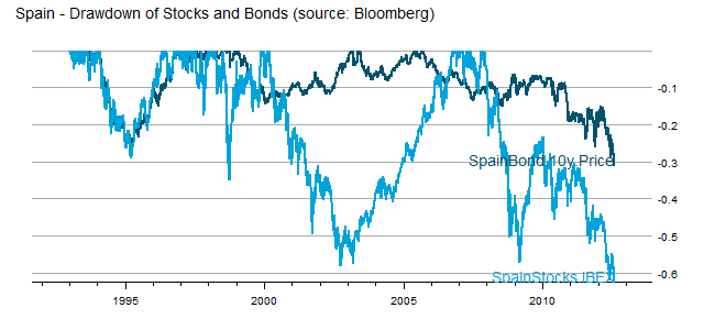
US investors were spoiled by US Treasuries which acted as a near perfect hedge to stocks during the 2008-2009 crisis.  However, in real crisis, bonds rarely offer any comfort, and asset allocation fails (see post Death Spiral of a Country and IMF paper Systemic Banking Crises Database: An Update; by Luc Laeven ... – IMF).  As a very timely example, we can examine Spain, which is not even to crisis level yet.

From TimelyPortfolio

In Spain, there is nowhere to hide, and allocation offers no comfort.

R code in Gist (click raw to copy/paste):

Tuesday, May 15, 2012

Skew of Bonds

As the researchpuzzler highlights in “a bad bet”, US bonds were a popular subject at the CFA Institute Annual Conference.  While US Bonds have been in an amazing 30 year run (see previous posts Lattice Explore Bonds, Bond Market as a Casino Game Part 1, Calmar Ratio 1.37 over the past 20 years), I think many positive skew-chasing market participants are not aware of the frequency of negative skew in bond returns.  As a public service, I thought I should issue a negative skew alert.

From TimelyPortfolio

R code from GIST:

Wednesday, April 18, 2012

Efficient Frontier of Funds and Allocation Systems

I did a very basic experiment in Efficient Frontier of Buy-Hold and Tactical System where I determined the efficient frontier of the S&P 500 with itself transformed by a Mebane Faber 10-month moving average tactical allocation.

The result was interesting, but I did not pursue further.  Now with some inspiration and tools by Systematic Investor, I thought I would extend the post. This time around we will use both the Vanguard U.S. Total Bond Market (VBMFX) and Vanguard U.S. S&P 500 (VFINX) combined with both portfolios determined by tactical methods (moving average, RSI, and omega) and those funds transformed individually by the same tactical methods.  I will as always warn you that this is not advice and large losses are almost guaranteed.  Also, I would like to note that I have checked the 10-month moving average every way possible (even manually in Excel), and it has been incredible on the VFINX since 1990.  Prior to 1990, results were good but nowhere near as amazing.  If I messed up, please let me know.

From TimelyPortfolio

R code from GIST:

Friday, January 13, 2012

Are We Japanese?

Most of the discussion trying to determine if the U.S. is Japan 20 years later focuses on the economy and the stock market.  However, one of the biggest and most persistent correlations between Japan and the U.S. are the Japanese Yen and the U.S. 10 Year Treasury Yield.  I think it is essential to really try to explore this relationship to help determine “How Japanese are we?”  With the US $ in decline, it is hard to imagine the continued persistence of this dynamic. (Thanks reader teramonagi for catching an error.)

From TimelyPortfolio

For additional thoughts on Japan, please see my post Japan Intentional or Accidental Pursuit of Deflation.

R code in GIST:

Thursday, January 12, 2012

Stocks When Bonds are Extreme

In Extreme Bond Returns, I did not consider the context of extreme bond returns, so let’s examine annual returns for the Dow Jones Industrial Average when bonds experience extreme annual returns.  I was very surprised that stocks performed extremely well when bonds also did extremely well.  Unfortunately, 6 of the 8 periods all occurred during the incredible 30 year bond bull 1980-2011, so it is difficult to come to any universal conclusions.

From TimelyPortfolio

And a little different look with lattice

From TimelyPortfolio

R code from GIST:

Quick Update on the Components of Bond Returns

In Real Squeeze, -1% Guaranteed Real Real Return! Yummy??, and Historical Sources of Bond Returns, I offer some historical perspective on the only sources of bond returns: inflation, real returns, and credit.  Assuming no credit risk in US Treasuries (probably not a good assumption given this Bloomberg quote on CDS on US Treasuries), the formula is fixed, and all inputs except inflation are provided ex-ante.  While bond prices can fluctuate wildly (Extreme Bond Returns), the experience over the life of a bond and a bond index is predetermined by the yield to maturity.  Unfortunately, that guaranteed experience in inflation or deflation is not so pleasant.

While everyone should know R, I understand that some readers would prefer an easier route.  FRED as usual comes to the rescue.  Unfortunately though, labeling is not allowed.  The codes can be translated as follows:

  • DBAA = total return on BAA
  • DBAA – (DGS10 – DFII10) = credit return
  • DGS10 – DFII10 = inflation (expected)
  • DGS10 = real return

In the spirit of continuous improvement, here is the chart now using lattice and latticeExtra.

From TimelyPortfolio

R code now in GIST:

Friday, January 6, 2012

Extreme Bond Returns

20 years of data is nowhere near enough to satisfy my insatiable appetite for bigger datasets.  While I showed Record Long Term Treasury Returns with Vanguard’s US Long Treasury mutual fund, its 20 year life is not sufficient to give me comfort risking money.  What happens when we take the Moody’s AAA rate series dating back to 1919?

My opinion changes dramatically when I include 70 more years, and the opportunity is much less certain.

From TimelyPortfolio

R code from GIST:

Wednesday, December 21, 2011

Record Long Term Treasury Returns

I mistakenly assume everyone knows that US Treasury Returns have been extreme in 2011.  As we near the end of the year, I thought it would be beneficial to look at the world’s best performer while incorporating some new graphical techniques.  There is also an opinion (NOT INVESTMENT ADVICE) expressed in one of the charts.

From TimelyPortfolio

R code in GIST:

Friday, December 16, 2011

Lattice Explore Bonds

Since my fifth most popular post has been Bond Market as a Casino Game Part 1, I thought I would use Vanguard Total US Bond Market mutual fund (VBMFX) monthly returns to build our skills in the lattice R package and help visualize the unbelievable run of U.S. bonds (Calmar Ratio 1.37 over the past 20 years).

Although I have primarily graphed with R base graphics, PerformanceAnalytics charts, and ggplot, the lattice package provides an extremely powerful set of charting tools.

We can start with a basic qqplot of the entire set of monthly returns.

From TimelyPortfolio

Then, we can group by year.

From TimelyPortfolio

Or, we can also very easily split each year into its own panel.

From TimelyPortfolio

Here is a little different look with a density plot.

From TimelyPortfolio

Now let’s build boxplots and dotplots.

From TimelyPortfolio

Add an annual dotplot to a boxplot for the entire period.

From TimelyPortfolio

Or we can add a boxplot for each year.

From TimelyPortfolio

See http://timelyportfolio.blogspot.com/search/label/bonds for all my posts on bonds.

R code from GIST: