Showing posts with label slidify. Show all posts

Wednesday, July 30, 2014

Refresh Old rCharts+flickr post with httr and pipeR

The R world keeps moving, and I noticed this old post didn’t work anymore, so I have rewritten it to use Hadley Wickham's httr instead of Rflickr for two reasons:

  1. Rflickr is not working for me anymore
  2. httr is a very helpful package for navigating the "what was scary to me" world of http and oauth

In addition to the changes above, I will also demonstrate use of the pipeR package from Kun Ren who has been quite prolific lately. I feel pretty strongly I will be rewriting this post one more time in the near future (already done) employing his rlist package.

image

Tuesday, July 15, 2014

Palette of Colors from Image %>% ggplot2 %>% rCharts + dimple.js

R should be mature and dying by now, but it is instead alive and vibrant. I experiment with some of the new developments below. It is probably best to copy/paste the intro below in case you do not see the iframe content.

The five purposes of this post/experiment are not really related, but I figured it would be an interesting challenge to combine them.

  1. Highlight the great blog MetaEvoPhyloEcoOmics from Russell Dinnage
  2. Explore the new world of color in R provided by Jo-Fai Chow through rPlotter
  3. Continue Experimenting with magrittr
  4. Examine ggplot_build as proposed by Carson Sievert in Visualizing ggplot2 internals with shiny and D3
  5. Test the use of alternate colors in rCharts and dimple.js

Monday, June 23, 2014

A Whole New R World with Chains and Pipes

I think that the recent shift in the R world to chains and pipes will become permanent.  Even if not, this style of code translates well to Javascript and other languages.  I thought a finance example exploring Fama/French factors with dplyr, magrittr, tidyr, and rCharts would help me learn and think through new workflows.

image

Friday, June 6, 2014

Dispelling Myths of Momentum | AQR Research Factory

In a recent working paper from the prolific AQR Research Factory, the authors seek to dispel ten common myths of momentum investing.  To their credit, they use the fine data publicly available from Kenneth French and use fairly simple metrics to make compelling arguments against the myths and for the momentum factor.  I replicated most of the calculations in R, and then in a blend of replication, summary, and discussion on process, used rCharts, Gmisc, and slidify to create the following writeup.  I hope others find it useful, and it serves a purpose much greater than a re-creation.

For another very detailed summary of the paper, see the post from Gary Antonacci of Optimal Momentum.


image

To make sure this gets seen by those who might not read the paper, I will copy the thanks section below.

Thanks specifically:

Tuesday, April 29, 2014

Slidify Old Book Images from Google Books

I really enjoy reading old books, especially finance books, from Google Books.  With all the changes in the world, their continued relevance amazes me.  For instance, as I prepared for my talk about Wealth and Skill, I rediscovered Developing Financial Skill by Enoch Gowin (1922).  I had forgotten some of the interesting visualizations in the book, and I just had to publicize them.  With some R and slidify, I made a IO2012 slideshow of the images in less than an hour.  Each of the images are linked to their original location in the book if you want the context.  Below are a quote from the book along with an image linking to the slideshow.

It appears in the well-thought-out conclusions of Justice Holmes, Doctor Beecher, President Hadley, Professors Fisher, Moore, and Cohn, Lord Kelvin, and Jesse Livermore that current views concerning speculation have confused it with gambling. Its real nature, however, set forth here, provides food for profitable reflection. Speculators, in reality, whether or not they think of themselves as being such, are all men who look ahead, the risk takers, men prudent, farsighted, "longheaded," forward-looking—to whom business profits sooner or later cannot fail to gravitate.

image

Tuesday, April 15, 2014

Wealth and Skill | A Talk to Students

I enjoyed talking to University of Alabama students this morning about wealth, skill, and luck.  I tried to synthesize a whole lot of research into something meaningful.  Of course, it would not have been possible without rCharts + Slidify.  Thanks Ramnath. Thanks to my good friend Dr. Underwood for the invitation. Click here or on the screenshot below for the show.

image

Wednesday, March 12, 2014

Must See R blog

Last year in my post d3 <- R with rCharts and slidify I predicted:

I have a feeling that nearly every R user of lattice or ggplot2 will be familiar with Ramnath’s brilliance by the end of the year 2013. He might even convince some d3 users to try a little R.

Now Ramnath has started a blog at http://ramnathv.github.io/blog/ with some (not surprisingly) really high quality posts.  I strongly encourage everyone (regardless of favorite language) to check it out.

Monday, February 24, 2014

More on Rebalancing | With Data from Research Affiliates

While on the topic of rebalancing (see Unsolved Mysteries of Rebalancing), I thought it would be good to highlight another good research paper with some quick rCharts analysis.

Arnott, Robert D., et al.
The Surprising Alpha from Malkiel’s Monkey and Upside-Down Strategies
The Journal of Portfolio Management 39.4 (2013): 91-105.

I have embedded in an iframe below, but you might get a better experience by clicking through to this full page.


Friday, February 21, 2014

Unsolved Mysteries of Rebalancing

There is a lot not yet fully understood about rebalancing in portfolio management.  This 2013 paper from Nardon and Kiskiras is the best I have read yet.

Kiskiras, John and Nardon, Andrea
Portfolio Rebalancing: A Stable Source of Alpha
January 18, 2013
Available at SSRN: http://ssrn.com/abstract=2202736

I wanted to share both a summary and extension of the article that I assembled in R with rCharts and slidify.  I embedded it below, but it will look much better if you follow this link http://timelyportfolio.github.io/rCharts_nardon_kiskiras/Industry_French_RebalPrem.html.

Friday, October 25, 2013

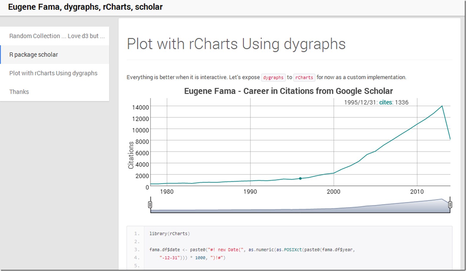
Combining Eugene Fama, rCharts, dygraphs, and scholar

What better way to end the week than to dump a lot of random topics into some experiments.  Here is what happened.

image

Equity Market Risk Premium Around the World

Over the years I have really enjoyed this very thorough IESE Business School survey of market risk premium around the world.

Market Risk Premium and Risk Free Rate Used for 51 Countries in 2013
A Survey with 6,237 Answers

Fernandez, Pablo and Aguirreamalloa, Javier and Linares, Pablo
June 26, 2013
Available at SSRN:
http://ssrn.com/abstract=91416

I thought a little d3/rCharts interactivity might really liven up the error bar plot.  This is far from perfect, but I like the direction in which it is headed.  Click here or on the screenshot below to see it live.

image

Thursday, October 24, 2013

ISO Popularity on Flickr Explore

Not finance, but I figured there might be some out there interested in the pictures from Flickr’s Explore.  In addition to amazing photography, there is an abundance of information.  In the short post below, I use R with rCharts, slidify, and Rflickr to take a look at the distribution of ISO speeds over the last 3 days' of pictures.

image

Wednesday, October 23, 2013

Overfitted Backtests

It has been a while since I discussed testing for overfitting in backtests.  Since then, Marcos López de Prado and coauthors have done some very thoughtful work (see the bottom), and they even started a blog.  Their newest paper builds on discoveries they made in their earlier work, and is an absolute must-read.

Bailey, David H. and Borwein, Jonathan M. and Lopez de Prado, Marcos and Zhu, Qiji Jim

Pseudo-Mathematics and Financial Charlatanism: The Effects of Backtest Overfitting on Out-of-Sample Performance (October 7, 2013)

Available at SSRN: http://ssrn.com/abstract=2308659

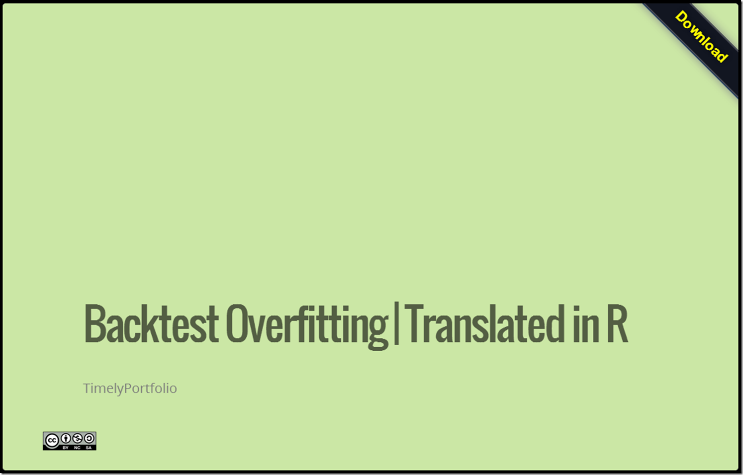
Translating scientific papers into code is not always easy, but I spent some time implementing some of the concepts in R, so that I can understand this more fully.  Just as a word of encouragement to others out there, I am no math genius nor have any advanced math education, so please don’t be intimidated by formulas.  Below you will see a slidify/rCharts discussion demonstrating these first steps.  I plan to research this much more thoroughly.  As always, I blog to interact, so please let me know what you are thinking.

image

Wednesday, August 28, 2013

Applications of Interactivity to Finance

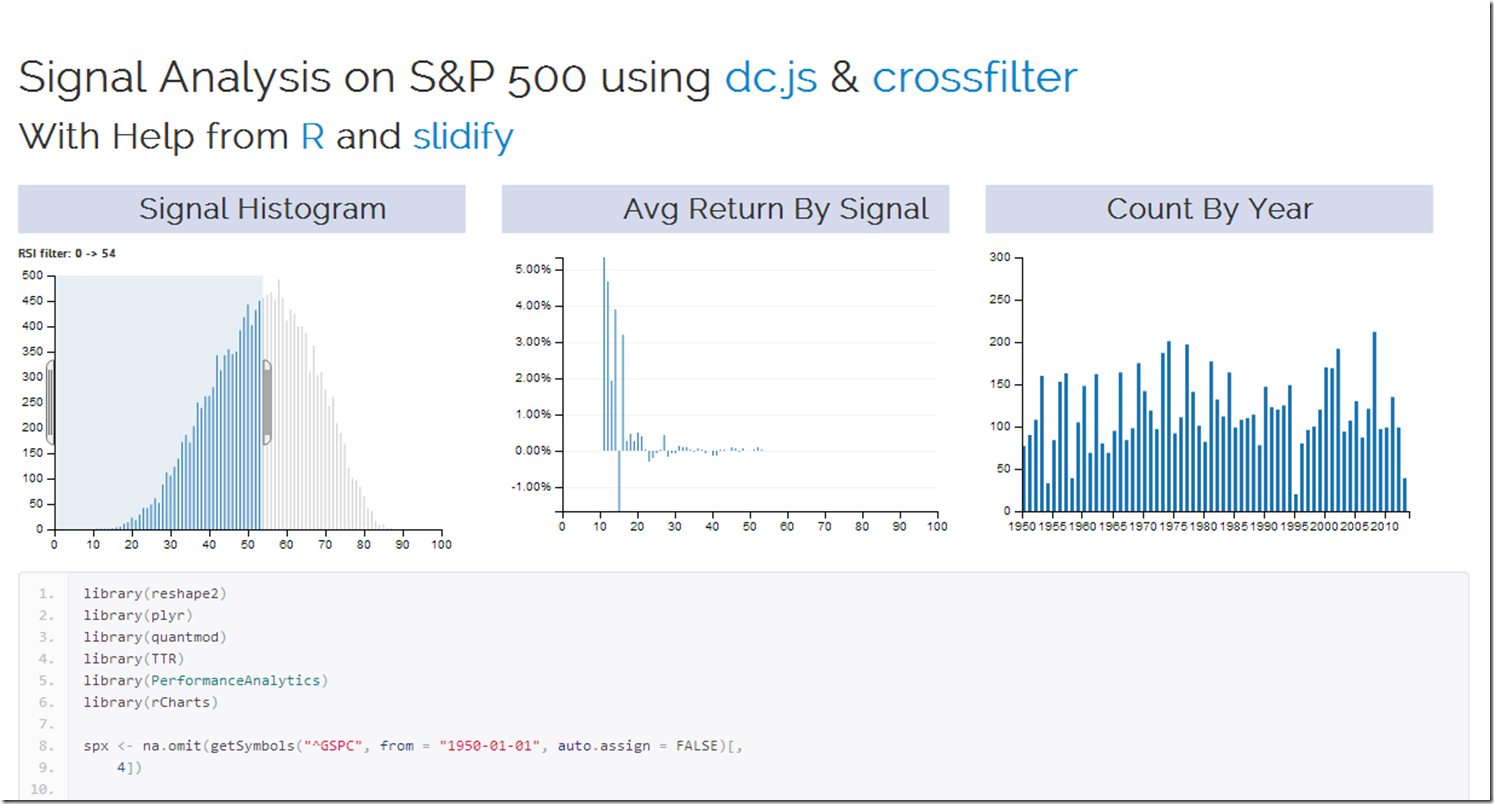
Of the nearly infinite ways of using crossfilter and dc.js in finance, the 2 that immediately came to my mind are signal analysis in system building and money manager analysis in due diligence.  My first very basic experiment explores a commonly known signal (RSI) on the daily S&P 500 since 1950.  Interactivity adds a lot to the experience.  I used R to grab and reshape the data and slidify to make it pretty.  Check it out by clicking here or on the screenshot below.

screenshot

For another very fine example of dc.js and crossfilter in use with AAII Stockpicking strategy data, see this fine site.

image

Wednesday, July 31, 2013

Slidify Did That… and That… and…

In my exuberance for rCharts, I have not expressed my equal love for its older sibling slidify.  I adopted slidify a little more slowly than other R bloggers

because I failed to realize that slidify does way more than just slideshows.  It acts as an almost universal presentation layer for R.   I am guessing that you have already seen some presentations created by slidify.  To make sure that slidify gets the credit in my work, I wanted to provide a list of examples that slidify created straight from R.  In these slidify gives me the power of Bootstrap, Minimal, and Bootplus.

All of these are github repos, so you can see the source and reproduce.

Slidify is easy and intuitive, and it makes HTML/CSS/javascript all accessible to the average R user.  It has become part of my workflow, and I now start with .Rmd more than than I start with .R.

Thursday, June 27, 2013

dimple d3 and rCharts

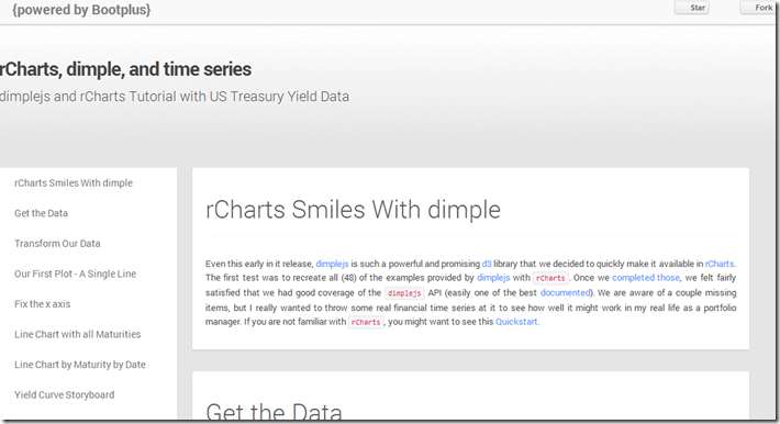
I put together a quick tutorial combining my two favorite things: finance and interactive visualizations.  I show how to use the new dimplejs d3 library with rCharts to create some nice interactive plots of US Treasury yield data.   A screenshot is below.  Go here for the tutorial and here for the code to reproduce.

image

Tuesday, June 11, 2013

Rickshaw d3.js from R with rCharts

Shutterstock’s open source Rickshaw provides a very nice tutorial to get started building interactive time series d3.js charts with Rickshaw.  I just could not resist rebuilding the tutorial but this time ENTIRELY in R with the amazing packages slidify and rCharts.  I have embedded the tutorial below, but it will probably look much better if you go directly to the Github pages version.

The slidify and rCharts author Ramnath Vaidyanathan has done an incredible job and continues to perfect these fine tools.  They completely transformed my workflow and output by allowing both dynamic and interactive components that I can combine into a beautiful document.  Be sure to see him present to this NYHackr meetup  on June 17, 2013.

Friday, May 3, 2013

Old Post with New d3 Life–GARCH and MA Performance

Parallel coordinates become much more useful when they are interactive, so I recreated one of my favorite blog posts "Trend is Not Your Friend" Applied to 48 Industries and convert the chart to a living breathing d3 parallel coordinates chart courtesy of Ramnath Vaidyanathan's rCharts and Kai Chang's d3.parcoords. I will convert the scatter and horizon plots in a later post.  See here for the finished product.  Here or embedded below is the quick Youtube video showing the creation process.

Monday, April 29, 2013

d3 <- R with rCharts and slidify

I believe that the NY Times interactive feature 512 Paths to the White House is one of the best visualizations of all time.  It is even better when we have details on the process of creating this marvel.   Although the graphic is not suited for other data sources (please tell me if this is not correct), I just could not resist using the amazing R packages slidify and rCharts from Ramnath Vaidyanathan to build it from R.  I wouldn’t have even thought it possible until I saw his tutorial Replicating NY Times Interactive Graphic and his demo Visualizing the Reinhart and Rogoff Public Debt Study.

I have a feeling that nearly every R user of lattice or ggplot2 will be familiar with Ramnath’s brilliance by the end of the year 2013. He might even convince some d3 users to try a little R.

Even more amazing is the entire tutorial embedded below (click here if it does not appear) is created in R with slidify, so it is entirely reproducible.  rCharts is early in development, but I urge you to try it out.


Tutorial