require(quantmod)
require(PerformanceAnalytics) getSymbols("SP500",src="FRED")
getSymbols("DGS10",src="FRED")
getSymbols("DTWEXB",src="FRED")
getSymbols("DTWEXM",src="FRED") fedData <- na.omit(merge(SP500,DGS10,DTWEXB))
fedData <- merge(ROC(fedData[,1],type="discrete",n=1),
ROC(fedData[,2]/fedData[,3],type="discrete",n=1))
colnames(fedData) <- c("SP500","US10y/USDBroad") #jpeg(filename="performance since 2007.jpg",quality=100,
# width=6.25, height = 6.25, units="in",res=96)
chart.CumReturns(fedData["2007::"],legend.loc="bottomright",
main="SP500 and US 10y Rate/Broad Dollar Index")
#dev.off() #jpeg(filename="correlation.jpg",quality=100,
# width=6.25, height = 6.25, units="in",res=96)
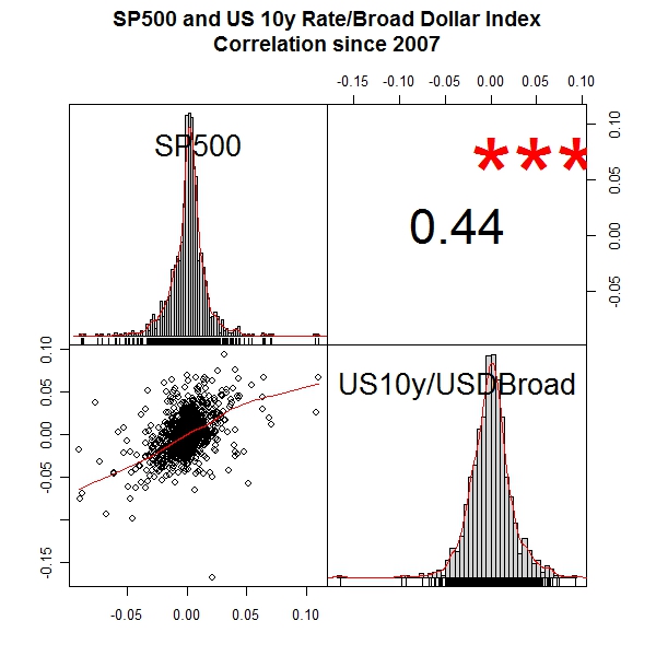
chart.Correlation(fedData["2007::"],
main="SP500 and US 10y Rate/Broad Dollar Index
Correlation since 2007")
#dev.off() #jpeg(filename="rolling correlation.jpg",quality=100,
# width=6.25, height = 6.25, units="in",res=96)
chart.RollingCorrelation(fedData["2007::",1],fedData["2007::",2],n=250,
main="SP500 and US 10y Rate/Broad Dollar Index
Rolling 250 Day Correlation")
#dev.off() fedData <- na.omit(merge(SP500,DGS10,DTWEXM))
fedData <- merge(ROC(fedData[,1],type="discrete",n=1),
ROC(fedData[,2]/fedData[,3],type="discrete",n=1))
colnames(fedData) <- c("SP500","US10y/USDMajor") #jpeg(filename="performance.jpg",quality=100,
# width=6.25, height = 6.25, units="in",res=96)
chart.CumReturns(fedData,legend.loc="topleft",
main="SP500 and US 10y Rate/Broad Dollar Index")
#dev.off() #jpeg(filename="correlation.jpg",quality=100,
# width=6.25, height = 6.25, units="in",res=96)
chart.Correlation(fedData,
main="SP500 and US 10y Rate/Broad Dollar Index
Correlation Since 1973")
#dev.off() #jpeg(filename="rolling correlation.jpg",quality=100,
# width=6.25, height = 6.25, units="in",res=96)
chart.TimeSeries(runMean(runCor(fedData[,1],fedData[,2],n=250),n=250),
main="SP500 and US 10y Rate/Broad Dollar Index
Rolling 250 Day Average of Rolling 250 Day Correlation")
#dev.off()


Hi there,
ReplyDeleteThese scatter plots look to not be reflected by the regression line you've used.
Consider having a look at them when using a 0.5 quantile regression (you can use the rq function from the quntreg package), to see how different the results are.
Cheers,
Tal