Tuesday, March 25, 2014

Interactive Discovery of Research Affiliates JoPM Paper

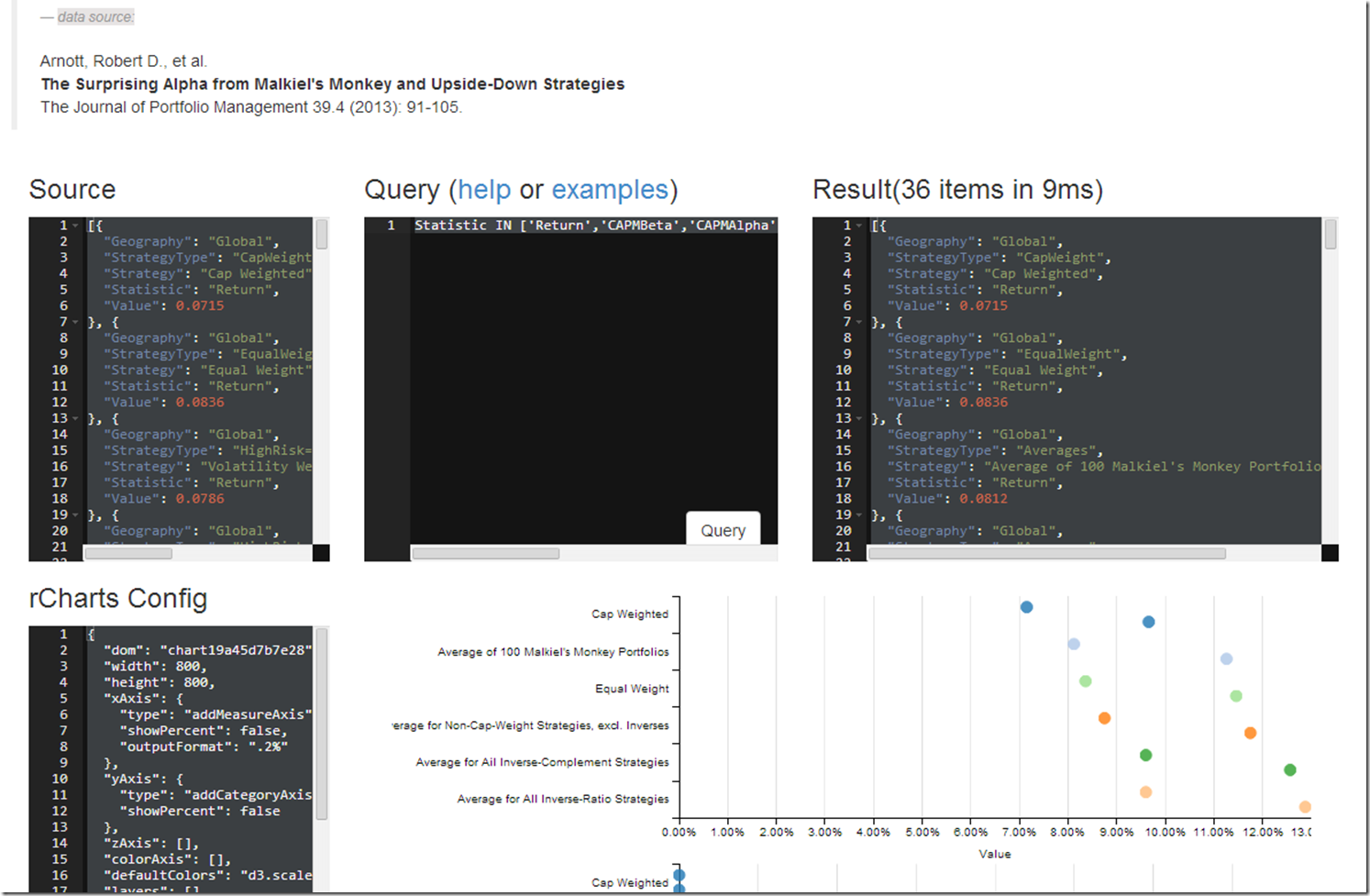
In my previous post More on Rebalancing | With Data from Research Affiliates , I did some really basic visualizations, but I thought this data would be great for some more powerful interactive discovery using an interesting javascript SQL-like query language objeq along with the d3.js charting library dimple.js.  Next, I hope to extend to use lodash or lazy.js.

This exercise helps me think through a couple of lingering issues:

  1. After we create the plot, do we need to maintain the overhead of a connection with R using something like shiny, or can we port some of the aggregation, filtering, and calculations to javascript as we did in this example?
  2. How can we use the rCharts templates with other languages such as Python, Ruby, and Javascript?
  3. What can we do with some more specific and customized page templates for rCharts?
  4. Is a Lyra-like interface better or will this type interface work for more advanced users?

Help me with your thoughts after you have played with the example shown by the screenshot below.image

Thursday, March 20, 2014

Is It Structurally Broke? bfast breakpoints

The R package bfast enthralls me.  I have posted 3 times on bfast but still did not understand the impact of the h parameter.  Armed now with some d3.js, angular.js, and rCharts I thought I could see it better with a fancy interactive visualization.  Here is the result when applied to the S&P 500 monthly price series since 1950.  You should see it embedded in an iframe below.  For the full effect, click here.

Friday, March 14, 2014

Bond Shop Views with dimplejs and rCharts

I saw this chart in a presentation and thought I could make it better and interactive.  Here is a short article on the iteration process.  Click on the screenshot below or here for the full post.

Note: these are not my views and this is not financial advice.  I did not name the original source of the graphic.  If you are the source, and you happen to see this, let me know if you would like me to name you.

image

Wednesday, March 12, 2014

Must See R blog

Last year in my post d3 <- R with rCharts and slidify I predicted:

I have a feeling that nearly every R user of lattice or ggplot2 will be familiar with Ramnath’s brilliance by the end of the year 2013. He might even convince some d3 users to try a little R.

Now Ramnath has started a blog at http://ramnathv.github.io/blog/ with some (not surprisingly) really high quality posts.  I strongly encourage everyone (regardless of favorite language) to check it out.

Monday, February 24, 2014

More on Rebalancing | With Data from Research Affiliates

While on the topic of rebalancing (see Unsolved Mysteries of Rebalancing), I thought it would be good to highlight another good research paper with some quick rCharts analysis.

Arnott, Robert D., et al.
The Surprising Alpha from Malkiel’s Monkey and Upside-Down Strategies
The Journal of Portfolio Management 39.4 (2013): 91-105.

I have embedded in an iframe below, but you might get a better experience by clicking through to this full page.


Friday, February 21, 2014

Unsolved Mysteries of Rebalancing

There is a lot not yet fully understood about rebalancing in portfolio management.  This 2013 paper from Nardon and Kiskiras is the best I have read yet.

Kiskiras, John and Nardon, Andrea
Portfolio Rebalancing: A Stable Source of Alpha
January 18, 2013
Available at SSRN: http://ssrn.com/abstract=2202736

I wanted to share both a summary and extension of the article that I assembled in R with rCharts and slidify.  I embedded it below, but it will look much better if you follow this link http://timelyportfolio.github.io/rCharts_nardon_kiskiras/Industry_French_RebalPrem.html.

Monday, January 27, 2014

Emerging Currencies with rCharts + FRED

I liked this chart a lot.

I thought I would show how we can semi-replicate it in R with rCharts.  Here it is with the currencies that are on FRED with dimplejs.

… and here with nvd3.

Code to replicate from Github Gist:

Tuesday, January 21, 2014

What Do the Odds Say? Buy Stocks Begin of Year?

At some point in 2013, I read (can’t remember where) that 2012 was a rare year for the S&P 500  where no day’s closing  price was lower than the closing price  for the first day.  So if you bought on the first day of 2012, you never had a loss for the entire year.  Well, the same thing happened 2013, so I just had to do some analysis.  Below is a dimple.js chart built using rCharts with the minimum close price for the year divided by the close price for the first day of that year.

data source: Yahoo! Finance, Standard & Poors

Thursday, January 16, 2014

Retail Relative Strength

So back before Thanksgiving I did a post Something to Think About Before Black Friday | rChart + dygraphs.  Well since then I have noticed that Retail relative strength has deteriorated considerably.  I thought it would be a good time to use good old bfast (see posts) to look for a structural breakpoint.  Below is the output.  And yes, I do plan to make interactive eventually with rCharts.

image

The remainder is what I think is very interesting.

image

Code:

Wednesday, January 15, 2014

Popularity Contest

Although I am sure most of the bloggers that discuss R on R-bloggers are not all that concerned with popularity, I thought it would be interesting to analyze (with R and rCharts, of course) the popularity of these bloggers using Feedly’s API.


After building the chart, I got to thinking about these two excellent posts about the nature of blog popularity.

How many more R-bloggers posts can I expect? by Markus Gesmann

Blog posts' half life - why bother? by Bruce McPherson

Clearly not posting for a month (me) is not the way to fame and glory as Google search becomes the most common referrer.

image

Also, is Bruce McPherson onto something when he points out that the nature of a blog does not lend to permanence?  Should every blog, especially educational ones, also have a different view of the same content that lends itself better to permanence?

For those that missed me, I’m back.

R code to get Feedly API data and build dimplejs chart: Github repo