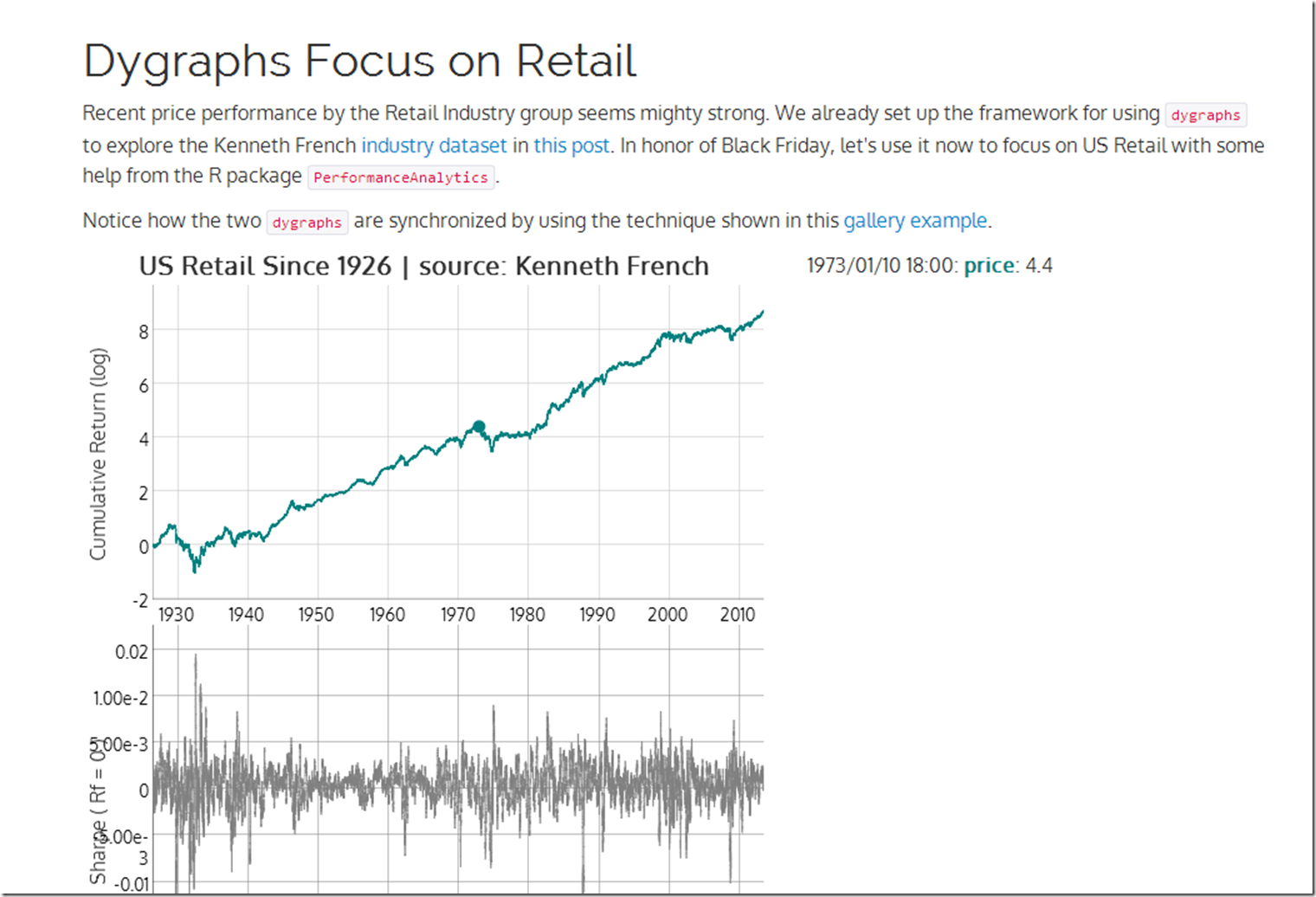
US Retail stocks have been killing it. Since the holiday season starting with Black Friday is so important to retail, let’s look at the US Retail industry price and Sharpe ratio using R rCharts and Performance analytics + javascript dygraphs. Thanks Kenneth French once again for the dataset.
Wednesday, November 27, 2013
Friday, November 15, 2013
Dygraphs with Bigger Data | US Industries from Kenneth French
After seeing the announcement by @lauraegerdal of the SEC’s use of dygraphs to visualize market structure, I was inspired to experiment more with the great dygraphs + rCharts. I really wanted to see how responsive dygraphs would be with a fairly large dataset. Some Kenneth French US Industry data seemed just big enough to get a good feel for dygraph’s digestive abilities. See it in action here or click on the screenshot below.
Thursday, November 7, 2013
BIS Derivatives Update
The newest BIS Derivatives update is out, so I updated my fork of Mike Bostock’s example with the most recent data. I will only say that these numbers do not inspire much confidence.
Wednesday, November 6, 2013
EXIF with R | rCharts + catcorrjs + exiftool
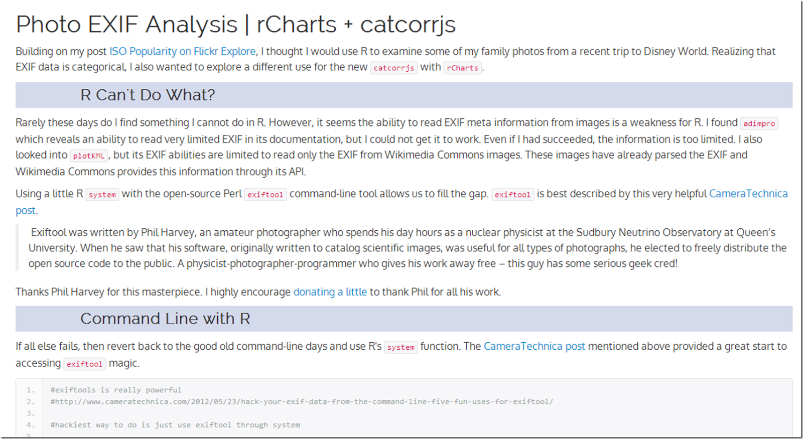
I wanted to analyze the EXIF information in a whole group of photos from a recent trip to Disney World. Of course I decided to use R and throw in some interactive charting with d3.js, rCharts, and and the new catcorrjs. Integrating the amazing and open-source Perl exiftool was a fun bonus. Click here or on the screenshot below for all the details.
On the trip I was baffled by some bad pictures. I realized the reason was ISO 6400, which was unintentionally set by the ring on our s100 when handing the camera to strangers for group shots.
Friday, October 25, 2013
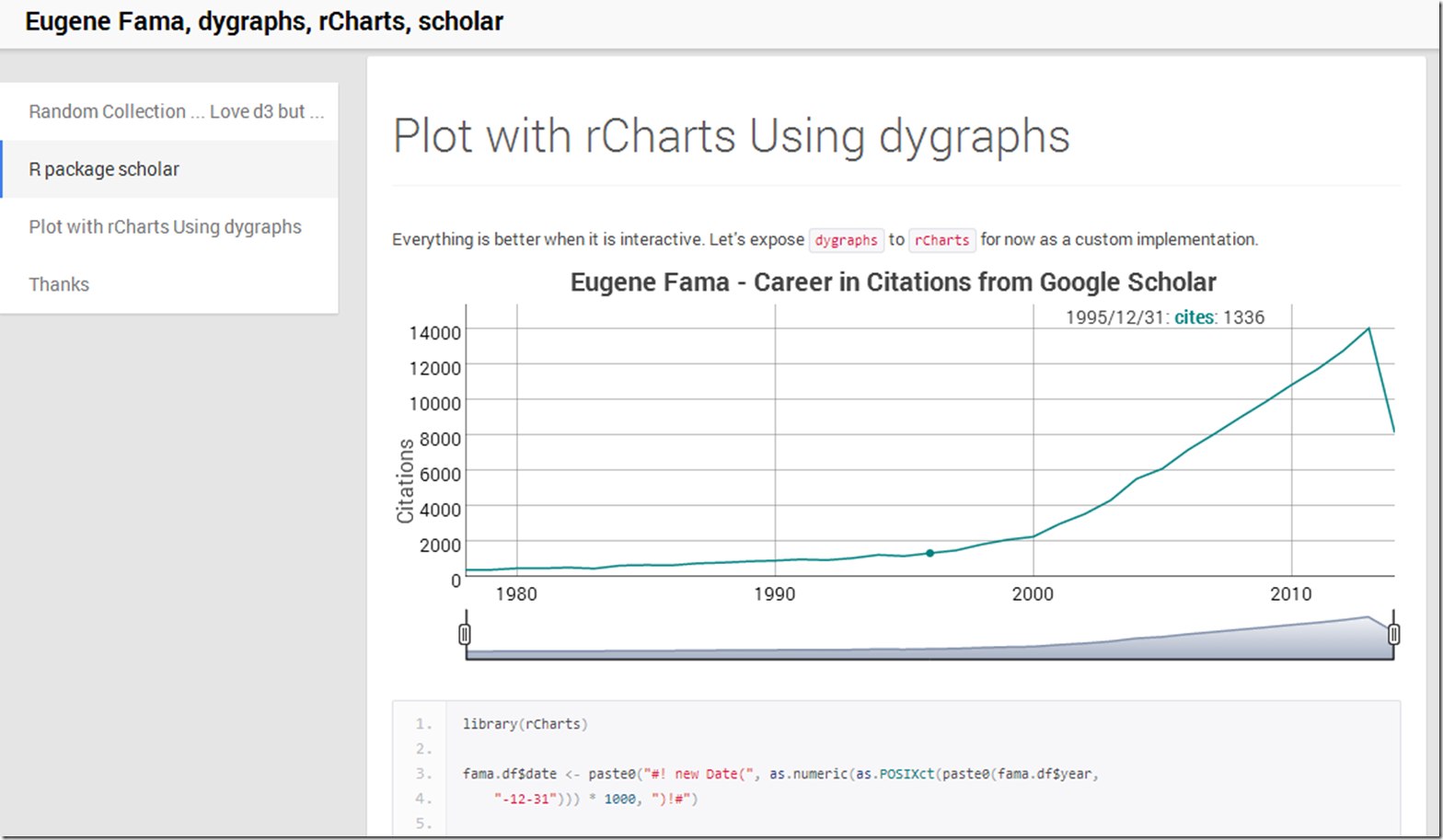
Combining Eugene Fama, rCharts, dygraphs, and scholar
What better way to end the week than to dump a lot of random topics into some experiments. Here is what happened.
Equity Market Risk Premium Around the World
Over the years I have really enjoyed this very thorough IESE Business School survey of market risk premium around the world.
Market Risk Premium and Risk Free Rate Used for 51 Countries in 2013
A Survey with 6,237 AnswersFernandez, Pablo and Aguirreamalloa, Javier and Linares, Pablo
June 26, 2013
Available at SSRN: http://ssrn.com/abstract=91416
I thought a little d3/rCharts interactivity might really liven up the error bar plot. This is far from perfect, but I like the direction in which it is headed. Click here or on the screenshot below to see it live.
Thursday, October 24, 2013
ISO Popularity on Flickr Explore
Not finance, but I figured there might be some out there interested in the pictures from Flickr’s Explore. In addition to amazing photography, there is an abundance of information. In the short post below, I use R with rCharts, slidify, and Rflickr to take a look at the distribution of ISO speeds over the last 3 days' of pictures.
Wednesday, October 23, 2013
Overfitted Backtests
It has been a while since I discussed testing for overfitting in backtests. Since then, Marcos López de Prado and coauthors have done some very thoughtful work (see the bottom), and they even started a blog. Their newest paper builds on discoveries they made in their earlier work, and is an absolute must-read.
Bailey, David H. and Borwein, Jonathan M. and Lopez de Prado, Marcos and Zhu, Qiji Jim
Pseudo-Mathematics and Financial Charlatanism: The Effects of Backtest Overfitting on Out-of-Sample Performance (October 7, 2013)
Available at SSRN: http://ssrn.com/abstract=2308659
Translating scientific papers into code is not always easy, but I spent some time implementing some of the concepts in R, so that I can understand this more fully. Just as a word of encouragement to others out there, I am no math genius nor have any advanced math education, so please don’t be intimidated by formulas. Below you will see a slidify/rCharts discussion demonstrating these first steps. I plan to research this much more thoroughly. As always, I blog to interact, so please let me know what you are thinking.
Wednesday, October 9, 2013
Tuesday, October 8, 2013
R in Raw
This nice little tool Raw from DensityDesign transforms text from your clipboard to d3. For those yearning to access Raw from R, here is an easy way to do it.
Use this function read.excel from StatisticallySignificant’s post Copying Data from Excel to R and Back. Once you run the function, your data will be copied tab-delimited to the clipboard. Then simply paste the data into Raw and make some d3 charts.
rCharts goes Polar
The new micropolar library from Chris Viau, author of
gives us reusable charts with polar coordinates for d3.js. In testament to rCharts design, Ramnath Vaidyanathan integrated micropolar with rCharts in less than 30 minutes. I don’t use polar coordinates much, so I wrote this quick little comparison of Cartesian and Polar systems using simulated money manager returns to get me up to speed.
Friday, October 4, 2013
Simplicity Explained by The Author
Source is usually best explained by the source. Ramnath Vaidyanathan provides an excellent look under the hood in his tutorial on rCharts explaining how he integrates the new d3 library uvCharts.
If you want to explore further, here is a list of my posts on using custom d3 with rCharts: rCharts Remake of NYT, Exploring Networks with Sankey, rCharts version of d3 horizon, d3 <- R with rCharts and slidify. I hope you are inspired to add your own rCharts implementation.
Friday, September 27, 2013
Wednesday, September 25, 2013
Ode to Systematic Clusters
Extending the d3 remixes of the fine work at Systematic Investor, I thought it woud be fun to do some dimple.js and nvd3 scatterplots of clusters of PIMCO mutual funds. As always, I welcome thoughts, comments, and suggestions. Click here or on the screenshot below.
Thursday, September 19, 2013
Genetics to Finance - Amazed By Open Source d3 and r
Open source amazes me by the speed of distribution and the power of iteration. Take for example the very fine combination of R and d3 provided here at http://www.biostat.wisc.edu/~kbroman/D3/. The correlation matrix with scatterplot instantly struck me as a wonderful way to liven up Pretty Correlation Map of PIMCO Funds. Since it is open and MIT licensed, within an hour I was able to come up with this.
Please take it and make it even better. Thanks so much to Karl Broman for this great work.
Thursday, September 12, 2013
rCharts | PerformanceAnalytics Tables + Systematic Investor Cluster
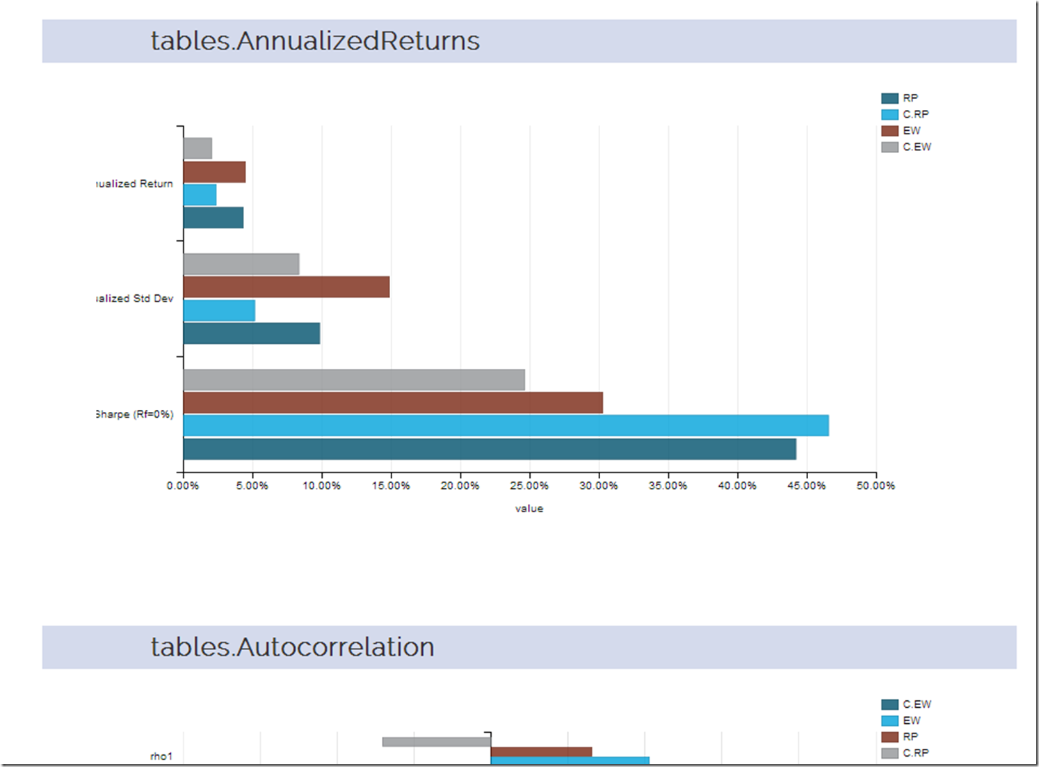
I thought a good extension of the last post d3-ify Systematic Investor Cluster Weight would be to analyze the returns with every table that PerformanceAnalytics offers. Since d3 interactive charts are way more fun than tables, let’s plot each table with dimplejs and rCharts. Click here or on the screenshot below to see the result.
Monday, September 9, 2013
d3-ify Systematic Investor Cluster Weight
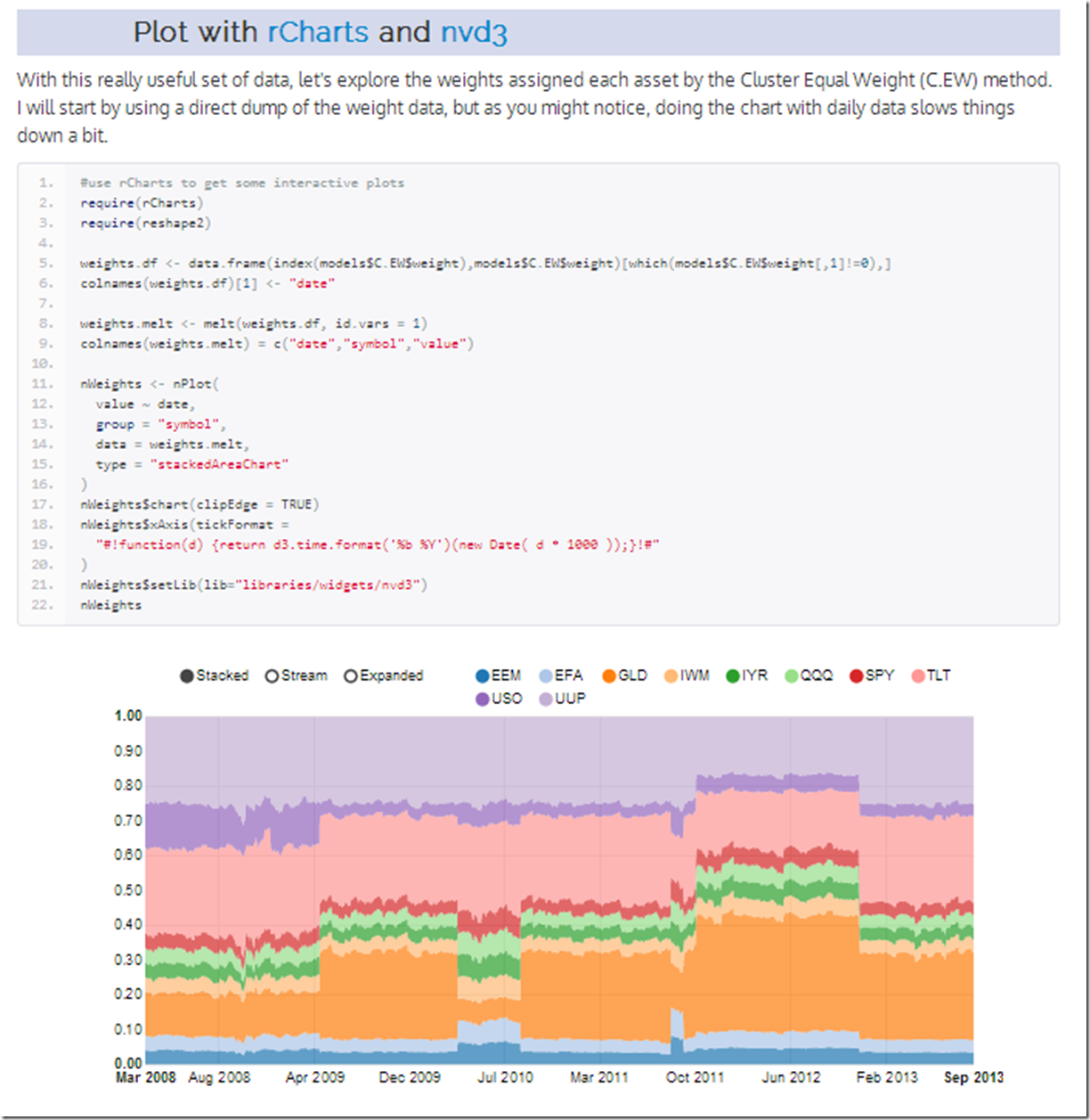
I have posted before about the brilliant R/finance work being done at Systematic Investor. I just had to see what his cluster work would look like with d3 interactivity. Click on the screenshot below or here to see an interactive recreation of his post.
Wednesday, August 28, 2013
Applications of Interactivity to Finance
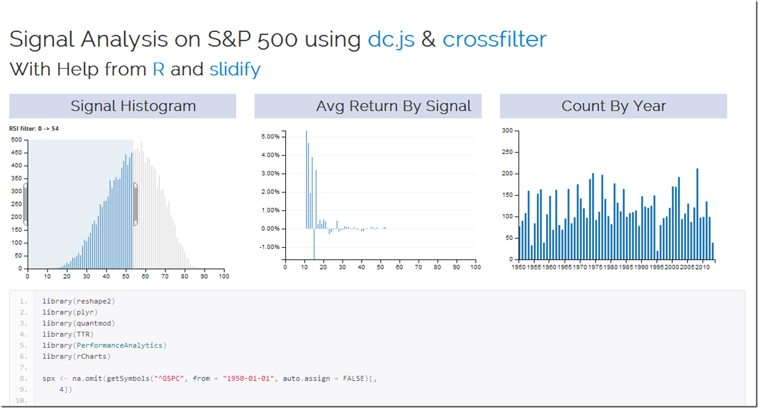
Of the nearly infinite ways of using crossfilter and dc.js in finance, the 2 that immediately came to my mind are signal analysis in system building and money manager analysis in due diligence. My first very basic experiment explores a commonly known signal (RSI) on the daily S&P 500 since 1950. Interactivity adds a lot to the experience. I used R to grab and reshape the data and slidify to make it pretty. Check it out by clicking here or on the screenshot below.
For another very fine example of dc.js and crossfilter in use with AAII Stockpicking strategy data, see this fine site.
Wednesday, August 14, 2013
gridSVG Multi-line Data Bind with d3–US Treasury Yields
If you have not read the other posts on gridSVG and d3, I recommend reading those before progressing to this one.
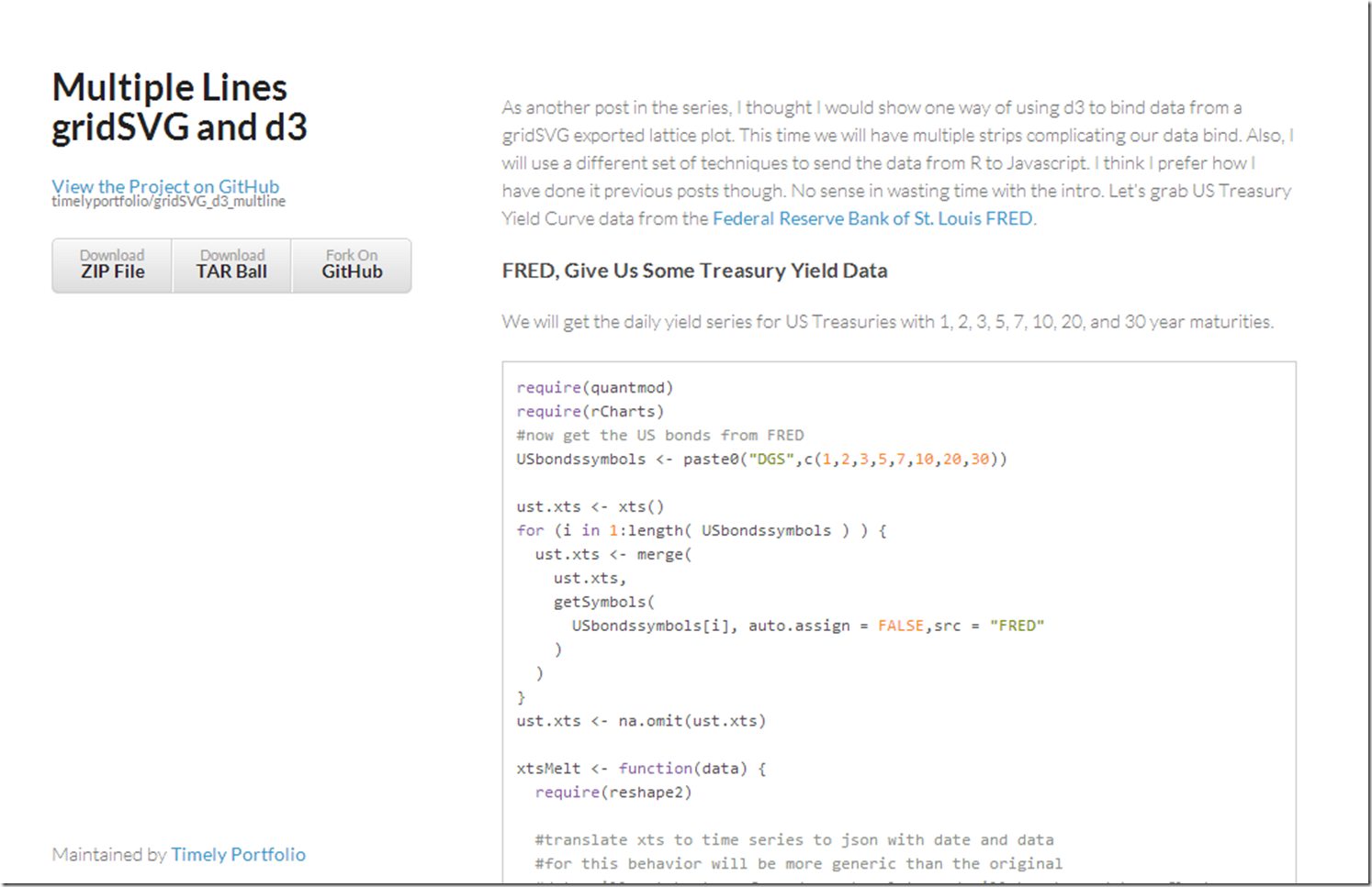
Facets or strips are one of my favorite features of lattice and ggplot2, so of course I want to extend our d3 reverse data bind to support these small multiples. Let’s see one way of accomplishing this. For a short explanation of the process, click here or on the screenshot below. If you just like yield curve data, I think you will enjoy the graph which I have embedded below.
Tuesday, August 13, 2013
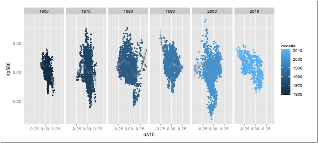
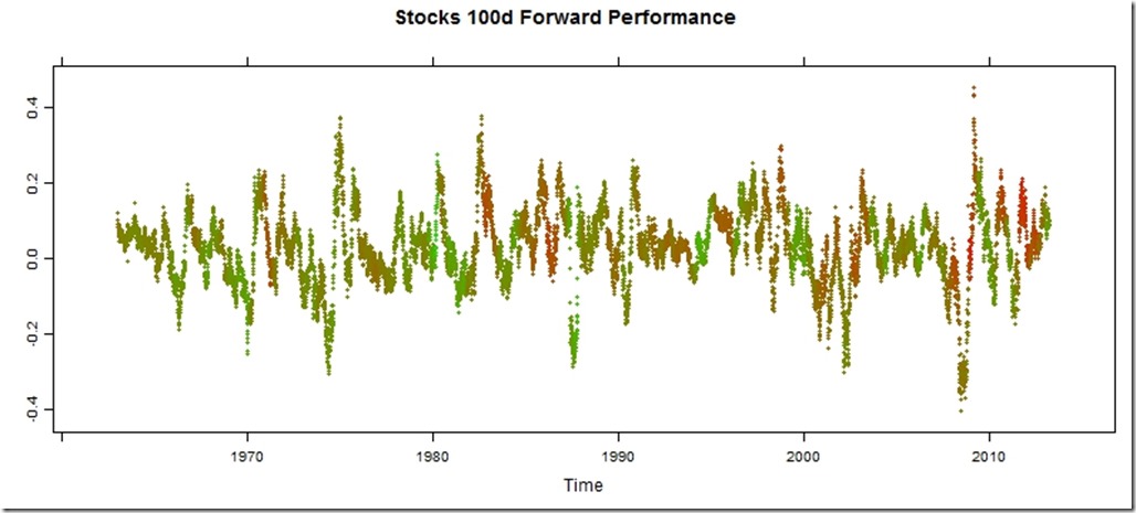
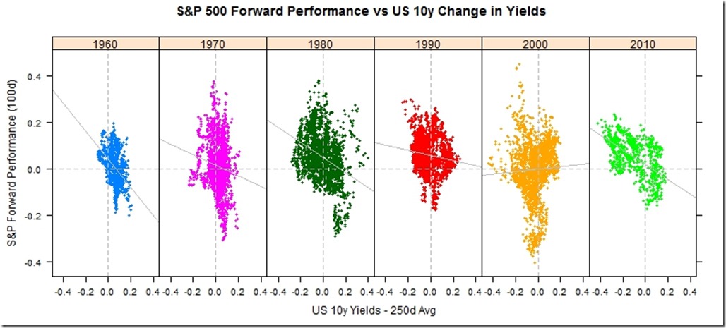
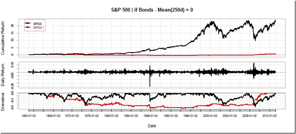
Stocks and Bonds Behavior by Decade
I struggled with whether or not I should even post this. It is raw and ugly, but it might help somebody out there. I might use this as a basis for some more gridSVG posts, but I do not think I have the motivation to finish the analysis.
Code:
require(latticeExtra)
require(quantmod)
require(PerformanceAnalytics)
getSymbols("SP500",src="FRED")
US10 <- na.omit(getSymbols("DGS10",src="FRED",auto.assign=FALSE))
stocksBonds <- na.omit(
merge(
lag(SP500,k=-100)/SP500-1, #forward 100 day sp500 perf
US10 / runMean(US10,n=250) - 1, #us10 yield - 250 day average
SP500
)
)
#get the decade
stocksBonds$decade = as.numeric(substr(index(stocksBonds),1,3)) * 10
#name columns
colnames(stocksBonds) <- c("sp500","us10","SP500","decade")
#get a color ramp for our change in us10 year yields
linecolors <- colorRamp(
c("red","green"),
interpolate="linear",
space="rgb"
)((stocksBonds[,2]+0.5))
xyplot(
stocksBonds[,1],
col=rgb(linecolors,max=255),
type="p",pch=19,cex=0.5,
main = "Stocks 100d Forward Performance"
)
xyplot(
sp500 ~ us10 | factor(decade),
groups = decade,
data = as.data.frame(stocksBonds),
pch=19,
cex = 0.5,
scales = list(
x = list(tck=c(1,0),alternating=1)
),
layout=c(6,1),
main = "S&P 500 Forward Performance vs US 10y Change in Yields",
ylab = "S&P Forward Performance (100d)",
xlab = "US 10y Yields - 250d Avg"
) +
latticeExtra::layer(panel.abline(h=0,col="gray",lty=2)) +
latticeExtra::layer(panel.abline(v=0,col="gray",lty=2)) +
xyplot(
sp500 ~ us10 | factor(decade),
col="gray",
data = as.data.frame(stocksBonds),
panel = panel.lmline)
require(ggplot2)
ggplot(data = data.frame(stocksBonds), aes(y=sp500, x= us10,colour=decade))+
geom_point()+facet_wrap(~decade,ncol=6)+geom_smooth()
charts.PerformanceSummary(
merge(
ROC(stocksBonds[,3],n=1,type="discrete"),
ROC(stocksBonds[,3],n=1,type="discrete") * (stocksBonds[,2]>0)
),
main="S&P 500 | if Bonds - Mean(250d) > 0"
)
Friday, August 9, 2013
PIMCO Rolling Correlation, d3, R, gridSVG, lattice | Gets An Axis
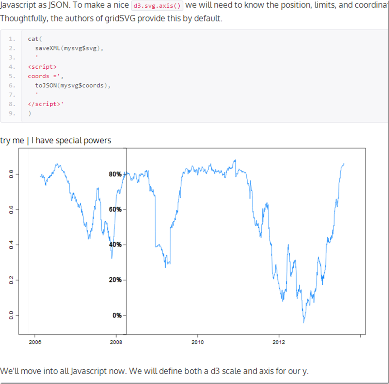
Where else will you hear Pimco, rolling correlation, R, gridSVG, lattice, and d3 all in one post? Let’s mix them all together to see what might happen. For those here for the geekery, we will add a d3 axis for our y and it will follow the mouse. For those who care nothing about d3 and R, you might like the chart too since it plots the 90 day rolling correlation between Pimco Total Return and Pimco All Asset Authority . Click here if or on the screenshot below. to see the live version.
At some point I will find the limits of my creativity and knowledge. Please give me some ideas.
Thursday, August 8, 2013
R/gridSVG/d3 Line Reverse Data Bind
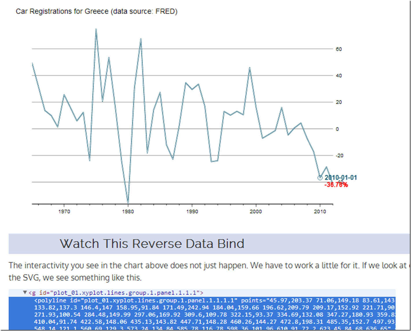
I veer from finance to tech, so let’s use some data from FRED/OECD this time. I do not think I need to comment much on what has happened to New Car Registrations in Greece.
Reverse data binding a line plot from ggplot2 or lattice is slightly more difficult than what we saw in the last post I Want ggplot2/lattice and d3 (gridSVG–The Glue). Here is a quick tutorial on one way we can accomplish this. Click on this link or the screenshot below.
As always, this is fully reproducible. See the code on Github.
R on Your iPhone (Not the Way You Think)
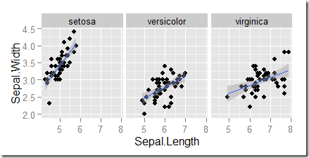
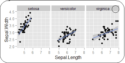
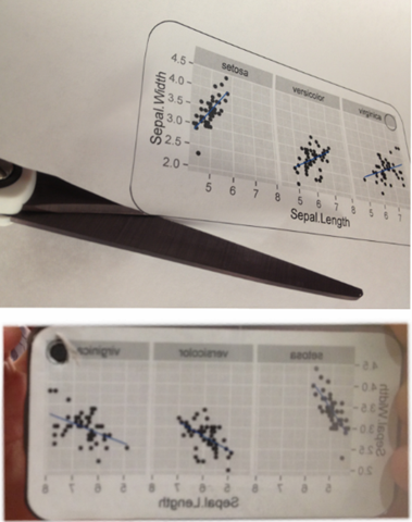
If you really love R, you should put it on your iPhone. Apple gives the measurements for its products here. Let's use a little grid magic with ggplot2 to make a chart for the back of your iphone similar to this.
require(grid)
require(ggplot2)

# thanks for the Apple measurements
# https://developer.apple.com/resources/cases/
x11(
  height = as.numeric(convertX(unit(58.55, "mm"), "in")),
  width = as.numeric(convertX(unit(115.15,"mm"), "in"))
)

# seems Rstudio make it hard to select a dev use until the new dev is
# Active
dev.set(which = dev.next())
# draw anything to activate our window
grid.text("my R iphone case")
# draw your most beautiful plot with ggplot2 or lattice a good example
# thanks http://sharpstatistics.co.uk/r/ggplot2-guide/
p <- ggplot(iris, aes(Sepal.Length, Sepal.Width)) + geom_point()
p + facet_grid(. ~ Species) + stat_smooth(method = "lm")
# draws rectangular and circular(camera) cutout
grid.roundrect(
  y = unit(28.975, "mm"),
  x = unit(57.275, "mm"),
  height = unit(57.95, "mm"),
  width = unit(114.55, "mm"),
  r = unit(8.17, "mm"),
  name = "iphoneback"
)
grid.circle(
  y = unit(49.78, "mm"),
  x = unit(106.45, "mm"),
  r = unit(3.46, "mm")
)
Cut and insert in or paste/tape to your case.
A little more seriously, this is a good way to test how your graph might appear on an iOS device if you have the need. Just use the screen measurements from the Apple specs.
Wednesday, August 7, 2013
ggplot2 meet d3
With great libraries, just a couple lines of code can do amazing things. For instance, let’s limit ourselves to less than 10 lines of code and see what ggplot2 and d3 can do. We will use gridSVG as discussed in yesterday’s post I Want ggplot2/lattice and d3 (gridSVG–The Glue) to expose ggplot2 to d3. Thanks Hadley Wickham, Mike Bostock, Paul Murrell, Simon Potter, and George Bull/Sharp Statistics.
If the iframe does not appear below, click here.
Just think what we can do if we remove our 10 line code limit.
#get the latest version of gridSVG
#install.packages("gridSVG", repos="http://R-Forge.R-project.org")

require(ggplot2)
require(gridSVG)

#draw a ggplot2 graph
#thanks http://sharpstatistics.co.uk/r/ggplot2-guide/
p <- ggplot(iris, aes(Sepal.Length, Sepal.Width)) + geom_point()
p + facet_grid(. ~ Species) + stat_smooth(method = "lm")

#define a simple html head template
htmlhead <-
'<!DOCTYPE html>
<head>
  <meta charset = "utf-8">
  <script src = "http://d3js.org/d3.v3.js"></script>
</head>

<body>
'

#use gridSVG to export our plot to SVG
mysvg <- grid.export("panzoom1.svg")


#define a simple pan zoom script using d3
panzoomScript <-
'  <script>
    var svg = d3.selectAll("#gridSVG");
    svg.call(d3.behavior.zoom().scaleExtent([1, 8]).on("zoom", zoom))

    function zoom() {
      svg.attr("transform", "translate(" + d3.event.translate + ")scale(" + d3.event.scale + ")");
    }
  </script>
</body>
'

#combine all the pieces into an html file
sink("panzoom_ggplot2.html")
cat(htmlhead,saveXML(mysvg$svg),panzoomScript)
#close our file
sink(file=NULL)
Tuesday, August 6, 2013
I Want ggplot2/lattice and d3 (gridSVG–The Glue)
I really like interactive graphics, especially when they come straight from R. I posted a lot about rCharts, but it is not the only way. In my mind there are three types of glue to link R to SVG/HTML/Javascript:
-
Let R do the data and then send the data to Javascript to create the SVG graphics. This is the process employed by rCharts, clickme,d3network, googleVis, gigvis, and tabplotd3.
-
Let R both do the data and render the graph then export the SVG to get interactivity from Javascript. We see this with the new and improved gridSVG and the predecessor SVGAnnotation.
-
Use 1. or 2. and then maintain bidirectional communication between R and Javascript through shiny, Rook, or some other web server type interface.
Let’s think about method 2. R has ggplot2 and lattice. Javascript has d3. I want both.
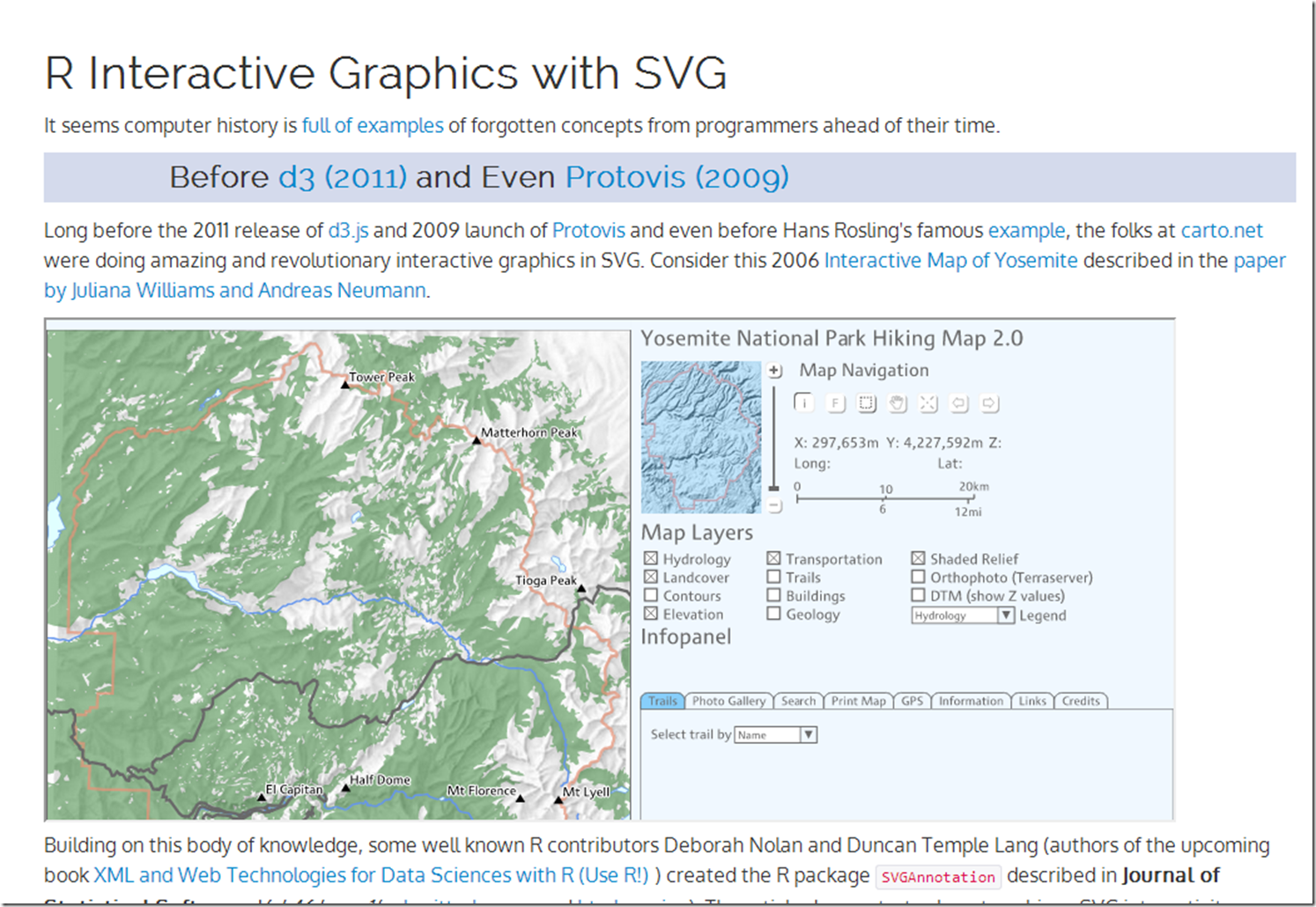
We R users are very spoiled by the ggplot2 and lattice engines that rival or beat the plotting libraries of any language. Wouldn’t it be nice to have all the power of these engines to create interactive graphs? Well, Paul Murrell, the author of grid (platform of ggplot2 and lattice), wrote gridSVG to do just that. Over the last couple of years, Simon Potter under the guidance of Murrell has refined gridSVG for his honours project. It is now a full-featured robust package capable of sending even your most complicated ggplot2 and lattice masterpieces to SVG. gridSVG can do amazing things on his own, but I, of course, wanted to combine gridSVG with d3. Click here or on the screenshot below to see a walkthrough applying a little gridSVG glue to ggplot2 and d3.
Thanks to Paul Murrell, Simon Potter, Hadley Wickham, Mike Bostock, Duncan Temple Lang, Deborah Nolan, Juliana Williams, Andreas Neumann, Ramnath Vaidyanathan and all the folks along the way that have made this possible.
Wednesday, July 31, 2013
Slidify Did That… and That… and…
In my exuberance for rCharts, I have not expressed my equal love for its older sibling slidify. I adopted slidify a little more slowly than other R bloggers
- Create elegant, interactive presentations from R with Slidify
- Interactive slides with googleVis on shiny
because I failed to realize that slidify does way more than just slideshows. It acts as an almost universal presentation layer for R. I am guessing that you have already seen some presentations created by slidify. To make sure that slidify gets the credit in my work, I wanted to provide a list of examples that slidify created straight from R. In these slidify gives me the power of Bootstrap, Minimal, and Bootplus.
- http://timelyportfolio.github.io/rCharts_dimple/dimple_timeseries.html
- http://timelyportfolio.github.io/rCharts_nyt_home_price/
- http://timelyportfolio.github.io/rCharts_d3_sankey/example_build_network_sankey.html
- http://timelyportfolio.github.io/rCharts_time_series/history.html
- http://timelyportfolio.github.io/rCharts_512paths/
- http://timelyportfolio.github.io/rCharts_rickshaw_gettingstarted/index.html
- http://timelyportfolio.github.io/rCharts_morris_gettingstarted/index.html
- http://timelyportfolio.github.io/rCharts_morris_standalone/
All of these are github repos, so you can see the source and reproduce.
Slidify is easy and intuitive, and it makes HTML/CSS/javascript all accessible to the average R user. It has become part of my workflow, and I now start with .Rmd more than than I start with .R.
Friday, July 26, 2013
ggplot2 with Noam Ross theme
When I first saw Noam Ross' blog post "The null model for age effects with overdispersed infection", I immediately liked the look of his ggplot2 graphs. I was even more delighted when I discovered that he has made his theme available on github. Even though I am all into rCharts, I still love a beautiful publication quality R graphic.
Below is some code to combine Noam Ross' theme with autoplot.zoo which makes plotting xts/zoo objects with ggplot2 easy.
require(ggplot2)
require(grid)
require(RColorBrewer)
require(quantmod)

# get closing values for S&P 500 from Yahoo! Finance
sp500 <- getSymbols("^GSPC", auto.assign = FALSE)[, 4]
sp500$ma <- runMean(sp500, n = 200)

colnames(sp500) <- c("S&P500", "200d Mov Avg")

# get noam ross ggplot2 theme from github
source("https://raw.github.com/noamross/noamtools/master/R/theme_nr.R")
# for some reason on my computer panel.background still shows up gray this
# fixes it but might not be necessary for others
theme_nr <- theme_nr() + theme(panel.background = element_rect(fill = "white")) +
    theme(plot.title = element_text(size = rel(2), hjust = -0.05, vjust = -0.3)) +
    theme(plot.margin = unit(c(1, 1, 2, 1), "cm"))

autoplot(sp500, facets = NULL) + theme_nr + theme(legend.position = "none") +
    scale_colour_manual(values = brewer.pal("Blues", n = 9)[c(6, 3)]) + geom_line(size = 1.15) +
    xlab(NULL) + ggtitle("S&P 500 (ggplot2 theme by Noam Ross)")
It isn’t perfect, but I think it offers a very nice starting point. Using ggplot2 directly would have allowed us more control over the bothersome details.
Wednesday, July 17, 2013
All My Roads Lead Back to Finance–PIMCO Sankey
The PIMCO All Asset funds are managed by Research Affiliates Robert Arnott and invest only in other PIMCO mutual funds rather than individual securities, so in many ways the fund’s success is dependent on the quality and breadth of other PIMCO funds. Since it sounds slightly incestuous, I thought it would be a good subject for my new tools—sankey diagrams and basic network analysis.
Excel to Edgelist with Old-school VBA
Since PIMCO (and nobody else for that matter) doesn’t provide holdings in an igraph readable edgelist, I decided to revive some fond memories and use VBA to convert the spreadsheet into a 3 column edgelist (source, target, value). Even though I am embarrassed by my VBA code, I will show it below.
Sub getedgelist()
    Dim clInfo As Range, clWrite As Range, tempcl As Range
    Dim offsetamt As Integer

    'this will be used throughout to indicate columns to offset for desired date
    'watch out for hidden rows
    offsetamt = 15

    'clInfo will be the cell with our reference information
    Set clInfo = ThisWorkbook.ActiveSheet.Range("a9")
    'clWrite will be the cell where we write the info that we gather
    Set clWrite = ThisWorkbook.ActiveSheet.Range("u9")

    Do Until clInfo = "Total Gross Asset Allocation"
        'looking at formatting is probably the easiest way to determine if group or fund
        'I chose indent to determine if group or fund
        'IndentLevel = 0 for groups and 1 for funds
        If clInfo.IndentLevel = 0 Then
            'if we are on a group write in clWrite the group and each fund within the group
            'with group as source and fund as target
            'we will loop until we are at the next group
            Set tempcl = clInfo
            'write mutual fund as source, group as target, and weight
            clWrite.Value = ThisWorkbook.ActiveSheet.Range("e6").Value
            clWrite.Offset(0, 1).Value = clInfo.Value
            clWrite.Offset(0, 2).Value = clInfo.Offset(0, offsetamt).Value
            Set clWrite = clWrite.Offset(1, 0)
            Do Until tempcl.Offset(1, 0).IndentLevel = 0
                'now loop through each fund in group
                'write group as source, held fund as target, and weight
                clWrite.Value = clInfo.Value
                clWrite.Offset(0, 1).Value = tempcl.Offset(1, 0).Value
                clWrite.Offset(0, 2).Value = tempcl.Offset(1, offsetamt).Value
                'next cell down
                Set tempcl = tempcl.Offset(1, 0)
                Set clWrite = clWrite.Offset(1, 0)
            Loop
            Set clInfo = clInfo.Offset(1, 0)
        Else

        End If
        'if we are on a group write in clWrite the group and each fund within the group
        'with group as source and fund as target
        Debug.Print (clInfo)
        Set clInfo = clInfo.Offset(1, 0)
    Loop
End Sub
Now we have everything we need to do the sankey diagram in R.
#sankey of PIMCO All Asset All Authority holdings
#data source http://investments.pimco.com/ShareholderCommunications/External%20Documents/PIMCO%20Bond%20Stats.xls


require(rCharts)

#originally read the data from clipboard of Excel copy
#for those interested here is how to do it
#read.delim(file = "clipboard")

holdings = read.delim("http://timelyportfolio.github.io/rCharts_d3_sankey/holdings.txt", skip = 3, header = FALSE, stringsAsFactors = FALSE)
colnames(holdings) <- c("source","target","value")

#get rid of holdings with 0 weight or since copy/paste from Excel -
holdings <- holdings[-which(holdings$value == "-"),]
holdings$value <- as.numeric(holdings$value)

#now we finally have the data in the form we need
sankeyPlot <- rCharts$new()
sankeyPlot$setLib('http://timelyportfolio.github.io/rCharts_d3_sankey')

sankeyPlot$set(
  data = holdings,
  nodeWidth = 15,
  nodePadding = 10,
  layout = 32,
  width = 750,
  height = 500,
  labelFormat = ".1%"
)

sankeyPlot
Blogger makes it hard to incorporate d3 directly into this post, so click here or on the screenshot below, to engage and interact with the sankey.
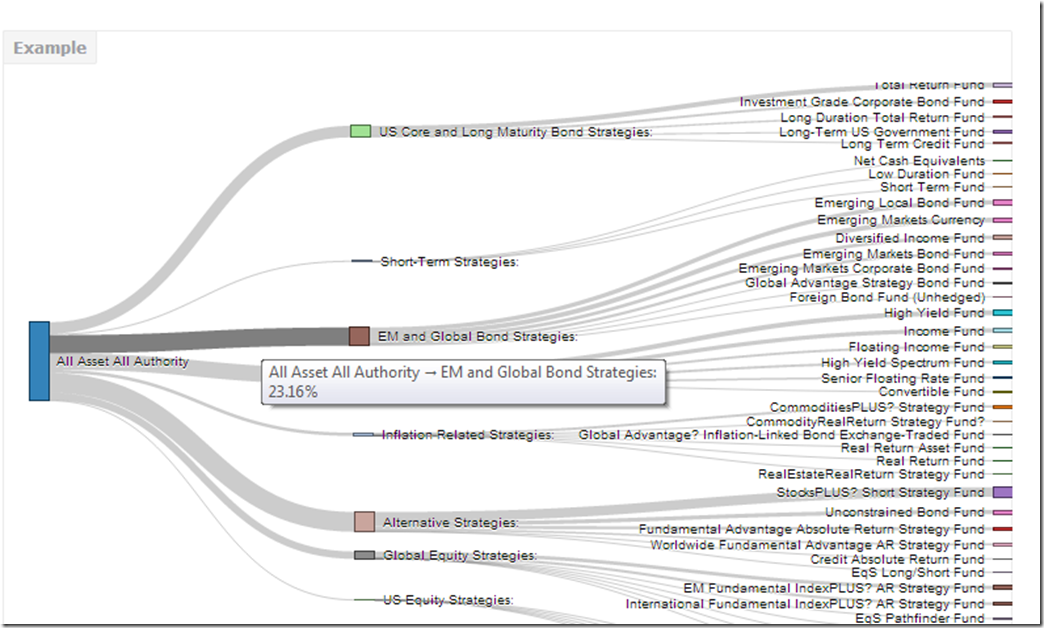
Just for good measure, here is the default plot from igraph.

Of course we could also plot the data a little more traditionally with a ggplot2 bar chart.
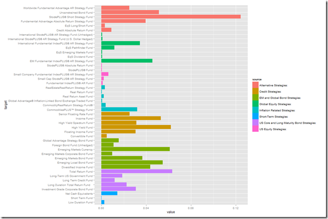
Any way we look at it, we can see that PIMCO now has way more than just bonds and the fund All Asset All Authority uses almost everything.
Tuesday, July 16, 2013
Exploring Networks with Sankey
Motivated by a tweet from Tony Hirst (http://blog.ouseful.info/), I started experimenting with an rCharts implementation of the d3 sankey plugin. While I was putting together examples, I found lots of gaps in my knowledge of sankeys and network analysis. I did not want to let good learning go to waste, so I put together this quick tutorial documenting what I learned. Click here or on the screenshot below to see it.
For those wondering how this might be useful in finance, sankeys could be employed well in Portfolio Appraisal/Holdings type reports where nodes represent household, client accounts, asset classes, and security types. Edge weight would be $ or % in each.
Wednesday, July 10, 2013
rCharts version of d3 horizon
I love horizon plots. My love shows up throughout my blog, and I have plotted horizon charts in base graphics, xtsExtra, lattice, and ggplot2. Now with rCharts, we can implement Jason Davies d3.js horizon chart plugin to plot R data in html/javascript. I put together a tutorial going into great detail on rCharts and convertin custom charts. For the tutorial, go here, or click on the screenshot below.
Friday, June 28, 2013
rCharts Remake of NYT
For those wondering if I have forsaken finance, the answer is no. I just don’t think there is much to do in here besides watch and wait. So more d3 and R as I try to distract myself from doing something dumb in the markets.
This time I used rCharts and slidify to recreate another NYT visualization similar to what I did in 512 Paths to the White House. Now with any cumulative growth time series that we build in R we can apply the template and create this amazing visualization. Below is a screenshot. Click here to see the live version.
I’ll be living the good life over the next week, so no posts until after the 4th of July.
Thursday, June 27, 2013
dimple d3 and rCharts
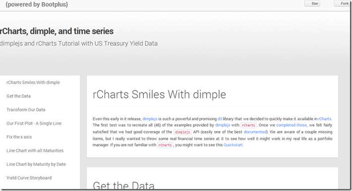
I put together a quick tutorial combining my two favorite things: finance and interactive visualizations. I show how to use the new dimplejs d3 library with rCharts to create some nice interactive plots of US Treasury yield data. A screenshot is below. Go here for the tutorial and here for the code to reproduce.
Wednesday, June 19, 2013
R Plotting Financial Time Series
In my little world of finance, data almost always is a time series. Through both quiet iteration and significant revolutions, the volunteers of R have made analyzing and charting time series pleasant. As a mini-tribute to all those who have helped, I wanted to write a short history of R time series plotting, specifically focusing on financial time series. I have embedded below, but it will look much better if you go to Github pages version.
Tuesday, June 11, 2013
Rickshaw d3.js from R with rCharts
Shutterstock’s open source Rickshaw provides a very nice tutorial to get started building interactive time series d3.js charts with Rickshaw. I just could not resist rebuilding the tutorial but this time ENTIRELY in R with the amazing packages slidify and rCharts. I have embedded the tutorial below, but it will probably look much better if you go directly to the Github pages version.
The slidify and rCharts author Ramnath Vaidyanathan has done an incredible job and continues to perfect these fine tools. They completely transformed my workflow and output by allowing both dynamic and interactive components that I can combine into a beautiful document. Be sure to see him present to this NYHackr meetup on June 17, 2013.
Thursday, May 30, 2013
If…then in Japan
require(latticeExtra)
require(quantmod)

japanReserves <- getSymbols("TRESEGJPM052N", src = "FRED",
    auto.assign = FALSE)
asTheEconomist(xyplot(japanReserves, scales = list(y = list(rot = 1)),
main = "Japan Foreign Reserves excluding Gold")) |
| From TimelyPortfolio |
Based on data from the US Treasury, 1.1 trillion of the 1.2 trillion of Japanese foreign reserves are US Treasury bonds. If Japan decides (is forced) to liquidate, the only thing they have to liquidate are US Treasury bonds. Who will buy if they sell? What happens next?
# get data from US Treasury for top 10 foreign
# holders of US treasuries
foreignUSTreas <- read.csv("http://www.treasury.gov/resource-center/data-chart-center/tic/Documents/mfhhis01.csv",
    skip = 4, nrows = 13, stringsAsFactors = FALSE)
top10 <- data.frame(foreignUSTreas[4:13, 1:2])
colnames(top10) <- c("Country", "Value")
top10$Value <- as.numeric(top10$Value)
top10$Country <- factor(top10$Country, levels = top10$Country[order(top10$Value)])

barchart(Country ~ Value, data = top10, origin = 0,
    xlab = "Value (in $Billions)", main = "Foreign Holders of US Treasuries - Top 10",
    scales = list(y = list(alternating = 3)), par.settings = theEconomist.theme(box = "transparent"),
lattice.options = theEconomist.opts()) |
| From TimelyPortfolio |
For those comparing the Federal Reserve H4 data to the US Treasury TIC data, this is a very good summary http://www.treasury.gov/resource-center/data-chart-center/tic/Pages/ticfaq2.aspx#q10.
Tuesday, May 28, 2013
Intended or Unintended Consequences
A quick glimpse at the US 10y Treasury Bond rate since 2000 seems benign with low volatility and a general downward trend.
require(latticeExtra)
require(quantmod)

US10y <- getSymbols("^TNX", from = "2000-01-01", auto.assign = FALSE)[,
    4]

asTheEconomist(xyplot(US10y, scales = list(y = list(rot = 1)),
    main = "US 10y Yield Since 2000"))
 |
| From TimelyPortfolio |
However, if we plot the change in rate over 252 days or 1 year, we might wonder whether the rate is as benign as we initially surmised. Although this might seem like an acceptable intended consequence of the aggressive monetary easing by the US Fed, I fear that we will face the historically normal unintended consequences.
p1 <- asTheEconomist(xyplot(US10y - lag(US10y, 252),
    scales = list(y = list(rot = 0)), main = "US 10y Yield - Yearly Change"))
p1
 |
| From TimelyPortfolio |
And if we use some Vanguard US Bond Funds (vbmfx and vustx) as a proxy for the US bond market Approaching the Zero Bound - Bonds, we see that we are now in a market different than the last 4 years.
require(directlabels)
require(reshape2)

getSymbols("VUSTX", from = "1990-01-01")
## [1] "VUSTX"
getSymbols("VBMFX", from = "1990-01-01")
## [1] "VBMFX"
bonds.tr <- merge(ROC(VUSTX[, 6], 250), ROC(VBMFX[,
    6], 250))
colnames(bonds.tr) <- c("VanguardLongTsy", "VanguardTotBnd")
bond.funds.melt <- melt(as.data.frame(cbind(as.Date(index(bonds.tr)),
    coredata(bonds.tr))), id.vars = 1)
colnames(bond.funds.melt) <- c("date", "fund", "totret250")
bond.funds.melt$date <- as.Date(bond.funds.melt$date)

p2 <- direct.label(xyplot(bonds.tr, screens = 1, ylim = c(-0.35,
    0.35), scales = list(y = list(rot = 0)), col = theEconomist.theme()$superpose.line$col,
    par.settings = theEconomist.theme(box = "transparent"),
    lattice.options = theEconomist.opts(), xlab = NULL,
    main = "Vanguard Bond Funds 250 Day Total Return"),
    list("last.points", hjust = 1, cex = 1.2))
p2
 |
| From TimelyPortfolio |
p3 <- asTheEconomist(horizonplot(totret250 ~ date |
    fund, origin = 0, horizonscale = 0.05, data = bond.funds.melt,
    strip = TRUE, strip.left = FALSE, par.strip.text = list(cex = 1.1),
    layout = c(1, 2), main = "Vanguard Bond Funds 250 Day Total Return"))
p3
 |
| From TimelyPortfolio |
# print(p2,position=c(0,0.4,1,1),more=TRUE)
# print(update(p3,main=NULL),position=c(0,0,1,0.5))
Comparison to Japan
For some reference, let's look at a country getting quite a bit of attention lately in the press. We can add US yields to my favorite chart from Japan - JGB Yields–More Lattice Charts. Most of the difference is in the short end of the curve where the US is still near the minimum since 2012 while Japan is near the max out to 7 years.
url <- "http://www.mof.go.jp/english/jgbs/reference/interest_rate/"
filenames <- paste("jgbcme",c("","_2010","_2000-2009","_1990-1999","_1980-1989","_1974-1979"),".csv",sep="")

#load all data and combine into one jgb data.frame
jgb <- read.csv(paste(url,filenames[1],sep=""),stringsAsFactors=FALSE)
for (i in 2:length(filenames)) {
  jgb <- rbind(jgb,read.csv(paste(url,"/historical/",filenames[i],sep=""),stringsAsFactors=FALSE))
}

#now clean up the jgb data.frame to make a jgb xts
jgb.xts <- as.xts(data.matrix(jgb[,2:NCOL(jgb)]),order.by=as.Date(jgb[,1]))
colnames(jgb.xts) <- paste0(gsub("X","JGB",colnames(jgb.xts)))

#get Yen from the Fed
#getSymbols("DEXJPUS",src="FRED")

xtsMelt <- function(data) {
  require(reshape2)

  #translate xts to time series to json with date and data
  #for this behavior will be more generic than the original
  #data will not be transformed, so template.rmd will be changed to reflect


  #convert to data frame
  data.df <- data.frame(cbind(format(index(data),"%Y-%m-%d"),coredata(data)))
  colnames(data.df)[1] = "date"
  data.melt <- melt(data.df,id.vars=1,stringsAsFactors=FALSE)
  colnames(data.melt) <- c("date","indexname","value")
  #remove periods from indexnames to prevent javascript confusion
  #these . usually come from spaces in the colnames when melted
  data.melt[,"indexname"] <- apply(matrix(data.melt[,"indexname"]),2,gsub,pattern="[.]",replacement="")
  return(data.melt)
  #return(df2json(na.omit(data.melt)))

}


jgb.melt <- xtsMelt(jgb.xts["2012::",])
jgb.melt$date <- as.Date(jgb.melt$date)
jgb.melt$value <- as.numeric(jgb.melt$value)
jgb.melt$indexname <- factor(
  jgb.melt$indexname,
  levels = colnames(jgb.xts)
)
jgb.melt$maturity <- as.numeric(
  substr(
    jgb.melt$indexname,
    4,
    length( jgb.melt$indexname ) - 4
  )
)
jgb.melt$country <- rep( "Japan", nrow( jgb.melt ))

#now get the US bonds from FRED
USbondssymbols <- paste0("DGS",c(1,2,3,5,7,10,20,30))

ust.xts <- xts()
for (i in 1:length( USbondssymbols ) ) {
  ust.xts <- merge(
    ust.xts,
    getSymbols(
     USbondssymbols[i],
     auto.assign = FALSE,
     src = "FRED"
    )
  )
}

ust.melt <- na.omit( xtsMelt( ust.xts["2012::",] ) )

ust.melt$date <- as.Date(ust.melt$date)
ust.melt$value <- as.numeric(ust.melt$value)
ust.melt$indexname <- factor(
  ust.melt$indexname,
  levels = colnames(ust.xts)
)
ust.melt$maturity <- as.numeric(
  substr(
    ust.melt$indexname,
    4,
    length( ust.melt$indexname ) - 4
  )
)
ust.melt$country <- rep( "US", nrow( ust.melt ))

bonds.melt <- rbind( jgb.melt, ust.melt )

p4 <- xyplot(
  value ~ date | maturity,
  groups = country,
  data = bonds.melt,
  type = "l",
  col = c(brewer.pal(9,"Blues")[5],brewer.pal(9,"Blues")[7]),
  layout = c( length( unique( bonds.melt$maturity ) ), 1 ),
  panel = function(x, y, subscripts, col, ...) {
    panel.abline(
      h = c(
        sapply( by( y, bonds.melt[subscripts,"country"], summary ), min ),
        sapply( by( y, bonds.melt[subscripts,"country"], summary ), max )
      ),
      #if(!col){
      col = col[1:length(unique(bonds.melt[subscripts,"country"]))]
      #} else col = trellis.par.get()$superpose.line$col[1:length(unique(bonds.melt[subscripts,"country"]))]
    )
    panel.xyplot( x = x, y = y, subscripts = subscripts, col = col, ... )
    panel.text(
      x = x[ length(unique(x)) / 2],
      y = mean(
        c(
          sapply( by( y, bonds.melt[subscripts,"country"], summary ), max )[1],
          sapply( by( y, bonds.melt[subscripts,"country"], summary ), min )[2]
        )
      ),
      labels = paste0(unique(bonds.melt$maturity)[panel.number()],"y"),
      cex = 0.8,
      #font = 2,
      col = "black",
      adj = c(0.5,0.5)
    )
  },
  scales = list(
    x = list(
      draw = FALSE
      #tck = c(1,0),
      #alternating = 1,
      #at = min(bonds.melt$date),
      #labels = format(min(bonds.melt$date),"%Y")
    ),
    y = list( tck = c(1,0), lwd = c(0,1) )
  ),
  strip = FALSE,
  par.settings = list(axis.line = list(col = 0)),
  xlab = NULL,
  ylab = "Yield",
  main = "JGB and US Yields by Maturity Since Jan 2012"
)
p4 <- p4 + layer(
  panel.abline(
    h = pretty(bonds.melt$value,4),
    lty = 3
  )
)
p4
 |
| From TimelyPortfolio |
Replicate
Gist source: https://gist.github.com/timelyportfolio/5665790Wednesday, May 15, 2013
Even More JGB Yield Charts with R lattice
See the last post for all the details. I just could not help creating a couple more.
Variations on Favorite Plot - Time Series Line of JGB Yields by Maturity
p2 <- xyplot(value ~ date | indexname, data = jgb.melt,
    type = "l", layout = c(length(unique(jgb.melt$indexname)),
        1), panel = function(x, y, ...) {
        panel.abline(h = c(min(y), max(y)))
        panel.xyplot(x = x, y = y, ...)
        panel.text(x = x[length(x)/2], y = max(y),
            labels = levels(jgb.melt$indexname)[panel.number()],
            cex = 0.7, pos = 3)
    }, scales = list(x = list(tck = c(1, 0), alternating = 1),
        y = list(tck = c(1, 0), lwd = c(0, 1))), strip = FALSE,
    par.settings = list(axis.line = list(col = 0)),
    xlab = NULL, ylab = "Yield", main = "JGB Yields by Maturity Since Jan 2012")
p2 <- p2 + layer(panel.abline(h = pretty(jgb.melt$value),
    lty = 3))
p2
 |
| From TimelyPortfolio |
jgb.xts.diff <- jgb.xts["2012::", ] - matrix(rep(jgb.xts["2012::",
    ][1, ], NROW(jgb.xts["2012::", ])), ncol = NCOL(jgb.xts),
    byrow = TRUE)
jgb.diff.melt <- xtsMelt(jgb.xts.diff)
jgb.diff.melt$date <- as.Date(jgb.diff.melt$date)
jgb.diff.melt$value <- as.numeric(jgb.diff.melt$value)
jgb.diff.melt$indexname <- factor(jgb.diff.melt$indexname,
    levels = colnames(jgb.xts))

p4 <- xyplot(value ~ date | indexname, data = jgb.diff.melt,
    type = "h")

update(p2, ylim = c(min(jgb.diff.melt$value), max(jgb.melt$value) +
    0.5)) + p4
 |
| From TimelyPortfolio |
update(p2, ylim = c(min(jgb.diff.melt$value), max(jgb.melt$value) +
    0.5), par.settings = list(axis.line = list(col = "gray70"))) +
    update(p4, panel = function(x, y, col, ...) {
        # do color scale from red(negative) to
        # blue(positive)
        cc.palette <- colorRampPalette(c(brewer.pal("Reds",
            n = 9)[7], "white", brewer.pal("Blues",
            n = 9)[7]))
        cc.levpalette <- cc.palette(20)
        cc.levels <- level.colors(y, at = do.breaks(c(-0.3,
            0.3), 20), col.regions = cc.levpalette)
        panel.xyplot(x = x, y = y, col = cc.levels,
            ...)
    })
 |
| From TimelyPortfolio |
p5 <- horizonplot(value ~ date | indexname, data = jgb.diff.melt,
    layout = c(1, length(unique(jgb.diff.melt$indexname))),
    scales = list(x = list(tck = c(1, 0))), xlab = NULL,
    ylab = NULL)

p5
 |
| From TimelyPortfolio |
update(p2, ylim = c(0, max(jgb.melt$value) + 0.5),
    panel = panel.xyplot) + p5 + update(p2, ylim = c(0,
    max(jgb.melt$value)))
 |
| From TimelyPortfolio |
Variations on Yield Curve Evolution with Opacity Color Scale
# add alpha to colors
addalpha <- function(alpha = 180, cols) {
    rgbcomp <- col2rgb(cols)
    rgbcomp[4] <- alpha
    return(rgb(rgbcomp[1], rgbcomp[2], rgbcomp[3],
        rgbcomp[4], maxColorValue = 255))
}

p3 <- xyplot(value ~ indexname, group = date, data = jgb.melt,
    type = "l", lwd = 2, col = sapply(400/(as.numeric(Sys.Date() -
        jgb.melt$date) + 1), FUN = addalpha, cols = brewer.pal("Blues",
        n = 9)[7]), main = "JGB Yield Curve Evolution Since Jan 2012")

p3 <- update(asTheEconomist(p3), scales = list(x = list(cex = 0.7))) +
    layer(panel.text(x = length(levels(jgb.melt$indexname)),
        y = 0.15, label = "source: Japanese Ministry of Finance",
        col = "gray70", font = 3, cex = 0.8, adj = 1))

# make point rather than line
update(p3, type = "p")
 |
| From TimelyPortfolio |
# make point with just most current curve as line
update(p3, type = "p") + xyplot(value ~ indexname,
    data = jgb.melt[which(jgb.melt$date == max(jgb.melt$date)),
        ], type = "l", col = brewer.pal("Blues", n = 9)[7])
 |
| From TimelyPortfolio |
