I struggled with whether or not I should even post this. It is raw and ugly, but it might help somebody out there. I might use this as a basis for some more gridSVG posts, but I do not think I have the motivation to finish the analysis.
Code:
require(latticeExtra)
require(quantmod)
require(PerformanceAnalytics)
getSymbols("SP500",src="FRED")
US10 <- na.omit(getSymbols("DGS10",src="FRED",auto.assign=FALSE))
stocksBonds <- na.omit(
merge(
lag(SP500,k=-100)/SP500-1, #forward 100 day sp500 perf
US10 / runMean(US10,n=250) - 1, #us10 yield - 250 day average
SP500
)
)
#get the decade
stocksBonds$decade = as.numeric(substr(index(stocksBonds),1,3)) * 10
#name columns
colnames(stocksBonds) <- c("sp500","us10","SP500","decade")
#get a color ramp for our change in us10 year yields
linecolors <- colorRamp(
c("red","green"),
interpolate="linear",
space="rgb"
)((stocksBonds[,2]+0.5))
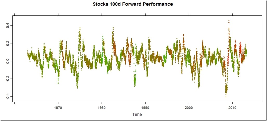
xyplot(
stocksBonds[,1],
col=rgb(linecolors,max=255),
type="p",pch=19,cex=0.5,
main = "Stocks 100d Forward Performance"
)
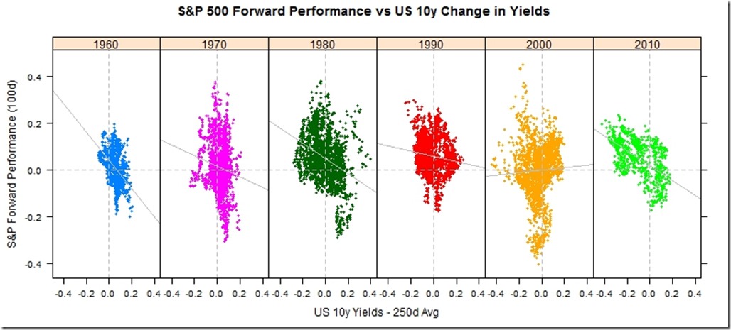
xyplot(
sp500 ~ us10 | factor(decade),
groups = decade,
data = as.data.frame(stocksBonds),
pch=19,
cex = 0.5,
scales = list(
x = list(tck=c(1,0),alternating=1)
),
layout=c(6,1),
main = "S&P 500 Forward Performance vs US 10y Change in Yields",
ylab = "S&P Forward Performance (100d)",
xlab = "US 10y Yields - 250d Avg"
) +
latticeExtra::layer(panel.abline(h=0,col="gray",lty=2)) +
latticeExtra::layer(panel.abline(v=0,col="gray",lty=2)) +
xyplot(
sp500 ~ us10 | factor(decade),
col="gray",
data = as.data.frame(stocksBonds),
panel = panel.lmline)
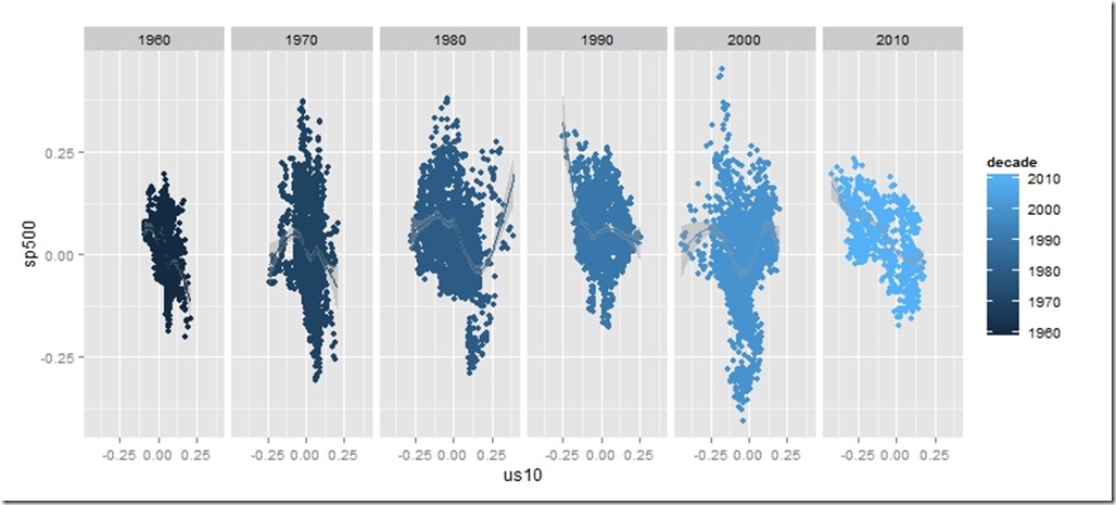
require(ggplot2)
ggplot(data = data.frame(stocksBonds), aes(y=sp500, x= us10,colour=decade))+
geom_point()+facet_wrap(~decade,ncol=6)+geom_smooth()
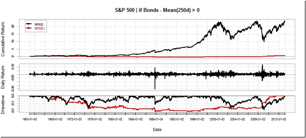
charts.PerformanceSummary(
merge(
ROC(stocksBonds[,3],n=1,type="discrete"),
ROC(stocksBonds[,3],n=1,type="discrete") * (stocksBonds[,2]>0)
),
main="S&P 500 | if Bonds - Mean(250d) > 0"
)


Nice post. It may be more interesting though to look at the 10Y-3M spread against the forward S&P return.
ReplyDelete