Monday, April 29, 2013

d3 <- R with rCharts and slidify

I believe that the NY Times interactive feature 512 Paths to the White House is one of the best visualizations of all time.  It is even better when we have details on the process of creating this marvel.   Although the graphic is not suited for other data sources (please tell me if this is not correct), I just could not resist using the amazing R packages slidify and rCharts from Ramnath Vaidyanathan to build it from R.  I wouldn’t have even thought it possible until I saw his tutorial Replicating NY Times Interactive Graphic and his demo Visualizing the Reinhart and Rogoff Public Debt Study.

I have a feeling that nearly every R user of lattice or ggplot2 will be familiar with Ramnath’s brilliance by the end of the year 2013. He might even convince some d3 users to try a little R.

Even more amazing is the entire tutorial embedded below (click here if it does not appear) is created in R with slidify, so it is entirely reproducible.  rCharts is early in development, but I urge you to try it out.


Tutorial

Wednesday, April 17, 2013

Banging on the JGBs

Since I have not posted in quite a while, I wanted to let everyone know that I am still alive and kicking.  The resurrection of excitement (opportunity) in the markets, quarterly reporting cycle, and the overwhelming number of unbelievable R/javascript releases have kept me from writing something good enough to justify a post.   In the markets, Japan and gold bring a smile to my face.    Nothing particularly new on the quarterly reporting cycle, but I have been watching the interesting ideas at http://axysreporting.com closely, and I have enjoyed learning a little about http://addepar.com.  Nothing though impresses me as much as all of the R and javascript packages that have been announced over the last two weeks.  I mentioned them in my post d3 Lifeline from vega and clickme, but I forgot to include Introducing the healthvis R package – one line D3 graphics with R from Jeff Leek who taught https://www.coursera.org/course/dataanalysis, and rCharts was not yet released.  rCharts reminded me of the very special slidify package that I have to my own detriment not used until now.  I strongly, strongly recommend readers to thoroughly look at  rCharts  and slidify.  Just to make sure everyone sees all of these, I have relisted them and added new links below with the Twitter announcements.

vega

Announcing Vega, a new visualization grammar built on #d3js! Design reusable chart components in a JSON format trifacta.github.com/vega

— Jeffrey Heer (@jeffrey_heer) April 2, 2013


rCharts from the same creator as slidify

@lisaczhang I wrote an R package wrapping functionality of Polycharts for R users. ramnathv.github.io/rCharts

— Ramnath Vaidyanathan (@ramnath_vaidya) April 10, 2013


clickme

@xieyihui I'd love your feedback on clickme, an R package to populate JS visualizations using #knitr bitly.com/vizbi_clickme

— Nacho Caballero (@nachocaballero) March 24, 2013


rhealthvis

Our package is announced today! healthvis.org

— rhealthvis (@rhealthvis) April 2, 2013

Now to show some of the results from my experiments, I will list some bl.ocks below.  The primary data source for all of these has been the Japanese Government Bond (JGB) yield data provided by the Japanese Ministry of Finance.  I will discuss the reasons for choosing JGBs in a much more thorough later post.  I would love thoughts on JGBs and my experiments.

  1. http://bl.ocks.org/timelyportfolio/5407807  JGB Yields in Small Multiples with clickme ractive
  2. http://bl.ocks.org/timelyportfolio/5405240  JGB Yield Curve with a vega spec and clickme ractive
  3. http://bl.ocks.org/timelyportfolio/5398614  JGB Yields Line Chart with a vega spec and clickme ractive

Some of my other more basic experiments are here.  These might be helpful to anyone not yet familiar with these new resources.

  1. http://bl.ocks.org/timelyportfolio/5351448
  2. http://bl.ocks.org/timelyportfolio/5342818
  3. http://bl.ocks.org/timelyportfolio/5322390
  4. http://bl.ocks.org/timelyportfolio/5316682


I’ll be back soon with what I hope is a very impressive slidify created market-related post.  Until then, please let me know what you think, or show your relevant experiments.


Thanks to everyone that has worked so hard creating these great open source projects.

Thursday, April 4, 2013

d3 Lifeline from vega and clickme

This has been an exciting week for d3.js and R with the

  1. release of vega by the data vis powerhouses at Trifacta
  2. launch of clickme and already significant rewrite to accommodate vega
  3. inception of a very promising d3 templates DexCharts described in multiple posts.

I am glad to have had time to play with all three, and I have actually already used them for legitimate purposes. I only understand the basics, but I thought I would post how we can combine a clickme ractive and a vega template to produce the lifelines example included in vega. I like the lifelines example because it is the one with the most complex data source and number of d3 elements. Fortunately, both projects are well documented, especially for early releases. I strongly recommend reading through both wikis to quickly progress along the learning curve. I will try to fill in some gaps in the clickmeclickme and vega” wiki page.

vega frameworks

vega frameworks are JSON objects to ease the construction of interactive d3 visualizations. In the wiki, the authors liken vega to ggplot2 but say

However, in service of rapid specification these systems make a number of decisions on behalf of the user, and also impose limits on the type of visualizations one can create. vega is intended to be lower-level, enabling fine-gained control of the visualization design.

ggplot2 and lattice users should immediately be familiar with words like “axes”,“scales”, “data”, and “marks”.

clickme ractives

clickme ractives are a directory structure with files that provide at a minimum a R markdown template (template.rmd) for a visualization and a R translator (translator.r) to allow the use of R data and calculations in the finished HTML5 rendering. Although clickme was developed unaware of vega, the author immediately saw the potential of combining both and rewrote clickme to allow easy integration. The synergy of the two is demonstrated by the ability to create 7 vega examples with all the same template.rmd and translator.r. vega templates now fall in the spec subdirectory of the data directory of a clickme ractive.

clickme filling vega

If we look at the original lifelines vega spec, we will see some spots where we might like R to provide the information, such as

...
"width": 400,
"height": 100,
"padding": {"top": 60, "left": 5, "bottom": 30, "right": 30},
"data": [
{
"name": "people",
"values": [
{"label":"Washington", "born":-7506057600000, "died":-5365324800000,
"enter":-5701424400000, "leave":-5453884800000},
...
"name": "events",
"format": {"type":"json", "parse":{"when":"date"}},
"values": [
{"name":"Decl. of Independence", "when":"July 4, 1776"},

I am guessing that some R users might stumble a little with the data section of this JSON, so let's translate into lists, something I hope might be a little more familiar.

data = list(
list(name="people",
values=list(
list(label="Washington", born=-7506057600000, died=-5365324800000, enter=-5701424400000, leave=-5453884800000),
list(label="Adams", born=-7389766800000, died=-4528285200000, enter=-5453884800000, leave=-5327740800000),
list(label="Jefferson", born=-7154586000000, died=-4528285200000, enter=-5327740800000, leave=-5075280000000),
list(label="Madison", born=-6904544400000, died=-4213184400000, enter=-5075280000000, leave=-4822819200000),
list(label="Monroe", born=-6679904400000, died=-4370518800000, enter=-4822819200000, leave=-4570358400000)
)
),
list(
name= "events",
format= list(type="json", parse=list(when="date")),
values= list(
list(name="Decl. of Independence", when="July 4, 1776"),
list(name="U.S. Constitution", when="3/4/1789"),
list(name="Louisiana Purchase", when="April 30, 1803"),
list(name="Monroe Doctrine", when="Dec 2, 1823")
)

)
)

Then in the translator.R part of our ractive, we can use the rjson package to translate the list into a JSON equivalent. Most of the data for d3 and vega can usually  just come from data.frames. The clickme author actually also wrote df2json to better handle the translation of data.frames to JSON, and there are numerous ractive examples using data.frames in the clickme package.

  get_data_as_json <- function(opts) {
...
} else {
library(rjson)
json_data <- toJSON(opts$data) ##opts$data comes from the data parameter of the clickme function
}
json_data
}

Now we just need to fill the vega spec with our data. We can replace the data section with

"data": {{ get_data_as_json(opts) }}

When we run the clickme_vega function, clickme will use the knit_expand function from knitr to expand/run the get_data_as_json function on the data supplied as a parameter to clickme_vega and replace like a mail merge with our translated JSON data representation.  With our ractive, we will also specify height, width, margins, title, etc. We can produce our HTML page with just one line.

clickme_vega(data,"lifelines",params=list(height=100,width=400,padding=list(top=60, left=5, bottom= 30, right=30)))

R to clickme to vega to d3 visualization workflow


Assuming we already have a predefined clickme ractive and vega spec, the workflow from R to a pretty d3 visualization becomes ridiculously easy:


  1. Just like we would if we were creating an R graph, we get our data, clean our data, and run our calculations
  2. in R, we run clickme_vega(data=our_data_from_step1, ractive=nameofourractive)
  3. show off and use our amazing, beautiful, and interactive visualization (might need a simple http server for some cases).

If we do not have a predefined clickme ractive, then we can easily borrow/steal from the unbelievable repository of d3 examples or a possible future vega repository, and follow the instructions in the clickme wiki to convert into a ractive.


Live Example


if embed does not show go to http://bl.ocks.org/timelyportfolio/5316682.


Reproduce me


Below is all the code to run this specific example. The ractive and vega spec are in this Git repo.

#if not already installed, uncomment the two lines below
#library(devtools)
#install_github("clickme", "nachocab")

require(clickme)
#set location where you put your multiline ractive
set_root_path("path to your ractive/r")

data = list(
list(name="people",
values=list(
list(label="Washington", born=-7506057600000, died=-5365324800000, enter=-5701424400000, leave=-5453884800000),
list(label="Adams", born=-7389766800000, died=-4528285200000, enter=-5453884800000, leave=-5327740800000),
list(label="Jefferson", born=-7154586000000, died=-4528285200000, enter=-5327740800000, leave=-5075280000000),
list(label="Madison", born=-6904544400000, died=-4213184400000, enter=-5075280000000, leave=-4822819200000),
list(label="Monroe", born=-6679904400000, died=-4370518800000, enter=-4822819200000, leave=-4570358400000)
)
),
list(
name= "events",
format= list(type="json", parse=list(when="date")),
values= list(
list(name="Decl. of Independence", when="July 4, 1776"),
list(name="U.S. Constitution", when="3/4/1789"),
list(name="Louisiana Purchase", when="April 30, 1803"),
list(name="Monroe Doctrine", when="Dec 2, 1823")
)

)
)

clickme_vega(data,"lifelines",params=list(height=100,width=400,padding=list(top=60, left=5, bottom= 30, right=30)))

Wednesday, April 3, 2013

Tables Are Like Cockroaches

As much as I would like to completely replace all tables with beautiful, intuitive, and interactive charts, tables like cockroaches cannot be eliminated. Based on this very interesting discussion on the Perceptual Edge forum with source Exploring the Origins of Tables for Information Visualization, tables date back to 1850 BCE. The paper concludes with

As part of exploration, tables help answer questions about data. As exemplars of communication, tables provide effective means for presenting data - each table has a story or stories to tell.

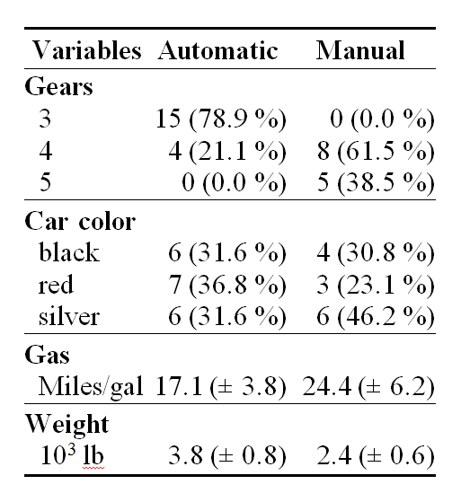
After struggling to create some attractive tables in HTML with R, I'm not sure they are any easier to create almost 4,000 years later. LaTeX is the clear winner when it comes to the table making competition. I have used xtable for HTML tables, but it could not fully produce a complicated table.  I was delighted to recently find the Gmisc package, which is the result of a frustrated orthopaedic surgeon's need to create tables in Word for journal submission.
pretty table from gforge.se

Another R to Word workflow was also discussed in Writing a MS-Word document using R (with as little overhead as possible). I was not aware of the need to produce a Word .doc from R. I simply thought creating an html table should not be that hard.

If you read Old Price Tables in Modern d3 Visualization and Dust off 130 Year Old Gold Books on Google Bookshelf, you'll know that my new favorite book is Gold and Prices Since 1873 by James Laurence Laughlin. This table on page 26 seems easy enough to recreate.

I had no idea how recreating this table would test and enhance my R skills. I started by manually entering the data since OCR did not work.

reps = c("http://ftp.sunet.se/pub/lang/CRAN", "http://cran.gforge.se")
install.packages("Gmisc", repos = reps, dependencies = TRUE)
library(Gmisc, verbose = FALSE)

# manually enter the data in a data frame
data1874 <- data.frame(c(1872, 1874, 1869, 1870, 1870, 1871, 1871, 1871, 1870, 
    1873, 1872, 1871), c(153825, 41380, 131800, 15447, 4893, 2109, 16651, 80361, 
    1749, 7058, 3801, 18900), c(0, 0, 106600, 33695, 14230, 55320, 37160, 4775, 
    4325, 1535, 6980, 0), c(198540, 20580, 274100, 88487, 40505, 62857, 119000, 
    429486, 7327, 11794, 16877, 284561))

rownames(data1874) <- c("Banks of the United Kingdom", "Banks of Australia", 
    "Banks of France", "Banks of Italy", "National Bank of Belgium", "Bank of the Netherlands", 
    "Bank of Austria-Hungary", "Imperial State Bank of Russia", "Imperial Bank of Sweden", 
    "Bank of Norway", "National Bank of Denmark", "National Bank of the United States")
colnames(data1874) <- c(" ", "Gold", "Silver", "Total Note Circulation")

data1885 <- data.frame(c(141205, 65890, 231483, 56121, 13900, 19161, 25902, 
    102207, 3436, 7169, 11566, 158100), c(0, 0, 217087, 11203, 6540, 38366, 
    48646, 676, 777, 0, 846, 7900), c(186850, 28115, 583610, 189690, 73400, 
    76972, 136351, 429860, 9835, 9287, 18370, 276500))
colnames(data1885) <- colnames(data1874)[2:4]


# get sums for totals row in table
data1874[NROW(data1874) + 1, ] = apply(data1874, MARGIN = 2, FUN = sum)
data1885[NROW(data1885) + 1, ] = apply(data1885, MARGIN = 2, FUN = sum)
# add Total to row names
rownames(data1874)[NROW(data1874)] = "Total"
rownames(data1885)[NROW(data1885)] = "Total"
# eliminate the sum of years which does not make sense
data1874[NROW(data1874), 1] = ""


# get commas in the numbers
data1874[, 2:4] <- format(data1874[, 2:4], big.mark = ",")
data1885 <- format(data1885, big.mark = ",")

Then with gmisc I very quickly achieved a decent table.

# use htmlTable to produce a table
htmlTable(cbind(data1874, data1885), caption = "", rowlabel = "", cgroup = c("Reserves", 
    "", "Reserves", ""), n.cgroup = c(3, 1, 2, 1, 0), ctable = TRUE, output = TRUE)
Reserves       Reserves    
  Gold Silver   Total Note Circulation   Gold Silver   Total Note Circulation
Banks of the United Kingdom 1872 153,825 0   198,540   141,205 0   186,850
Banks of Australia 1874 41,380 0   20,580   65,890 0   28,115
Banks of France 1869 131,800 106,600   274,100   231,483 217,087   583,610
Banks of Italy 1870 15,447 33,695   88,487   56,121 11,203   189,690
National Bank of Belgium 1870 4,893 14,230   40,505   13,900 6,540   73,400
Bank of the Netherlands 1871 2,109 55,320   62,857   19,161 38,366   76,972
Bank of Austria-Hungary 1871 16,651 37,160   119,000   25,902 48,646   136,351
Imperial State Bank of Russia 1871 80,361 4,775   429,486   102,207 676   429,860
Imperial Bank of Sweden 1870 1,749 4,325   7,327   3,436 777   9,835
Bank of Norway 1873 7,058 1,535   11,794   7,169 0   9,287
National Bank of Denmark 1872 3,801 6,980   16,877   11,566 846   18,370
National Bank of the United States 1871 18,900 0   284,561   158,100 7,900   276,500
Total 477,974 264,620   1,554,114   836,140 332,041   2,018,840


However, the complicated multiple row heading was still missing, so here is the much harder brute force work to parse the HTML to get the table structured correctly.

# do all the hard work to make the table more of an exact replica
gtable_table <- htmlTable(cbind(data1874, data1885), caption = "", rowlabel = "", 
    cgroup = c("Reserves", "", "Reserves", ""), n.cgroup = c(3, 1, 2, 1, 0), 
    ctable = TRUE, output = FALSE)

require(XML)
# parse the table so that we can access the elements in a very crude
# manner
doc <- htmlParse(gtable_table)
# add another row heading to the table with XML
temp <- addChildren(getNodeSet(doc, "//thead")[[1]], newXMLNode("tr", list(newXMLNode("th", 
    attrs = list(colspan = "1", style = "font-weight: 900; border-top: 2px solid grey;border-right: 1px solid grey;"), 
    text = ""), newXMLNode("th", attrs = list(colspan = "6", style = "font-weight: 900; border-top: 2px solid grey;"), 
    text = "1870-1874"), newXMLNode("th", attrs = list(colspan = "5", style = "font-weight: 900; border-top: 2px solid grey;"), 
    text = "1885"))), at = 0)


# add some vertical borders; wish this were easier but very manual
th <- getNodeSet(doc, "//thead//th")  #start with the th elements in thead
for (i in c(1, 2, 4, 8, 12, 18)) {
    oldstyle <- xmlAttrs(th[[i]])["style"]  #get the old style attribute
    removeAttributes(th[[i]], attrs = "style")  #remove the style attribute
    addAttributes(th[[i]], style = paste(oldstyle, "border-right: 1px solid grey;", 
        sep = ""))  #add the old style attribute concatenated with border-right
}

th <- getNodeSet(doc, "//tbody//td")  #now do the td elements in tbody
for (i in c(seq(1, 133, by = 11), seq(7, 139, by = 11))) {
    oldstyle <- xmlAttrs(th[[i]])["style"]  #get the old style attribute
    removeAttributes(th[[i]], attrs = "style")  #remove the style attribute
    addAttributes(th[[i]], style = paste(oldstyle, "border-right: 1px solid grey;", 
        sep = ""))  #add the old style attribute concatenated with border-right
}

# although htmlTable will group rows, I could not make it do what I wanted
# so add underline before the total row
for (i in 133:143) {
    oldstyle <- xmlAttrs(th[[i]])["style"]  #get the old style attribute
    removeAttributes(th[[i]], attrs = "style")  #remove the style attribute
    addAttributes(th[[i]], style = paste(oldstyle, "border-top: 1px solid grey;", 
        sep = ""))  #add the old style attribute concatenated with border-top
}


# for some reason &nbsp; becomes Â, so reverse it back to $nbsp;
returnHTML <- gsub("[Â].", replacement = "&nbsp;", saveXML(getNodeSet(doc, "//table")[[1]]))

# not sure if necessary but free up doc from memory
free(doc)

cat(returnHTML)
1870-1874 1885
Reserves       Reserves    
  Gold Silver   Total Note Circulation   Gold Silver   Total Note Circulation
Banks of the United Kingdom 1872 153,825 0   198,540   141,205 0   186,850
Banks of Australia 1874 41,380 0   20,580   65,890 0   28,115
Banks of France 1869 131,800 106,600   274,100   231,483 217,087   583,610
Banks of Italy 1870 15,447 33,695   88,487   56,121 11,203   189,690
National Bank of Belgium 1870 4,893 14,230   40,505   13,900 6,540   73,400
Bank of the Netherlands 1871 2,109 55,320   62,857   19,161 38,366   76,972
Bank of Austria-Hungary 1871 16,651 37,160   119,000   25,902 48,646   136,351
Imperial State Bank of Russia 1871 80,361 4,775   429,486   102,207 676   429,860
Imperial Bank of Sweden 1870 1,749 4,325   7,327   3,436 777   9,835
Bank of Norway 1873 7,058 1,535   11,794   7,169 0   9,287
National Bank of Denmark 1872 3,801 6,980   16,877   11,566 846   18,370
National Bank of the United States 1871 18,900 0   284,561   158,100 7,900   276,500
Total 477,974 264,620   1,554,114   836,140 332,041   2,018,840


This can be even further improved with some simple CSS.  I hope this helps somebody.  Oh, I just also remembered dprint which I will revisit soon. For now I think I'll go back to making graphs.

Gist Source:

Monday, April 1, 2013

Old Price Tables in Modern d3 Visualization

In my post Dust off 130 Year Old Gold Books on Google Bookshelf, I reproduced some of the old and way out of copyright price tables from the appendices in Gold and Prices Since 1873 by James Laurence Laughlin using latticeExtra xyplot. Now, with the clickme multiline d3 ractive built in my last post “Building ractives is so addictive it should be illegal!”, we can easily transform this data into an interactive time series line chart.

I tried to generalize the multiline ractive to create almost any line chart for an xts object from R. See the commit history for the minor modifications that I made to the original ractive:

  1. Take data as given instead of transforming to a cumulative line
  2. Allow parameters for a title and the location of the x-axis
  3. Handle data series with differing start and end dates

We can build the html file using clickme with a couple of lines of R code.

# if not already installed, uncomment the two lines below
# library(devtools) install_github('clickme', 'nachocab')

require(clickme)
# set location where you put your multiline ractive
set_root_path("path to your ractive/r")
clickme(data = priceTables["1850::", c(-1, -6, -8, -11, -12)], ractive = "clickme_multiline_generic", 
params = list(title = "Price Tables from <em> Gold and Prices Since 1873 </em>",
x_axis_location = 100))

I had not seen an example of passing parameters, so I used title and x_axis_location as a test for how clickme handles parameters. If I read the source correctly, the template_config.yml specifies permissible parameters. Then the parameters can be specified by a list provided as params to the clickme function as shown above.

...
default_parameters: {
width: 960,
height: 500,
title,
x_axis_location
}
...

Live example


Git Repo