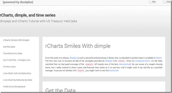
I put together a quick tutorial combining my two favorite things: finance and interactive visualizations. I show how to use the new dimplejs d3 library with rCharts to create some nice interactive plots of US Treasury yield data. A screenshot is below. Go here for the tutorial and here for the code to reproduce.

No comments:
Post a Comment