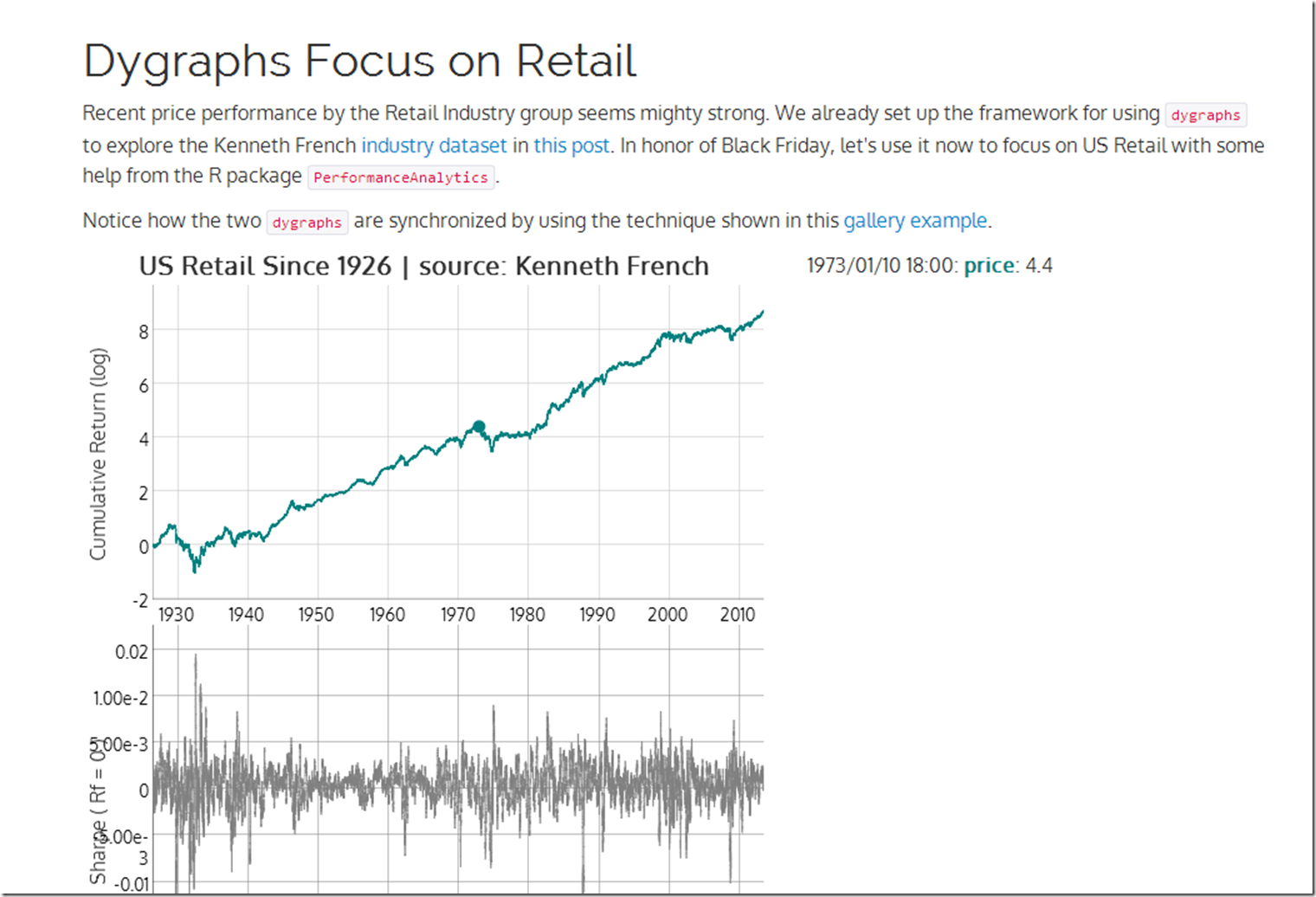
US Retail stocks have been killing it. Since the holiday season starting with Black Friday is so important to retail, let’s look at the US Retail industry price and Sharpe ratio using R rCharts and Performance analytics + javascript dygraphs. Thanks Kenneth French once again for the dataset.
Wednesday, November 27, 2013
Friday, November 15, 2013
Dygraphs with Bigger Data | US Industries from Kenneth French
After seeing the announcement by @lauraegerdal of the SEC’s use of dygraphs to visualize market structure, I was inspired to experiment more with the great dygraphs + rCharts. I really wanted to see how responsive dygraphs would be with a fairly large dataset. Some Kenneth French US Industry data seemed just big enough to get a good feel for dygraph’s digestive abilities. See it in action here or click on the screenshot below.
Thursday, November 7, 2013
BIS Derivatives Update
The newest BIS Derivatives update is out, so I updated my fork of Mike Bostock’s example with the most recent data. I will only say that these numbers do not inspire much confidence.
Wednesday, November 6, 2013
EXIF with R | rCharts + catcorrjs + exiftool
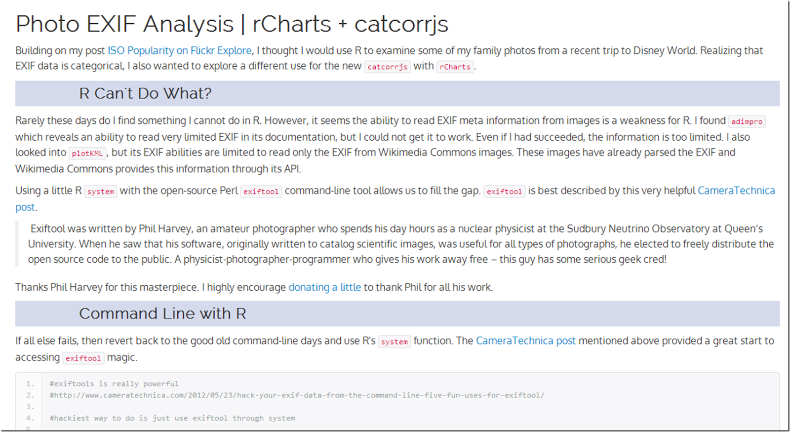
I wanted to analyze the EXIF information in a whole group of photos from a recent trip to Disney World. Of course I decided to use R and throw in some interactive charting with d3.js, rCharts, and and the new catcorrjs. Integrating the amazing and open-source Perl exiftool was a fun bonus. Click here or on the screenshot below for all the details.
On the trip I was baffled by some bad pictures. I realized the reason was ISO 6400, which was unintentionally set by the ring on our s100 when handing the camera to strangers for group shots.


