Friday, June 29, 2012

Horizon Plot Already Available

When I wrote Cubism Horizon Charts in R, I should have known that horizon plot functionality already exists in R http://rgm2.lab.nig.ac.jp/RGM2/func.php?rd_id=latticeExtra:horizonplot and in this case in one of my already favorite packages latticeExtra.

I think I like my version a little better, but I’m sure the horizonplot function from latticeExtra can be amended to look similar, and that function is much more robust than mine.  Also, since it incorporates strip functionality, scaling is much better.

From TimelyPortfolio

R code from GIST: (do raw version for copy/paste)

Tuesday, June 26, 2012

Turning 100,000

Way back in December 2010, I started blogging here at Timely Portfolio, and as you can see, turning 100,000 pageviews was something I never expected.  Thanks to all the readers who have motivated me to continue and who have taught me along the way.

Wednesday, December 8, 2010

Reading->Writing

I am determined to play not spectate. After 20 years of voracious reading, I have decided to write, and this blog represents my commitment. More than likely it will be a reflection of me, so a lot about my work/passion money management and markets but also hopefully some worthwhile thoughts and observations. I will be the writer and possibly the only reader ultimately but I know that I will benefit immensely from this project. Any benefit to others will be extremely gratifying and help resolve my debt to all the wonderful authors that have entertained and enlightened me over the years.

The stats look like this.

clip_image001

Crazy RUT in Academic Context Why Trend is Not Your Friend

In response to Where are the Fat Tails?, reader vonjd very helpfully referred me to this paper The Trend is Not Your Friend! Why Empirical Timing Success is Determined by the Underlying’s Price Characteristics and Market Efficiency is Irrelevant by Peter Scholz and Ursula Walther.  The authors conclude

“Our study on the basis of real data clearly confirms the hypothesis that the asset price characteristics of the underlying price process have a crucial impact on timing results. This allows us to forecast the timing success depending on the market's parameters. An OLS
regression analysis supports our predictions and verifies our assumption that the drift has the
strongest influence on timing success. By contrast, the higher moments (skewness, kurtosis)
seem not to have any significant impact on the timing result in the empirical sample. As we
presumed, the level of market development, and hence the degree of efficiency, does not play
any role. Trading worked coincidentally rather well in the developed world and quite poorly in
the emerging markets. The driving factor for the timing success is the parametric environment the trading system stumbles on…

Our study contributes to the discussion by providing a structured analysis of the relevance of the most important price process parameters. As a result, the traditional explanations for timing success can be abandoned: we find that it is very likely for the SMA trading rule to generate excess returns over its benchmark if the underlying price path exhibits negative drifts, high serial autocorrelation, low volatilities of returns, and highly clustered volatilities. Drift and autocorrelation of the underlying asset seem to have the largest impact, though.”

They go a long way toward answering my puzzle “Why has the Russell 2000 been so difficult to beat over the last decade?”  I have made a lot of progress in replicating their research in R, but for now, let’s have a messy look at their Table 2: Descriptive statistics of 35 leading equity indices with ggplot2.

From TimelyPortfolio

Now let’s combine Table 2 with their Table 21: Average excess return from timing in the 35 selected leading equity indices with a little graphical help from R.  The colors in the chart indicate the sum of all outperformance by the multiple moving averages.  Red, such as China and Russia, demonstrates drastic underperformance of the moving average strategies versus buy and hold.  If excess return was symmetrical, we would expect bright green similar to the bright red, but instead we only see dull gray in the bottom left indicating slight outperformance.

From TimelyPortfolio

Now that we have established the context, we will explore in future posts where the Russell 2000 fits in terms of statistical properties and see if the this fits the authors discoveries.

Thanks again to reader vonjd for leading me to this fine work by Peter Scholz and Ursula Walther.

R code from GIST (choose raw for copy/paste):

Tuesday, June 19, 2012

Where are the Fat Tails?

In Crazy RUT, I started to explore why the moving average strategy has failed for the last 2 decades on the Russell 2000.  I still do not have an answer, but I thought looking at skewness and kurtosis might help explain some of the challenge of beating this index.  I think--but don’t have as much rigid objective evidence as I would like--that moving average systems work best when skew is negative and kurtosis is positive because that implies that the bad stuff happens below the mean when you would be out.

The Russell 2000 has been remarkably tame in terms of skewness and kurtosis even including 2008-2009.

From TimelyPortfolio

R code from GIST (do raw for copy/paste):

Friday, June 15, 2012

Cubism Horizon Charts in R

Like many, I have been in awe of the d3.js and cubism.js visualization packages created by Mike Bostock.

Mike Bostock @ Square talks about Time Series Visualization from Librato on Vimeo.

The charts are beautiful and extraordinarily functional, so I thought it would be fun to at least replicate the horizon chart (unfortunately without the helpful overlays and real-time updating).  I was so happy with the result that I thought I would wrap it up in a function as a gift to my loyal readers.

From TimelyPortfolio

And here in the mirrored form.

From TimelyPortfolio

R code from GIST:

Thursday, June 14, 2012

Pretty Correlation Map of PIMCO Funds

As PIMCO expands beyond fixed income, I thought it might be helpful to look at correlation of PIMCO mutual funds to the S&P 500.  Unfortunately due to the large number of funds, I cannot use the chart.Correlation from PerformanceAnalytics.  I think I have made a pretty correlation heatmap of PIMCO institutional share funds with inception prior to 5 years ago.  Of course this eliminates many of the new strategies, but it is easy in the code to adjust the list.  I added the Vanguard S&P 500 fund (VFINX) as a reference point.  Then, I orderded the correlation heat map by correlation to VFINX.

As expected there are two fairly distinct groups of funds: those (mostly fixed income) with negative/low correlation to the S&P 500 and those with strong positive correlation.

From TimelyPortfolio

Here is the more standard heat map with dendrogram ordering, which has its purpose but gets a little busy.

From TimelyPortfolio

If we are only interested in the correlation to the S&P 500 (VFINX), then this might be more helpful.

From TimelyPortfolio

R code from GIST:

Monday, June 11, 2012

Statistics of Drawdown–paper and post

Thank so much to Patrick Burns’ post Variability in maximum drawdown.  He starts with “Maximum drawdown is blazingly variable,” which I say is why money management is so blazingly difficult.  After spending a lot of time thinking about his post and trying to replicate the referenced paper

Casati, Alessandro, About the Statistics of the Maximum Drawdown in Financial Time Series (May 1, 2012). Available at SSRN: http://ssrn.com/abstract=2049584 or http://dx.doi.org/10.2139/ssrn.2049584

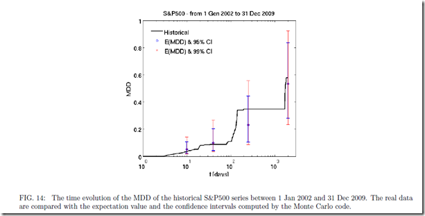
I think that the cumulative statistics, both total return and drawdown, fit well with the comment “The pictures imply that the maximum drawdown could have been pretty much anything.” Here is one of the figures that leads to this conclusion, and the predicted confidence interval from 20% to 90% is incredibly wide and not all that helpful.  If someone was willing to pay me for the bet that over the next 1,000 days, the S&P 500 or really any equity index drawdown falls between 20% and 90%, I would be happy to take that bet, and I would not need sophisticated statistical techniques to give me that insight.

image

Although I do not replicate the paper exactly with the most obvious difference that I use monthly returns 1950-May 2012 rather than daily returns 2002-2009, we can evaluate both return and drawdown through density plots with multiple distribution methods.  I limited my simulation to 10,000 samples so that I would not be up all night, but 10,000 is sufficient to show that over 62 years, both cumulative return and max drawdown can be virtually anything and both are “blazingly variable.”  I wonder how this would compare with life with sickness/death as drawdown and age of death as cumulative return.

From TimelyPortfolio

To be fair, let’s annualize the cumulative returns (actually probably better to do over 5 to 20 year periods).

From TimelyPortfolio

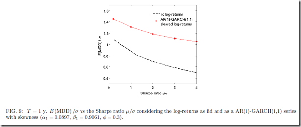
Independent of the outcome, I really enjoyed the paper’s Figures 8, 9, and 10 getting me one step closer to the question posed in my post Is Drawdown the Biggest Determinant of System Success?

image

image

image

We do see a relationship between return and drawdown.

From TimelyPortfolio

If nothing else, I was delighted to see a discussion of the often ignored drawdown statistic, which is the key to every investment decision I make.

R code from GIST:

Friday, June 8, 2012

knitr Performance Report 4

please see knitR Performance Report 3 (really with knitr) and dprint, knitr Performance Report–Attempt 3, knitr Performance Report-Attempt 2 and knitr Performance Report-Attempt 1

Here is another iteration of the ongoing performance reporting attempts using R, knitr, and latex.  In this version, I used the dev=”tikz” option (don’t like but show for an example) and work hard with lattice to get what I believe is a very nice overview page.  I’ll revert back to my second example and use the tufte-handout package for a little cleaner and more modern layout. These examples are intended to stimulate thought and comment. Please let me know what you think.

R code in GIST ( use the line knit2pdf(“pathtofile.rnw”) ) to create the pdf:

Evaluation of Tactical Approaches

Tactical approaches are often chosen based on the best cumulative return which implicitly incorporates significant hindsight bias.  Just because an approach dominates for a period of time does not indicate that it will be the best approach.  As the investment community abandons buy-and-hold and embraces tactical allocation, my guess is that the best cumulative return gathers the most assets.

Mebane Faber’s 10-month moving average system explored in

A Quantitative Approach to Tactical Asset Allocation
Journal of Wealth Management, Spring 2007

and further refined in his book

offers a simple method for achieving what most would deem as a good result—respectable cumulative returns with significantly less risk regardless of risk measure.  Let’s play with degrees of freedom and make slight changes to the system to see how they performed in the past.  Let’s then try to decide which approach we should pursue in the future given very incomplete information.  Once we decide, let’s then decide how confident we can be in the future result.

I will test 4 systems that are all very similar in approach:

NOT INVESTMENT ADVICE.  PLEASE DO NOT USE AS THE RESULT WILL BE LARGE AND PAINFUL LOSSES.

  1. Mebane Faber 10 month moving average
  2. Rolling Proprietary (say with a smile but don’t use emoticon) Sharpe ratio > 10 month moving average
  3. Rolling Proprietary Sharpe ratio > 0
  4. Rolling Proprietary Sharpe ratio > 6 months ago Rolling Proprietary Sharpe ratio

With a little help from the fine examples given in Download and parse EDHEC hedge fund indexes, we can visualize the cumulative returns and drawdowns of each approach.  I have denoted with a line 1985 which is a time when we might have chosen approach #2 since it offered significantly better cumulative returns from 1950-1985.  However, the result after our 1985 choice was not as good as we would have expected.

From TimelyPortfolio

Again using Download and parse EDHEC hedge fund indexes, we can use some more sophisticated measure of risk.  The middle (MovAvgSharpe or approach #2) offers the lowest level of historical risk on a cumulative basis.  Even though performance lagged since its 1985 first place finish, this might encourage us to still pick this approach.

From TimelyPortfolio

To continue our move away from cumulative return towards other statistics, we can check the distribution of the monthly changes and also some higher-moment statistics skewness and kurtosis.

From TimelyPortfolio

Even after all this exploration, we can predict nothing.  For more confidence, we might use ttrTests (explained in posts http://timelyportfolio.blogspot.com/search/label/ttrTests), use random portfolios as advocated and explained very well by http://portfolioprobe.com, and/or let relative strength decide as advocated and explained very well by http://systematicrelativestrength.com/.  However in 30 years, we have no idea what will do best or even what best means.

R code in GIST:

Friday, June 1, 2012

System from Trend Following Factors

As I thought more about Trend Following Factors from Hsieh and Fung, I thought that the trend following factors might indicate a state/regime for the equity markets that could potentially offer momentum-style timing signals for a system on the S&P 500.  Now, THIS ABSOLUTELY SHOULD NOT BE CONSIDERED INVESTMENT ADVICE, especially since the factor data is very lagged and the testing is nowhere near comprehensive enough.  I will however try to replicate the factor methodology to get a more real-time indicator extended to any index in another post. What is most interesting to me is that this is ex-ante intuitive and the signal is just basic statistics.

From TimelyPortfolio
Comments have been very light. Please let me know your thoughts.

R code from GIST: