Wednesday, July 27, 2011

Join the Reserves

Most forget that the tremendous macro imbalances caused by the 10 Trillion in foreign reserves are just 14 years old phenomenon but the results have been and will be profound.  The buying started after the Asia Pacific collapse of 1997, and the Asian central banks chose to continuously engage a different form of quantitative easing that far exceeds Bernanke’s QE1 and QE2. Remember Greenspan’s “Conundrum” and the inability of Fed rate increases to push the long end of the curve higher.  Those artificially restrained rates persuaded money managers and institutions to seek higher returns in new products like CDOs and motivated additional housing demand from the US consumer.  These were both significant factors in the 2008 collapse.

Interest rates are a very effective negative feedback mechanism that helps control the cyclicality of the economy.  When nonmarket forces inhibit the normal functioning of interest rates, significant macro imbalances can cause severe consequences.  Unfortunately, it seems we still have not learned our lesson.

It is very odd to me that all the recent media and popular attention on the political debate gives an illusion of control to our inept politicians and causes us to forget that the market, primarily Asian central bank buyers, determines the limits of US fiscal and monetary policy.  I can only hope that somehow the US can maintain the very tenuous confidence we take for granted.

From TimelyPortfolio

R code (click to download):

#get reserve data from IMF
require(ggplot2)   url = "http://www.imf.org/external/np/sta/cofer/eng/cofer.csv"   cofer <- read.csv (url, skip=5)
cofer <- cofer[c(7:17),c(1,3:18)]
rownames(cofer) <- cofer[,1]
cofer <- cofer[,2:NCOL(cofer)]
#erase commas
col2cvt <- 1:NCOL(cofer)
cofer[,col2cvt] <- lapply(cofer[,col2cvt],
function(x){as.numeric(gsub(",", "", x))})
#erase spaces
rownames(cofer) <- gsub(" ", "", rownames(cofer))
#get numeric
col2cvt <- 1:NCOL(cofer)
cofer[,col2cvt] <- lapply(cofer[,col2cvt],
function(x){as.numeric(x)})
#get data frame and invert
cofer <- as.data.frame(t(cofer))
#convert years to dates to use
datestoformat <- rownames(cofer)
datestoformat <- as.Date(paste(substr(datestoformat,2,5),"-12-31",sep=""))
#prepare for ggplot
rownames(cofer) <- 1:NROW(cofer)
cofer <- cbind(datestoformat,cofer)
cofer_melt <- melt(cofer,id.vars=1)
colnames(cofer_melt) <- c("Date","Country","Amount")   #get area chart
jpeg(filename="oecd cofer reserves area chart.jpg",quality=100,
width=6.25, height = 6.25, units="in",res=96)
ggplot(cofer_melt,
aes(x=Date,y=Amount,fill=Country)) + geom_area() +
scale_fill_hue(l=40, c=65) +
opts(title="OECD Cofer Foreign Currency Reserves",
panel.background = theme_rect(colour="gray"))
dev.off()

Created by Pretty R at inside-R.org

Sunday, July 24, 2011

Crazy RUT

I have noticed that the Russell 2000 (RUT) acts very differently from most of the other indexes that I have studied.  If we apply the system shown in Shorting Mebane Faber to RUT and then extend it with a simple slope, we notice something very different about RUT behavior.  No clear dominant strategy really emerges.

From TimelyPortfolio

R code (click to download):

require(quantmod)
require(PerformanceAnalytics)   getSymbols("^RUT",from="1919-01-01",to=Sys.Date())   RUT <- to.monthly(RUT)[,4]
index(RUT) <- as.Date(index(RUT))   #get 10 month rolling average
avg10 <- runMean(RUT,n=10)   #know I can do this better in R but here is my ugly code
#to calculate 6 month slope of 10 month average
width=6
for (i in 1:(NROW(avg10)-width)) {
#get sp500/crb slope
model <- lm(RUT[i:(i+width),1]~index(RUT[i:(i+width)]))
ifelse(i==1,avg10slope <- model$coefficients[2],
avg10slope <- rbind(avg10slope,model$coefficients[2]))
}
#get xts so we can use
avg10slope <- xts(cbind(avg10slope),order.by=index(avg10)[(width+1):NROW(avg10)])   priceSignals <- na.omit(merge(RUT,avg10,avg10slope))   signalUpUp <- ifelse(priceSignals[,1] > priceSignals[,2] & priceSignals[,3] > 0, 1, 0)
signalUpDown <- ifelse(priceSignals[,1] > priceSignals[,2] & priceSignals[,3] < 0, 1, 0)
signalDownUp <- ifelse(priceSignals[,1] < priceSignals[,2] & priceSignals[,3] > 0, 1, 0)
signalDownDown <- ifelse(priceSignals[,1] < priceSignals[,2] & priceSignals[,3] < 0, 1, 0)   retUpUp <- lag(signalUpUp,k=1)* ROC(RUT,type="discrete",n=1)
retUpDown <- lag(signalUpDown,k=1)* ROC(RUT,type="discrete",n=1)
retDownUp <- lag(signalDownUp, k=1) * ROC(RUT,type="discrete",n=1)
retDownDown <- lag(signalDownDown, k=1) * ROC(RUT,type="discrete",n=1)   ret <- merge(retUpUp,retUpDown,retDownUp,retDownDown,ROC(RUT,type="discrete",n=1))
colnames(ret) <- c("UpUp","UpDown","DownUp","DownDown","RUT")   jpeg(filename="performance summary.jpg",quality=100,
width=6.25, height = 6.25, units="in",res=96)
charts.PerformanceSummary(ret,ylog=TRUE,
colorset=c("cadetblue","darkolivegreen3","goldenrod","purple","gray70","black"),
main="RUT 10 Month Moving Average Strategy Comparisons
May 1987-Jun 2011"
)
dev.off()   jpeg(filename="rolling returns.jpg",quality=100,
width=6.25, height = 6.25, units="in",res=96)
chart.RollingPerformance(ret,width=36,
colorset=c("cadetblue","darkolivegreen3","goldenrod","purple","gray70","black"),
main="RUT 10 Month Moving Average Strategy Comparisons
36 Month Rolling Return May 1987-Jun 2011"
)
dev.off()

Created by Pretty R at inside-R.org

Tuesday, July 19, 2011

Shorting Mebane Faber

Although I do not personally know Mebane Faber, I know enough that I do not want to short him.

However, I thought it would be insightful to see how the short side of his “A Quantitative Approach To Tactical Asset Allocation” might look.  Once we see how it looks, I think it confirms my focus on drawdown as my primary risk measure (see post Drawdown Control Can Also Determine Ending Wealth) and proves the difficulty of shorting upward sloping U.S. equities.

From TimelyPortfolio

I thought this chart was a nice modification of PerformanceAnalytics RiskReturnScatter.

From TimelyPortfolio

Here is an illustration of how all the other risk measures don't say much except for the drawdown number.

From TimelyPortfolio

R code (click to download):

require(quantmod)
require(PerformanceAnalytics)   #completely from the PerformanceAnalytics package chart.RiskReturn
#cannot claim any of the credit for the fine work in this package   chart.DrawdownReturn <- function (R, Rf = 0, main = "Annualized Return and Worst Drawdown", add.names = TRUE,
xlab = "WorstDrawdown", ylab = "Annualized Return", method = "calc",
geometric = TRUE, scale = NA, add.sharpe = c(1, 2, 3), add.boxplots = FALSE,
colorset = 1, symbolset = 1, element.color = "darkgray",
legend.loc = NULL, xlim = NULL, ylim = NULL, cex.legend = 1,
cex.axis = 0.8, cex.main = 1, cex.lab = 1, ...)
{
if (method == "calc")
x = checkData(R, method = "zoo")
else x = t(R)
if (!is.null(dim(Rf)))
Rf = checkData(Rf, method = "zoo")
columns = ncol(x)
rows = nrow(x)
columnnames = colnames(x)
rownames = rownames(x)
if (length(colorset) < columns)
colorset = rep(colorset, length.out = columns)
if (length(symbolset) < columns)
symbolset = rep(symbolset, length.out = columns)
if (method == "calc") {
comparison = cbind(t(Return.annualized(x[, columns:1])),
t(maxDrawdown(x[, columns:1])))
returns = comparison[, 1]
risk = comparison[, 2]
rnames = row.names(comparison)
}
else {
x = t(x[, ncol(x):1])
returns = x[, 1]
risk = x[, 2]
rnames = names(returns)
}
if (is.null(xlim[1]))
xlim = c(0, max(risk) + 0.02)
if (is.null(ylim[1]))
ylim = c(min(c(0, returns)), max(returns) + 0.02)
if (add.boxplots) {
original.layout <- par()
layout(matrix(c(2, 1, 0, 3), 2, 2, byrow = TRUE), c(1,
6), c(4, 1), )
par(mar = c(1, 1, 5, 2))
}
plot(returns ~ risk, xlab = "", ylab = "", las = 1, xlim = xlim,
ylim = ylim, col = colorset[columns:1], pch = symbolset[columns:1],
axes = FALSE, ...)
if (ylim[1] != 0) {
abline(h = 0, col = element.color)
}
axis(1, cex.axis = cex.axis, col = element.color)
axis(2, cex.axis = cex.axis, col = element.color)
if (!add.boxplots) {
title(ylab = ylab, cex.lab = cex.lab)
title(xlab = xlab, cex.lab = cex.lab)
}
if (!is.na(add.sharpe[1])) {
for (line in add.sharpe) {
abline(a = (Rf * 12), b = add.sharpe[line], col = "gray",
lty = 2)
}
}
if (add.names)
text(x = risk, y = returns, labels = rnames, pos = 4,
cex = 0.8, col = colorset[columns:1])
rug(side = 1, risk, col = element.color)
rug(side = 2, returns, col = element.color)
title(main = main, cex.main = cex.main)
if (!is.null(legend.loc)) {
legend(legend.loc, inset = 0.02, text.col = colorset,
col = colorset, cex = cex.legend, border.col = element.color,
pch = symbolset, bg = "white", legend = columnnames)
}
box(col = element.color)
if (add.boxplots) {
par(mar = c(1, 2, 5, 1))
boxplot(returns, axes = FALSE, ylim = ylim)
title(ylab = ylab, line = 0, cex.lab = cex.lab)
par(mar = c(5, 1, 1, 2))
boxplot(risk, horizontal = TRUE, axes = FALSE, ylim = xlim)
title(xlab = xlab, line = 1, cex.lab = cex.lab)
par(original.layout)
}
}     getSymbols("DJIA",src="FRED")
#if you prefer Yahoo! Finance
#getSymbols("^DJI",from="1919-01-01",to=Sys.Date())   DJIA <- to.monthly(DJIA)[,4]
index(DJIA) <- as.Date(index(DJIA))   signalUp <- ifelse(DJIA > runMean(DJIA,n=10), 1, 0)
signalDown <- ifelse(DJIA < runMean(DJIA,n=10), -1, 0)   retUp <- lag(signalUp,k=1)* ROC(DJIA,type="discrete",n=1)
retDown <- lag(signalDown, k=1) * ROC(DJIA,type="discrete",n=1)
ret <- merge(retUp + retDown,retUp,retDown,-retDown,ROC(DJIA,type="discrete",n=1))
colnames(ret) <- c("Combined","LongAbove","ShortBelow","LongBelow","DJIA")   #jpeg(filename="performance summary all.jpg",quality=100,
# width=6.25, height = 6.25, units="in",res=96)
charts.PerformanceSummary(ret,ylog=TRUE,
colorset=c("cadetblue","darkolivegreen3","goldenrod","purple","gray70"),
main="DJIA 10 Month Moving Average Strategy Comparisons
May 1896-Jun 2011"
)
#dev.off()
#jpeg(filename="performance summary before 1932.jpg",quality=100,
# width=6.25, height = 6.25, units="in",res=96)
charts.PerformanceSummary(ret["::1932-06",3],ylog=TRUE,
main="DJIA Short Below 10 Month Moving Average Works
May 1896-Jun 1932"
)
#dev.off()
#jpeg(filename="performance summary after 1932.jpg",quality=100,
# width=6.25, height = 6.25, units="in",res=96)
charts.PerformanceSummary(ret["1932-07::",3],ylog=TRUE,
main="DJIA Short Below 10 Month Moving Average Fails
Jul 1932-Jun 2011"
)
#dev.off()   #jpeg(filename="drawdown annualized return scatter.jpg",quality=100,
# width=6.25, height = 6.25, units="in",res=96)
chart.DrawdownReturn(ret[,1:5])
#dev.off()   #look at risk measures
require(ggplot2)
#jpeg(filename="risk.jpg",quality=100,width=6.25, height = 5,
# units="in",res=96)
downsideTable<-table.DownsideRisk(ret)
downsideTable<-melt(cbind(rownames(downsideTable),
downsideTable))
colnames(downsideTable)<-c("Statistic","Portfolio","Value")
ggplot(downsideTable, stat="identity",
aes(x=Statistic,y=Value,fill=Portfolio)) +
geom_bar(position="dodge") + coord_flip()
#dev.off()

Created by Pretty R at inside-R.org

Wednesday, July 13, 2011

More Thoughts on US Death Spiral

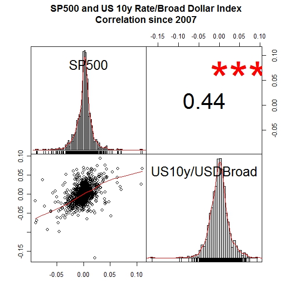
What troubles me most about today’s environment is the persistent belief that crisis large or small results in a US dollar rally and lower Treasury rates. However, what happens if the US dollar and US Treasury rates are the source of the crisis? Then the US enters a death spiral and the currency, stocks, and bonds suffer simultaneously and equally, and unfortunately there is nowhere in traditional asset allocation to hide.

Recent events are simply a phenomenon begun in 1998 with $4-$5 Trillion Asian Central Bank reserve building and local currency devaluation. There are limits to the monetary and fiscal policies pursued so vigorously since 2000, and I think we have found those limits and will face much more severe consequences.

For more see earlier posts:

New Favorite Test of US Monetary Policy Limits

Nine Lives of the Fed Put

Unsustainable Gift

Death Spiral of a Country

From TimelyPortfolio

If we look past 1998, the relationship looks much different.

From TimelyPortfolio

R code (click to download):

require(quantmod)
require(PerformanceAnalytics)   getSymbols("SP500",src="FRED")
getSymbols("DGS10",src="FRED")
getSymbols("DTWEXB",src="FRED")
getSymbols("DTWEXM",src="FRED")   fedData <- na.omit(merge(SP500,DGS10,DTWEXB))
fedData <- merge(ROC(fedData[,1],type="discrete",n=1),
ROC(fedData[,2]/fedData[,3],type="discrete",n=1))
colnames(fedData) <- c("SP500","US10y/USDBroad")   #jpeg(filename="performance since 2007.jpg",quality=100,
# width=6.25, height = 6.25, units="in",res=96)
chart.CumReturns(fedData["2007::"],legend.loc="bottomright",
main="SP500 and US 10y Rate/Broad Dollar Index")
#dev.off()   #jpeg(filename="correlation.jpg",quality=100,
# width=6.25, height = 6.25, units="in",res=96)
chart.Correlation(fedData["2007::"],
main="SP500 and US 10y Rate/Broad Dollar Index
Correlation since 2007"
)
#dev.off()   #jpeg(filename="rolling correlation.jpg",quality=100,
# width=6.25, height = 6.25, units="in",res=96)
chart.RollingCorrelation(fedData["2007::",1],fedData["2007::",2],n=250,
main="SP500 and US 10y Rate/Broad Dollar Index
Rolling 250 Day Correlation"
)
#dev.off()   fedData <- na.omit(merge(SP500,DGS10,DTWEXM))
fedData <- merge(ROC(fedData[,1],type="discrete",n=1),
ROC(fedData[,2]/fedData[,3],type="discrete",n=1))
colnames(fedData) <- c("SP500","US10y/USDMajor")   #jpeg(filename="performance.jpg",quality=100,
# width=6.25, height = 6.25, units="in",res=96)
chart.CumReturns(fedData,legend.loc="topleft",
main="SP500 and US 10y Rate/Broad Dollar Index")
#dev.off()   #jpeg(filename="correlation.jpg",quality=100,
# width=6.25, height = 6.25, units="in",res=96)
chart.Correlation(fedData,
main="SP500 and US 10y Rate/Broad Dollar Index
Correlation Since 1973"
)
#dev.off()   #jpeg(filename="rolling correlation.jpg",quality=100,
# width=6.25, height = 6.25, units="in",res=96)
chart.TimeSeries(runMean(runCor(fedData[,1],fedData[,2],n=250),n=250),
main="SP500 and US 10y Rate/Broad Dollar Index
Rolling 250 Day Average of Rolling 250 Day Correlation"
)
#dev.off()

Created by Pretty R at inside-R.org

Tuesday, July 12, 2011

Some Good Discussion

I thought this was a very good and fun discussion http://quant.stackexchange.com/questions/1427/risk-factors-in-analysing-strategies.  Please comment negative or positive.  Unfortunately, I do not spend much time talking about all the failed methods that I have discovered but everyone should know that my failure rate for mathematically intense strategies is far higher than the failure rate for the simple.  Now, I would much rather find more data than learn more math and stats.

One of my main philosophies is that based on joint probabilities the more decisions I make the less likely they will be correct.

If I have not stated enough over the last 7 months of blogging, simple methods tested with multi-country and sector datasets extending well beyond 1980 and hopefully well beyond 1950 provide me the confidence I need to risk my own money and maintain confidence in myself in mass chaos like 2008-2009.  Waiting for mass chaos to test your methods and ask questions most likely guarantees a very unfavorable result.

I have seen the smartest people blow up fairly reliably over my career (see quant funds 2007-2008, LTCM 1998, Victor Niederhoffer, and on and on).  In all my experience I have found it is very easy to lose money equally well with both sophisticated and basic.  However, making money reliably seems to favor the simple.  As long as skeptical questions like this are asked and money flows to shorter and shorter High Frequency products, I feel comfortable that I can pursue my infantile methods for profit in the markets.  However, I am also an open and humble voracious reader who readily accepts any methods that pass my very stringent tests.

Here are some very good sources for additional reading:

Paul Wilmott and Emanuel Derman (easily two of the greats in quantitative finance) http://www.ederman.com/new/docs/fmm.pdf

Ned Davis http://www.amazon.com/Being-Right-Making-Money-Davis/dp/0970265107 (look at those used prices wow! must be something of value in there")

IPE Quant: All in the numbers http://ipe.com/magazine/all-in-the-numbers_40749.php?issue=June%202011

Bryan Urstadt The Blow-up http://bryanturstadt.com/uploads/Nov07FeatureQuants-2.pdf

New York Times “In Modeling Risk, the Human Factor Was Left Out” http://www.nytimes.com/2008/11/05/business/05risk.html

One of the very few quantitative success stories is Simons at Renaissance Cracks Code, Doubling Assets (Update1).