Thursday, January 27, 2011

Billion Prices Project @ MIT – Watch out Bonds and CPI!!!!

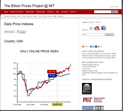
This is an extremely valuable set of information particularly when it shows something not being priced in to the markets, especially bonds.  I have been checking weekly/monthly waiting for a pop, and here it is.  Watch out bonds and CPI!

2011-01-27 billion prices project

Everyone please go to the site and play with the numbers for yourself.  Also, please share this with anyone who cares.


20 minutes

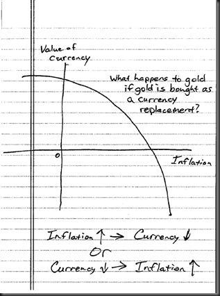
Gold as Currency in Inflation

Another visualization inspired by This is Indexed.

2011-01-27 gold currency inflation

Nothing New But Don’t Think It Should Be Ignored—Warren Buffett and MCO

This has been discussed at http://www.businessinsider.com/moodys-ceo-dumped-stock-sec-wells-notice-2010-5, but I have not seen a chart or timeline of events.

March 18, 2010 – SEC issues Wells notice to Moody’s but public does not know

March 18, 2010 –  March 26, 2010 Warren Buffett sells > 1,000,000 shares of Moody’s

May 7, 2010 – Moody’s discloses Wells Notice and stock is down 28% from Buffett’s sales price

2011-01-27


Also, the interesting phenomenon is the huge selloff while the public was completely unaware of the Wells notice.  Who else knew?  S&P 500 did not turn down until the end of April 2010, so that is not an adequate explanation.


For the R Geeks here is the code (I cheated on two of the labels):

library(quantmod)
library(TTR)
library(PerformanceAnalytics)

tckr<-"MCO"

start<-"2008-06-30"
end<- format(Sys.Date(),"%Y-%m-%d") # yyyy-mm-dd

# Pull tckr index data from Yahoo! Finance
getSymbols(tckr, from=start, to=end)

MCOdaily<-dailyReturn(MCO)
Return.cumulative = cumprod(1+MCOdaily) - 1
Return.cumulative = (1+Return.cumulative) * 34.44 #price of MCO at start of period
colnames(Return.cumulative)<-c("Moody's")
chart.TimeSeries(Return.cumulative, colorset = "darkblue", legend= NULL, period.areas = cycles.dates, period.color = "lightgreen", event.lines = risk.dates, event.labels = risk.labels, event.color = "red", lwd = 2, main="Moody's Stock Price",sub="Green Shaded Represents Sales",xlab=NULL)

abline(h=15.87,col="red",lty=2)

cycles.dates = list(
    c("2009-07-21","2009-07-22"),
    c("2009-09-01","2009-09-02"),
    c("2009-10-28","2009-10-29"),
    c("2009-12-07","2009-12-18"),
    c("2010-03-18","2010-03-26"),
    c("2010-09-10","2010-09-20"),
    c("2010-10-12","2010-10-21"))
# Event lists - FOR BEST RESULTS, KEEP THESE DATES IN ORDER
risk.dates = c("2008-11-07","2010-03-18","2010-05-07")
risk.labels = c("Buffett buys 31.5mm shares for $499mm","SEC issues Moody's Wells","Moody's reports Wells")


45 minutes
Wednesday, January 26, 2011

Not Sure I Understand the Fuss About Munis

Recently, munis have received lots of press due to a perceived crisis.  However, from iShares description of iShares S&P National AMT-free Municipal Bond Fund (MUB), it appears that the press and investors just don’t understand one of the most important basics of fixed income—duration.

Fundamentals as of 1/24/2011

Weighted Average Maturity Weighted Average Maturity
11.81 yr

Weighted Average Coupon Weighted Average Coupon
4.77%

Effective Duration Effective Duration
7.61

Standard Deviation (3 year) Standard Deviation
as of 12/31/2010
6.93%

Duration tells you the expected price change from a move in interest rates, so in the case of MUB with effective duration of 7.61, MUB should lose in price 7.61% for every 1% move up in interest rates.  7.61 duration (equivalent to a 7-10 Year Treasury) is what I would consider very interest rate sensitive and much more susceptible than the Barclays Aggregate at 4.98.

If we look on a graph (courtesy of Stockcharts), muni behavior has not been all that strange or unusual compared to the iShares 7-10 US Treasury (IEF).  So far, it just appears to be a bounded random blip that has already corrected itself.

via StockCharts.com

Now, of course if you have a leveraged closed-end fund, the pain is worse, but that is the danger of leverage.

Another way to look at it statistically would be to graph the rolling correlation (thanks R and PerformanceAnalytics).

image

This also does not look strange or unusual, especially if we compare to the 2008 panic.

The moral of the story is pay attention to duration if you invest in bonds.  The same thing is happening in the Investment Grade Corporate Index at a near-record duration (LQD is 7.01), so be very careful there too.

1.5 hours

Tuesday, January 25, 2011

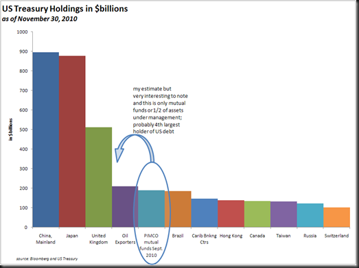
4th Largest Holder of US Treasuries? PIMCO

I have to admit that I have been startled by these articles on Bill Gross and his boast of home phone calls from the US Treasury Secretary--what I would call “inside information” (apparently perfectly legal in bond management).

http://www.nytimes.com/2009/06/21/business/21gross.html?_r=1&pagewanted=all

http://www.theglobeandmail.com/report-on-business/managing/the-lunch/the-obsessive-life-of-bond-guru-bill-gross/article1769691/

This is even more concerning given PIMCO’s huge holdings in US Treasury bonds, which it appears they intentionally try not to aggregate for public consumption.  I tried to compile the numbers on total holdings, and my best estimate based on mutual fund holdings is $180 billion and over $250 billion applying the allocation to other managed accounts.  It looks something like this.

image

And then strangely enough, when we examine outperformance of PIMCO Total Return Fund over the Barclays Aggregate, something stands out slightly

image

I certainly don’t know what happened, but I like to point out odd things that go unquestioned especially when they deal with $1/4 Trillion of US Treasuries.  Please let me know if you have any insight.


2.5 hours

Monday, January 24, 2011

Dollar Cost Average in Ugly Markets Version 2

As an update to my “Dollar Cost Averaging in Ugly Markets” post from earlier today, I updated the system slightly.  In this version, buy after a 55% drawdown 10% each month that is higher than the previous month.  The results from 1931-1937 in the Dow and 2009-2010 in the S&P 500 are shown below. 

There are certainly far better systems and methods, and I do not advise this as your method of entry, but sometimes it is nice and comforting to keep it very simple in the midst of panic.

image

Of course, this all assumes that the investor exited in the first place at some point prior to the 55% drawdown.


1 hour

Dollar Cost Averaging in Ugly Markets

Pragmatic Capital’s summary of Jeff Saut’s weekly commentary reminded of my dollar-cost averaging notion that I had on (I’m not kidding) March 9, 2009 in an email:

“Another thought I had:

What if you started investing 10%/month in Dow  for 10 months until 100% equity allocation  after you hit the 60% drawdown level in September 1931?  These are your returns pursuing such a strategy.  Good to know assuming this is the absolute worst case  (can't think of much worse than the Great Depression with 89% ultimate drawdown) .  I like my chances.”

The thought at that point was how can we overcome the panic/despair/despondency of the dreadful market in 2008 and take definitive action to transform ugliness into opportunity.  So, knowing in 2008, that the bottom was unknowable, I thought I could test dollar cost averaging on the worst market in US history and see how it might work.  I picked without optimization 60% as the drawdown level to initiate a 10 month (makes the math easier) 10%/month allocation to the Dow Jones (1929-1931) and S&P500 (2007-2008).  The 60% drawdown level on monthly average basis hit September 1931, so let’s see how it worked then.  Just knowing the worst case can help overcome the disabling fear.  A little tweaking would dramatically improve the performance, but I wanted to be intellectually honest and not optimize.

image

Unfortunately for the system but fortunately for the remaining equity investors, the S&P 500 did not hit 60% drawdown in the 2008 crisis.  Just for fun, let’s tie this post and system concept to the caution of my “Perils of Bottom Picking” post by amending the drawdown to 55% and only investing when the index moves up on a monthly basis in tomorrow’s post (have not done, so will be a surprise to me too)…

75 minutes

Thursday, January 20, 2011

Perils of Bottom Picking

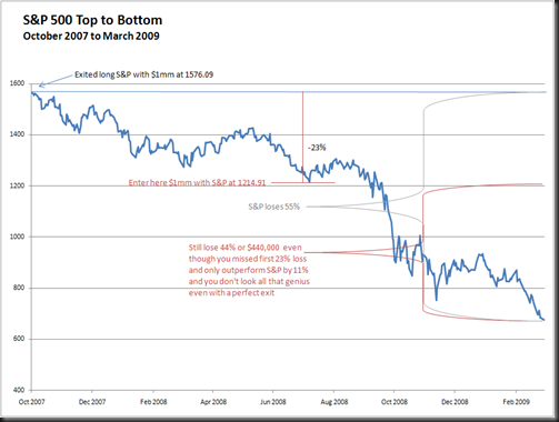
Compounding negative returns is not as splendid as Albert Einstein’s (if he said it at all) “most powerful force in the universe” of compounding interest or positive returns.  Drawdown is a series of traps or a compounding of really ugly negative returns.  Let’s say that you as master investor exited your $1,000,000 million position in the S&P 500 at the exact top in October 2007 at 1576.09.  You wait very patiently and based on your investment experience from 1980-2006, reenter at 1214.91 down 23% seven months later as discussed in in Barron's July 2008.  The money you don’t lose or save is not 55% (total loss to S&P) – the 23% you missed.  Rather, it is still a very painful loss of 44% and it does not seem so genius even with a genius exit.  This trap hurt a lot of supposed geniuses that earned that reputation from 1980-2006.

image

1 hour

Friday, January 14, 2011

“Dumb Money”

In the financial industry, there always seems to be a discussion about “Dumb Money.”  Generally, “Dumb Money” is used to describe the retail investor, but based on Ned Davis Research, all stock price gains over the last 50 years came when there were inflows to equity mutual funds, so this would indicate “Dumb Money” might actually be “Smart Money.”

Also, it seems that “Dumb Money” is always the money made by someone else with a view opposite of yours.  Jealousy and bitterness often seems to be the source of this “Dumb Money” classification.  John Hussman seemed to fall in this category with this weekly commentary "Profiting from the Tooth Fairy", which with hindsight seems clearly wrong.  However, his definition of “Dumb Money” in this same post probably fits very well with mine

“‘catching’ gains from speculative investment themes that have a high probability of collapsing” or (my addition) where risk dramatically exceeds potential returns.

With this in mind, what was the “Dumb Money” last year?  I think US bonds, gold, and Japanese Yen, but I might just be bitter or jealous.  By the end of 2011, we’ll know the truth.

image


1 hour

Thursday, January 13, 2011

Simple Return Graph

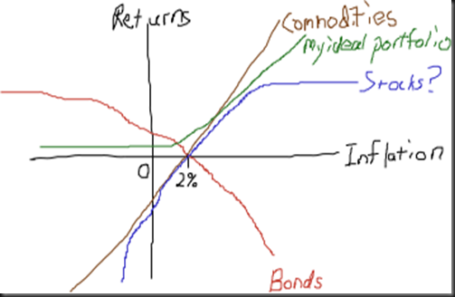
I just found and really enjoyed http://thisisindexed.com.  Here is my first attempt.  The biggest enemy to any bond is inflation, and the lower the rate, the lower the defense against inflation.  See previous posts for thoughts on gold and bonds.

image


30 minutes

Wednesday, January 12, 2011

Yen Impediment to Japanese Stocks

In the chart below, the restraint of the Japanese yen on the Nikkei 225 is very evident.  Based on my most likely scenario of higher inflation leading to appreciating Emerging Asian currencies as they abandon the US Dollar peg, Japanese exporters would benefit most greatly as their competitiveness improves dramatically.  For your portfolio to benefit from that scenario, go long Japanese stocks, long emerging market currencies, long commodities, short bonds, and short Euro/Yen/US$ reserve currencies.  It sure would be nice if there were a fund with all these exposures, but for now long ujpix, long eem, long tbt, and long dba/dbc should offer a reasonable substitute for the retail investor.  Buy and hold might finally be a good strategy again with this combination.

As usual, my thoughts are simply that and should not be construed as investment advice.  This suggestion could very easily lose money, and I might not notify you when it does, so you’re on your own.  Best of luck.

Nikkei Relative to Dow Jones World Monthly Performance with Japanese Yen overlay

via StockCharts.com

1 hour

Tuesday, January 11, 2011

Bonds in Constrained Bubble

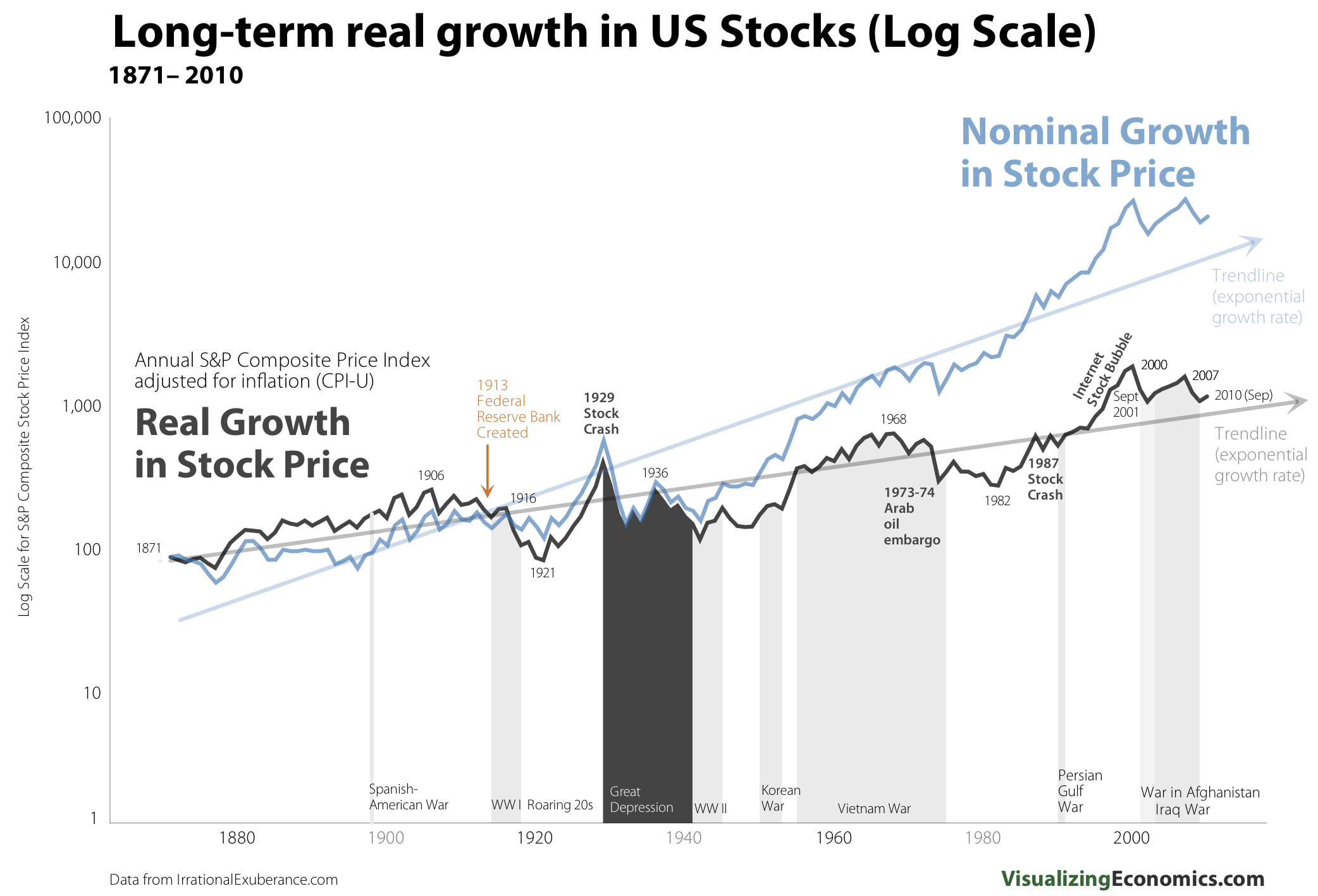
I characterize a “bubble” as irrational overvaluation based on the belief that potential returns are infinite and pursued by uncharacteristic amounts of money.  Based on this definition, bonds cannot ever be a bubble because potential returns and overvaluation are mathematically constrained by the zero bound of interest rates.  However, after a 30 year run, bonds are a constrained bubble.  I have seen stocks graphed based on long term linear forecasts (most recently and beautifully in Visualizing Economics), but very rarely see a similar chart for bonds, so using the same Shiller dataset, I have plotted bonds with some interesting overlays.

image

That is a lot of lines, so let’s narrow it down to the experience since 1980 but keeping the long-term framework in mind.

image

or maybe we can look at bonds one more way in terms of price return on a 5 year rolling basis.  1980-2010 certainly stands out.

image


2 hours

Wednesday, January 5, 2011

More on Gold as Expensive Inflation Insurance

I was struck by an Bloomberg article declaring “World Food Prices Surge to Record, Passing Levels That Sparked 2008 Riots” because in all my research I had not analyzed this dataset from the Food and Agriculture Organization of the United Nations.  As I usually do when I run across a broad dataset from a respectable organization, I started playing with the numbers.  I found more confirmation that gold is expensive against inflation previously discussed in “Gold is Mighty Expensive Inflation Insurance.”  Here are the charts

image image

source: Food and Agriculture Organization of the United Nations and Bloomberg

I think a lot of investors/speculators will be mighty surprised when we get inflation and significant commodity price movements while gold does nothing or even worse moves down.


25 minutes

Monday, January 3, 2011

Wise Japanese Investor? Wise US Investor?

Investors of a country do not have to suffer the same fate as the country in which they reside.  Free markets allow an investor to make a investment independent of their country of residence.

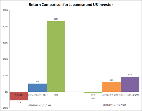
If a Japanese investor switches from the Nikkei to short-term Japanese Government Bonds at the height of the Japanese equity bubble in December 1989, the investor is celebrated as a hero and lauded as one of the greatest investors of all time.  However, if the Japanese investor expanded the opportunity set and included United States stocks, the Japanese investor would have truly shown amazing wisdom.

image

source: Bloomberg, Dow Jones, S&P, and Merrill Lynch/Bank of America

The US investor that sold stocks in December 1999 and switched to short-term US bonds would be called a superinvestor, but that narrow-minded decision was not the best.

Let’s look at a real superhero investor who switched investment allocation 3 times over the last 30 years.  This superinvestor bought Japanese stocks on 12/31/79, US stocks 12/31/89, and emerging market stocks 12/31/99.  This superinvestor would have achieved a 1050% return (16.6% annualized) over the last 30 years from 1979-2009.


1 hour