Thursday, December 20, 2012

Shiny/R Conversion of Another One of My Favorite Mike Bostock d3 Examples

Mike Bostock has revolutionized visualization with his d3 and his seemingly infinite examples.  In another adaptation of his amazing work, I will adapt one of my favorite examples to supplement the interactive scatterplot with data supplied by R through Shiny.  Often in finance, we will use a scatterplot to explore the relationship between different asset classes or risk exposures.  This exploration becomes much more deep and meaningful when we can interact in real-time with the plot.

I thought using the technique to look at the monthly returns of Vanguard funds representing different exposures would be helpful.  A clear linear relationship immediately shows up between the equity funds (VFINX-Vanguard S&P 500, VDMIX-Vanguard Developed Markets, and VEIEX-Vanguard Emerging Markets).  Also, we can see the very beneficial effect of VBMFX-Vanguard Total US Bond throughout what we know was a tumultuous period.

Live example hosted at Glimmer (IE does not correctly render IFRAME below)

Code at Github

Shiny SVG no d3–New and Improved

The fine author Joe Cheng of RStudio Shiny suggested in this Google Groups message to use htmlOutput rather than the ugly hack in my last post R Shiny svg with no d3.  As I should have known, it works great and eliminates all the useless javascript.  Unless, you dig into the code, nothing changes, but I have posted a new glimmer live example and the code at Github.  For the ambitious, please feel free to use d3 now or other code to show how we could change colors and other aesthetics with javascript.

Tuesday, December 18, 2012

R Shiny svg with no d3

see Shiny SVG no d3–New and Improved for a better version

Paul Murrell’s Technical Report reminded me that svg in the browser does not require d3.  With his package gridSVG, we can do all sorts of wonderful things without leaving R.  I think I prefer the power of d3.js, but here is an example of R creating svg from a lattice plot with gridSVG and then sending to the browser through Shiny.

Here is the code at github.

Monday, December 17, 2012

From d3 to pdf (hopefully knitr) with R Shiny

Although I think I like the d3, R, and Shiny team the best, I could definitely envision a big need for multi-page pdf reports created with R, knitr, and latex delivered to the browser with Shiny.  Shiny helpfully provides pre-built functionality to send .png charts and graphics created by R to the web.  This works especially well since most browsers offer containers for the graphics that can dynamically change.

In this quick experiment, I use the pdf() dev function from R instead of the hoped for knit2pdf to see if sending the binary pdf data is possible.  It seems the downloadHandler function from Shiny only currently handles text.  The downloadHandler function from Shiny also serves up downloads well.  I have included the code to get that to work also if you prefer this behavior.

Try it out at http://glimmer.rstudio.com/timelyportfolio/shiny-d3-pdf.  It seems to work with the newest Chrome and IE.

image

Code at Github.

Friday, December 14, 2012

d3, Shiny, and R Reporting Performance

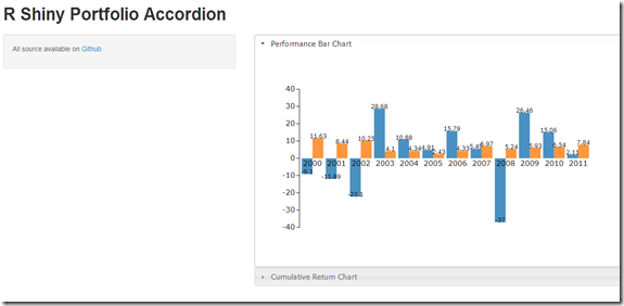
I thought it would be interesting to offer a little different example of how we can use d3, R, and Rstudio Shiny.  This time we will perform a simple example to report portfolio or index performance.  Just as a test of my progress, I also threw in a jQuery UI accordion effect.

Live example here

image

Code here

Thursday, December 13, 2012

Shiny, R, d3 Adaptation of Mike Bostock’s Calendar

The idea with all the posts http://timelyportfolio.blogspot.com/search/label/shiny was to learn both d3 and shiny by iterating through multiple experiments.  This example adaptation was my quickest yet at about 30 minutes.  Mike Bostock had done all the hard work, and all I had to do was write about 40 lines of R code to download the index data through getSymbols and Yahoo!Finance and deliver that data to d3.

Example http://glimmer.rstudio.com/timelyportfolio/shiny-d3-calendar/

Code https://github.com/timelyportfolio/shiny-d3-calendar

image

Wednesday, December 12, 2012

more d3 with shiny and R (CPI from bls.gov)

Extending the marginal success achieved in

d3 Showreel Combined with R and Shiny 

d3 and r interacting through shiny

I have converted http://bl.ocks.org/3891711 to use data supplied by an R load of http://bls.gov CPI data through Rstudio's Shiny.  The example does not work perfectly due to some NaN in the d3 path, but I wanted to publish for some feedback.

A live example is here (please be patient since it will download about 6mb before showing anything), and the code is here on Github.

image

Monday, December 10, 2012

d3 Showreel Combined with R and Shiny

Since the d3 portion of the example provide in my last post d3 and r interacting through shiny was so weak, I thought it would be interesting to combine the much more compelling Showreel Example with the same stock data.  However, this time the data will come from R getSymbols.  Also, most of the plots would be better using cumulative return data, so we will use R to convert the price data into a cumulative return series.

Almost all credit for the code contained in this example goes to Mike Bostock, and although much of the code is now gone, the structure and idea belong to Trestle Technology's Jeff Allen.

See it live in the browser at http://glimmer.rstudio.com/timelyportfolio/shiny-d3-showreel/, and all code is hosted on Github, so please play, experiment, and let me know what great things you do with this.

Friday, December 7, 2012

d3 and r interacting through shiny

I was amazed and delighted by the Reconstruct Gene Networks Using Shiny.  Jeff accomplished what I knew was possible but had absolutely no idea how to implement.  With the boost, I went to work combining his d3 force layout with my d3 experiments discussed in Hi R and Axys, I’m d3.js “Nice to Meet You” (On the Iphone)Unfortunately, I could not figure out how to host the example at http://glimmer.rstudio.com See this live at http://glimmer.rstudio.com/timelyportfolio/shiny-d3-plot/, and for all the source code go to https://github.com/timelyportfolio/shiny-d3-plot.

Wednesday, December 5, 2012

Apple Compared to Others with ggthemes

For a happy person delightfully concentrated in Apple, I wanted to show Apple’s performance versus Microsoft and Cisco in decades 1(1990-2000) and 2 (2000-2012).  I thought this would give me a good chance to try out the very interesting work being done at https://github.com/jrnold/ggthemes.

From TimelyPortfolio

Just as a reference, my general goto chart is theEconomist set from latticeExtra.  Here is how it would look with that method.  I think it is still my favorite.

From TimelyPortfolio

For another chart since 2003 prepared by the far more capable at the Wall Street Journal, see Why Microsoft Beats Apple hat tip from Stock Picking Matters: Apple v Microsoft from The Big Picture by Global Macro Monitor with a hat tip from Jason Zweig.

My best guess in terms of the debate is some other company will resoundingly beat both Microsoft and Apple over the next decade.

R code in GIST:

Monday, November 19, 2012

Drawdown Determined Position Size

This caught my eye as I searched for some more academic research on my favorite risk measure drawdown.

Yang, Z. George and Zhong, Liang,
Optimal Portfolio Strategy to Control Maximum Drawdown -
The Case of Risk Based Dynamic Asset Allocation
(February 25, 2012).
Available at SSRN:
http://ssrn.com/abstract=2053854 or
http://dx.doi.org/10.2139/ssrn.2053854 

The paper seeks to do what I have tried to do without any real success—use drawdown to help determine position size.  I felt motivated to replicate in R their measure Rolling Economic Drawdown-Controlled Optimal Portfolio Strategy (REDD-COPS).  Since drawdown suffers from a significant lag, the authors suggest a rolling drawdown to offset some of the embedded lag:

"Intuitively, a drawdown look-back period H [length of rolling period] somewhat shorter than or similar to the market decline cycle is the key to achieve optimality. Substituting EDD with a lower REDD in equation (1), we have higher risky asset allocation to improve portfolio return
during a market rebound phase. In the examples followed, we'll use H = 1 year throughout."

The authors calibrate REDD-COPS on the S&P 500 as a single asset, and then use REDD-COPS in a portfolio context with three assets (S&P 500 – SPY, US 20+ Year Treasury – TLT, and DJ UBS Commodity Index).  I’ll show the results from my attempt to replicate the single asset test.  Sorry for the Thanksgiving but ugly colors, but I just could not resist.

From TimelyPortfolio

Their results are interesting, but I’m not entirely convinced of the robustness of a system using REDD-COPS to determine position size especially since their use of entire period Sharpe requires hindsight.  However despite the ultimate result, the byproduct discovery discussed in my post Cash–Opportunity Lost or Opportunity Gained was well worth the effort.  Stay tuned for my attempt to do the multi-asset REDD-COPS system.

R code in GIST:

Friday, November 9, 2012

Unbelievable and Amazing R Shiny–Web Parameter Test in 1.5 Hours

Life keeps getting better and better.  Yesterday, I discovered the absolutely unbelievable and amazing work RStudio has done with Shiny employing one of my favorite R packages websockets.  As proof of the ease and quality, within a couple of minutes, I was able to get it up and running.  This morning basically starting from scratch in less than 1.5 hours I was able to achieve a web-based interactive parameter test for a moving average system as my first example.

Below is a screencast of this very basic parameter testing web app.  I can only hope that this simple application can illustrate just how powerful Shiny is.  Just imagine pairing this with d3 or knitr.

R code for server.R and ui.R from GIST:

Wednesday, November 7, 2012

Cash–Opportunity Lost or Opportunity Gained

Tom Brakke from http://researchpuzzle.com/ wrote a great thought piece Cash as Trash, Cash as King, and Cash as a Weapon for the CFA Institute blog.  My favorite part comes in the last paragraph:

“That’s the kind of analysis that should be brought to the discussion of cash, not simple sayings that bounce back and forth in response to the mood of the market. Individual investors should not be afraid to hold cash, even when it’s earning little, if it’s available to them when needed most. And investment professionals should get away from misguided notions about how much cash is too much cash in a portfolio. Let the manager use the value and power of cash to execute a strategy. Then you can judge whether the strategy makes sense. Don’t remove cash as an effective weapon.”

Another way of looking at cash is does it represent the commonly accepted notion of opportunity lost (opportunity cost or “cash as trash”) or does it represent opportunity gained (Buffett’s cash as a “call option” as described in the solid Globe and Mail article).  I hope those who know me or read this blog know where I stand.  Cash is a refuge in the absence of opportunity, and I plan to spend significant time over the next couple months exploring how to mathematically price cash as a call option. If anyone has attempted this or read any research, please share it with me.

Interestingly enough as a byproduct of some other research, yesterday I was confronted with something that I should have already known.  If you compare the 1 year US Treasury (not really cash but close enough) with just the price return of the S&P 500 starting from 1960, the price only S&P 500 is extraordinarily unremarkable.

From TimelyPortfolio

Also, cash does not look so bad when we consider the new Research Affiliates research "Glidepath Illusion".  Certainly commonly accepted “wisdom” does not seem so wise.

R code from GIST:

Monday, October 22, 2012

Resurrect Posts on Japan and the Yen

As the Yen and Japan continue to get more interesting in my mind, I just wanted to resurrect some posts that I have done on Japan and the Yen and sort them by my favorites.

Japan Trade by Geographic Region
Japanese Trade and the Yen
Japan Intentional or Accidental Pursuit of Deflation
Japan Trade More Specifically with Korea

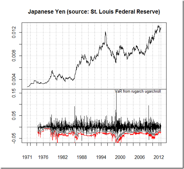
Just to add a chart, here is one using data from the Federal Reserve Bank of St. Louis (FRED).  While the extreme correlation between the Yen and the S&P 500 has limited the opportunity available in the Yen, the correlation has recently weakened as Japanese deficits have worsened and the Yen stopped getting stronger.

From TimelyPortfolio

R code:

require(latticeExtra)
require(quantmod)

getSymbols("DEXJPUS",src="FRED")
getSymbols("SP500", src="FRED")

asTheEconomist(xyplot(DEXJPUS,main="US Dollars for Japanese Yen Since 1970\nSource: Federal Reserve Bank of St. Louis"))

#merge the weekly returns of Yen and SP500
ret <- na.omit(merge(weeklyReturn(DEXJPUS),weeklyReturn(SP500)))
#use the rolling correlation method from PerformanceAnalytics chart.RollingCorrelation
rollcor <- as.xts(rollapply(ret, width = 208, FUN = function(x) cor(x[,
                     1, drop = FALSE], x[, 2, drop = FALSE]), by = 1,
                     by.column = FALSE, na.pad = FALSE, align = "right"))
xyplot(na.omit(merge(SP500,rollcor,DEXJPUS)),col=brewer.pal("RdBu",n=9)[c(9,2,8)],
              lattice.options=theEconomist.opts(),
              par.settings=theEconomist.theme(box="transparent"),
              scale=list(y=list(rot=0)),
              xlab=NULL,
              strip=strip.custom(factor.levels=c("S&P 500","Correlation (Rolling 4 Year) S&P 500 and USD/Yen","USD/Japanese Yen")),
              main = "S&P 500 and USD/Yen Since 1970\nSource: Federal Reserve Bank of St. Louis")

Tuesday, October 16, 2012

Japanese Government Bond (JGB) Data Since 1974

The Ministry of Finance Japan very generously provides data on JGBs back to 1974.  Here is a quick example how to pull it into R and then graph it.

From TimelyPortfolio

R code in GIST (do raw for copy/paste):
Life on the Big International Frontier

Although I have used the Kenneth French data library extensively in various posts, I have not yet used the international data sets paired with the wonderful paper.

Eugene F. Fama and Kenneth R. French (2012) "Size, Value, and Momentum in International Stock Returns", Critical Finance Review

To rectify this home bias, let’s generate some efficient frontiers for the biggest cap stocks by geographic region to see how the frontiers have evolved over the last 20 years.

From TimelyPortfolio

Eventually, I would like to think through some other methods of comparing risk, return, and weights across multiple frontiers.

R code from GIST (do raw for copy/paste):

Monday, October 15, 2012

Not Much of a Grand Finale. What if We Go To 0?

When I ask the question “What if the US 10 year goes to 0?", most do not know the effect, the catalyst, or if 0 has ever happened before.  The math is fairly simple to do in Excel or with an old-school calculator, but let’s use RQuantLib to do the pricing and then use LatticeExtra with some slight adjustment in SVG.  RQuantLib spits out a total return of 17% if we go to 0 by the end of October, which seems like a decent amount until we look at on a chart.

From TimelyPortfolio

Mildly impressive, but the move is almost undetectable on a log scale.

From TimelyPortfolio

Throughout history, we have really only one good reference point in Japan whose 10 year went very briefly to 0.47%, but we need to remember that was in extended deflation in which stocks and real estate lost 90%.  That 17% return if we go to 0 (actually much less since 0.47% 0.43% was the stopping point) is not all that helpful in this devastating environment.

Even more strange is that the move we experienced over the last 15 months is greater than the potential move from here to 0.  On a six month change in yield chart, the 2% from April to 0% in October seems perfectly normal if we forget about the starting point.

From TimelyPortfolio

Similarly, a 12 month rolling total return chart does not reveal anything odd.

From TimelyPortfolio

However, starting point is critical.  Instead of subtracting ending from starting yield, ending yield/starting yield is more appropriate at this critical level.  Now we can see how unusual the move really is.

From TimelyPortfolio

If you are buying bonds to protect/benefit from a disastrous, deflationary “end of the world”, please be aware that best case you make a fairly measly 17%.  Just moving back to where we were Spring 2011 would mean a bigger loss than the absolute best case.

THIS IS NOT INVESTMENT ADVICE.  ALL OF THE ABOVE IS SIMPLY FOR ILLUSTRATION.

R code from GIST: (do raw for copy/paste)

Tuesday, October 2, 2012

Emerging as Low Vol

Extending the series begun with When Russell 2000 is Low Vol, I thought I should take a look at Emerging Market stocks during periods of low relative volatility to the S&P 500.  So you can replicate even without access to expensive data, let’s use the Vanguard Emerging Market Fund (VEIEX) and the Vanguard S&P 500 Fund (VFINX) as proxies.  In the 12 month rolling regression, we see the same fairly steadily increasing beta and correlation of the Emerging Market stocks to the S&P 500 that we saw in the Russell 2000.

From TimelyPortfolio

If I progress further on this research, I will have to work on an adaptive definition of “low vol”, but for the purpose of this post, I defined “low vol” as

Emerging 50 day std. dev – S&P 500 50 day sd > –0.075

For the Russell 2000, we used a more strict 0.0125.  Although the numeric definition is different, the chart shows a very similar profile.

From TimelyPortfolio

R code from GIST:

Monday, October 1, 2012

When Russell 2000 is Low Vol

Continuing in my exploration of the Russell 2000 (Russell 2000 Softail Fat Boy), I thought I would try to approach the topic with a low volatility paradox mindset.  Since 2005, beta of the Russell 2000 compared to the S&P 500 has exceeded 1.2 with a max of 1.6 for almost every rolling 1 year period.  This suggests that the Russell 2000 is anything but low vol.

From TimelyPortfolio

However, we can take a more simplistic view by comparing the rolling 50-day standard deviation of the Russell 2000 with the S&P 500.  Russell 2000 on an absolute and relative basis does very well when rolling 50-day standard deviation of the Russell 2000 minus the same standard deviation on the S&P 500 exceeds –1.25%, so the Russell 2000 performs best when volatility approaches the S&P 500.  In low relative volatility environments, it seems we should own the high beta Russell 2000.  You will see the largest down moves all occur in the non-shaded time periods.

From TimelyPortfolio

I intentionally wanted this post to be simple, so I hid a lot of the preliminary work and extra links.  Far more went into this than appears above.

R code from GIST:

Thursday, September 20, 2012

Obviousness of REITs?

I very much enjoy papers such as

Antonacci, Gary, Risk Premia Harvesting Through Momentum (September 5, 2012). Available at SSRN: http://ssrn.com/abstract=2042750 or http://dx.doi.org/10.2139/ssrn.2042750

Faber, Mebane T., A Quantitative Approach to Tactical Asset Allocation (February 17, 2009). Journal of Wealth Management, Spring 2007. Available at SSRN: http://ssrn.com/abstract=962461

and clearly the finance community appreciates these with the first as a First place winner of the 2012 NAAIM Wagner Awards for Advancements in Active Investment Management and the second with a download rank of 2 on SSRN with 273,000 abstract views.

However, I struggle mightily with how obvious would these papers’ choice of assets been without the benefit of hindsight.  I already briefly touched on this flaw in Bonds Much Sharpe -r Than Buffett.  Of course, using what we now know is one of the best asset classes in the history of the world that has also experienced an anomalous and extremely negative correlation with equities during their distress will provide a very positive result.  Unfortunately, I have yet to find any research from the late 1970s or early 1980s that predicted such a glorious environment for bonds.

Similar but not quite as extreme, adding REITs (all my posts about REITs)  over the last 12 years in any way would almost guarantee a pleasant result.  However, REITs were not so stellar for the 15 year period 1984-1999.  Would REITs have been such an obvious choice in 1999?  Of course, if we know the future, but I’m not so sure when we only knew the past.

From TimelyPortfolio

Also, how obvious would gold have been in 1998 or how obvious would high yield have been in the early 1980s when they did not even exist? Can we expect the next 10 years to look like the last 10 years?

R code from GIST:

Friday, September 7, 2012

Big Issue with System Backtests

Almost always, when I see a system backtested, the backtest assumes a static portfolio with no contributions or withdrawals.  This assumption only covers an extremely limited subset of my clients.  Cash flows in and out of a portfolio or system can have a much larger impact on ending net worth than the geometrically linked performance of a system or money manager.  Most of the systems I have shown for demonstration purposes on this blog have suffered from this unrealistic assumption.  I thought I should show how contributions similar to those in a 401k can affect a simple moving average system.

In a roaring bull market, any momentum system will underperform so significantly that potential abandonment of the system due to lack of confidence is highly likely.  As shown below, there was very little discussion of moving average strategies 1990-2000 due to the simple fact that buy/hold absolutely clobbered them.  While normal adjustments like return/risk and a log scale can soften the impact on the screen, the psychological impact to a client can be very damaging as the focus moves entirely to $ value of the portfolio.  Below is a comparison of buy and hold versus a 200 day moving average system with no additions or withdrawals.  As discussed, 1990-2000 was not kind to the moving average.

From TimelyPortfolio

However, if we add a simple framework similar to a 401k investor starting with $100,000 and adding $10,000 per year ($2,500 per quarter), the results differ significantly.

From TimelyPortfolio

I intentionally played a little trick by changing the y axis to a log scale.  Clients don’t think in log scale when evaluating performance.  They simply look at $ value of the portfolio.  If we look at the results without a log scale, underperformance by 2000 is visible, but it is nowhere near as great as shown in the first chart of the post, and outperformance after the 2008-2009 collapse is very healthy.  I actually think a client could accept this profile much more readily than that shown with a static portfolio.

From TimelyPortfolio

Of course, this test was not perfect, and all sorts of assumptions and simulations can be added, but we can start to see how inflows and outflows can impact a portfolio whether it is buy/hold, discretionary, or systematic.

R code from GIST ( do raw for copy/paste ):

Friday, August 31, 2012

Russell 2000 Softail Fat Boy

If the Russell 2000 were a motorcycle, maybe it should be a Harley-Davidson Softail Fat Boy.  I have explored the exceptional case of the Russell 2000 in quite a few posts

but I still am not sure I have done a good job of clearly and simply explaining some of the unique characteristics of the Russell 2000 over the last  25 years.  The Russell 2000 has been extremely difficult to beat because the upside has been so good (fat boy) and the downside has been the same or better (softtail).

From TimelyPortfolio

R code from GIST:

Thursday, August 30, 2012

Another Great Google Summer of Code 2012 R Project

Tradeblotter announced the very nice features that will be added to the PerformanceAnalytics package as a result of the Google Summer of Code (GSOC) 2012 project:

“…Matthieu commenced to produce dozens of new functions, extend several more existing ones, and add more than 40 pages of additional documentation (complete with formulae and examples) to PerformanceAnalytics. He’s included Bacon’s small data set and several new table.* functions for testing and demonstrating that the functions match the published results. All on plan, I would add.

He also wrote a very nice overview of the functions developed from Bacon (2008) that are included in PerformanceAnalytics, which should be helpful to readers or teachers of Bacon’s work. Matthieu’s summary document will also be distributed as a vignette in the package, accessible using vignette('PA-Bacon'). Additional detail is included in the documentation for each function, as well. I’ll highlight some of those functions in later posts…”

Although the Bacon vignette is very helpful, I highly recommend reading the book also.  For those of you on O’Reilly’s Safari, you can add the book to your bookshelf.

Preview

or buy it from Amazon.

Since I saw the announcement (been patiently waiting) when I was also reading this very good article “Tomatoes and the Low Vol Effect” by Research Affiliates, I was already working on some R to explore the Sharpe and Information Ratio between a buy/hold on the S&P 500 and a 10 month moving average strategy.  When you look at the code, you might enjoy some of the other charts and methods, but  I decided to change directions with my research and integrate a new PerformanceAnalytics function and continue to push the limits with another fine Google Summer of Code 2012 addition xtsExtra plot.xts.  I was not real selective and opted for ProspectRatio, since it is a formula I do not often hear discussed.  On page 20, the Bacon vignette describes ProspectRatio as

image

I basically tried to include absolutely everything possible (scattered, smothered, covered, chunked, and diced) from xtsExtra plot.xts in this chart.  The chart includes cumulative growth of buy/hold and 10 month moving average on the S&P 500 in the top panel, shows drawdown in the middle, and then adds a horizon plot of Prospect Ratio for the ma strategy – Prospect Ratio for the buy/hold.  Since plot.xts also allows for blocks, I thought it would be helpful to also shade those periods when the 36 month rolling Sharpe Ratio of the ma strategy outperforms buy/hold.  While this is probably a bit much for a single chart, I think it demonstrates clearly how powerful these tools are.

From TimelyPortfolio

R code from GIST (do raw for copy/paste):

Monday, August 27, 2012

Horizon on ggplot2

SocialDataBlog’s kind reference in post Horizon plots with ggplot (not) motivated me to finish what the post started.  I knew that ggplot2 would be a little more difficult to use for the purpose of a horizon plot, but I felt compelled to provide at least one example of a horizon plot for each of the major R graphing packages.  I achieved a good result but the code is not as elegant or as flexible as I would like.  Readers more comfortable with ggplot2, please bash, fork, and improve.

From TimelyPortfolio

R code in GIST (do raw for copy/paste):
Thursday, August 23, 2012

Bonds Much Sharpe -r Than Buffett

Mebane Faber’s post Buffett’s Alpha points out Warren Buffett’s 0.76 Sharpe Ratio discussed in the similarly title paper Buffet’s Alpha.  I of course immediately think about the 8th Wonder of the World – the US Bond Market, whose Sharpe Ratio has trounced Buffett’s for the last 30 years.  What I like even better are all the tactical systems that employ US bonds in their backtests and make no adjustment for substantially different returns going forward.  For those of you who do not know, bonds with absolute certainty cannot achieve >8% annualized returns with max drawdown < 5% for the next 30 years with a starting yield to worst at 1.86% (Barclays Agg 8/23/2012). 

If anyone can show me where to get 8% annualized returns with max drawdown of 5% for the next 30 years, please let me know, and I will buy that with leverage and enjoy life. I’ll be happy to share my gains with whomever has the answer.

From TimelyPortfolio

In addition to an unbelievable Sharpe Ratio, bonds have exhibited a low/negative correlation with stocks during stocks’ bear market, which is also historically very anomalous.

From TimelyPortfolio

Just because I love horizon plots.

From TimelyPortfolio

For a longer perspective, here is rolling correlation since 1900 from the CSFB 2011 Yearbook.

image

So the experience can be dramatically different than what we have been fortunate enough to experience recently.

image

R code from GIST (install xtsExtra):

Monday, August 20, 2012

plot.xts with Moving Average Panel

(for all plot.xts posts, see http://timelyportfolio.blogspot.com/search/label/plot.xts)

As another example of all that we can do with the new plot.xts, let’s try to do a price plot with a moving average overlays.  We will use the ETFs shown by Mebane Faber at http://www.mebanefaber.com/timing-model/.  With the panel functionality, it is very easy to specify a panel to draw the price line and then add the calculated moving average.  Notice how in all the examples, the recession block appears easily and very nicely.

From TimelyPortfolio

Also, if you wanted to specify some funky layouts, we have that option.  For this case, I do not think it makes much sense, but in the future I will demonstrate some more appropriate uses.

From TimelyPortfolio

Or as one more example, let’s change it up just slightly.

From TimelyPortfolio

R code in GIST (do raw for copy/paste and also install xtsExtra from r-forge):

Friday, August 17, 2012

GARCH Panel in plot.xts

I’m clearly out of my realm of competence with most of the rugarch functions, but I thought it might be nice to provide an example combining plot.xts and uGARCHroll.

image

R code from GIST:

Horizon Plots with plot.xts

Anyone who has read

  1. 48 Industries (Dendrogram Ordered) Over 50 Years
  2. 48 Industries Since 1963
  3. “Trend is Not Your Friend” Applied to 48 Industries
  4. Horizon Plots in Base Graphics
  5. More on Horizon Charts
  6. Application of Horizon Plots
  7. Horizon Plot Already Available
  8. Cubism Horizon Charts in R

should already know that I really like horizon charts.  Also, you would probably guess that I would be very excited if the new plot.xts could produce horizon charts.  So I am excited, since with its panel functionality, plot.xts very capably creates horizon charts.

From TimelyPortfolio

R code from GIST (also, please install xtsExtra from r-forge):

Thursday, August 16, 2012

plot.xts is wonderful

As mentioned in FOSS Trading post A New plot.xts yesterday

“The Google Summer of Code (2012) project to extend xts has produced a very promising new plot.xts function. Michael Weylandt, the project's student, wrote R-SIG-Finance to request impressions, feedback, and bug reports. The function is housed in the xtsExtra package of the xts project on R-Forge.

Please try xtsExtra::plot.xts and let us know what you think. A sample of the eye-candy produced by the code in Michael's email is below. Granted, this isn't a one-liner, but it's certainly impressive! Great work Michael!”

and as announced by author Michael Weylandt in https://stat.ethz.ch/pipermail/r-sig-finance/2012q3/010652.html

“As the community which makes the most heavy use of xts, I would like to draw your attention to a new set of plotting functions for xts objects available as part of Google Summer of Code 2012. This work represents a major overhaul of previously existing plot.xts and should provide you with the most comprehensive and flexible time series plotting available in R. Features include:

  • "automagic" layout construction and axis alignment
  • smart argument recycling
  • panel function abilities
  • more attractive candle and bar plots for OHLC objects
  • scatterplots to view the co-evolution of multiple series
  • event markers
  • regime highlighting
  • time-oriented barplots via barplot.xts [based on code by Peter Carl]
  • interoperability with all known R time series classes using the xts try/reclass paradigm

while retaining the same smart axis formatting and gridlines that plot.xts provided. We have made every effort to maintain complete compatibility with documented usages of the old plot.xts and to be 95% compatible with plot.zoo. My goal has been to craft a design which uses smart defaults to put attractive and informative graphics ever at your fingertips, while remaining flexible enough for "power-users" to craft every detail as they desire…”

Michael has done a fantastic job with this Google Summer of Code (GSOC) project, and I look forward to incorporating all the new features of plot.xts.  As a quick example very different from that shown in the post and mailing list announcement, I thought it would be fun to show how we can use plot.xts to replace the veteran chart.TimeSeries and charts.PerformanceSummary plots from the PerformanceAnalytics package.

For the chart.TimeSeries, I will almost exactly replicate the chart given in the documentation.

From TimelyPortfolio

Not really as a useful application but for the sake of demonstration, we can produce something like this to separate styles and also avoid event label collision (just implemented by Michael very late last night).

From TimelyPortfolio

plot.xts even allows plot.zoo and lattice panel type functionality which allows us to do very nice things like in this charts.PerformanceSummary style chart.

From TimelyPortfolio

I very much appreciate this very powerful contribution to R.  Thanks to everyone involved.

R code in GIST (note: install xtsExtra from R-forge) :

Thursday, August 9, 2012

48 Industries (Dendrogram Ordered) Over 50 Years

Thanks to reader AHWest for the comment on post 48 Industries Since 1963.

“I think it would be interesting to see the industries ordered by some sort of similarity of returns.”

I think this is a great suggestion, and I would like to see it also.  I tried the dendrogram plot technique from Inspirational Stack Overflow Dendrogram Applied to Currencies, but then I spotted the dendrogramGrob in the latticeExtra documentation.  This was much easier, and in a couple of lines, we are able to order and connect the 48 industries.

From TimelyPortfolio
R code from GIST (do raw for copy/paste):

Wednesday, August 8, 2012

“Trend is Not Your Friend” Applied to 48 Industries

Please see previous post Crazy RUT in Academic Context Why Trend is Not Your Friend.

I’ll repeat the intro to the post mentioned above, so we can all get caught back up.

In response to Where are the Fat Tails?, reader vonjd very helpfully referred me to this paper The Trend is Not Your Friend! Why Empirical Timing Success is Determined by the Underlying’s Price Characteristics and Market Efficiency is Irrelevant by Peter Scholz and Ursula Walther. The authors conclude

“Our study on the basis of real data clearly confirms the hypothesis that the asset price characteristics of the underlying price process have a crucial impact on timing results. This allows us to forecast the timing success depending on the market's parameters. An OLS
regression analysis supports our predictions and verifies our assumption that the drift has the
strongest influence on timing success. By contrast, the higher moments (skewness, kurtosis)
seem not to have any significant impact on the timing result in the empirical sample. As we
presumed, the level of market development, and hence the degree of efficiency, does not play
any role. Trading worked coincidentally rather well in the developed world and quite poorly in
the emerging markets. The driving factor for the timing success is the parametric environment the trading system stumbles on…

Our study contributes to the discussion by providing a structured analysis of the relevance of the most important price process parameters. As a result, the traditional explanations for timing success can be abandoned: we find that it is very likely for the SMA trading rule to generate excess returns over its benchmark if the underlying price path exhibits negative drifts, high serial autocorrelation, low volatilities of returns, and highly clustered volatilities. Drift and autocorrelation of the underlying asset seem to have the largest impact, though.”

One of my initial ideas for extending the research was to incorporate a much larger set of indexes over a longer period of time.  As I was working on 48 Industries Since 1963, I decided 50 years of data on 48 different indexes would be a great dataset to apply the ideas and methods presented in the paper.

Using R and all its wonderful packages, it is surprisingly easy to accomplish.  Let’s see if we can test “drift and autocorrelation…have the largest impact” on excess returns with industries also.  I’ll try not to get too statistical.

In terms of drift or annualized return, we can see a linear inverse relationship between return and out(under)performance of the 200 day moving average system, so the better the performance of the industry, the less likely a moving average system is to outperform.

From TimelyPortfolio

In terms of the GARCH model effects on excess returns, a parallel coordinate chart will best start our exploration.  Lines are colored by the excess return of a moving average system on each industry.

From TimelyPortfolio

Mu and alpha1 seem to most heavily influence the ability of a moving average system to outperform.  Let’s isolate our chart to mu and alpha1 and add ar1 based on the authors’ findings.  I am very tempted to try to explain GARCH here, but for the sake of brevity, I’ll refrain.  This paper and this Portfolio Probe post offer a good introduction to GARCH.

From TimelyPortfolio

Now let’s look at a scatterplot of excess return versus each of the GARCH stats, starting with those with the most influence.

From TimelyPortfolio

In conclusion, it seems the same effects observed by the authors also apply to US industry indexes.  In future posts, I’ll add a little more statistical rigor to the analysis and apply to other indexes.

Now, I just cannot resist using a horizon plot to evaluate the rolling 250 day excess returns of a moving average system over buy and hold.  As you can see, a bull market favors buy and hold.  The 70s and 2008-2009 were very kind to a moving average approach.

From TimelyPortfolio

R code in GIST (do raw for copy/paste):