Wednesday, January 30, 2013

Approaching the Zero Bound - Bonds

As bonds approach the artificial zero bound, where do we go next especially after the record setting +30% in 2011?  The rolling 250-day total return has rarely gone negative since the inception of the Vanguard Funds VBMFX and VUSTX.  I am intentionally an ex-bond fund manager, so I am very interested.

From TimelyPortfolio

R code in GIST:

Monday, January 28, 2013

Applying Tradeblotter’s Nice Work Across Manager Rather than Time

Ever since I saw the very helpful distribution page first presented in Download and parse EDHEC hedge fund indexes, I have used it liberally.  Now that it is has been functionalized (Visually Comparing Return Distributions), I thought I would amend it slightly to compare distributions of returns across managers rather than time.  As a simple example, I compared the mutual funds offered by Vanguard and Pimco.  This amended function might be very helpful for internal performance monitoring of separately managed accounts across external or internal money managers.  Also, for the purposes of composite dispersion, this might be a good beginning summary look.

I like what I did in Pretty Correlation Map of PIMCO Funds, but this time I wanted to get the performance data directly in a table rather than calculating performance from multiple calls to the getSymbols function.  R can easily load these tables, but I got lazy and imported the tables into Excel https://docs.google.com/file/d/0ByeeEIaS0AOsRE1OeWk2VmFFVUU/edit and then cleaned them up with some old fashioned pivot tables.  When finished data munging, I copied and pasted into a data sheet to save as .csv (could have used R again to get the data directly from Excel), so I could publish through Google Docs for anyone that wanted to replicate what I have done.

Pimco and Vanguard Mutual Funds 1 Year Performance
From TimelyPortfolio
Pimco and Vanguard Mutual Funds YTD 2013 Performance
From TimelyPortfolio

Now, I’d like to incorporate another fine piece of work Tracking Number of Historical Clusters into this analysis, but I’ll save that for another post.

Code from Gist:

Wednesday, January 16, 2013

Slightly Different Measure of Valuation

I grow tired of the tried and true standard measures of valuation, and from time to time I try to think of alternate methods.  One thought was to analyze Ken French’s Market(ME) to Book(BE) Breakpoints by percentile.  We can see by year at what level is a stock considered cheap relative to the universe.  As these breakpoints move higher, the market is willing to pay a higher price.  In reverse, as these breakpoints move lower, stocks fetch a lower price or can be considered cheaper.  Since there are 20 fifth percentiles, a horizon plot can provide a good overall look at this measure of valuation.

Here is a horizon plot of absolute ME/BE valuation by fifth percentile since 1926.

From TimelyPortfolio

For a more representative look, let's plot a horizon chart of the ME-BE / historical mean - 1.

From TimelyPortfolio

For one more non-horizon look, we can use an xyplot.

From TimelyPortfolio

In theory, I think this could provide yet another gauge of the cheapness of stocks, but of course, there is lots of research to be done.

R Code from Gist:

Thursday, January 10, 2013

Interesting Presentation from Van Eck Trackers Team

I just saw a very interesting presentation from the Van Eck Trackers Team (acquired by Van Eck in July 2012) at the CFA Society of Alabama January 2013 lunch.  I have not had the chance to read all their research and attempt to replicate portions in R, but I found two points very compelling.  First, the research done on the price of illiquidity

Freed, Marc S., and Ben McMillan. "Investible Benchmarks and Hedge Fund Liquidity." The Journal of Wealth Management 14.3: 58-66.

published in the Journal of Wealth Management potentially could inversely answer the pricing of Warren Buffett’s notion of “cash as a call option” described in a Globe and Mail article with my own thoughts in this post.  The price of illiquidity can be considerable as shown below,

image

so inversely the opportunity from liquidity or available cash could be substantial. Imagine what hedge fund performance might look like net of fee, net of tax, and net of illiquidity. Even the best managers cannot achieve a high enough return to compensate for this level of embedded costs.  Strangely enough it also comes close to my crude heuristic of 10% expected return premium necessary for me to justify illiquidity.

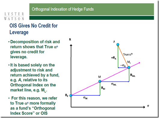
The presentation (similar presentation given to the CFA Society of Pittsburgh) also discusses the concept of True® Alpha.  The decomposition is nicely described in this graphic from the presentation.

image 

I have not confirmed with the authors/speakers their use of R, but their were some remarkably familiar graph layouts that lead me to believe R played a prominent role.  Regardless, I would really like to replicate some of the calculations in R.