Tuesday, July 31, 2012

“We Will Do Whatever it Takes”

When I first heard Draghi’s quote “We Will Do Whatever it Takes,”  I immediately thought that I should dig through some other good quotes from similarly positioned officials in financial history.  Let’s start with Prime Minister John Major in England 1992.

I found this clip reminding us of the 1992 British Pound devaluation.

http://news.bbc.co.uk/onthisday/hi/dates/stories/september/16/newsid_2519000/2519013.stm “The move is a dramatic U-turn in government policy, as only last week Prime Minister John Major reaffirmed the government's commitment to remaining within the mechanism.” (see his strong words below at the 2:34 mark)

Another near real-time view of Black Wednesday, September 16, 1992.

I think the last lines from the Atlantic June 4, 2010 article “Go For the Jugular” sum it up very well

“That evening, Lamont called a press conference in the Treasury's central courtyard. At 7:30 p.m., facing a massive battery of TV cameras from all over the world, he announced Britain's exit from the exchange-rate mechanism.

The markets had won, and the government had at last recognized it.

Application of Horizon Plots

for background please see prior posts Horizon Plot Already Available and Cubism Horizon Charts in R

Good visualization simplifies, and stories are better told with effective and pretty visualizations.

Although horizon plots are not immediately intuitive, I have embraced them as an extremely effective method of analyzing more than four series.  I hope they become much more popular, so I can use them with much more confidence.  If we look at a traditional cumulative growth chart on the managers dataset provided by PerformanceAnalytics, I get confused by too many lines and colors since there are 10 different series.  While this chart works, it can be better.

From TimelyPortfolio

We could panel the data, but I think this makes comparison even more difficult.

From TimelyPortfolio

In this case and many others, horizon plots provide what I feel to be both a more attractive and effective visualization.  Here is an example using latticeExtra’s horizonplot function with very little adjustment.  You can detect both comovement or seasonality and can compare the amplitude simultaneously.

From TimelyPortfolio

With a little additional formatting, we can get an ideal visualization-pretty and effective.  The ability to scale well beyond 10 series offers power that we cannot obtain with a traditional line chart.

From TimelyPortfolio

As another example, let’s look at how we can use horizon plots to monitor a moving average system similar to the Mebane Faber's timing model.  If you follow the link, you can see a decent visualization of the price and moving average.  A horizon plot could accomplish this much more efficiently.

From TimelyPortfolio

I personally like the mirrored horizon plot even better.  Let’s incorporate that.

From TimelyPortfolio

Please help me popularize these extremely powerful charts.

R code from GIST (do raw for copy/paste):

Friday, July 27, 2012

Hi R and Axys, I’m d3.js “Nice to Meet You” (On the Iphone)

I am still definitely in the proof of concept stage, but as I progress I get more excited about the prospects of combining d3.js with R and Axys through Bryan Lewis’ really nice R websockets package (even nicer now that he has added the daemonize function).  In this iteration, I will add a cumulative growth line chart, some animation and transitions, and then javascript will ask R to calculate drawdowns.  Instead of R returning a chart like last time, R will send the results of the drawdown calculations through JSON through the websocket.  We will then use d3.js to draw a line chart of drawdowns.  This becomes really powerful when we consider the existing and thanks to Google Summer of Code soon to be added risk/return calculations offered by the R PerformanceAnalytics package.

As one last bonus at the end of the video you will see that we can get this interactive reporting experience and websocket communication all on our Iphone and Ipad.

As a quick review of what is happening

  1. Axys runs a report called perhstsp.rep.
  2. Axys calls the cdataset.xlsm testd3axys macro and sends performance information.
  3. Excel cdataset.xlsm testd3axys macro does some very basic formatting, converts the data to JSON, creates a webpage, and opens the webpage in the default browser.
  4. Browser opens the webpage and d3.js generates a bar graph of performance and then a cumulative growth line chart.
  5. Browser provides a button to open a websocket with R and send the performance information originally calculated in Axys.
  6. R receives the performance data through the websocket, calculates drawdown, and then sends the drawdown calculations as JSON back to the browser.
  7. Browser receives the drawdown calculations and d3.js plots them as a line chart.


The next set of iterations will focus on cleaning up the d3.js charts and adding interactivity.

So far I have received no comments.  Please let me know what you think about this.

The list of acknowlegements is starting to get long. I really appreciate all the fine work done by Mike Bostock on d3.js https://github.com/mbostock/d3/wiki, the dedicated authors of the R package PerformanceAnalytics http://cran.r-project.org/web/packages/PerformanceAnalytics/index.html, Bryan the author of http://illposed.net/websockets.html and the example, the author of RJSONIO http://cran.r-project.org/web/packages/RJSONIO/index.html, and Bruce McPherson at http://excelramblings.blogspot.com/ for the inspirational idea.

To work through on your own, you will need the Excel file cdataset.xlsm, the Axys report perhstsp.rep, and the R code from GIST.

Wednesday, July 25, 2012

Inspirational Stack Overflow Dendrogram Applied to Currencies

When I saw the answer to this Stack Overflow question, I immediately remembered working on my old post Clustering with Currencies and Fidelity Funds and just had to try to apply this technique.  As I should have guessed, it worked with only a minimal amount of changes.  Hoping to incrementally improve, I added a couple of slight modifications.

From TimelyPortfolio

R code from GIST (select raw to copy/paste):

Tuesday, July 24, 2012

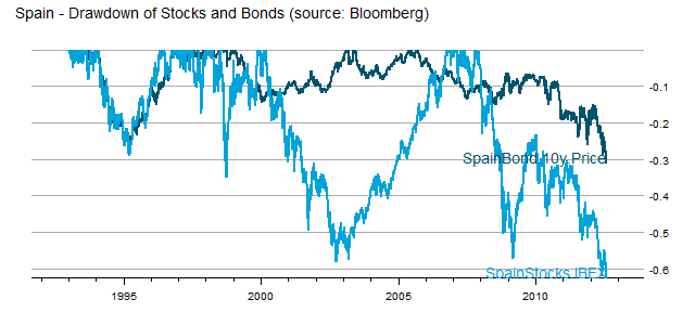
The Failure of Asset Allocation - Bonds Are An Imperfect Hedge

US investors were spoiled by US Treasuries which acted as a near perfect hedge to stocks during the 2008-2009 crisis.  However, in real crisis, bonds rarely offer any comfort, and asset allocation fails (see post Death Spiral of a Country and IMF paper Systemic Banking Crises Database: An Update; by Luc Laeven ... – IMF).  As a very timely example, we can examine Spain, which is not even to crisis level yet.

From TimelyPortfolio

In Spain, there is nowhere to hide, and allocation offers no comfort.

R code in Gist (click raw to copy/paste):

Thursday, July 19, 2012

Best of Axys, R, d3.js, and HTML5

Axys, R, d3.js, and HTML5 all offer incredibly powerful tools for investment management and reporting, but they are not set up to synergistically interact to fill each other’s gaps and leverage each other’s strengths.  In my ideal scenario, Axys serves as the accounting system and performance calculator, R serves as the advanced financial/statistical engine, d3.js serves as the interactive reporting component, and HTML5 offers the user interface and ties everything together through websockets (nicely demoed here).  After working and suffering with Axys for 12 years, I am amazed that it all seems to be coming together.  I provided a bare proof of concept for Axys to d3.js in my post Axys to d3.js Error Catching and Formatting.  Now let’s extend that to R and websockets through the generously contributed R websockets package.  I have borrowed very heavily from the author's Youtube example presented in

In this proof of concept, Axys will calculate performance and send to Excel through a graph macro which creates JSON and an html page (thanks Bruce http://excelramblings.blogspot.com/).  The html page contains javascript and d3.js to produce a simple bar chart.  Now we add a button to take the JSON created by Excel and embedded in our html and send it to R.  R will produce a charts.PerformanceSummary chart and send it back as jpeg to the html page.  The html page will receive the image and replace the d3.js bar chart with the image.

Going forward I will only use R as the statistical engine and continue to rely on d3.js for the interactive reporting.  How far I go with this depends heavily on user response.  Please let me know if you would like me to continue down this path.

The list of acknowlegements is starting to get long.  I really appreciate all the fine work done by Mike Bostock on d3.js https://github.com/mbostock/d3/wiki, the dedicated authors of the R package PerformanceAnalytics http://cran.r-project.org/web/packages/PerformanceAnalytics/index.html, Brian the author of http://illposed.net/websockets.html and the example, the author of RJSONIO http://cran.r-project.org/web/packages/RJSONIO/index.html, and Bruce McPherson at http://excelramblings.blogspot.com/ for the inspirational idea.

To work through on your own, you will need the Excel file cdataset.xlsm, the Axys report perhstsp.rep, and the R code from GIST.

Wednesday, July 18, 2012

Axys to d3.js Error Catching and Formatting

I got so excited in d3.js Chart of Axys Performance that I did not test adequately.  When I added a y-axis, I realized that the axis was reversed.  All the links should now be fixed with the better code, and I also added some labels.  This is a work in progress, so please stay tuned.

To try it for yourself, please download the perhstsp.rep Axys report and a stripped down version of cDataSet.xlsm (see the full version for more http://ramblings.mcpher.com/Home/excelquirks/downloadlist) . If you would just like to see the final html output then go to http://bl.ocks.org/3106445.

Thanks to Mike Bostock http://bost.ocks.org/mike/for all his incredible work on everything, but especially d3.js. Also, thanks again to Bruce for his stimulating work with Excel.

Friday, July 13, 2012

d3.js Chart of Axys Performance

Please see Axys to d3.js Error Catching and Formatting for a much better version.

Way back in January I made some amazing (is it sad that I consider this amazing?) discoveries as I tried to push the limits with Advent Axys reporting and even integrated R with Axys in R in Axys (Impossible Dream).  Now I have accomplished what I believe to be even more exciting and potentially useful by  combining the nice Excel and d3.js work done at http://excelramblings.blogspot.com/ with 20 year old Axys technology (nicely improved by http://viabinary.com/ViaBinary/Home.html).  For those of you who know reporting in Axys, I’m sure you share my excitement.  Please let me know your thoughts.

To prove that I’m not dreaming, here is the screencast.

To try it for yourself, please download the perhstsp.rep Axys report and a stripped down version of cDataSet.xlsm (see the full version for more http://ramblings.mcpher.com/Home/excelquirks/downloadlist) .  If you would just like to see the final html output then go to http://bl.ocks.org/3106445.

Thanks to Mike Bostock http://bost.ocks.org/mike/for all his incredible work on everything, but especially d3.js.  Also, thanks again to Bruce for his stimulating work with Excel.

Thursday, July 5, 2012

More Exploration of Crazy RUT

Unintentionally while playing with the lawstat package in R, I started trying to build systems (STANDARD DISCLAIMER: NOT INVESTMENT ADVICE AND WILL LOSE LOTS OF MONEY SO PROCEED WITH CAUTION) based on the Jarque Bera test of normality (entry in Wikipedia or the research paper http://scholar.google.com/scholar?cluster=18293285759900281575&hl=en&as_sdt=0,1).  Since I was only playing around, I sort of deliberately curve fitted a system to work on the Russell 2000.  After a lot of experimentation, I came up with something very interesting, which led me to test on multiple other indexes.  It seemed to only really work well on the Russell 2000 and mainly over the last 5 years, which of course led me right back to the question posed in Crazy RUT and explored again in Crazy RUT in Academic Context Why Trend is Not Your Friend, which is “Why don’t most momentum systems work over the last decade on the Russell 2000 when they work on almost all other indexes?”  Please let me know if you have a good explanation, or if you want to test for regimes. Here is the result. I apologize that I spent little time on making these pretty.

From TimelyPortfolio

Even more strange is that the system applied to Kenneth French’s small classification shows different results.

From TimelyPortfolio

Here is how the system looks on the S&P 500, and again certainly nothing special.

From TimelyPortfolio

R code from GIST (do raw for copy/paste):

Monday, July 2, 2012

Graphics Artifacts from Quarterly Commentary

For my Q2 2012 commentary, I tried multiple graphs to illustrate the disconnect of the US stock markets with the rest of the world.  I think I finally settled on this simple Excel bar graph populated by Bloomberg data, but I thought some might like to see some of the R graphical artifacts as I explored how best to illustrate my point.

From TimelyPortfolio

Although I settled on a 1 year performance chart, I really wanted to show more history, but without all the noise of a daily, weekly, or even monthly chart.  I tried a chart connecting the 200 day max/min points, but it still seemed noisy and difficult to follow. One big letdown was Yahoo! Finance not providing DJUBS, E1DOW, or P1DOW any more.

From TimelyPortfolio

I then thought connecting the end of year points might offer a nice simplification, and I probably liked this best of the R charts.  This shows enough of the path to see the universal move up to 2010, and then the disconnect.

From TimelyPortfolio

Even one R base graphics chart. Thanks again Josh for the fork.

From TimelyPortfolio

As one other option, I thought I would try to just connect beginning, middle, and end since December 2008.  This certainly shows the huge disconnect between the U.S. and the rest of the world, but I found it difficult to describe the methodology within the chart.

From TimelyPortfolio

I hope this helps someone somewhere.  As always, I very much enjoy comments and opinions.

R code in GIST (do raw for copy/paste):